
What a website design checklist covers
Quick answer
A website design checklist is the list of decisions, page contents and design rules to settle before anyone picks colors or a template. Decide the one action the site exists for, gather the facts customers ask about, give every page a job and the items it must carry, then apply the rules the whole site follows for design, phones, speed, search and forms. The 113 items below sit in thirteen lists, each with who does it and when. Copy them, check them off, and hand the finished set to whoever builds the site.
Most website projects stall in the same place: the designer asks for the content and the owner does not have it yet. The services are in the owner's head, the reviews are on Google, the photos are on a phone, and the hours changed last spring. A design checklist fixes the order: decisions and content first, design second, review third.
In Theo's audit of 5,974 small business websites, 48 percent of the 4,027 sites with search data got an estimated zero visitors a month from Google search. The numbers are in The State of Small Business Websites 2026. The report counts the traffic, not the cause. This checklist spends more items on pages and words than on visuals because a site that looks finished can still fail to say what the business does, where, and for whom.
The list stops at the design review and the handoff. Testing the built site, the domain, redirects from an old site and the first weeks after go-live are a different moment and belong to the launch checklist, linked where the review ends.
How to use the checklist: who does each item and when
Each list below has an owner and a moment. Most items are done once. A few need another look whenever the business changes its hours, prices, staff or services, and those are marked in the table. Print the table as the schedule and the lists as the detail.
| List | Items | Who does it | When |
|---|---|---|---|
| Planning decisions | 12 | The owner | Before any design; one afternoon with the facts at hand |
| Page contents, six pages | 45 | The owner drafts the words; the builder lays them out | Before the design; again when services, prices or staff change |
| Sitewide design rules | 12 | The builder, from the owner's logo, colors and photos | Once, at design; again after any redesign |
| Mobile, speed and accessibility | 10 | The builder | At design, and after new photos or pages are added |
| Search items in the design | 9 | The builder at build; the owner reads every title | At design; each new page follows the same rules |
| Security, privacy and forms | 8 | The builder, with the owner's policies | Once; the form again after any change to it |
| Design review | 10 | The owner, on a phone | On the preview, before approving it |
| Handoff | 7 | The owner | Once the lists above are complete |
Website planning checklist: decide these before any design
These 12 items are the brief. Every later page decision comes back to them, so write them in one document rather than answering them one at a time in the designer's inbox. Items 11 and 12 are the ones most owners skip, and they decide whether the site is still right a year after launch.
- Name the one action the site exists for: a call, a quote request, a booking, an order, a visit. Pick one; everything else on the site is secondary to it.
- Name the customer in one sentence: who they are, what they need, where they are. A homeowner in Mesa with a leaking water heater is a brief; anyone who needs plumbing is not.
- Write the reason to choose this business over the one next to it in the search results: the years, the specialty, the warranty, the response time, the price shape.
- List the questions a customer asks before acting: what it costs, how long it takes, whether you serve their area, what happens next. These become the FAQ page and the questions on each service page.
- List the services or products, one line each, in the words a customer would type into Google, not the trade term. Each line becomes a page.
- Collect the business basics in one document: legal name, address, service area, hours, phone, email and license numbers where the trade requires them. Match them to the Google Business Profile character for character.
- Gather the proof: review profiles, photos of real work, certifications, years in business and a job or patient count where the number is real.
- Choose the domain: keep the one the business already has, or pick one that matches the business name. Write down where it is registered and who holds the login.
- List the tools the site links to and does not replace: the booking calendar, the ordering system, the invoicing tool, the review profile, the store if there is one.
- Open the three competitor sites that rank for the main service in your town. Note what they carry that yours must match, and what they leave out that yours can add.
- Decide who keeps the site current after launch: the owner, a staff member or the builder. Hours, prices and staff change, and a name on this line is what keeps the site from going stale.
- Write down what counts as working: calls from the site, form submissions, bookings. Pick the number you will look at each month, so the design has a target and the first month has a baseline.
The pages and what each one must carry
Each page needs one job, and a small business site needs fewer pages than most owners expect. The table is the short version of the lists that follow; add a page only when it answers a real question. The small business website essentials post explains why each page earns its place; this checklist stays on what to put on them.
The demo sites Theo built for a plumber, a cleaning service, a law firm and a restaurant appear below next to the page each one illustrates, so the items can be checked against a finished page rather than imagined.
| Page | Its job | Must carry | How many |
|---|---|---|---|
| Homepage | Say what the business does, where and for whom | Headline, service list, service area, one main button, one proof item, phone number, what happens next | One |
| Service pages | Convince a visitor with one problem that this business solves it | Scope, who it is for, price shape, process, proof, a button, related services | One per service |
| About | Show the people behind the site and their qualifications | Real names and photos, years, credentials, the story in plain words | One |
| Contact | Turn a ready visitor into a call, a form or a booking | Phone, email, address, hours, short form, map or service area, booking link, response time | One |
| Reviews | Put customer words where the visitor is deciding | Rating and count with the source, three to five named quotes, a link to the profile | One, plus quotes on other pages |
| FAQ | Answer the questions the phone gets | Cost, timing, service area, what happens next, policies, what the business does not do | One, plus per-service questions |
Homepage checklist
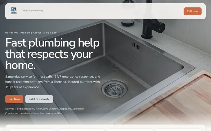
The homepage has a few seconds to answer three questions: what do you do, where, and is this for me. Everything on it serves those three answers or the one main action. The plumbing demo below puts the call button in the header, lists repair, drains and water heaters as separate pages, and names the towns it serves. Check the homepage again whenever the service list or the phone number changes.
- A headline that names the service and the place: "Plumbing repair in Mesa, same day" beats "Welcome to our website".
- One sentence under the headline that says who the business serves and what makes it the right call.
- One main button for the action from planning item 1, visible before scrolling on a phone, with the same wording it will carry on every page.
- The phone number as text in the header, tappable on a phone.
- The list of services, each linking to its own page, in the customer's words.
- The service area or neighborhoods served, written out as text, not only shown on a map.
- One piece of proof near the button: the review rating and count, a credential, or years in business.
- A why-this-business section of three or four items a competitor could not paste onto their own site.
- A short what-happens-next section: "Call, we schedule, a technician arrives with a written quote." It answers the fear behind the first call.
Service page checklist
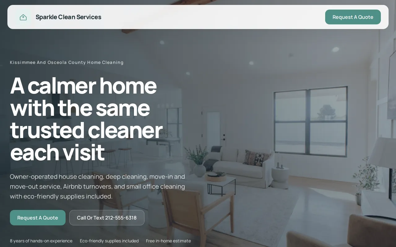
One page per service, each written for the visitor with that one problem. A single Services page with a paragraph per service gives a visitor nothing to act on and Google nothing to rank; the service page examples show how a finished page reads. The cleaning demo below splits residential and commercial into their own pages and carries a quote request and the bonded and insured details. Revisit each service page when its scope or its price shape changes.
- The service name in the heading, in the customer's words: "water heater replacement", not "hydronic solutions".
- What is included and what is not, as a short list.
- Who it is for and when: the situations that bring someone to this page.
- The price shape: a starting price, a range, or how the estimate works. Silence on price sends the visitor to the competitor who states one.
- The process in three to five steps, from first call to finished job.
- One proof item that matches this service: a review that mentions it, a photo of the work, a certification.
- The same button as the homepage, with the same wording.
- Two or three questions specific to this service, answered on the page.
- Links to the two or three related services, so a visitor who landed on the wrong page finds the right one without opening the menu.
About page checklist
A visitor who opens the about page is checking whether real people are behind the site and whether they are qualified. The law firm demo below answers both with attorney bios that carry credentials. Keep the page short and specific, and update it the week someone joins or leaves.
- The owner's name and a real photo. A stock photo of a smiling team is worse than no photo.
- How long the business has operated and where it started, in one or two sentences.
- Licenses, certifications, insurance and memberships, with numbers where the trade requires them.
- The team, with names and roles, if customers will meet them.
- Why the business exists, in the owner's own words, two or three sentences.
- One line that sets expectations: who answers the phone, who shows up, what the first visit is like.
- A button to the contact page, because a visitor who finished reading is ready.

Contact page checklist
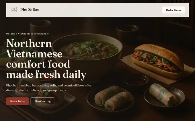
The contact page is where the main action happens, so it carries every way to reach the business and says what happens next. It is also the page most likely to go stale, so the hours and the phone number get a look every month. The restaurant demo below repeats the hours and address on every page and links reservations and ordering to the tools the kitchen already uses rather than rebuilding them.
- Phone, email and street address as text, so they can be tapped and copied.
- Hours, including the days the business is closed, and whether the phone is answered outside them.
- A form with the fewest fields that let the business reply: name, phone or email, and what the visitor needs. Every extra field costs a submission.
- The response time, stated: "We reply within one business day." Then keep it.
- A booking link, if the business takes appointments, from the tool it already uses: Calendly, Square Appointments, Acuity, Jobber.
- A map for a business customers visit; the service area list for one that travels to the customer.
- A confirmation message that says what happens next after the form is sent.
- The same name, address and phone number as the Google Business Profile, so a visitor who checks both sees one business.
Reviews and proof checklist
Proof works next to the claim it supports, not on a testimonials page nobody opens. Gather it once for the handoff, then keep it moving: a new quote every few months and a new photo whenever the work is worth showing.
- The review rating and count from Google, with a link to the profile so the visitor can check.
- Three to five quotes, each with a first name and a town, each mentioning a different service or concern.
- Photos of real work, the real shop, the real team; before-and-after pairs where the trade allows.
- Credentials and badges only where they mean something to the customer: a license, an insurance certificate, an industry membership.
- A number where a real one exists: jobs completed, years, patients seen. Leaving the number out beats a rounded guess.
- The date on the newest review visible, and a fresh one added every few months. A visitor reads a two-year-old quote as a business that stopped.
FAQ page checklist
The FAQ answers the questions the phone gets, before the call, in two to four sentences each, with each question in the words a customer would type. Add a question whenever the same one arrives twice in a week.
- Cost: what a typical job costs, or how the estimate works, and what changes the price.
- Timing: how soon the business can start and how long the work takes.
- Service area and eligibility: where the business goes, who it serves, what it does not do.
- What happens next: from first contact to finished job, including payment and follow-up.
- Policies customers ask about: cancellations, warranties, deposits, insurance claims, parking, pets, whatever the trade brings.
- The questions that usually end a call badly, answered plainly: what the business does not do, and who to call instead.
Web design checklist: rules every page follows
Design decisions come last on purpose: once the pages and their contents are set, the design has something to serve. These 12 rules hold across every page, and a builder applies them once. The owner's part is to supply the logo, the colors if they exist and the photos, and to say no to anything that breaks a rule for the sake of looking different.
- One main color, one accent, dark text on a light background. The accent goes on buttons and nothing else, so a button is always recognizable.
- Two fonts at most: one for headings, one for text. Body text at least 16 pixels.
- The same header on every page: logo, five or six menu items, the phone number, the main button.
- The same footer on every page: address, hours, phone, email, the service list, links to the privacy policy and terms, and the business's social profiles where customers use them.
- The logo links to the homepage on every page.
- Buttons and links that say what they do ("Get a quote", "Book a cleaning"), never "Click here" or "Submit".
- Real photos, sized for the web, each with a short alt description of what is in it.
- Space between sections, so each one reads as one idea. A page that is one wall of text on a phone gets skipped.
- A heading on every section that a visitor could read alone and know what the section is about.
- No slider, carousel or auto-playing video in the first screen. The headline and the main button stay still.
- Forms that look like forms: visible labels above each field, a button that names the action, and a message when a required field is empty.
- A page for mistyped addresses that carries the menu and the phone number, so a bad link still reaches the business.
Mobile, speed and accessibility checklist
The visitor to design for arrives from a Google result on a phone, often standing in the kitchen with the problem in front of them. These 10 checks cover the phone screen, the load time and the visitors who use a screen reader or cannot read low contrast. The guide to making a website accessible goes deeper on that last group; the items here are the ones that belong in the design itself.
- Every page readable on a phone without zooming, buttons large enough for a thumb, the main button visible before scrolling.
- The phone number and the address tappable on a phone: one tap calls, one tap opens directions.
- Photos exported at the size they are shown, not the full-size file the camera made. Large images are the usual reason a page loads slowly.
- Only the two chosen fonts, loaded once, so text appears with the page and does not swap after it.
- Text contrast that meets the Web Content Accessibility Guidelines level AA: 4.5 to 1 for body text. Light gray on white fails it.
- Alt text on every image that says what is in it; a purely decorative image has empty alt text so a screen reader skips it.
- The whole site usable with a keyboard alone: the tab key reaches every link, button and field in a sensible order.
- No text inside images. Hours, prices and phone numbers are typed, so they scale on a phone and can be read aloud.
- The phone menu opens with one tap, closes with one tap, and the phone number stays visible while it is open.
- Links that make sense out of context: "See water heater prices" rather than "Read more", because a screen reader lists links on their own.
Search items that belong in the design
Search is not a layer added after the design. The titles, headings, addresses and links are set when the pages are, and these 9 items cost nothing to include at design time and a great deal to retrofit. None of them promises a ranking; they make sure that when Google reads the site it finds the same plain answers a visitor does.
- A page title and description for every page, written for the search result, with the service and the town in them.
- A URL for every page that reads like its heading: /water-heater-repair, not /services-3.
- One H1 per page that says what the page is about, in the words a customer would search, then H2s a visitor can skim.
- The menu as text links a crawler can read, not images or a script that hides the links.
- Every page linked from at least one other page, and every service page linked from the homepage.
- The business name, address and phone written the same way on every page and on the Google Business Profile.
- A location page for each town the business serves when it serves more than one, each saying something true about that town, not one page with the name swapped.
- A blog or news area only if someone will write for it. An empty one, dated two years ago, tells a visitor the business stopped.
- An analytics account and Search Console ready to connect once the domain is live, so the first month has numbers to compare against planning item 12.
Security, privacy and forms checklist
A small business site holds little data, but the little it holds is a customer's name and phone number. These 8 items keep the site and its form honest. They are set once, and the form gets tested again after any change to it.
- HTTPS on every page, with the lock in the address bar. A form on a page without it is a form fewer visitors fill in.
- A privacy policy and terms linked from the footer, in plain words, saying what the form collects and who sees it.
- The form asks only for name, contact details and a short message. A medical, dental or wellness practice keeps it that way and sends appointment requests through the practice's own tool.
- Spam protection on the form that does not make a real visitor solve a puzzle.
- A consent line on any form that adds the visitor to a mailing list. A quote request is not a newsletter signup.
- The domain login, the logo files and the site login held by the owner, with a second person who knows where they are.
- A known way to get a copy of the pages and the images out, whoever hosts the site, so the business is never tied to one vendor by its own content.
- Payments, bookings and member logins handled by the tools built for them and linked from the site, not rebuilt inside it.
Design review checklist: what to check on the preview before approving it
The review happens on the preview, before the design is approved and before any go-live testing. Do it on a phone, as a customer would, with the planning document open beside it. If one of these 10 checks fails, send it back naming the check that failed rather than a feeling about the page.
Once the preview passes, the website launch checklist takes over: testing the built site as a customer, the domain, redirects if an old site exists, and the first 30 days.
- The three-question test on the homepage: what the business does, where, and whether it is for this visitor, answered without scrolling.
- The main button says the same thing on every page and goes to the same place.
- Every page in the page table exists, and no page exists that is not in the table.
- No placeholder text, no stock photo of a smiling team, no sample phone number left over from a template.
- The phone number, hours and address match the planning document, character for character.
- Each headline read aloud: would a customer say it that way? If not, rewrite it in their words.
- Each service page passes its own list, including a price shape and a proof item.
- The design rules hold on every page: same header, same footer, one accent color, two fonts.
- Every link to a tool (booking, ordering, the store) opens the real tool, not a page that says coming soon.
- Someone who has never seen the site finds the phone number and the main service in under a minute on a phone.
What to hand over, and what comes after the design
With the lists complete, the handoff to a designer or a builder is one folder. The guide to writing website copy covers the copy document; the folder holds the rest. A complete folder is the difference between a first draft that is close and one that restarts the conversation.
- The planning list, items 1 to 12, on one page.
- The page table, with any pages added or removed.
- The copy for every page in one document, one heading per page, sections in order.
- Photos in one folder, named for what they show, with the page each belongs to.
- The logo in its original file, the brand colors if they exist, and the review quotes with names attached.
- The tools the site links to, with the links: booking, ordering, the store, the review profile.
- The name of the person who keeps the site current, and the number that counts as working, from planning items 11 and 12.
How Theo builds a site from this checklist
Theo has no drag-and-drop editor. The owner answers a few questions about the business and Theo builds the pages, so the planning list above is what to have at hand when those questions come, and the page lists are what it builds to. Here is how the checklist maps onto a Theo build.
- Answer the few questions Theo asks at the start: the business name, what it does, where it serves customers, the one action, and what sets it apart. Planning items 1, 2, 3, 5 and 6 cover them.
- If a site already exists, give Theo its address instead. Theo reads the site, its reviews and its socials, and can match the look of the existing site, which keeps the colors and fonts customers already know.
- Open the first preview, usually ready in minutes, on a phone with the design review list beside it.
- Drop the photos, the logo and the review quotes into the editing chat, and say which page each belongs to.
- Refine it in the same chat, in plain English: "Move the reviews above the services", "Add a page for water heater replacement", "Change the button to Get a quote". Chat credits cover these edits; a small change uses a little, a new page more.
- Publish, then connect the domain. Theo walks the owner through pointing both the root and the www version at the site; the old site stays live until the registrar's records update, usually within a few hours. Analytics and Search Console connect once the domain is active.
Common website design checklist mistakes and the fix for each
The same items fail across small business sites, whoever built them. Each one has a fix that takes a sentence to state.
| Mistake | What the visitor sees | The fix |
|---|---|---|
| Starting with the template | A homepage that says "Welcome" and a menu of thin pages | Finish planning items 1 to 5; choose a design only once the page table exists |
| One Services page for everything | A paragraph per service, no price, no proof, nothing for Google to rank | One page per service, each passing the service page list |
| "Contact us" as the only button | A visitor with a leaking pipe does not know what happens after the click | One named action, visible before scrolling: "Get a same-day quote" |
| Stock photos | A team that is not the team, and a visitor who notices | Real photos of the owner, the shop and the work, named in the handoff folder |
| Silence on price | A visitor who calls the competitor who states a starting price | A price shape on every service page: a starting price, a range, or how the estimate works |
| Hours and phone that differ from Google | Two versions of the business, and a visitor who trusts neither | One planning document; the same name, address and phone on every page and the Google Business Profile |
| Text inside images | Prices and hours a phone cannot scale and a screen reader cannot read | Type them; images carry photos only |
| Nobody named to keep it current | A site that is right on launch day and wrong by spring | Planning item 11: one name, and the contact page checked monthly |
Frequently asked questions
What should a website design checklist include?
Three things, in order: the decisions before design (the one action, the customer, the proof, the pages), the items each page must carry, and the rules the whole site follows for design, phones, speed, search and forms. A good one also says who does each item and when it gets checked again. Testing and go-live sit on the launch checklist, so this list ends at the design review and the handoff.
What pages does a small business website need?
Six in most cases: a homepage, one page per service, about, contact, reviews and a FAQ, plus the privacy policy the footer links to, covered in the security list. Add a pricing page if customers ask about price before calling, a gallery if the work is visual, and a location page for each town the business serves. Combine pages when two of them answer the same question.
Should the copy be written before the design?
Yes. The design serves the content, so a designer working from finished copy makes fewer guesses and fewer revisions. The copy does not need to be final; it needs to exist, page by page, with the headings in the customer's words.
What is the difference between a website design checklist and a website launch checklist?
The design checklist covers what the site says and how it is laid out, and ends when you approve the preview. The launch checklist starts there: testing the built site as a customer, connecting the domain, redirecting the old addresses that still get traffic, and watching the first 30 days. Doing them in that order means the launch checks test a site that already reads right.
How long does it take to complete the checklist?
The planning list takes an afternoon when the facts are at hand. Photos and reviews take longer, because they have to be collected from a phone and from Google, and the page copy is the largest job. With Theo the first preview is usually ready in minutes once the start questions are answered, and you add that material in chat and refine the draft before any plan starts.
How much does a small business website cost once the checklist is done?
It depends on who builds it. A freelancer or an agency quotes a build fee and then a monthly retainer or an hourly rate for changes. Theo builds the site free as a preview, so you see a first draft of the pages before paying anything; Basic is $29.99 a month for the site and hosting, Starter is $69.99 a month and free for the first 30 days with the ongoing search work included, and Pro is $129.99 a month. The pricing page lists what each plan includes.
Who owns the site built from the checklist, and what happens if I cancel?
You do: the handoff folder went in, and the pages, photos and reviews that came out belong to your business. Theo hosts the site, and on Pro you can read and copy the code through GitHub. There is no long-term commitment; cancel any time, the confirmation shows when the subscription ends, and you can copy the pages and images out to take elsewhere before that date.
What makes a good website design for a small business?
A visitor on a phone can tell in a few seconds what the business does, where, and whether it is for them, and can act with one tap. Every service has its own page with a price shape and a proof item, the header and footer are the same everywhere, and the hours and phone match Google. Color and fonts matter less than most owners expect; plain words and real photos matter more.
The website design checklist, built into a live site by Theo
Everything on this website design checklist is material Theo builds from: the owner answers a few questions about the business, opens a first preview, then drops in the photos and the reviews and refines it in plain English before publishing. Basic, at $29.99 a month, covers the site build and hosting. Starter, at $69.99 a month and free for the first 30 days, adds the ongoing work that gets the pages found, including the location pages and service pages the search list calls for, technical fixes and Search Console submissions; Pro is $129.99 a month with more pages and posts each week. An owner with a site already can run the free website audit to see its traffic, rankings and search health, with the fixes in order; an owner starting fresh can build the site free and see the pages before deciding.
More like this in the guides and under building a small business website. The numbers behind it are in Theo's research.