
What website design requirements are
Quick answer
Website design requirements are the decisions a website has to satisfy before anyone chooses colors, fonts or layouts. A small business site has eleven. The first three set the message: who the site is for, what it says first, and what each page helps a visitor decide. The next three cover trust and action: what proof it shows, how contact or buying works on a phone, and which tools it connects to. The last five are standards and upkeep: how fast it loads, whether everyone can use it, how it protects visitors, how Google finds it, and who keeps it current. Each one has a test that gives a yes or a no. Write them down before the build, and check them before launch.
A site can look finished and still not do its job, usually because the project started with visual preferences and left the customer decision for later. The better starting point is a short list of what a visitor must be able to understand, trust and do without calling first. That list becomes the brief for every page and the standard the finished site is checked against. A freelancer or an agency quotes against it, and a service like Theo builds from it.
This page is for an owner planning a new site, choosing between a builder, a freelancer, an agency or a done-for-you service, or weighing a redesign. It is not a list of qualifications for becoming a web designer. That search shares the same words but asks a different question, and the FAQ at the end answers it in one paragraph. Below are the eleven requirements, each with a pass test, then a requirements document template to copy, a launch checklist, and the gaps that show up most often in owners' lists.
How to write a website requirements document for a small business
A website requirements document does not need to be long. For a small business it is one page with six parts, plus a seventh when the site replaces an old one. An owner who knows the business can fill it out in an afternoon, before a single design conversation. Any builder can quote against a document written this way, and the finished site can be checked against it. Attach the template table from later on this page. Together, the document and the table make the whole requirements package.
- State the business problem in one sentence: more estimate requests from the east side of town, fewer phone calls asking about hours, online orders instead of call-in orders. Every later decision is judged against this sentence.
- List the three or four visitor situations the site must handle, each with the question that visitor has and the action that comes next. This is requirement 1 below, and it takes twenty minutes with a notepad.
- List the pages, and beside each the decision it supports and the next step it offers. Skip page counts. A page without a decision does not belong on the list.
- List every tool the business already runs: the booking calendar, the point-of-sale, the store, the review platform, the email list. Each one is either linked, connected or replaced, and the document says which.
- Write the standards as tests: the speed, accessibility, security and search checks in requirements 7 to 10, each with the report that shows it passing.
- Name the update owner and the way a change gets requested, then set the review rhythm. This is the part most documents leave blank, and the one that decides whether the site is still accurate a year later.
- If the site replaces an old one, add what must not change: the pages that already bring in customers, the phone number and address customers know, and any web address printed on trucks, cards or menus.
Small business requirements vs an agency RFP
An enterprise requirements document specifies server environments, user roles, content workflows and acceptance criteria, because an agency is building custom software. A small business website is a set of pages that help a customer decide, so its requirements are about that customer, not the technology. The questions are who is reading each page, what that reader needs to know, what they should do next, and how the business will know it worked.
The two documents also differ in who reads them. An RFP (request for proposal) goes to several agencies and gets priced. A small business requirements list goes to one builder and gets built, or goes to a service that builds from a description. Keep every line plain enough for the owner to check without help, because the owner is the one who will.
Requirement 1: it is built for the visitors the business actually serves
The first requirement is a clear picture of the people the site has to help, not a page count. A plumber serves someone with water on the floor and someone planning a bathroom remodel. Those two people read a homepage differently: the first wants a phone number in the first second, and the second wants photos and a sense of price. A restaurant serves the person choosing between three places on a Friday evening, who needs the menu, the hours and how to reserve before anything else.
Write down the top three or four visitor situations, each with the question the visitor needs answered and the action that comes next. A roofing company answers "Do you handle this kind of roof?" before it asks for an estimate. A tutoring service answers "Do you teach this subject at this grade?" before it shows a form. Do not design for an average visitor, because a page aimed at everyone makes each real person sort through too much.
The test: hand the list of situations to someone who does not know the business and ask them to find each path on a phone. Every path found in under a minute is a pass. A path that needs explaining is a requirement the design has not met yet.
Requirement 2: it says what the business does in the first screen, in its own words
A first-time visitor should not have to decode the business. The first screen says what the business offers, who it is for when that helps, and why it is worth a look. That screen gives a visitor enough confidence to go on to the page that fits their situation. Its words should sound like the business already sounds on the phone and on its truck, so a customer who has met the business recognizes it.
Make this a requirement for the homepage and every service or product page: one subject, one promise the business can keep, and the details that answer the next question. The material already exists in sales calls, front-desk questions, reviews and estimates. The website copywriting guide shows how to turn it into pages a customer can scan. Drop superlatives such as "best" or "leading", because they do not give anyone a reason to choose the business.
Being true to the business also covers the look. Real photos of the crew, the dining room or the office beat stock photos every time. The colors and logo should match the signage and the invoices. Theo can match the look of an existing site from its URL, which matters when a redesign has to keep the identity customers already know. The test: a stranger reads the first screen and can say in one sentence what the business does and for whom.
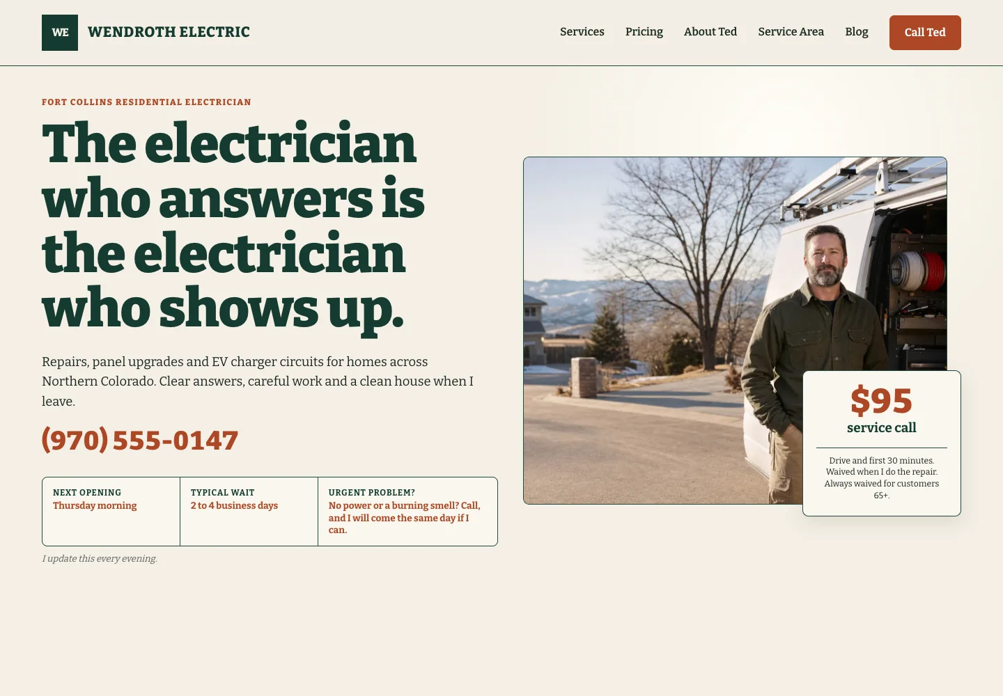
The first screen below, from Wendroth Electric, a site Theo built, passes that test. See the live site.
Requirement 3: every page supports one decision
This requirement names what each page helps a visitor decide, and the page count follows from that. A service page explains the service, who it helps, what is included, why the business is credible and how to request an estimate. A product page shows the item accurately, answers delivery and return questions and makes buying simple. An about page answers the question a visitor is quietly asking: are these people worth calling?
Most small business sites need the same core set: home, about, services or products, proof, FAQ, contact, and any booking or ordering path. The small business website checklist has the page-by-page list, with what belongs on each. Navigation belongs in this requirement too: plain labels that match how customers talk (Services, Menu, Book, Contact) and a short first set of choices.
The test: for every page in the plan, write the decision it supports and the next step it offers, one line each. A page with a blank in either column is cut or merged. A decision with no page gets one.
Requirement 4: it shows proof a visitor can check
Visitors make small trust decisions before a big one. They look for current contact details, services that match their problem, photos of real work, a real team, reviews where they matter, and a sense that someone will answer. Design cannot manufacture that trust. It comes from true details a visitor can verify. A license number that can be looked up is worth more than a row of badges.
Gather the material before the build starts: project photos, team names, service areas, licenses, approved testimonials, hours and policies. Place each piece next to the decision it supports, not on a separate page of awards. A cleaning company puts its bonded and insured line beside the quote form, because that is the moment a stranger decides whether to let someone into the house. Honest limits count as proof too: if the service area is limited or an appointment is required, say so.
The test: pick the page where the biggest decision happens and list every claim on it. Each claim has a photo, a name, a number or a document behind it, or it comes off the page.
Tullberry Tax Resolution, a site Theo built, gives its credential a page of its own and links visitors to the IRS directory to check it. See the live site.

Requirement 5: contact, booking or buying works on a phone
Customers test the contact path at the moment they need it: checking a menu in a parking lot, or comparing two contractors between calls. Test it first on a real phone, not a resized browser window. Read the main message without zooming, find the service, tap the contact or booking action, fill in the shortest likely form, and confirm the visitor can tell what happens next. Forms ask only for what is needed to start, label every field, name the field that was missed, and confirm the submission.
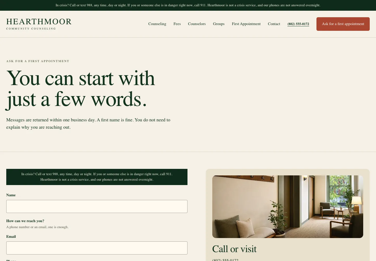
The phone number is a link that dials. The address opens the map app. The booking button opens the tool the business already uses. The contact page below shows how short a form can be. Hearthmoor Community Counseling is a nonprofit counseling center's site for Burlington, Vermont, built by Theo. Its form asks for a name, one way to reach the person (a phone number or an email, one is enough) and a message, and the page says messages are returned within one business day and that a first name is fine. See the live site.
The test: a person who has never seen the site takes the shortest path from the homepage to a sent form, a dialed number or a booked slot, using their own phone. Afterward, they should be able to say what will happen next. Time it, and count under two minutes as a pass.
Requirement 6: it connects to the tools the business already runs
Most small businesses already run on tools: a booking calendar, a point-of-sale, a reservation system, an online store, a review platform, a client portal. This requirement lists every one and says what the site does with it: link to it, connect to it, or replace it. The site is rarely the right place to replace a tool that works. What matters is that nobody re-enters data or runs two calendars.
Theo sites link to booking, point-of-sale, reservation, membership and event tools such as Calendly, Square Appointments, Acuity, Mindbody, Jobber, Housecall Pro, ServiceTitan, Toast, OpenTable and Eventbrite. A Shopify or Wix store connects directly on every plan, with products, prices, stock and a cart showing on the site. Checkout still completes on the store, and the owner clicks "Refresh my products" after changing anything there. Owners who sell on Etsy, Big Cartel, Gumroad, Payhip or PayPal keep their checkout. Their storefront on Theo shows each real product, and every Buy button opens that product's live listing. A store that lives on a website platform, such as WooCommerce, Square Online or Squarespace Commerce, has three options. The first is moving the store to Shopify, which Theo recommends and connects to directly. The second keeps the store running at shop.yourdomain.com, with the Theo site on the main domain. If that is too hard, the third leaves the current site and store in place and adds a separate Theo site on a subdomain such as blog.yourdomain.com. The integrations page lists each tool and how it connects.
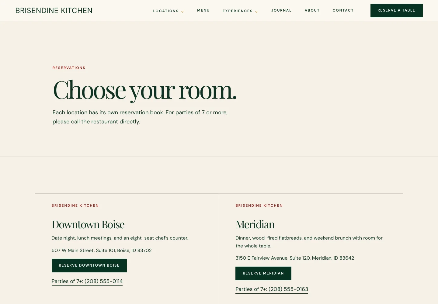
The reservations page below shows how simple this can be. Brisendine Kitchen, a restaurant site Theo built, has two rooms, one in downtown Boise and one in Meridian, Idaho. Each room keeps its own reservation book, so the page gives each one its own Reserve button, and each button opens that room's book in the reservation tool. Parties of seven or more get each room's phone number instead. See the live site.
The test: every tool on the list has a link or a connection on the site, each opens the right place, and a test booking or order lands in the tool the staff already watch.
Requirement 7: it loads fast, with a number attached
"Fast" is not a requirement until it has a number and a report. As of September 2026, Google publishes passing thresholds for its Core Web Vitals, three measures of how fast and steady a page feels. The largest element on the page appears within 2.5 seconds, the page responds to a tap within 200 milliseconds, and the layout shifts by less than 0.1 while loading. Search Console (Google's free tool for site owners) lists which pages pass in its Core Web Vitals report. Google's PageSpeed Insights tests one page at a time.
The usual causes of a slow small business site are large photos uploaded straight from a phone, a chat widget, an embedded video and a pop-up. A page builder that loads scripts for features the site does not use slows it down too. Write the requirement as a rule: no widget, video or pop-up is added unless it earns its place, and photos are resized before upload. Every Theo site is a static website, the kind with no database call between the visitor and the page.
The test: the homepage and the main service pages show as Good in the Core Web Vitals report before launch and again after any large change. Check on a phone over a cellular connection, not on office Wi-Fi.
Requirement 8: everyone can use it, measured against WCAG 2.1 AA
Accessibility is a requirement with a published standard, the Web Content Accessibility Guidelines (WCAG). The level the Department of Justice cites is AA. Which rules apply depends on the business, so check the current Department of Justice and state rules for yours. Leave accessibility off the list and it can arrive after launch as a demand letter, which is a bad time to discover the forms have no labels.
The checks below are the ones that fail most often. The full list, the eight steps and what to do after a demand letter are in the guide to making a website ADA compliant. The test: run an automated checker on the main pages, then do the two checks it cannot. Tab through the site with the mouse unplugged, and read a service page with the phone's screen reader turned on.
- Descriptive headings in order, so a screen reader user can jump through the page the way a sighted visitor scans it.
- Text readable on a phone without zooming, and color contrast that does not hide information (a light gray phone number on white fails).
- A description on every meaningful image, and an empty description on decorative ones.
- A label on every form field, a message that names a missed field, and a visible focus outline so a keyboard user can see where they are.
- Buttons big enough to tap, no horizontal scrolling on a phone, and captions or a transcript for any video that carries information.
Requirement 9: it protects the visitor with HTTPS, privacy and payments
Three lines cover security and privacy for most small business sites. Every page is served over HTTPS, so no browser marks the site as not secure. Payments never touch the site itself. They complete on the connected store or payment provider, which carries the compliance load. A privacy policy says what the site collects, and the site collects as little as possible. Forms ask only for name, contact details and a short message, and appointment requests go through the site's request form or the business's own booking tool.
Health, legal and financial businesses add a line: no intake details beyond name and contact go through a web form, and the secure portal the business already uses handles the rest. Every Theo site is served over HTTPS, and store payments go through the connected provider.
The test: type the address with http and confirm it lands on https. Then submit each form to confirm what it stored and where, and find the privacy policy from the footer of every page.
Requirement 10: Google can find it and the owner can measure it
A site that nobody finds does not meet its requirements, no matter how it looks. In Theo's audit of 6,861 small business websites, 47 percent of the 4,633 sites with search data got an estimated zero visitors a month from Google search. Across those sites, the median was an estimated one visitor a month from Google search. The State of Small Business Websites 2026 has the split by platform and industry. The sites in the report are the ones whose owners ran the free audit, so they are not a random sample. Being found belongs on the requirements list from the first draft.
The measurable version has four parts. Every page has one subject and a plain title that names it. Google Search Console and Google Analytics are connected once the domain is live, so the owner can see which pages are indexed and which bring visits. New and changed pages are submitted to Google for indexing. The business's listings, starting with Google Business Profile, point at the site. Decide up front, too, who does the ongoing work: the keyword research, the new pages and posts, and the technical fixes. That work compounds over months, and nobody does it by accident.
Measurement is what turns the requirement into a number. Buy My Lunch, a school lunch ordering service, shows what that looks like after its move to Theo in June 2026. Its site had 131 clicks from Google search in one 90-day period and 929 in the 90 days that followed, which ended September 27, 2026. In the same windows, impressions in Google search climbed from 7,500 to 61,700, and the average position went from 13 to 8 while the growth work published pages. Those figures come from the site's own Search Console, a report every owner should be able to open.
The test: within a month of launch, Search Console shows the main pages as indexed, Analytics shows visits by page, and the owner can name the three pages that bring the most visitors.

Requirement 11: someone owns updates after launch
This is the requirement most projects forget. Services change, hours move, a seasonal offer ends, and customers keep asking a question the site does not answer. A site with no update owner drifts out of date even when the launch was strong, and an out-of-date site fails requirement 4 a little more every month.
Name the person or service that receives changes and approves facts, then set a rhythm. Review the core pages after any business change, check the contact details and hours monthly, and turn repeated customer questions into clearer pages each quarter. The website maintenance checklist lists the recurring checks by week, month and year. Write down how an update gets made and how long it should take. On a Theo site the owner types the change in a chat ("Move the fifth section above section two") and Theo makes it. A small edit uses a little of the plan's monthly chat credits, and a new page uses more.
The test: request a small change, such as a new opening hour or a price, and time how long it takes to appear on the live site. If the answer is a week and an invoice, the requirement is not met.
The website design requirements template
Copy the table into a document, fill in the middle column, and hand it to whoever builds the site. The table is the small business version of a requirements document: one line per requirement, what to write down, and the test that shows it is met. With the six-part document above, it gives an agency, a freelancer or a done-for-you service everything it needs to quote.
| Requirement | What to write down | How you know it is met |
|---|---|---|
1. Visitors and their jobs | Three or four visitor situations, each with its question and next action | A tester finds each path in under a minute on a phone |
2. First-screen message and identity | What the business does, who it is for, why it is worth a look; the real photos, logo and colors | A stranger can say what the business does after the first screen |
3. Pages and decisions | Each page, the decision it supports, the next step | No page without a purpose, no decision without a page |
4. Proof | Photos, team, service areas, licenses, testimonials, hours, policies | Every claim on the decision page has something checkable behind it |
5. Phone path | The contact, booking or buying steps, and the fields each form asks for | A first-time visitor completes the path on a real phone in under two minutes |
6. Tools | Every tool the business runs, and whether the site links to it, connects to it or replaces it | Each link opens the right place, and a test booking or order lands in the tool |
7. Speed | The pages that must pass, the no-widget rule, the photo size rule | Core Web Vitals show Good on the homepage and main service pages |
8. Accessibility | The WCAG 2.1 AA checks and who runs them | The automated checker, the keyboard check and the screen reader check all pass |
9. Security and privacy | HTTPS, where payments complete, what each form collects, the privacy policy | http lands on https; each form stores only what it asks; the policy is in every footer |
10. Findable and measurable | Page titles; Search Console and Analytics connected; listings point at the site; who does the ongoing search work | Pages show as indexed, and the owner can see visits by page |
11. Update owner | Who makes changes, how to request one, how long it should take, how often pages are reviewed | A test change is requested and live within the agreed time |
Website requirements checklist: scope, launch and the first month
Run this before approving a scope and again before launch. Each item is a yes or a no, with who checks it and when.
- Before the scope is approved (owner): the business problem is one sentence, the priority visitors and their situations are written down, and every tool the business runs is on the list.
- Before the scope is approved (owner): every important page has one decision it supports and one next step, and the proof for the biggest decision is gathered.
- Before launch (owner, on a personal phone): the first screen says clearly what the business does, and the contact, booking or buying path works end to end.
- Before launch (builder): Core Web Vitals show Good, the WCAG checks pass, every page loads over HTTPS, and each form stores only what it asks for.
- Launch week (builder, then owner): the domain is connected, Search Console and Analytics are connected, and Google Business Profile points at the site.
- First month (owner): the main pages show as indexed, a test change was requested and went live within the agreed time, and the review rhythm is on the calendar.
Mistakes in website design requirements, and the fix for each
These gaps show up most often when an owner's requirements list arrives, whether in a builder's inbox or in a chat with Theo. Each one comes with its fix.
- The list is a page count ("a five-page site"). Fix: replace each page with the decision it supports, and the count falls out of that.
- The requirements are adjectives (modern, clean, fast, professional). Fix: turn each into a test with a report, or delete it. "Fast" becomes Core Web Vitals Good, and "professional" becomes real photos and checkable proof.
- The tools are missing. Fix: walk through a day at the business and write down every screen the staff touch. Each one becomes a line in requirement 6.
- Search is left for later. Fix: put Search Console, Analytics and the listings in the launch-week block, and name who does the ongoing work before the site is built.
- Nobody owns updates. Fix: name the owner, the request channel and the agreed time before launch, and test it with one change.
- The copy is left to the designer. Fix: the owner supplies the sales-call answers, the front-desk questions and the proof, and the pages are written from those rather than invented.
How Theo builds a site from these requirements
Theo builds from this kind of list rather than from a template. The owner describes the business, its visitors and the tools it already uses in a chat, and the first preview is usually ready in minutes. From there the owner refines it in plain English, dragging photos into the chat and asking for the changes that make requirements 1 to 6 true. When it is right, the owner publishes.
Connecting the owner's own domain comes next. Theo walks the owner through pointing both the root and www versions at the site. For the few hours the change usually takes, visitors still see the old site, and then the domain opens the new one. After the domain is active, the owner signs in with Google once, and Theo sets up Analytics and Search Console, the measuring half of requirement 10. The Google sign-in also submits the site's sitemap, on every plan. With the domain and both Google connections in place, the ongoing search work on Starter and Pro switches on. Requirement 11 is the chat, where the owner types a change and Theo makes it. The pages, posts and fixes drafted each week on Starter and Pro wait in the Growth tab until the owner publishes them, and they never use chat credits.
To see a live customer site in your industry, ask the team, which shares sites whose owners have said yes to being shown.
Frequently asked questions
What are website design requirements?
The decisions a website has to satisfy before design work starts: who it serves, what each page has to do for a visitor, and the standards it has to pass. They are written before the build and checked before launch. Each one only counts as a requirement when it has a test that gives a yes or a no.
What is a website requirements document?
A short written brief that a builder can quote against and a finished site can be checked against. For a small business it is one page: the business problem, the visitor situations, the pages and their decisions, the tools, the standards written as tests, and the update owner. The template table on this page is that document in table form.
What are functional requirements for a website?
Functional requirements say what the site has to do: dial the phone number on tap, send a form to a named inbox, open the booking calendar, show the store's products at current prices. Non-functional requirements say how well it does those things: load time, accessibility level, HTTPS. For a small business site, requirements 5 and 6 above are the functional ones and 7, 8 and 9 the non-functional ones.
How do I write website requirements for a redesign or to send to an agency?
Start with the business problem the redesign has to solve, then fill in the six-part document and the template table. Add what must not change: pages that already bring in customers, the contact details customers know, and any web address on printed material. Describe customer outcomes rather than visual preferences, so any builder or agency can quote against them and the finished site can be checked line by line.
Who owns the site once it is built to these requirements?
You do. On every plan, the pages, words and photos built from your requirements belong to your business, and Theo hosts the site. There is no contract term, so you can cancel at any time. The confirmation names the day the subscription ends, and the site stays live until then. Before that day you can save your text and images to use elsewhere. Pro also includes read-only access to the site's code on GitHub, which you can copy.
How much does a website that meets these requirements cost?
It depends on who does the work. A DIY builder costs a monthly subscription plus your own time. A freelancer or agency charges a project fee and then a retainer for changes. On Theo the first build is free to see, and the site build, hosting and security are then $29.99 a month on the Basic plan. The ongoing search and content work that helps the site get found comes with the Starter plan at $69.99 a month, free for the first 30 days. Pro is $129.99 a month, with more weekly pages and posts.
How long does a website project take once the requirements are written?
With the requirements, the proof and the photos gathered, the build is the short part. On Theo the first preview is usually ready in minutes, and you refine it in chat before publishing. Your domain connects once the registrar's records update, usually within a few hours. A freelancer or agency project runs on its own schedule. On those projects, the requirements document is what keeps the schedule from slipping on missing content.
What are the requirements to become a web designer?
That is a different question that shares the same words. Becoming a web designer usually means learning layout, typography, HTML and CSS, a design tool and accessibility basics, then building a portfolio. There is no license to hold. This page is about the requirements a business writes down before its own website is built.
Website design requirements are the brief Theo builds from
A useful site starts with the requirements, and the design is built around them. On Theo, this list becomes the first chat: the owner describes the business, its visitors and the tools it already uses, sees a preview, and asks for changes until it is ready to publish. The site with hosting is $29.99 a month on the Basic plan. Starter adds the ongoing search and content work for $69.99 a month, free for the first 30 days. Owners with a site can run the free audit to test requirement 10, whether Google finds the site, and get the specific fixes. Owners without one can build the site free and see it before deciding.
More like this in the guides and under building a small business website. The audit numbers quoted across these posts are in Theo's research.