
How to make your website ADA compliant: the short answer
Quick answer
To make your website ADA compliant, bring it in line with WCAG 2.1 Level AA, the accessibility standard the Department of Justice cites and that demand letters commonly quote. In practice that means real headings, text with at least 4.5 to 1 contrast and a written description on every meaningful image. Every form field needs a visible label, every control has to work with a keyboard alone, video needs captions, and no information can rely on color alone. Work through the eight steps below on the pages customers use most, test with free tools, publish an accessibility statement, then keep the same checks on every update.
Many owners search for this after a demand letter, a customer complaint or a warning from their lawyer. The good news is that the work is mostly content work. A small business site with ten pages, a contact form and a gallery can be brought in line without a rebuild. The items that matter most are ones an owner or a builder can change: headings, text color, image descriptions, form labels and link wording.
Plan on an afternoon to test and a few evenings to fix a site that size. Sites built on a modern builder often pass the code-level checks already, so the remaining work is words and pictures. Sites with a PDF menu or a video without captions take longer, because the menu has to be retyped as page text and the captions written. A booking widget from another vendor can take longer still, because its fix belongs to that vendor.
This guide explains what the ADA and WCAG ask for, then gives the steps, the checklist and the tests. It is written for a business owner, not a developer, and it is not legal advice. Anyone holding a demand letter should talk to a lawyer while the fixes get made.
Why website accessibility matters for a small business
A resource funded by the US Department of Labor, askearn.org, opens its accessibility guide with the figure that nearly 1 in 5 Americans has a disability, as of September 2026. For a business, that means customers who read with a screen reader or move through pages with a keyboard or a switch. Others watch video with captions, zoom text to twice its size or cannot tell red from green. When a site blocks them, they call a competitor, and some of them, or their lawyers, send a letter.
The Department of Justice's own guidance gives examples of barriers: poor color contrast, information given by color alone, images without text alternatives and video without captions. The same list includes online forms that do not say what each field is for, and pages that only work with a mouse. Every one of those is on the checklist below, and most of them are content changes rather than developer work.
There is a second reason that has nothing to do with the law. A screen reader needs real headings, alt text and words typed as page text instead of baked into images, and Google reads the same things. In Theo's audit of 6,861 small business websites, 47 percent of the 4,633 sites with search data got an estimated zero visitors a month from Google search. A menu locked inside a photo is unreadable to a screen reader and a search engine alike. A page without real headings is harder for both to make sense of, so an accessibility pass helps on both counts. The full numbers are in Theo's research report.
When the ADA applies to a small business website
The Americans with Disabilities Act is a federal civil rights law from 1990. Title III covers businesses open to the public: shops, restaurants, clinics, salons, law offices, contractors, gyms, any business that serves customers. Title II covers state and local governments. The law predates the web, but the Department of Justice has said for years that Title III reaches a business's website, because the website is one of the places it serves the public. The DOJ published web guidance saying exactly that in March 2022, and that guidance is the reference this checklist follows.
On April 24, 2024, the Department of Justice published a rule for state and local governments under Title II that names WCAG 2.1 Level AA as the standard their websites and mobile apps must meet. The rule sets compliance dates by the size of the government body, and those dates have moved since it was published. A public body should go by the Department of Justice's current schedule and its own state's rules, since a date printed in an article can go stale. There is no matching rule for private businesses yet. WCAG 2.1 AA is the version the DOJ's 2024 rule names and the one demand letters commonly quote, so it is the practical target for a small business. Check the Department of Justice's current guidance and your state's rules for your own business as well.
The same guidance page also shows what enforcement looks like. It lists the Department of Justice's own settlements with businesses under Title III and with state and local governments under Title II, each over a website that people with disabilities could not use. Private demand letters get the attention, but the department itself has acted on inaccessible websites. That record is the plainest answer to what actually happens.
Federal agencies follow a separate law, Section 508 of the Rehabilitation Act, which also points at WCAG. Which rule applies depends on what the organization is and whom it serves:
- The business sells to, serves or books the general public, in person or online. The DOJ guidance places it under Title III and is the reference to follow.
- The business is a state or local government body, a public school, a public library or a transit agency. Title II and the 2024 rule apply. Check the Department of Justice's current compliance schedule for the body's size.
- The site takes orders, bookings, applications or payments. The DOJ guidance treats these as the same service the business offers at the counter.
- The business is a private club or a religious organization. Title III has exemptions here, so ask a lawyer whether one applies.
- The business sells to a federal agency. Section 508 may apply to what it delivers, and the agency may ask how the site or product measures against WCAG.
What WCAG 2.1 AA means in plain words
WCAG stands for Web Content Accessibility Guidelines, published by the World Wide Web Consortium (W3C), the body that maintains web standards. It turns "accessible" into a testable list. Each version adds to the last: 2.0 in 2008, 2.1 in 2018 and 2.2 in October 2023. WCAG's checks come in three levels: A is the minimum, AA is the level laws and lawsuits reference, and AAA is a stretch goal few sites meet in full. The target for a small business website is WCAG 2.1 Level AA, which means every Level A and Level AA item in version 2.1.
Every guideline sits under one of four principles. The table says what each one means and what to check on a small business site.
| WCAG principle | What it means | What to check on a small business site |
|---|---|---|
| Perceivable | People can take in the content with sight, hearing or a screen reader | Alt text on images, captions on video, text contrast, no information by color alone, text that reflows on a phone |
| Operable | People can move through the site and use every control | Keyboard access, visible focus, a menu that opens and closes, descriptive link text, no timed content, nothing that flashes, a skip link |
| Understandable | People can read the words and predict what a control will do | Plain language, the page language set, labeled forms, a clear message when a field needs a fix, the same menu on every page |
| Robust | The site works with browsers and assistive tools now and later | Real headings and buttons in the code, confirmations a screen reader announces |
How to make your website ADA compliant in eight steps
The steps run in the order that pays off fastest: find the pages that matter, find out what is wrong, fix the words and pictures, fix the controls, set the sitewide items, prove the work, then keep it up. The times are for a ten-page small business site and assume the owner or the builder can edit any page. The four checklist sections after this list give the detail for steps 3 to 6.
- List the pages customers use most (30 minutes). Pull last month's numbers from Google Analytics or Search Console (Google's free search report) and write down the ten pages with the most visits. Add the contact page, any booking or quote form and any page a demand letter names. Fix those pages first, and the rest follow in the same order.
- Run the free tools on those pages (about an hour). WAVE and Lighthouse take a minute per page and mark the things a screen reader user hits first: missing alt text, low contrast, empty links, unlabeled fields and skipped heading levels. Copy each finding into a simple list with the page name and the fix.
- Fix headings, text and color (an evening). Give every page one main heading, put section headings in order, darken any text under 4.5 to 1 contrast, take text off busy photos and rewrite "click here" links so they say where they go.
- Fix images, video and documents (an evening, longer with video). Write alt text for every meaningful image and mark decorative ones as decorative. Retype any menu, price list or hours that live inside a photo or a PDF as page text, and add captions to every video.
- Fix keyboard access, menus and forms (an evening). Put the mouse away and tab through each page, making sure the menu and any pop-up open and close from the keyboard. Give every form field a visible label, and make the form say in words which field needs a fix.
- Set the sitewide items and publish an accessibility statement (an hour). Set the page language, give each page a unique title, add a skip link and check the site on a phone. Then publish a short statement that names WCAG 2.1 AA, lists known gaps and gives a phone number and an email for problems.
- Retest with a keyboard and a screen reader (an hour). Run the tools again. Then complete the main task (find a service and send the form) with the keyboard alone, and again with VoiceOver, NVDA or Narrator reading the page aloud. Keep a dated record of what changed and when.
- Put the checks into every update (ongoing). Add alt text, labels, contrast and heading checks to the routine for new pages and posts, so the site does not drift back out of line one photo at a time.
ADA website compliance checklist: headings, text and color
The first group covers what every visitor reads: the items a screen reader depends on and a busy customer on a phone notices first. Most can be fixed page by page without touching the design.
- One main heading per page that says what the page is for, then section headings in order (a level two, then level threes under it). Text made big and bold to look like a heading does not count.
- Normal text with a contrast of at least 4.5 to 1 against its background, the WCAG 2.1 AA figure. Light gray on white and pale text over a photo do not pass. Large text, about 24 pixels or 19 pixels bold, may drop to 3 to 1.
- Buttons, icons and the borders of form fields with at least 3 to 1 contrast against what surrounds them, a rule WCAG 2.1 added so the controls people need are visible.
- Body text large enough to read without zooming, and a page that still works when the visitor zooms to 200 percent: nothing cut off, nothing overlapping.
- Link text that says where the link goes ("See our pricing"), not "click here" or "learn more", because a screen reader can list every link on a page out of context.
- No message carried by color alone: a required field, a sold-out item or a mistake in a form needs a word or a symbol too.
- Plain language on every customer-facing page: short sentences, the customer's words for the service, no internal jargon. The website copywriting guide shows how to turn customer questions into clear headings and sentences.
Images, video and documents
Images, videos and PDFs carry a lot of a small business's story and are a common gap. The rule: anything a sighted visitor learns from a picture or a video must also be available as text.
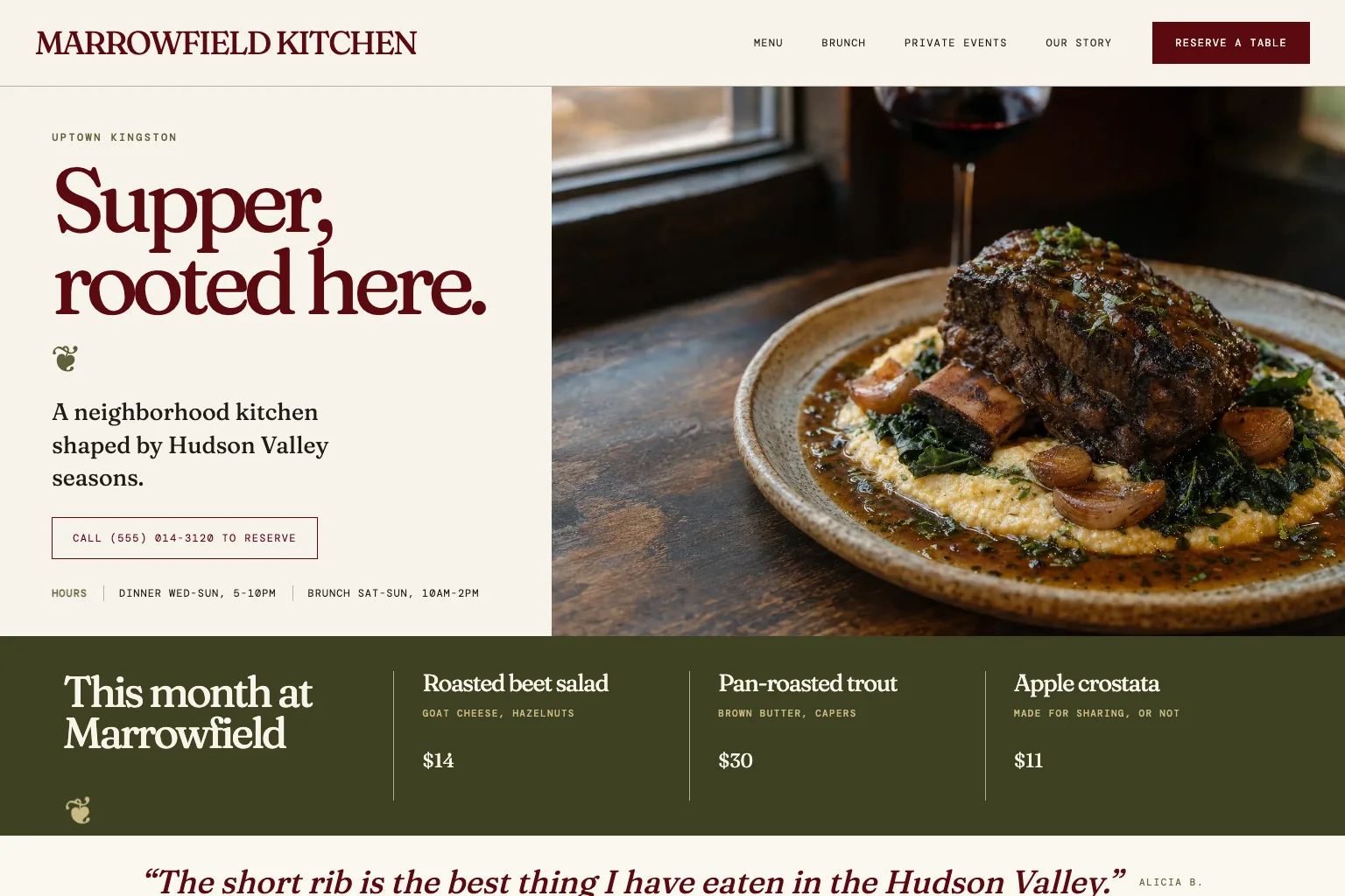
The restaurant demo site below is built the way this section asks. Its menu is typed onto the page instead of uploaded as a PDF or a photo, and the hours and address sit as text on every page. Because all of it is text, a screen reader, a phone and a search engine read it the same way.
- Every meaningful image has alt text that says what matters in it: "Kitchen remodel in Oak Park, white shaker cabinets", not "IMG_2041" or "image".
- Decorative images are marked as decorative (empty alt text) so a screen reader skips them instead of reading a file name.
- No price, phone number, menu, hours or promotion lives only inside an image. The same words appear as page text.
- Charts, infographics and before-and-after photos get a sentence or two next to them that says what they show.
- Every video has captions, and any video that explains something has a transcript or the same information in text nearby.
- PDF menus, forms and brochures either have a page-text version or are made as tagged, readable PDFs rather than scans.
- A CAPTCHA on a form offers an audio version or is replaced by a checkbox or a hidden field, because an image-only puzzle stops a blind customer at the last step.
- Nothing autoplays with sound, and nothing flashes more than three times a second.
Keyboard, menus and forms
The third group covers whether a visitor can do things: open the menu, reach the phone number, book, buy or send a message. Many people move through a site with the Tab key instead of a mouse, and a screen reader follows the same order. The test for both: put the mouse away and try.
- Press Tab from the top of a page. Every link, button and field is reachable in a sensible order, and the active one is visibly outlined at every step. A design that removed the outline for looks has to put it back.
- The menu, any pop-up and any cookie notice open and close with the keyboard, and Escape closes what Enter opened. A menu that only opens on hover fails. The navigation guide covers a menu short enough to tab through.
- The menu sits in the same place with the same items on every page, so a visitor who learned it once can use it everywhere.
- Every form field has a visible label that stays on screen while typing, not a placeholder that disappears the moment the cursor lands.
- When a field needs a fix, the form says which field and what to change, in plain words, and keeps the other answers in place.
- A confirmation such as "Message sent" is announced by a screen reader, not only shown on screen. A builder or developer sets this with one attribute.
- Nothing moves, scrolls or advances on its own for more than five seconds without a pause button: carousels, tickers and auto-advancing slides need a stop.
- No time limit on a form, a quote request or a checkout that the visitor cannot extend or turn off.
- Buttons are real buttons and links are real links in the code, so assistive tools announce them correctly.
- The form asks only for what the first conversation needs. The contact page examples show short, labeled forms that work.
Mobile and sitewide settings
The last group is sitewide: settings fixed once that then hold for every page. Most live in the site's head code or its layout, so they are a single request to a builder or a single chat message on Theo.
- The page language is set in the code (English on an English site), so screen readers pronounce words correctly.
- The site works on a phone without sideways scrolling or pinching, and still reads in one column at 320 pixels wide, the WCAG 2.1 reflow figure.
- The site works held upright or sideways, and nothing locks it to one orientation.
- Tap targets are big enough to hit with a thumb. WCAG 2.2 sets a floor of 24 by 24 pixels at Level AA, a good rule even on a 2.1 target.
- Every page has a unique, descriptive title in the browser tab, the first thing a screen reader says when a page loads.
- A "skip to main content" link sits at the top of each page for keyboard users, so they do not tab through the menu on every page.
How to write a website accessibility statement
An accessibility statement is a short page, usually linked from the footer next to the privacy policy. It says which standard the site aims for, what is known to fall short and how to get help. The ADA does not require one for a private business, but it shows good faith. It also gives a customer who hits a barrier a phone number and an email, so a problem can be solved before it becomes a complaint. A short working version for a bakery reads: "This bakery wants everyone to be able to use this website and aims to meet WCAG 2.1 Level AA. Online ordering runs on a separate service, and captions for its ordering video are in progress. If any part of the site is hard to use, call the shop or email it, and staff will take the order another way and fix the page. Last reviewed September 2026." On Theo, ask for the page and a footer link to it in one chat message.
Whatever the business, five things belong in it:
- The standard: "This site aims to meet WCAG 2.1 Level AA." Name the version and the level. A vague "committed to accessibility" line says nothing a reader can check.
- Known gaps and when they will close: an older PDF brochure, a video awaiting captions, a gallery being redescribed. Listing a gap with a date is stronger than pretending there is none.
- The parts run by someone else: a booking widget, an ordering service, a payment page. Name the service and say the business will take the booking or the order by phone if the widget is hard to use.
- How to report a problem: a phone number, an email and how quickly someone replies. This line is the reason the page exists.
- The date the statement was last reviewed, updated each time the site is retested.
How to test whether your website is ADA compliant
No tool can certify a site as compliant, because many WCAG checks need a human judgment (is this alt text useful, does this link make sense on its own). But a handful of free tools, a keyboard and a screen reader find most of the items above in an afternoon. Fold them into the website audit checklist so accessibility gets checked in the same pass as speed and content.
- Run WAVE (wave.webaim.org) on the homepage, a service page and the contact page. It draws icons onto the page itself, in red for missing alt text, an empty link or an unlabeled field. Its contrast panel lists every text color that fails 4.5 to 1.
- Run Lighthouse, built into Chrome (right-click, Inspect, Lighthouse tab, Accessibility). It gives the page a score out of 100 and lists each failing check with the exact element behind it, so a builder knows what to change.
- Run axe DevTools, a free browser extension, on the same pages. It catches a slightly different set than WAVE, groups findings by how serious they are and explains each item in a sentence.
- Paste any two colors from the site into WebAIM's contrast checker (webaim.org/resources/contrastchecker). It shows the ratio and a pass or fail for normal and large text, which settles arguments about brand colors in seconds.
- Put the mouse away and complete the main task with the keyboard: find a service, open the menu, submit the contact form. Watch whether the outline is visible at every stop and whether anything traps the cursor.
- Turn on a screen reader and listen to the homepage: VoiceOver on a Mac or iPhone, Narrator on Windows, NVDA (free) on Windows, TalkBack on Android. Headings, links and images should make sense read aloud. A photo announced as "IMG underscore two zero four one" still needs its alt text.
- Write down what each tool found, fix the items page by page and run the tools again. Keep a dated record of the fixes, since it is the evidence to show if a lawyer or an insurer asks.
The most common failures and the WCAG rule behind each
Demand letters and audit reports quote WCAG by number, which is unreadable without a key. This table maps the failures the free tools flag most often on small business sites to the criterion behind them and the fix, so a letter can be checked line by line.
| What the tool flags | WCAG 2.1 criterion | The fix |
|---|---|---|
| Image without alt text | 1.1.1 Non-text Content (A) | Write what matters in the picture, and use empty alt for decoration |
| Light gray text on white | 1.4.3 Contrast (Minimum) (AA) | Darken the text to at least 4.5 to 1 |
| Required field shown only in red | 1.4.1 Use of Color (A) | Add the word "required" or an asterisk with a key |
| Placeholder used as the label | 3.3.2 Labels or Instructions (A) | Put a visible label above the field |
| "Click here" or "learn more" links | 2.4.4 Link Purpose (In Context) (A) | Say where the link goes |
| Bold text used as a heading | 1.3.1 Info and Relationships (A) | Use real heading tags in order |
| Menu that only opens on hover | 2.1.1 Keyboard (A) | Open on Enter, close on Escape |
| No outline on the active link | 2.4.7 Focus Visible (AA) | Restore the focus outline |
| Video without captions | 1.2.2 Captions (Prerecorded) (A) | Add captions |
| Menu uploaded as a photo or scan | 1.4.5 Images of Text (AA) | Retype the menu as page text |
| Form message that only says "invalid" | 3.3.1 Error Identification (A) and 3.3.3 Error Suggestion (AA) | Name the field and say what to change |
| Carousel that never stops | 2.2.2 Pause, Stop, Hide (A) | Add a pause control or turn off autoplay |
Mistakes that keep a site out of compliance, and the fix
The same handful of decisions undo good intentions on small business sites. Each one below is paired with its fix.
- Installing an overlay widget and calling it done. An overlay adds a toolbar on top of the page, but it does not replace the checklist work on the site's own pages. Fix: do that work first and treat the widget as an extra, if kept at all.
- Fixing the homepage and stopping. A demand letter can name any page a customer tried to use, such as the menu, the booking page or the contact form. Fix: work from the list of most-visited pages in step 1, not from the top of the site map.
- Uploading new photos without descriptions. One photo without alt text a week is fifty a year. Fix: write the alt text in the same sitting as the upload, and make it part of every update.
- Choosing pale brand colors for body text. The palette passes on a business card and fails on a screen. Fix: keep the pale tone for backgrounds and accents, and use a darker version of the same color for words.
- Removing the focus outline because it looked untidy. Keyboard users lose their place on every page. Fix: style the outline to match the brand instead of deleting it.
- Trusting a third-party widget nobody tested. The booking, ordering or review widget is part of the site in a customer's eyes and in a letter. Fix: test it with the keyboard and a screen reader, ask the vendor for its accessibility statement, and name it in the site's own statement with a phone alternative.
- Publishing a statement that promises more than the site does. Fix: name the standard, list the real gaps with dates, and update the review date after each retest.
What to do after an ADA demand letter
A demand letter can name the pages a person could not use, quote WCAG numbers and set a date to respond. A letter like that is a common reason owners search for this topic. Here is the order of work for the first week after one arrives.
- Talk to a lawyer the same day, before replying to anyone. Letters set deadlines, and an early promise in writing can be hard to walk back.
- Start a dated record the same day: the letter, the pages it names, screenshots of each page as it is now, and the tool reports from step 2 of the list above.
- Fix the pages the letter names first, in the order the letter lists them, using the table of failures above to match each quoted criterion to its fix.
- Publish the accessibility statement with a phone number and an email, so any customer has a way to get served while the rest of the site is brought in line.
- Retest the named pages with the tools, the keyboard and a screen reader, save the reports next to the originals, and give the lawyer the before-and-after record.
- Finish the remaining pages on the same checklist over the following weeks, and add the checks to the update routine so the same letter does not arrive twice.
Keeping the site compliant after launch
A site drifts out of line one update at a time: a new photo without alt text, a promo banner in pale text, a form field without a label. Make the checks part of every update rather than a yearly project. Add the items below to the website maintenance checklist and check new pages before they go live.
The table sets a cadence that a one-person business can keep. Content checks fall to the owner, who writes the content. Anything that lives in the code goes to the builder, and on a Theo site the owner asks for those fixes in chat.
| Check | How often | Who does it |
|---|---|---|
| Alt text on every new photo, label on every new field, contrast on every new banner | Every update, before publishing | Owner |
| WAVE or Lighthouse on any new page or post | Every new page | Owner |
| Keyboard walk through the main task (find a service, send the form) | Monthly | Owner |
| Screen reader listen on the homepage and the contact page | Quarterly | Owner, or the owner asks the builder |
| Full tool pass on the ten busiest pages, record saved | Twice a year | Owner, or the owner asks the builder |
| Third-party widgets retested, vendor statements rechecked | Yearly, or when a widget changes | Owner with the vendor |
| Accessibility statement reviewed, gaps and date updated | After every retest | Owner |
Frequently asked questions
Does a small business website have to be ADA compliant?
If the business serves the public, the Department of Justice's position is that the ADA covers its website. There is no separate technical rule for private businesses, so WCAG 2.1 Level AA is the standard to work toward. Check the current DOJ guidance and your state's rules for your business, and since this is not legal advice, ask a lawyer about your own situation.
How do I know if my website is ADA compliant?
Run WAVE and Lighthouse on the five busiest pages, then tab through them and listen to one with a screen reader. If the tools show no missing alt text, no contrast failures and no unlabeled fields, and the keyboard reaches everything, the site meets the parts of WCAG 2.1 AA a tool can see. No tool can certify the rest, so keep a dated record of the tests and the fixes.
How long does it take to make a website ADA compliant?
On a ten-page site with a contact form, plan on an afternoon to test and a few evenings to fix, mostly writing alt text and labels and darkening text. Captioning a video and retyping a PDF menu as page text add time. A booking widget from another vendor can add more, because that vendor has to make its fix. On a Theo site, each fix to the site's own pages is a chat request, so you spend your time on the list and Theo makes the edits.
How much does it cost to make a website ADA compliant?
It depends on how the site was built. On a small site most items are content changes (alt text, labels, headings, darker text, link wording) that you or your builder can make without a redesign. A formal audit by an accessibility specialist is a separate service, usually priced per site. On Theo the fixes are chat requests. Each small edit uses a little of the plan's monthly chat credits, and Basic, at $29.99 a month, includes 1,500 of them.
If Theo makes the accessibility fixes, who owns the site, and what happens if I cancel?
You do: the site, its pages, the alt text, the labels and the accessibility statement all belong to your business, and Theo hosts it. There is no long-term commitment: cancel anytime, and the confirmation shows the date your subscription ends. The site stays up until that date. Before then you can save the text and images from the fixed pages, and Pro customers can also read and copy the site code through GitHub.
Which version should I follow: WCAG 2.0, 2.1 or 2.2?
Aim for WCAG 2.1 Level AA, the version named in the Department of Justice's 2024 rule for state and local governments and the one demand letters commonly quote. WCAG 2.2, published in October 2023, adds a few criteria on top of 2.1, mostly about keeping focus visible, a minimum tap target size and making input easier. A site that meets 2.1 AA is most of the way to 2.2 AA.
Is an accessibility overlay or widget enough?
No. An overlay adds a toolbar on top of the page, usually for text size or contrast. The headings, alt text, labels and contrast on the site's own pages still need the fixes on the checklist. Make those first, and treat any widget as an extra, not the fix.
Do I need an accessibility statement on my website?
The ADA does not require one for a private business, and a statement on its own fixes nothing. It helps in two ways. A customer who hits a barrier can call or email you before the problem turns into a complaint. Anyone reading the site also sees a named standard, listed gaps and a review date. Keep it short, keep it true and update the date each time the site is retested.
Making your website ADA compliant on Theo
On a Theo site, every item that lives on the site's own pages is one chat message. The message can be as simple as "add a description to every photo on the gallery page", "put a visible label on every field in the quote form" or "add an accessibility statement page with our phone number". Theo makes the change on the site it builds and hosts as static pages over HTTPS, and photos dragged into the chat can be described in the same message. Basic, at $29.99 a month, covers the site and hosting. Starter, at $69.99 a month and free for the first 30 days, adds the ongoing SEO and growth work. An owner starting over can build the site free and see the first preview, usually in minutes, then ask Theo to work through the checklist before publishing. An owner who already has a site can run Theo's free audit to see its search health alongside the accessibility tests above.
More like this in the guides and under building a small business website. The audit numbers quoted across these posts are in Theo's research.