Quick answer
Good website header design puts the business name or logo, a short menu and one clear action at the top of every page. Add a phone number only when a call is a real customer action. Keep secondary items, such as social links, legal pages and long lists of services, out of the header. On a phone, the menu must be easy to open, close and read, with the main action still visible. The examples below are from sites built by Theo, with a ten-minute review at the end.
A header is the repeatable strip at the top of a website, not the large opening section below it. The World Wide Web Consortium describes that top region as the place for site-wide information such as the logo, search and navigation. For a small business, it has a simpler commercial job too: reassure a visitor that they are in the right place, let them choose a path and remove friction from the next step.
That makes the header one of the few parts of a site that a visitor sees on almost every page. It should be quiet enough to scan and specific enough to be useful. The eight examples here are not templates to copy wholesale. Each is built around what the customer needs before they call, book, order or keep reading. Use them to decide what your own header must earn its space doing.
What belongs in a website header
Most small business headers need four ingredients: an identity, a short menu, one primary action and, when it changes the decision, a utility detail. Identity is usually the logo or business name, linked back to the homepage. The menu sends people to the few pages that solve their immediate questions. The primary action might be Call, Book a visit, Get an estimate or View the menu. A utility detail might be a phone number, client login or service-area note, but only when customers actually use it before deciding.
The W3C page-regions guidance explains why this repeated area should have a clear structure: visitors using assistive technology need the same reliable way to find the site-wide controls. The visual rule is just as practical. A person who lands directly on a service page should not have to scroll back to the top, guess which icon opens the menu or hunt through the footer for contact details.
A useful test is subtraction. If removing an item would not stop a customer from recognizing the business, finding an important answer or taking the main action, it probably belongs elsewhere. A header with every service, social profile, award, announcement and policy link tries to be helpful and becomes furniture. The website navigation examples show how to decide which destinations earn a top-level menu label.
| Header part | What it should do | What usually belongs elsewhere |
|---|---|---|
Logo or name | Confirm whose site this is and return visitors to the homepage. | A long slogan that squeezes the menu. |
Primary menu | Offer the five to seven destinations that answer the main customer questions. | Every service variation, policy and footer link. |
One action | Make the likely next step obvious: call, book, request an estimate or order. | Two competing buttons that ask for different things. |
Utility detail | Answer a high-stakes practical need, such as a tap-to-call number or client login. | Decorative icons, duplicate links and low-priority social profiles. |
Header example 1: a plumber makes the urgent action easy
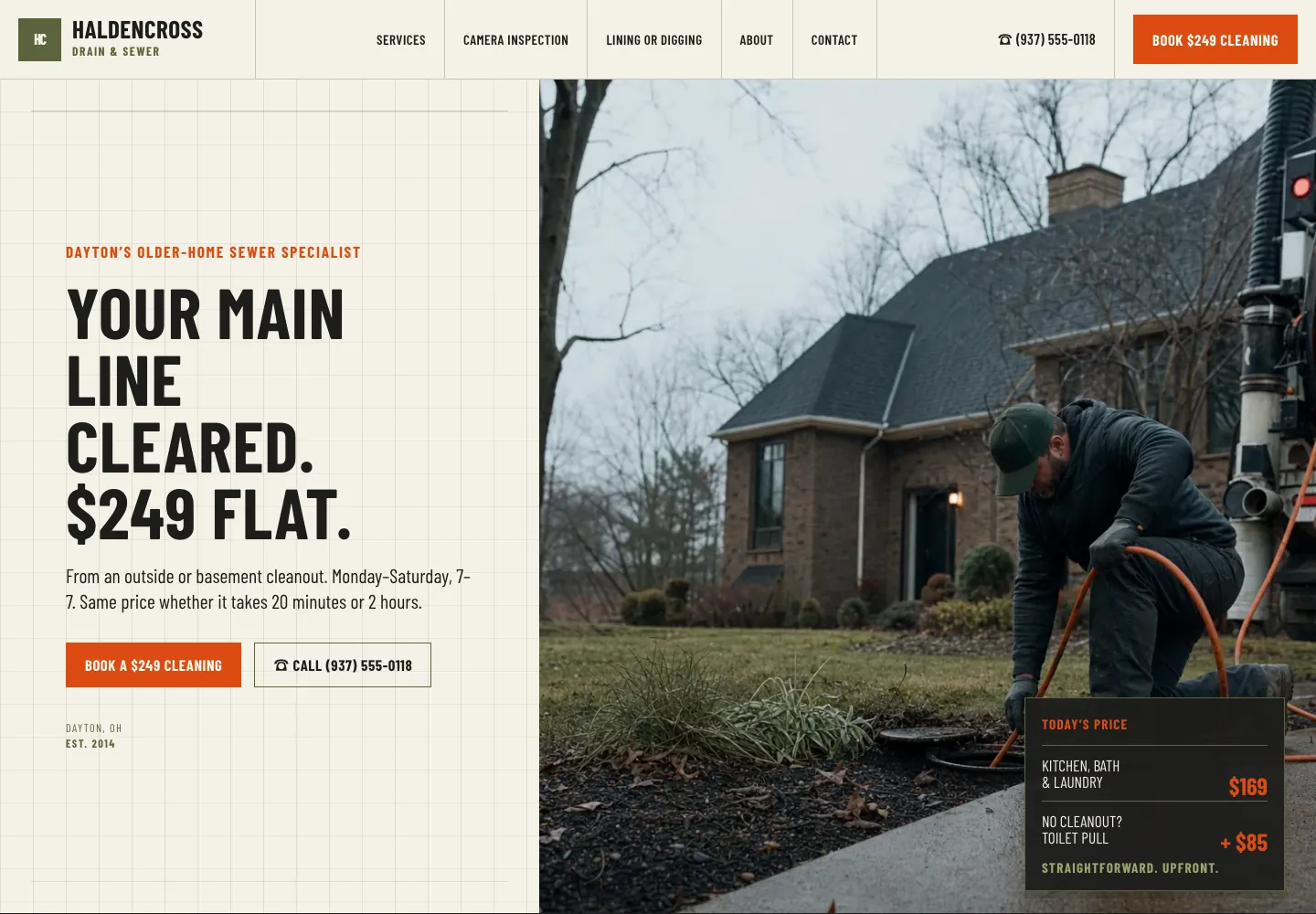
A plumbing visitor often arrives with a problem in front of them. The header for Haldencross Drain & Sewer keeps the business name, five plain labels, the phone number and one booking button in view. The menu is not a catalog of every repair. It points to Services, Camera Inspection, Lining or Digging, About and Contact, which mirror the decisions a homeowner makes as a drain problem becomes a repair choice.
The phone number earns a header slot because calling is an urgent and normal action for this business. The button names a specific bookable service rather than saying Submit or Learn more. That distinction matters: a visitor can decide whether the next step fits before opening another page. The same approach works for an electrician, HVAC company or emergency vet, but only when a real person can answer the call as promised.
If your business handles urgent requests, put the phone number in text, make it tappable on a phone and pair it with a specific alternative for people who cannot call. The contact page examples explain what that alternative should say after a visitor chooses it.
Header example 2: a mobile vet uses the header to lower first-visit friction
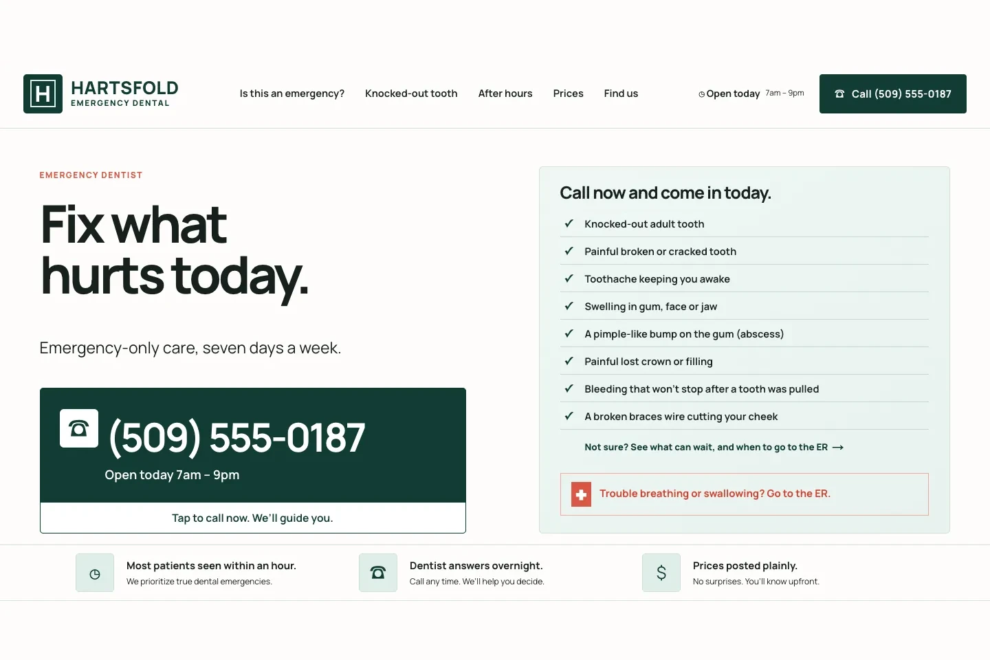
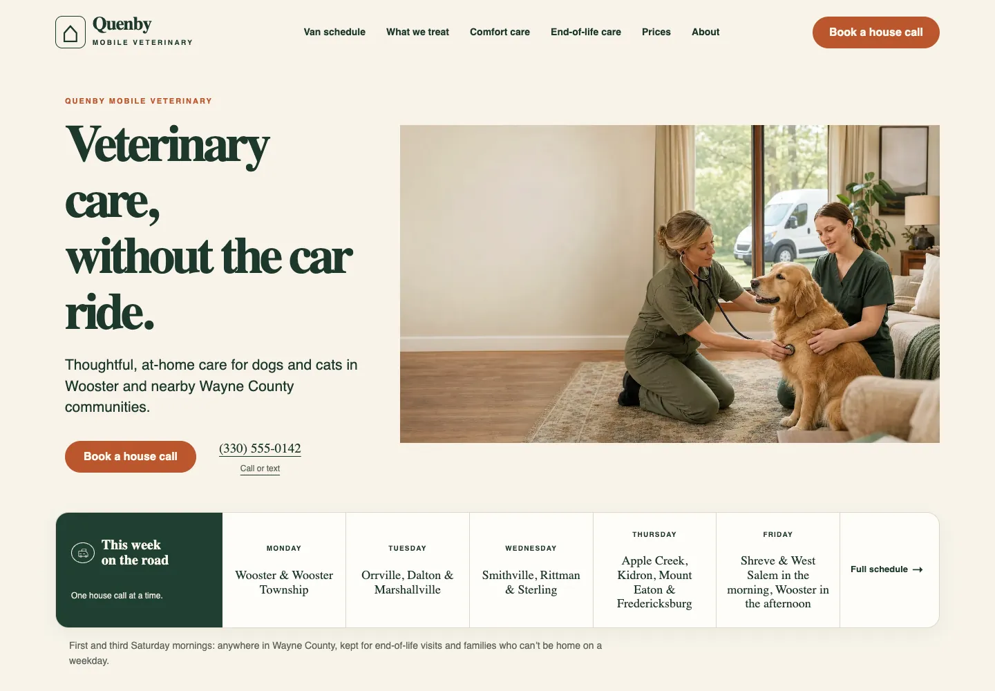
A pet owner deciding whether to book a mobile visit needs different reassurance. Lorikin Bird and Exotic Animal Clinic puts Species We See, Safe Travel, Emergencies, Prices and Our Vets in the header, followed by a written phone number and Book a Visit. The labels anticipate the questions that could otherwise stop an unfamiliar owner: does the clinic see my animal, is travel safe, can you help now and what will the visit cost?
This is a useful pattern for health, care and professional services. A header does not need to say everything, but it can name the questions that decide whether a visitor continues. Put the customer’s language in the menu. A vague label such as Solutions makes people translate; Prices or First Visit lets them choose immediately.
The book button works because it is paired with the information that makes booking feel safe. A form button without those answers can feel premature. A business that has no online booking should use the action it can actually deliver, such as Request a visit or Call the clinic.
Header example 3: a restaurant sends people to today’s decision
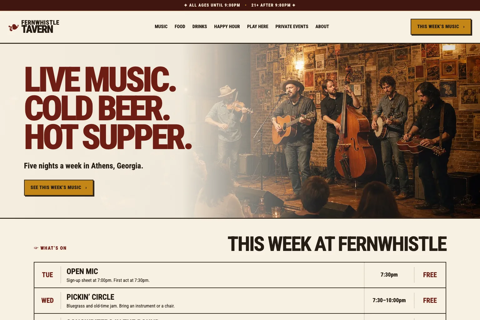
A restaurant header should help a hungry visitor decide whether to come today. Fernwhistle Tavern leads with Music, Food, Drinks, Happy Hour, Play Here, Private Events and About, with a This Week’s Music button. The header follows the business’s real draw: people often choose this venue around the lineup, then check food, drinks or a private-event option.
Notice that the action is not a generic Contact us button. The calendar is the route a new visitor needs most, and it has a label that says what appears next. A restaurant where reservations are the primary action might instead use Reserve a table. A caterer could use View catering menus. The wording should describe the visitor’s next decision, not the business’s internal workflow.
This pattern applies whenever a schedule, availability, menu or current collection influences the purchase. Keep the changing information on a dedicated page, then give it the header attention the customer gives it. For more examples of matching a button to the moment, see the website call-to-action examples.
Header example 4: a law firm leads with the questions that delay contact
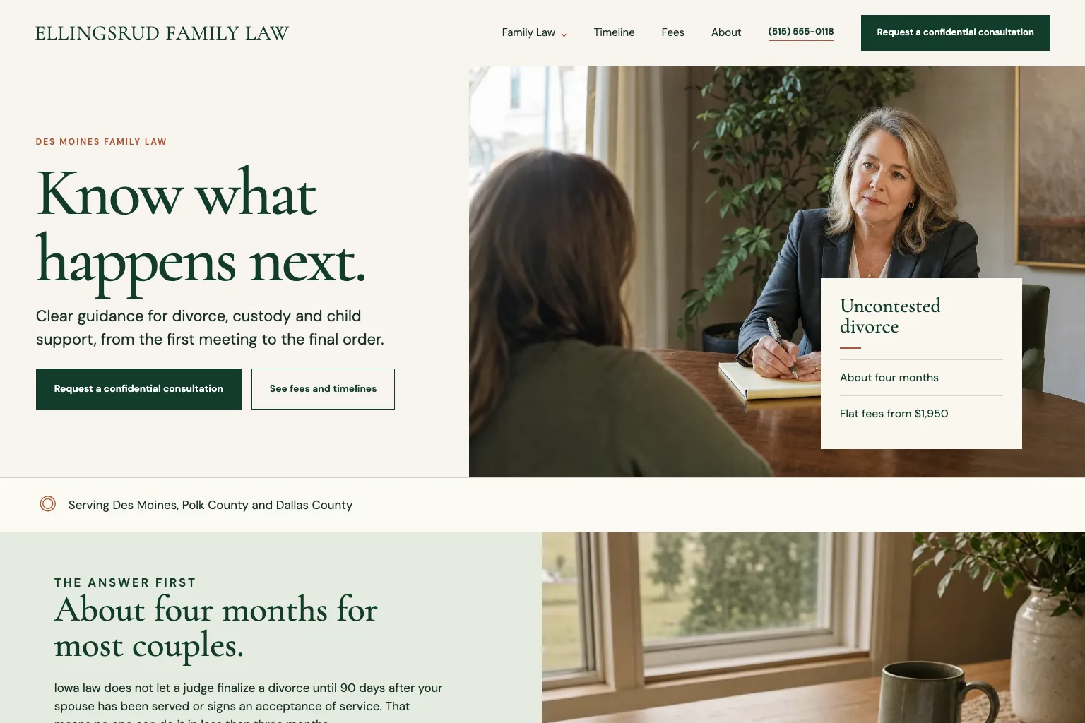
Ellingsrud Family Law uses a shorter header: Family Law, Timeline, Fees and About, followed by the phone number and Request a confidential consultation. Family Law groups the closely related practice pages under one clear label. Timeline and Fees each hold their own top-level position because they answer two questions that can delay a consultation: how long might this take, and what will it cost?
A small menu does not mean an incomplete site. It means the header reflects the most common starting points. A visitor who needs a custody page can enter through Family Law. Someone who is not ready to contact the firm can resolve a practical concern first through Timeline or Fees. That is better than making every practice-area page compete for space in the first row.
For a business with grouped services, give the group one understandable label and make the group’s landing page useful on its own. Avoid a dropdown made of mysterious abbreviations or a list so long that the first item falls off a laptop screen. The Nielsen Norman Group’s menu design guidance is a good check on visibility, labels and usable menu behavior.
Header example 5: a service business keeps one main action unmistakable
Lastkey Move-Out Cleaning gives a visitor several ways to understand the offer: Move-Out Cleaning, Guides, Prices, Property Managers, Before and After, Promise and About. Yet the header gives one action visual priority: Book a clean. The contrast is deliberate. The links help someone research fit, while the button serves a person who has already decided that the service is right for them.
This is the default pattern for many service businesses. Give every important page a clear text link, then reserve the button treatment for the action closest to revenue. If the header shows Get a quote, Call us and Book now in equal weight, it hands the visitor three choices before they know which one applies. Pick the action that best matches the business’s normal first step.
The decision is not permanent. A business can change the header action when its buying process changes, but it should measure the result and leave time for enough visitors to use it. The website conversion guide covers how to make one focused improvement at a time instead of rebuilding the whole first screen on a hunch.
When a two-row header earns its space
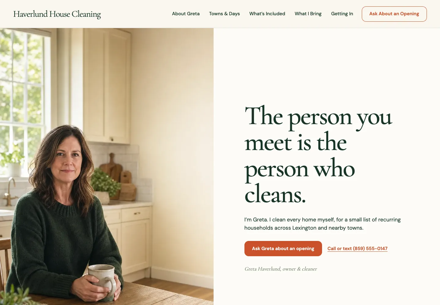
Most small business sites should use one compact row. A second row is justified only when it separates information people need immediately from the main menu. A restaurant may put opening hours or an age rule in a thin top strip. A multi-location practice may put the phone number, location selector or urgent-care line above the main navigation. A financial firm may set Client login apart from the sales path.
The test is whether the top strip changes a visitor’s next decision. If it contains a rotating slogan, generic social icons or a holiday graphic, it adds height without helping. On a phone, that height is expensive because it pushes the page’s first useful words farther down. Keep the strip brief, readable and truthful, and remove outdated notices as soon as they stop applying.
A header that stays visible while visitors scroll needs the same discipline. It can make the next action easy to reach, but it should be small enough not to cover the page, opaque enough to remain legible and tested with keyboard focus. The W3C guidance on focus not being obscured explains why a fixed element must not hide the link or button a keyboard visitor is using.
| Use a second row when | Keep one row when |
|---|---|
The top line carries an urgent phone route, location choice, opening-hours rule or client-only control. | The extra line only repeats the logo, menu or main action. |
The business has a recurring practical rule that changes whether someone visits, such as all-ages-before-nine or emergency-hours information. | The message is promotional, seasonal decoration or a social-follow request. |
The mobile version can keep the essential detail readable without making the header consume the first screen. | The line forces small text, cramped controls or a stacked header taller than the opening content. |
How to make a website header work on a phone
A desktop header can look calm and still fail a visitor on a phone. The menu needs a labeled button when the links no longer fit, and the primary links must remain reachable after it opens. A visitor should be able to tap outside the panel to close it, press Escape from a keyboard, or choose a link and land on the new page with the menu closed. Those are not fancy extras. They are the ordinary ways people correct a mistaken tap.
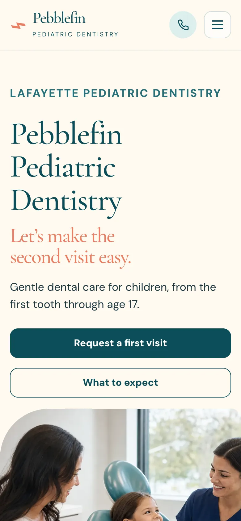
Keep tap targets generous and labels intact. A three-line icon with no visible Menu label can work only when the surrounding design makes its job unmistakable, but a clear label is safer for a mixed audience. Do not force phone users to zoom to read a number, squeeze a row of six links into two lines or guess which icon opens appointments. A useful mobile header often shows the logo, the most urgent action and the menu control, then gives the open panel enough room for the complete labels.
Test the header at more than one width. A menu can fit at a wide desktop size and a phone size yet collide in the middle, where many laptops and tablets sit. The W3C’s writing tips reinforce a related rule: link text should tell a person where it goes. That rule makes every menu faster to scan too.
- Open the menu with a finger and make sure every primary link is available.
- Tap outside the panel, press Escape and choose a link, checking that each method closes the menu.
- Check the business name, main action and phone number at 390px, around 1024px and a wide desktop width.
- Make the active keyboard focus visible on the menu button, links and header action.
- Read every label out loud. Replace internal language, abbreviations and vague verbs with the words a customer would use.
A ten-minute website header review
Open the homepage and one service page as a first-time visitor. In the first few seconds, you should be able to say whose site it is, where to find the relevant service and what action the business wants you to take. Then open the same pages on a phone. If the answer changes because the menu is hidden, the phone header needs attention.
Record what you find in a short checklist. Separate the immediate tasks from the nice-to-haves, so a business can fix missing contact routes or a broken mobile menu before debating whether the logo should move a few pixels. Pair it with the website design checklist when you are reviewing the page behind the header as well.
Do not redesign a working header just because another site uses a fashionable layout. Change it when a real customer need is not being served: the main action is unclear, a high-stakes question has no path, the menu hides the relevant page or phone visitors cannot use it comfortably. Then review the customer path again, from the page they land on through the next action.
What should a website header include?
Most business headers need a logo or business name, a short primary menu and one clear action. Add a phone number, login, location chooser or thin top strip only when it solves a real customer task. Keep the header focused enough that a visitor can scan it before deciding where to go.
How many links should a website header have?
For a small business, five to seven top-level links is a useful starting range. The exact number depends on the customer journey. Group closely related services under one clear label and move lower-priority pages, policies and social links to the footer rather than making the primary menu harder to read.
Should a phone number be in the website header?
Put a phone number in the header when calling is a common, timely first action and someone can answer or return messages as the site promises. A plumber, emergency clinic or local service business often benefits. If customers normally book, request a quote or buy online, the primary action may be more useful than a number taking up the same space.
Should a website header stay fixed while scrolling?
A fixed header can help when it keeps a useful action or essential navigation within reach. It should stay compact, remain readable over the page and never cover focused links or page content. On phones, test it especially carefully because a tall fixed header can hide too much of the page.
What is the difference between a website header and a hero section?
The header repeats across the site and contains the business identity, navigation and main site-wide action. The hero section is the opening content for one page, usually with its own headline, supporting words and page-specific action. Keeping those jobs separate prevents the header from becoming a billboard.
How should a mobile website header work?
A mobile header should keep the business identity and the most important action easy to reach, then use a clear menu control for the remaining primary links. The open menu should be easy to close by tapping outside it, pressing Escape or choosing a link, and its controls should be large enough to tap without zooming.
Do all pages need the same header?
Yes, public pages should normally use the same shared header so visitors can rely on the same navigation and main action everywhere. A page can have different content below the header, but changing the logo, menu or contact path from page to page makes a visitor relearn the site at the moment they are trying to decide.
How Theo helps keep the header useful
A header is not a one-time decoration. It changes when a business adds a service, starts taking bookings, changes its primary customer action or learns that people keep looking for an answer in the wrong place. Theo builds the business’s header around those facts, then keeps the customer path current as the site changes.
If your existing site has a header that is hard to use, start with the free website audit. It identifies the practical issues that can keep a site from being found and gives the next fixes in order. When the business facts and desired customer action are clear, Theo can turn them into a header and pages that make the next step obvious.
Make the first choice easy
A strong header does not win by looking busier than the rest of the page. It wins when a visitor knows whose site this is, where to go next and how to take the action that fits their situation. Start with the customer’s most urgent question, keep the choices plain and test the result on a phone.
More like this in the guides and under turning visitors into customers. The audit numbers quoted across these posts are in Theo's research.