Quick answer
A website style guide is a short, shared reference for the rules that make a site feel like one business instead of a collection of unrelated pages. For a small business, record the logo, color roles, heading and body type, image style, navigation labels, button language, form behavior and copy rules. Download the small-business website style guide template, fill it in with the people who know the business, and use it whenever a page is added or changed.
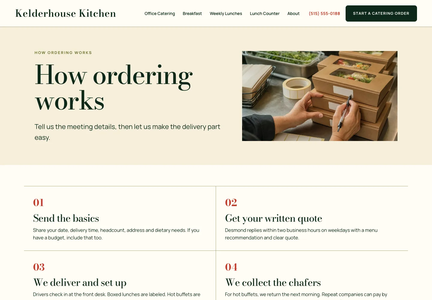
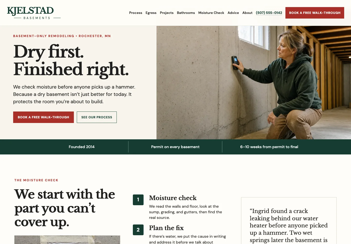
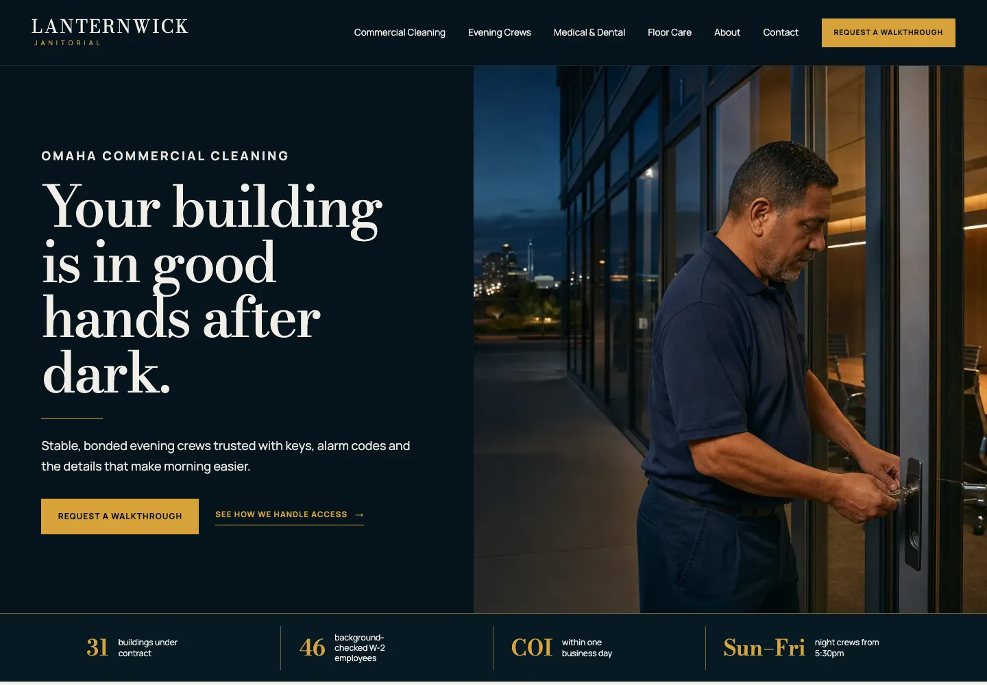
A growing website tends to drift in small, costly ways. One new page gets a different blue button. A later page uses a third font. A booking link becomes “Learn more.” A photo that looks polished but says nothing about the business replaces a useful picture of the work. None of those choices looks dramatic alone. Together, they make a visitor work harder to recognize the business and trust that the next step will be familiar.
A style guide prevents that drift by making the repeatable choices visible. It is not a 60-page brand book and it is not a technical design system. It is the compact working document a business owner, writer, photographer and web partner can use to answer, “Does this new page still look, sound and work like us?” The Figma guide to style guides reaches the same conclusion from a broader brand perspective: clear rules for visual identity, voice and examples make it easier for everyone touching the work to stay coherent.
Start with the customer path, not the color palette
Before choosing typefaces or color names, settle what the website is supposed to help a customer do. A plumber may need a visitor to call or request urgent help. A restaurant may need people to see the menu, check today’s hours or reserve a table. A financial adviser may need a cautious visitor to understand fees and request a first conversation. Those decisions tell you which action deserves button treatment, which facts need a reliable place in the header or footer and which images will build confidence.
Write the site promise in one sentence: “We help [customer] get [outcome] in [place or situation].” Then write the one action the site should make easiest. This is the anchor for the rest of the guide. If a new page introduces a competing action or a vague label, the guide gives the team a reason to pause before publishing it.
Use the website page layout examples to decide what each important page needs to do, then use the style guide to make those pages feel connected. Layout answers where information goes. The style guide answers how a visitor recognizes the same business while moving from a homepage to a service page, FAQ or contact route.
| Decision | Write this in the guide | Why it matters to a customer |
|---|---|---|
Main action | The exact label, such as Request an estimate or Book a visit | The next step stays recognizable instead of changing from page to page. |
Proof | The facts, photos or permissions the business can honestly use | New pages support real claims instead of reaching for generic praise. |
Customer language | The words people use for services and questions | Navigation and headings stay easy to scan. |
Voice | A few approved traits and words to avoid | The site sounds like one business, even when different people update it. |

Choose a small set of visual rules that do real work
A small business does not need endless shades, font weights and card styles. It needs a few choices used deliberately. Give each color a job. One color can carry the main action. A quieter accent can support labels or small details. The background and text colors must make ordinary paragraphs easy to read. If every color is competing for attention, the visitor cannot tell which button is the next step.
Do the same with type. One heading face and one body face is usually enough, and one family can be enough for the whole site. Record the sizes and weights that separate a page title, section title, ordinary body text and small utility text. This prevents a new page from looking louder just because its author chose a larger headline or a trendier font. The point is not to make every section identical. It is to make hierarchy predictable.
Accessibility belongs inside these rules. The W3C’s design guidance calls for clear and consistent navigation, links that stand out from surrounding text and visible keyboard focus. In business terms, a customer should be able to recognize a link, find the menu and use the page without guessing what will happen after a tap or click.
- Name the main background, text and action colors, including their exact values and when each is used.
- Set one heading treatment and one body treatment before adding decorative typefaces.
- Write the intended spacing rhythm: breathing room between sections, tighter space inside related content and no crowded cards.
- Keep buttons, links, fields and error messages recognizably interactive wherever they appear.
- Check text and button contrast before approving a color, not after a customer struggles to read it.
Set rules for images, not just for logos and colors
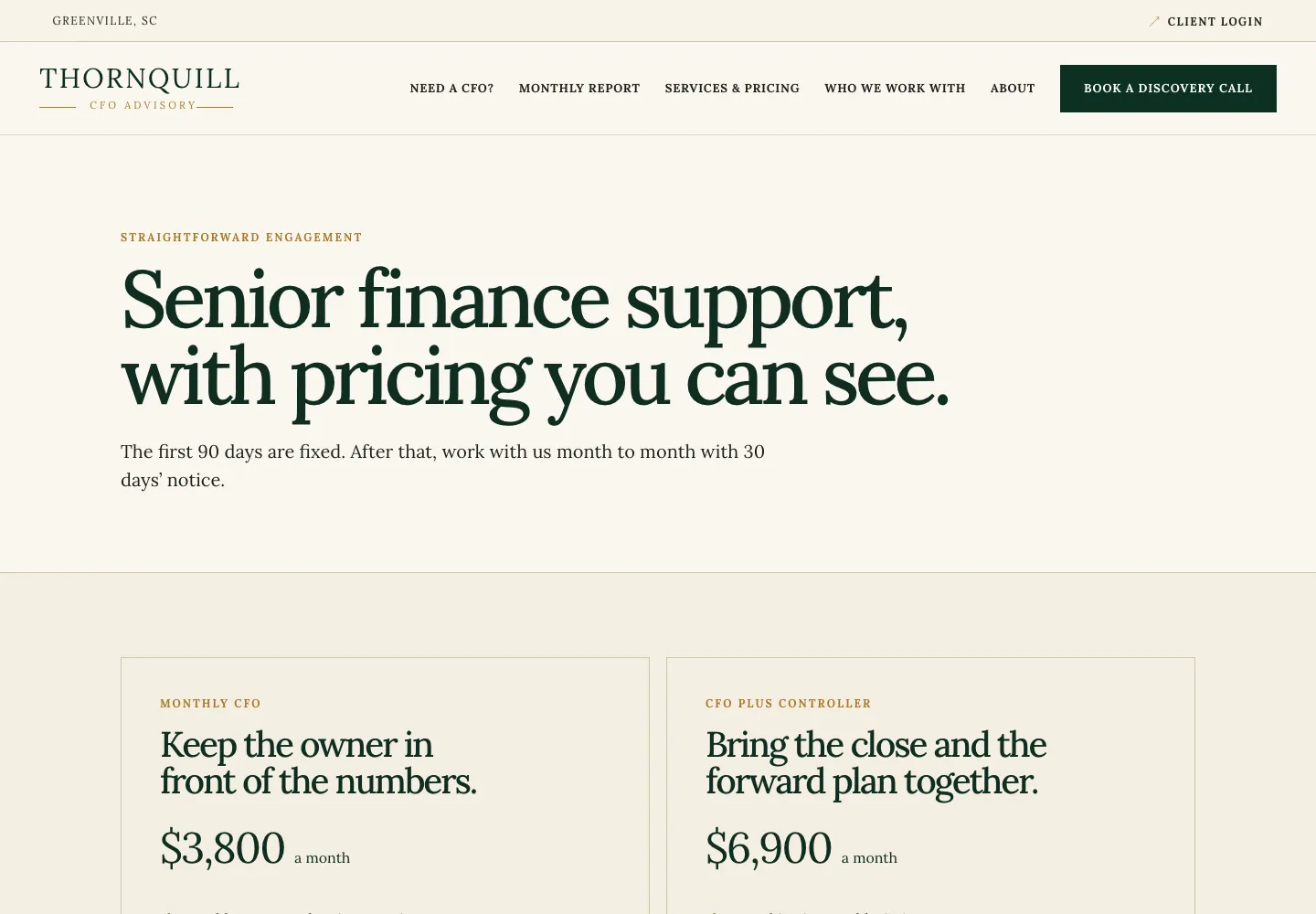
Images often cause the fastest style drift because they are added one at a time. A site can start with original work photos, then acquire a generic office handshake on one page, an over-edited stock portrait on another and a blurry phone image on a third. The result is not simply aesthetic. A visitor has less evidence that the business is real, current and careful.
Write down the image style that fits the business. A contractor may lead with finished work and the people who do it. A restaurant may use the food, dining room and current events. A professional service may use the real advisers, office, process diagrams and useful documents. Decide when an illustration is appropriate, who approves photos and what a meaningful alt description needs to identify. Keep each image tied to the section it supports, rather than using it as wallpaper.
This also gives the team a sensible test for image cropping. A photograph of a finished deck should show the deck. A team photo should not cut someone out. A product image should not hide the feature a customer is considering. The website content checklist helps organize the original photos, permissions and proof behind those choices before a page is built.
Make navigation, buttons and forms behave consistently
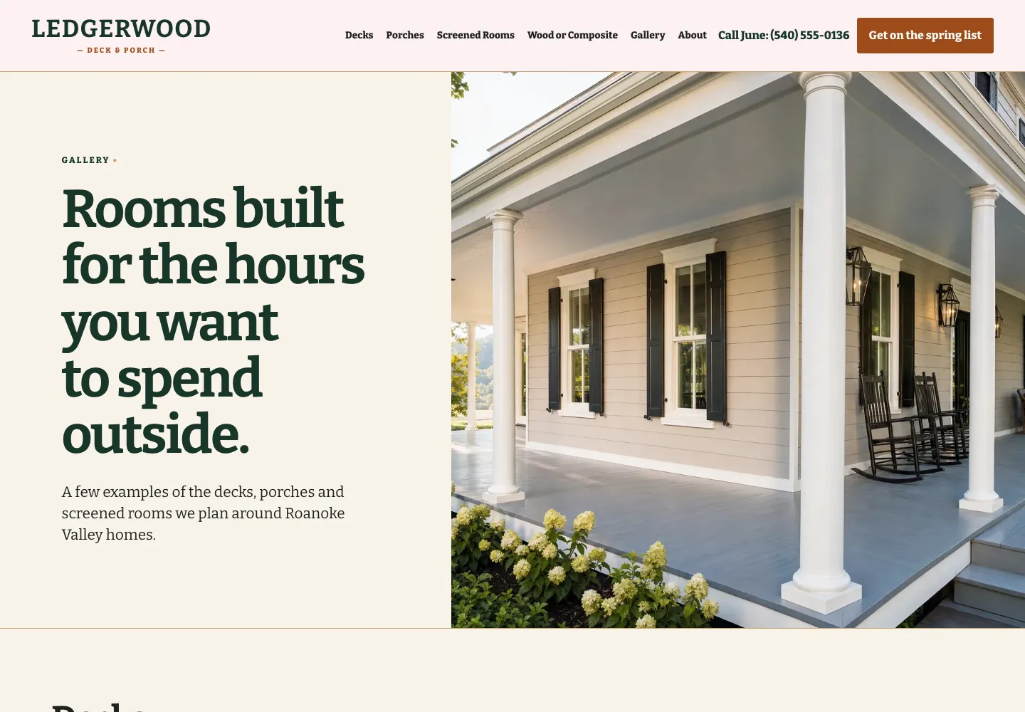
The visual guide should include behavior that a visitor experiences, not just colors. Record the header links, the wording for the main action and the details that belong in the footer. A person who learns that the solid button means “request a quote” on the homepage should not find the same treatment opening an unrelated brochure on a service page. Consistency makes the site easier to learn without making it monotonous.
Use plain labels that name the destination or action. Services, Prices, Book a visit and Contact are stronger than vague labels that force a visitor to translate. Keep the header and footer structure steady across public pages, then let the page content answer its specific question. The website navigation examples show how a short menu and a clear primary action help customers move without turning the header into a storage unit.
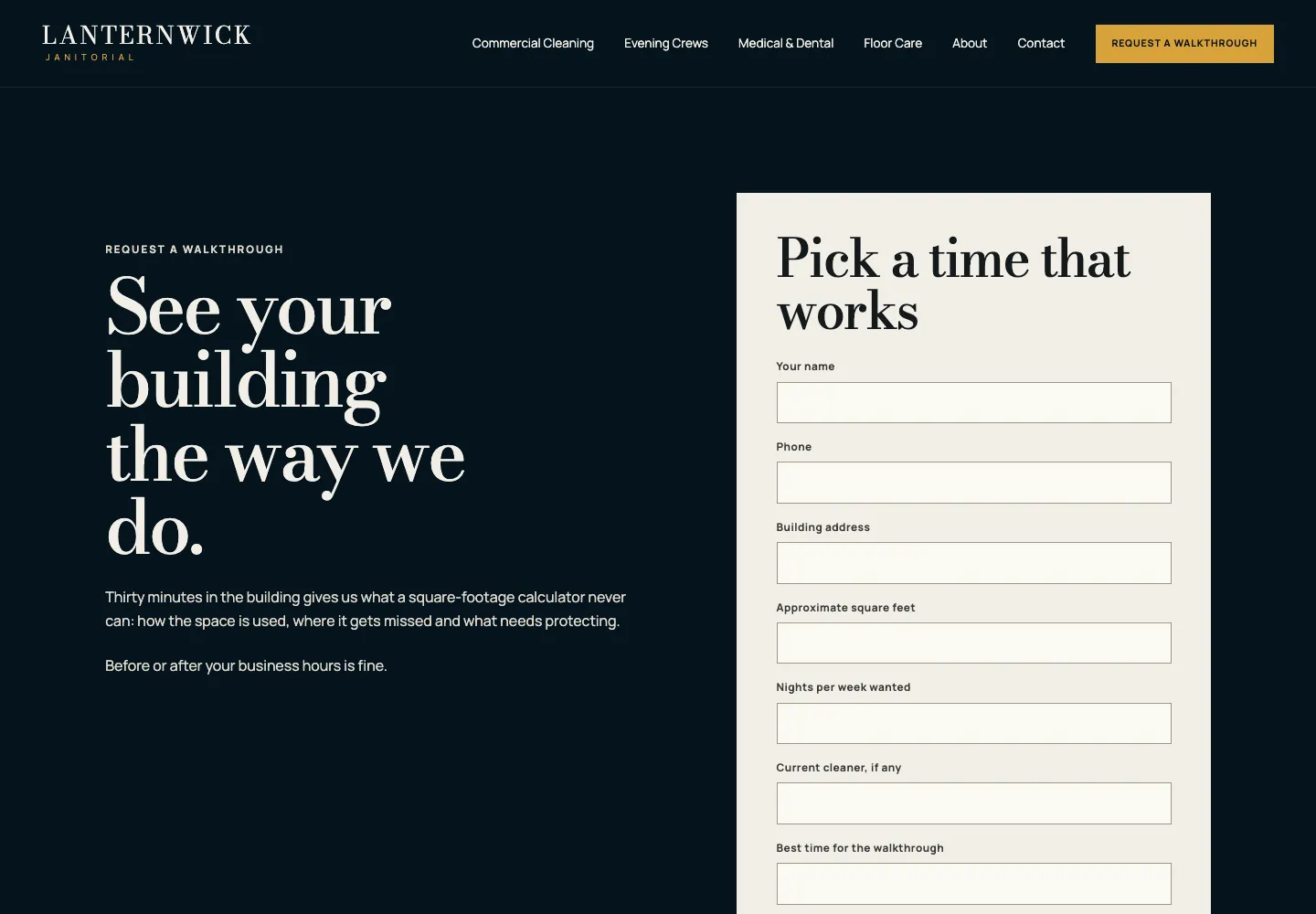
Forms deserve rules too. Every field needs a visible label, the button needs an honest action label and the confirmation needs to tell the visitor what happened next. A guide that says “Use a clear response expectation” keeps a new page from quietly replacing “We will reply within one business day” with a blank thank-you state. That is a small detail until a ready customer wonders whether their request reached anyone.
| Element | Rule to record | Avoid |
|---|---|---|
Primary button | One visual treatment and a specific action label | Changing between Submit, Get started and Learn more for the same customer action. |
Navigation | Short labels in customer language, placed in the same order | Internal department names or a different menu on each page. |
Links | A visible text treatment and descriptive destination | Plain paragraph text that happens to be clickable or “click here.” |
Forms | Visible labels, useful validation and a clear next-step message | Placeholder-only fields and a button that gives no clue what happens. |
Write the copy rules that keep a site sounding human
Copy consistency is not about making every sentence sound polished in the same way. It is about protecting the facts and voice that help customers decide. A good guide records the words a business uses for its services, customers and main actions. It also records the claims that need approval, such as response times, credentials, prices, service areas and availability. That gives a writer room to be clear without inventing promises.
Keep a short list of preferred words and a short list to avoid. “Request an estimate” may be right for a contractor. “Plan a first visit” may suit a family practice. Generic phrases such as “world-class solutions” rarely help either. The website copy template helps turn those rules into page-level words that explain the offer, proof and next step in the order a customer needs them.
A few examples are more useful than a long list of adjectives. Include one approved service heading, one button, one proof statement and one response expectation. Then explain why each works. Someone updating a page can use the examples as a guardrail instead of guessing whether a new phrase sounds on-brand.
- Use the service names and customer terms the business uses in real conversations.
- Put the useful detail before the adjective: place, service, scope, process or proof.
- Mark price, timing, availability and qualification claims for approval before publishing.
- Keep headings and buttons specific enough that they make sense when scanned on their own.
- Replace vague persuasion with an honest next step and what a customer can expect after taking it.
Build a one-page website style guide in one working session
Set aside an hour with the person who knows the business, the person who approves public claims and whoever will make the next website update. Open the current homepage, one service page and the contact page. Notice what is already working before changing anything. The goal is to capture a usable version one, not to begin a rebrand because a button is a different shade of blue.
Fill in the template in this order: the customer path, identity and image rules, type and color roles, repeated elements, copy rules and the phone review. Wherever the answer is not known, write “to confirm” and assign an owner. That is much safer than pretending a guess is a brand rule. Review the document when the business adds a new service, changes its main action or learns that customers keep missing something important.
Finish by opening the key pages on a phone. W3C guidance on consistent navigation is a useful standard, but the practical test is simpler: can a new visitor tell where they are, find the relevant service and take the expected action without relearning the site? The website design checklist adds the wider page, phone and launch checks once the style guide is in place.
- Write the customer promise and the main action first.
- Record the visual roles for colors, type, images and spacing, including what not to use.
- Set the repeated header, footer, button, link and form rules.
- Add approved wording, claims that need sign-off and one good example of each.
- Check the current pages on a phone, then name the person who owns the next review.
What should a website style guide include?
Include the customer promise, approved logo use, color roles, heading and body type, image style, header and footer rules, button and link treatments, form behavior, copy rules and the person who approves future changes. A small business can keep this in one useful page when each rule answers a real editing question.
What is the difference between a brand guide and a website style guide?
A brand guide usually covers the business everywhere it appears, including print, social media, advertising and signage. A website style guide focuses on how those choices work on pages: readable type, color roles, links, buttons, forms, images, navigation and the customer path on a phone.
Do small businesses need a website style guide?
A small business benefits as soon as more than one page, person or update is involved. The guide stops minor inconsistencies from accumulating and makes it easier to add a service page, seasonal update or new form without making the site feel unfamiliar to customers.
How long should a website style guide be?
For a small business, start with one page. Include only rules someone will use while adding or reviewing a page. A detailed brand program may need more material, but a short guide that is consulted beats a polished document that stays in a folder.
Should a website style guide include accessibility rules?
Yes. Record readable text and color choices, visible links and focus states, clear navigation labels, meaningful image descriptions and form labels. These rules help more visitors use the site and prevent accessibility from being treated as an afterthought.
Who should approve a website style guide?
The business owner or person responsible for the public promise should approve the customer language, claims, images and main action. A designer or website partner can define the visual and interaction rules, but should not invent business facts or promises without approval.
When should a website style guide be updated?
Review it when the business changes its services, audience, main action, visual identity or customer process. Otherwise, review it before a major site update or when a page begins to look or sound different from the rest of the site.
How Theo keeps a growing website consistent
A useful website does not stay still. Services change, a new question becomes common, a booking route replaces a phone call or a business finally has better project photos. Theo can turn those real changes into pages that keep the same customer path, visual rules and voice, rather than creating a disconnected new section each time.
Start with the free website audit if the current site already feels uneven or hard to use. It gives a business a clear view of the most important issues. Once the facts and style rules are settled, Theo can build or improve a small-business website design around the pages and actions customers actually need.
Make every new page feel familiar
A website style guide is not decoration. It is the small set of decisions that lets a customer recognize the business, understand the page and take the next step without starting over each time. Capture the rules while they are clear, test them on a phone and use them whenever the site grows.
More like this in the guides and under building a small business website. The audit numbers quoted across these posts are in Theo's research.