Quick answer
A website page layout is the order in which a page answers a visitor's questions. For a small-business homepage, begin with what the business does, who or where it serves, one reason to trust it and one next step. Then show the relevant services, proof, how the process works, the questions that delay action and a contact path. A service page, about page and contact page need different orders because a visitor arrives with a different question on each one.
A layout is not a theme, a row of cards or an excuse to keep adding sections. It is the order that lets a visitor decide without hunting. The best page layout makes the next answer appear just before the visitor needs it. A homeowner with a leaking pipe needs the service, area, phone route and a reason to trust the business. Someone comparing a planned basement project needs scope, process, proof and a way to ask for a walk-through.
This guide uses real small-business websites built by Theo, not mood boards. Each example has a job: orient a first-time visitor, explain a service, establish trust, make contact feel safe, answer recurring doubts or help a visitor choose a route. That makes the examples useful even when your industry is different. The small-business website examples show more complete sites when you want to compare the finished customer path.
Choose the page job before choosing the layout
A layout works when the page has one main job. The homepage answers, “What is this business, and is it for me?” A service page answers, “Can you help with my problem?” An about page answers, “Why should I trust the people behind this?” A contact page answers, “What happens if I reach out?” Trying to make every page do every job produces a long page with no clear finish.
Write the page job as a sentence before arranging anything: “This page helps [visitor] decide [one thing] so they can [next action].” That sentence reveals what belongs near the top and what can move lower. Shopify's website-layout guidance makes the same practical point: the arrangement should serve the action a visitor needs to take, rather than just display every available detail.
Use the small-business website page layout planner to make that decision on paper first. It asks for the customer, their decision, the proof available and the next action before a blank design forces generic filler. The website design process explains how this page plan connects to the rest of a website project.
| Page | Visitor's main question | What the layout must do |
|---|---|---|
Homepage | What do you do, and am I in the right place? | Orient, show the offer and make the primary path obvious. |
Service page | Can you solve my specific problem? | Explain scope, fit, proof, practical details and how to begin. |
About page | Who are these people, and why trust them? | Connect real people, experience or method to the customer's decision. |
Contact page | What happens if I call, book or send a message? | Set the right contact route, expectations and practical details. |
FAQ page | What could stop me from acting? | Answer the recurring decision questions completely and directly. |
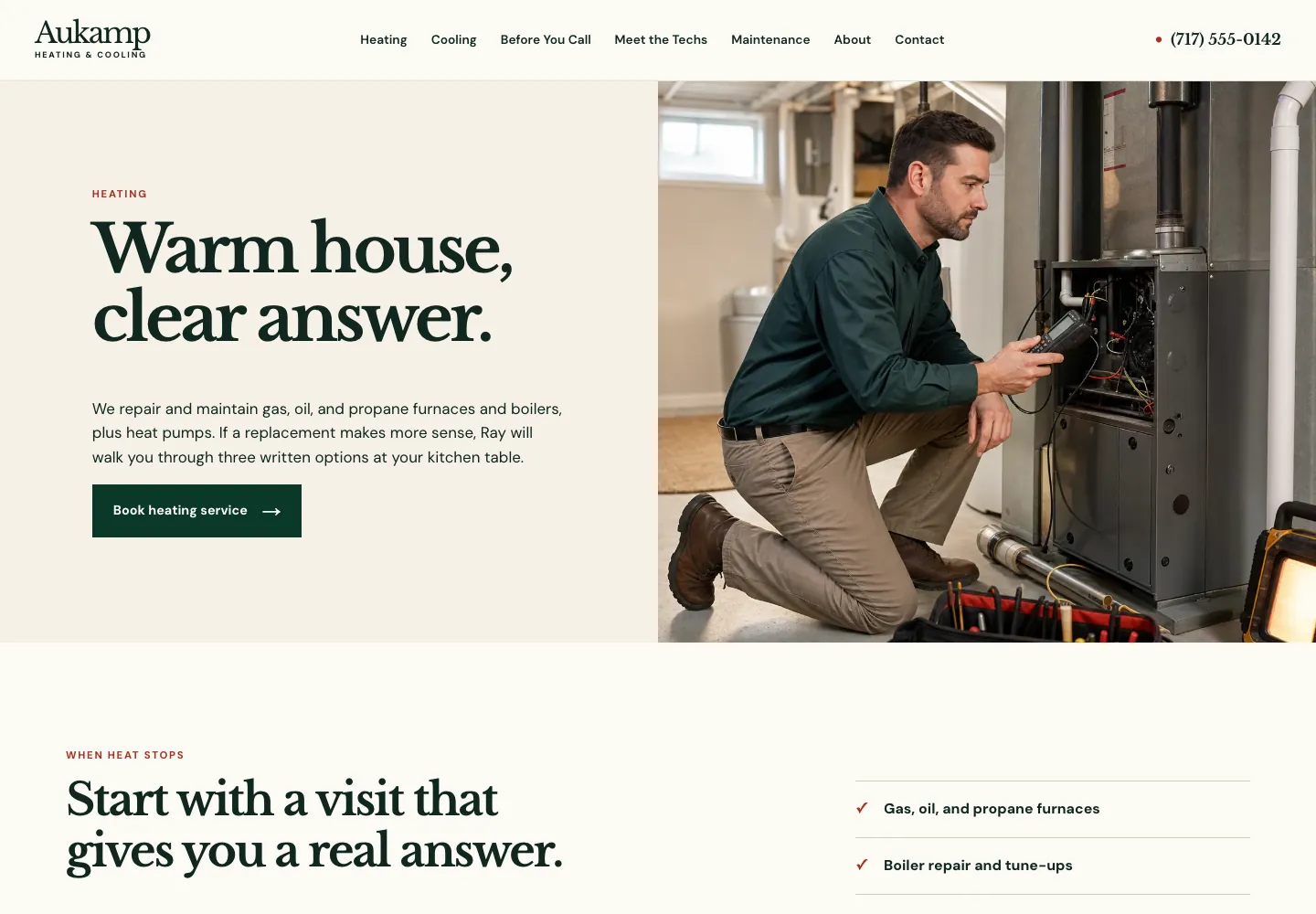
Layout example 1: a homepage that orients a new visitor
A homepage has to work for people arriving cold. The first screen should answer what the business does, who or where it serves, why a visitor can trust it and what they can do next. That does not mean every detail must fit above the fold. It means the first screen should make the rest of the page worth reading.
The basement-finishing example above starts with the project, service area, proof points and a free walk-through request. Under that, the layout can earn the next click: types of projects, how the first visit works, examples of work, answers about cost or timing, then the request path again. The order follows a homeowner's decision, not the business's internal department chart.
Keep the homepage from becoming a second version of every other page. Give each later section a reason to exist. The website copy template provides prompts for the actual words inside this layout, and the website header examples cover the shared menu and main action above it.
- First screen: clear offer, audience or service area, one proof detail and one action.
- Offer section: plain-language links to the services or products visitors most often compare.
- Proof section: real projects, credentials, process details or reviews used with permission, placed near the claim they support.
- Decision section: cost factors, timing, availability or another practical question that commonly causes hesitation.
- Action section: the same next step, with an honest explanation of what happens after it.
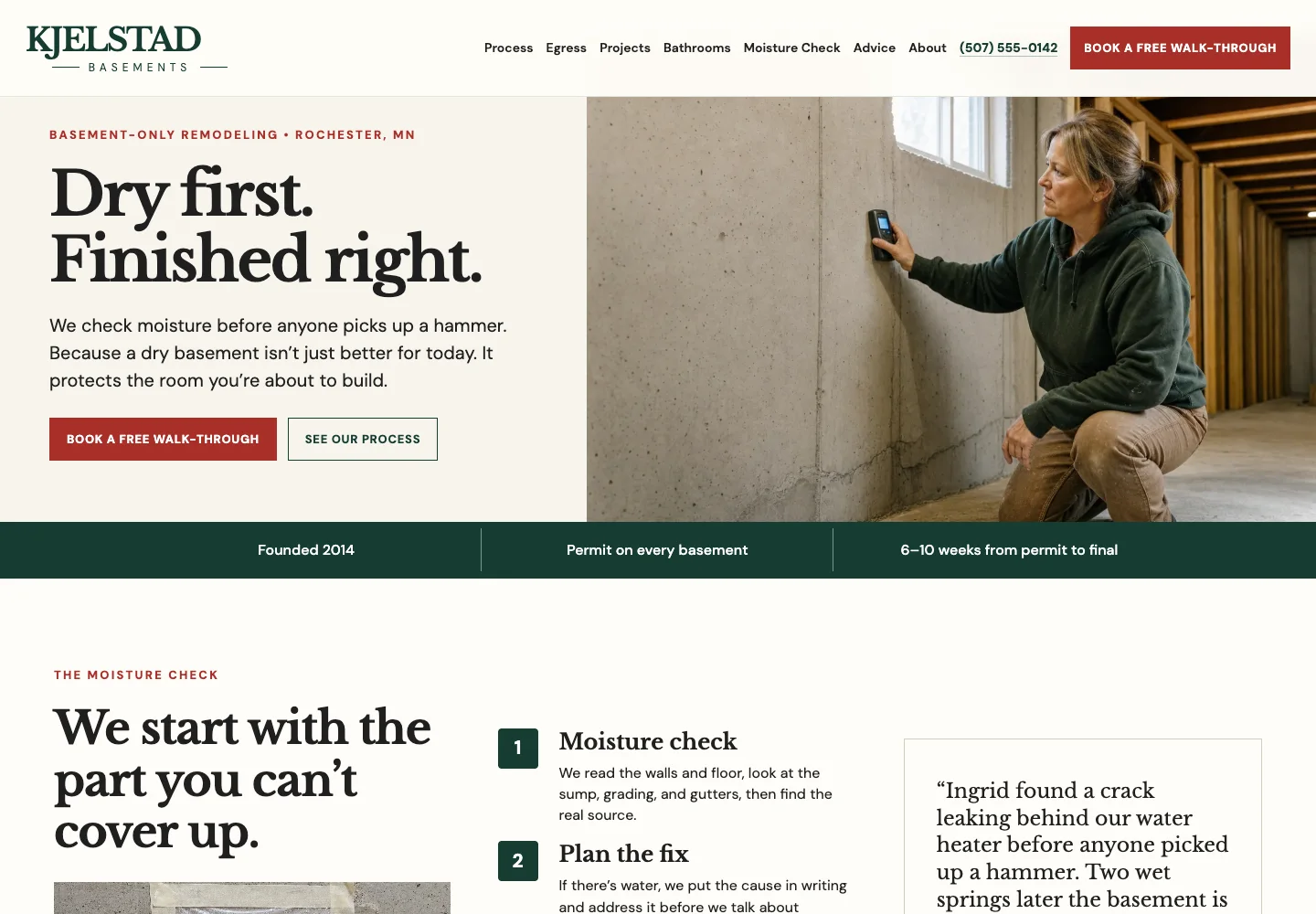
Layout example 2: a service page that earns the inquiry
A service-page visitor is farther along. They do not need a broad welcome first. They need to know whether this is the right service, what is included, what affects the cost or timing and what the next step asks of them. Put the direct answer at the top, then use the rest of the page to remove the reasons a qualified visitor might leave.
The strongest service layouts usually move from scope to process to proof. Explain the service in the words customers use. Name who it is for and when it is not the right fit. Then show the parts of the work, what changes the estimate, evidence that supports the promise and the contact route. The service-page examples show this pattern across different kinds of businesses.
Avoid a card grid that lists features but never explains the outcome. A customer is not comparing boxes. They are deciding whether to trust you with a problem. Give each section a sentence that connects the detail to that decision, then keep the action visible without repeating it after every paragraph.
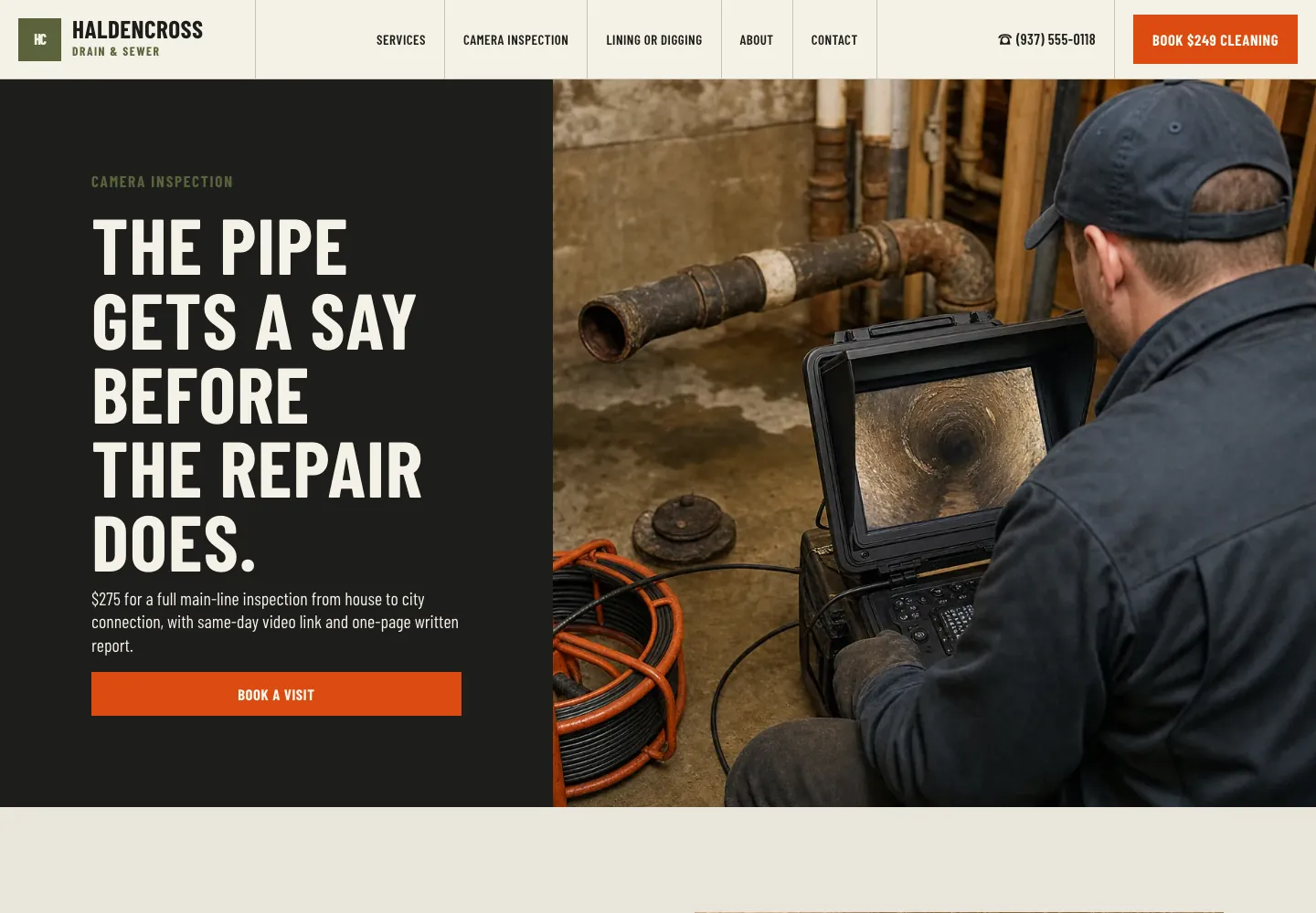
Layout example 3: an about page that makes trust specific
An about page is not a biography with a team photo at the bottom. It is where an uncertain customer looks for evidence that the business is real, capable and a fit for their situation. Lead with the useful reason the people, experience or approach changes the customer's decision. Then support it with facts a visitor can recognize and verify.
For an insurance agency, that might mean named advisers, the kinds of decisions they help with, the area they serve and what happens in a first conversation. For a contractor, it might mean who visits the home, how the estimate is explained and how the work is managed. The layout must turn “about us” into an answer a customer can use.
A good rule is to put the proof beside the promise. If the page says the team is experienced, name the relevant experience. If the business says its process is careful, show the checkpoints. The guide to building trust on a website helps decide which proof belongs here and which belongs on a service or contact page.
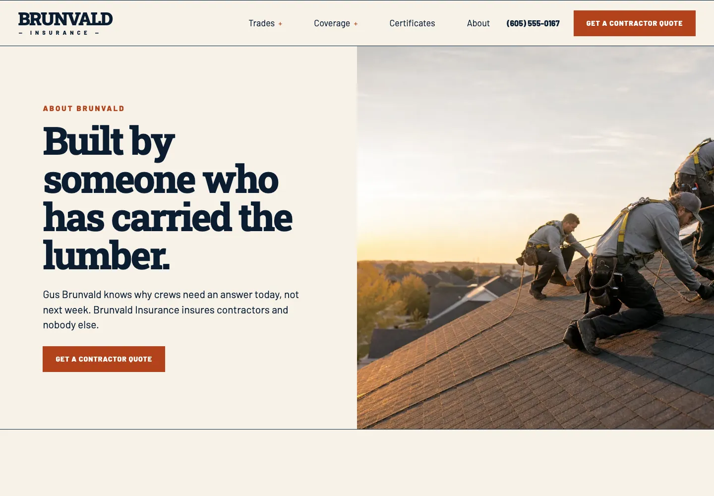
Layout example 4: a contact page that lowers the risk of reaching out
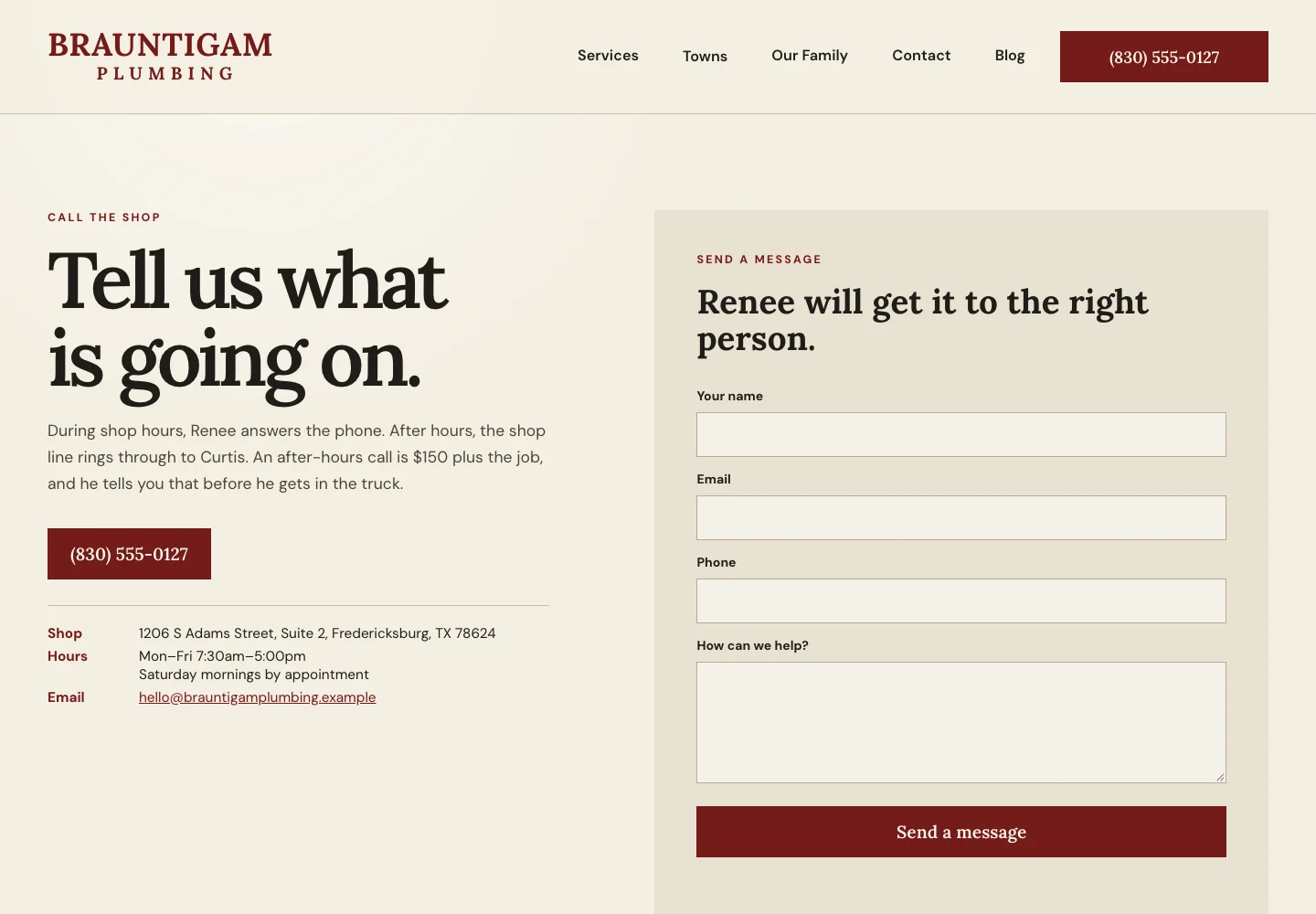
A contact page should not make a visitor decode which phone number, inbox or form applies. Start by saying what this route is for. Then show the contact method, the few details that help the business respond, practical information such as hours or service area and what happens next. That final answer matters, especially when the visitor is comparing a few businesses and does not want a sales call they did not ask for.
A plumbing contact page can put the service area, hours and request-service route beside the form. A restaurant might lead with location, opening hours, reservations and private-event inquiries as separate paths. A professional service may state who reads the message and when a response normally happens. Each version is clear because it mirrors the real handoff.
Keep the form short enough for the first conversation. The contact-page examples explain what to ask, what to leave optional and how to make the next step feel specific without making promises the business cannot keep.
Layout example 5: an FAQ page that clears real hesitation
FAQ pages work best when they answer the questions a visitor asks before taking the main action: cost, timing, service area, suitability, cancellation, preparation and what happens next. Arrange the questions by what can stop the decision soonest, not by the order staff happen to hear them. Cost and timing often deserve the earliest position because visitors will otherwise leave to ask somewhere else.
Each answer should stand on its own. “Contact us for details” does not answer a question. If a price varies, say what makes it vary. If a service is not right for every situation, say when another route is better. The page earns trust by replacing evasive language with useful boundaries.
The FAQ-page examples give practical question patterns for small businesses. Pair the page with a focused service page instead of using FAQs to hide details that should be on the page where a customer first needs them.
Layout example 6: keep the structure usable on a phone
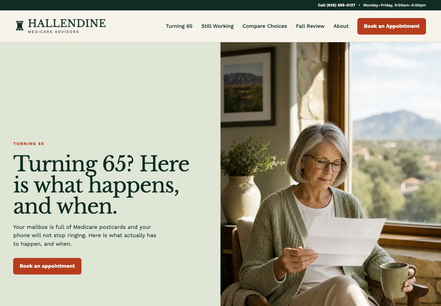
A phone layout is not a desktop page squeezed smaller. It is the same customer decision checked in the order a person can actually use with one hand. Keep the first answer readable, make the primary action easy to tap, let visitors reach the relevant service from the menu and avoid putting important comparisons inside a table that cannot be read without pinching.
The World Wide Web Consortium's page-region guidance describes the stable landmarks visitors and assistive technology need: header, navigation, main content and footer. Its responsive guidance also advises keeping visible components in a consistent order across screen sizes. In plain business terms, a phone visitor should not have to relearn the site just because the screen is smaller.
Run the layout planner's phone review after the words and sections are in place. Open a real service page and complete the main task as if you were new to the business. The website launch checklist adds the final checks for working links, contact paths and the practical details that customers rely on.
- Read the first screen at normal text size. If the offer or action is not clear, simplify it before changing the color or animation.
- Open the menu, follow the relevant path, then close it again. The menu should help a visitor move, not become another task.
- Tap the phone, booking and form routes that matter. A button is only useful when it leads to the next real action.
- Check images for the information they carry. A project photo that proves work should not crop out the work; a decorative image should not push the answer below the fold.
- Remove any section that does not help a visitor understand, trust or act. Less page can be more useful page.
Build the layout around the next customer decision
The right page layout is the one that answers a real question in the right order. It does not need to look like a design gallery. It needs to make the business easy to understand, make proof easy to find and make the next step feel proportionate to the visitor's readiness.
Download the page layout planner, complete one page at a time and mark the facts that still need approval. If the structure is clear but the existing site still makes customers hunt for an answer, Theo can turn the plan into a small-business website design built around the real services, proof and customer path.
What is a website page layout?
A website page layout is the order and grouping of information on one page. It should put the answer a visitor needs first, followed by the proof and practical details that help them decide what to do next.
What should a small-business homepage layout include?
Include a clear explanation of what the business does, who or where it serves, one reason to trust it and one main action near the top. Follow that with the relevant services, proof, process, recurring questions and a clear contact or booking route.
Should every page use the same layout?
No. Public pages should share the same header, footer and visual system, but each page should use an order that fits its job. A service page needs scope and proof, while a contact page needs practical handoff details and expectations.
How many sections should a website page have?
Use as many sections as the customer decision requires, then stop. A section earns its space when it clarifies the offer, adds credible proof, answers a practical question or makes the next action easier. Decorative repetition can be removed.
Should a call to action appear more than once?
Yes, when a page is long enough that a visitor may become ready after reading further down. Keep the action consistent and place it after meaningful decision points rather than showing competing buttons after every paragraph.
How do I plan a website layout before design starts?
Start with the visitor, their main question, the proof you can honestly show and the action you want them to take. Use a written page plan to place those answers in order before choosing colors, templates or decorative effects.
How do I know if a website layout is working on a phone?
Use the page as a new visitor would. At normal text size, check that the first answer is clear, the menu and primary action are reachable, important details remain readable and every link or form leads to the promised next step.
Make the next answer easy to find
A page layout should make a visitor feel less uncertain with every section. Start with the one decision the page exists to support, give the proof and practical detail a logical place, then make the next action easy to take. Theo can turn that plan into a website that gives customers a clearer path from first question to real contact.
More like this in the guides and under page examples. The audit numbers quoted across these posts are in Theo's research.