
What the best services page examples have in common
Quick answer
The best services page examples do one service's job. The headline names the service and the place, and the first lines say who it is for. Below that, the page lists what is included, explains how the work goes and shows a price or how it is set. The page also puts proof beside the claim it supports, answers the questions customers phone in about, and ends with one next step. The fifteen demo pages below show which block leads and how the price is shown, trade by trade.
A services page is where a visitor decides whether the business can do their job. They arrive with one need, often from a search for that exact service, and want three answers fast: is this the service, will it work for someone like me, and what happens if I ask. A page that answers those three on the first screen gets the call. One that opens with a slogan gets the back button.
The phrase 'services page' covers two different pages. One is the overview in the menu, which lists every service with a line and a link. The other is the page for a single service, which does the selling and is where a search sends people. Most of this post is about that second kind, because it is where the visitor decides.
The examples come from demo sites Theo built to show what a finished small business site looks like, one per industry. None of them belongs to a customer, and each one carries a demo label. The full sites are on the examples page, where each services page can be seen inside the site around it. Ask the team for live customer sites in your industry, and it will share the ones whose owners have agreed.
What every services page needs
A services page that does its job has eight blocks in a fixed order: relevance first, then scope, then the doubts, then the action. The fifteen demos below show which block leads in each trade. The website copywriting guide has the words for each block, including a fill-in service page template. This post sticks to structure and what changes from trade to trade.
| Block | What the visitor is asking |
|---|---|
| Headline | Is this the service I searched for, and do you work where I am |
| Who it is for | Will this work for someone in my situation |
| What is included | What exactly am I paying for, and what is extra |
| Process | What happens after I book, in what order, and how long it takes |
| Price or how it is set | What will this cost me |
| Proof | Why should I believe you |
| Customer questions | The three things I would ask on the phone |
| Next step | What do I do now, and what happens after |
One services page or one page per service
Most small business sites start with one Services page that lists everything. It works as a menu. It is weak as a selling page. A homeowner who searched for water heater replacement lands on a page that also covers drains, repiping and gas lines, and has to dig for the one paragraph that applies. Google sees the same problem: one page rarely ranks well for eight different searches.
The decision rule is short. A service gets its own page when any of three things is true: customers search for it by name, it has its own price, process or questions, or a different kind of customer buys it. When none of the three is true, it stays a line on the overview.
The demo sites follow that rule, and each trade splits its services differently. The plumber gets a page per service, plus one service-area page that names the towns it covers. The dentist gets a page for each kind of care, with the insurance, membership plan and financing details kept together. The CPA firm divides its work between individuals and businesses, and the coach puts its programs and their prices on one page.
Services page example 1: a plumber's water heater page
A homeowner with a cold shower searched for water heater replacement and the name of their town. The page has to say, on the first screen, that this company replaces water heaters in that town and can come soon. The plumbing demo Theo built gives water heaters their own page, beside emergency repairs and drain cleaning. Click-to-call in the header and the hero keeps the phone number a single tap away. A single service-area page lists the towns the company covers, customer quotes sit on the home page, and the license line runs in the footer. The rest of the site is covered on the plumbing website design page.
Copy this: put the license number and the towns served on the service page itself, where the homeowner decides.
- Name the service and the town in the headline, with the phone number beside it
- Show the license details and reviews about water heaters next to the call button

Services page example 2: a cleaning service's residential and commercial pages
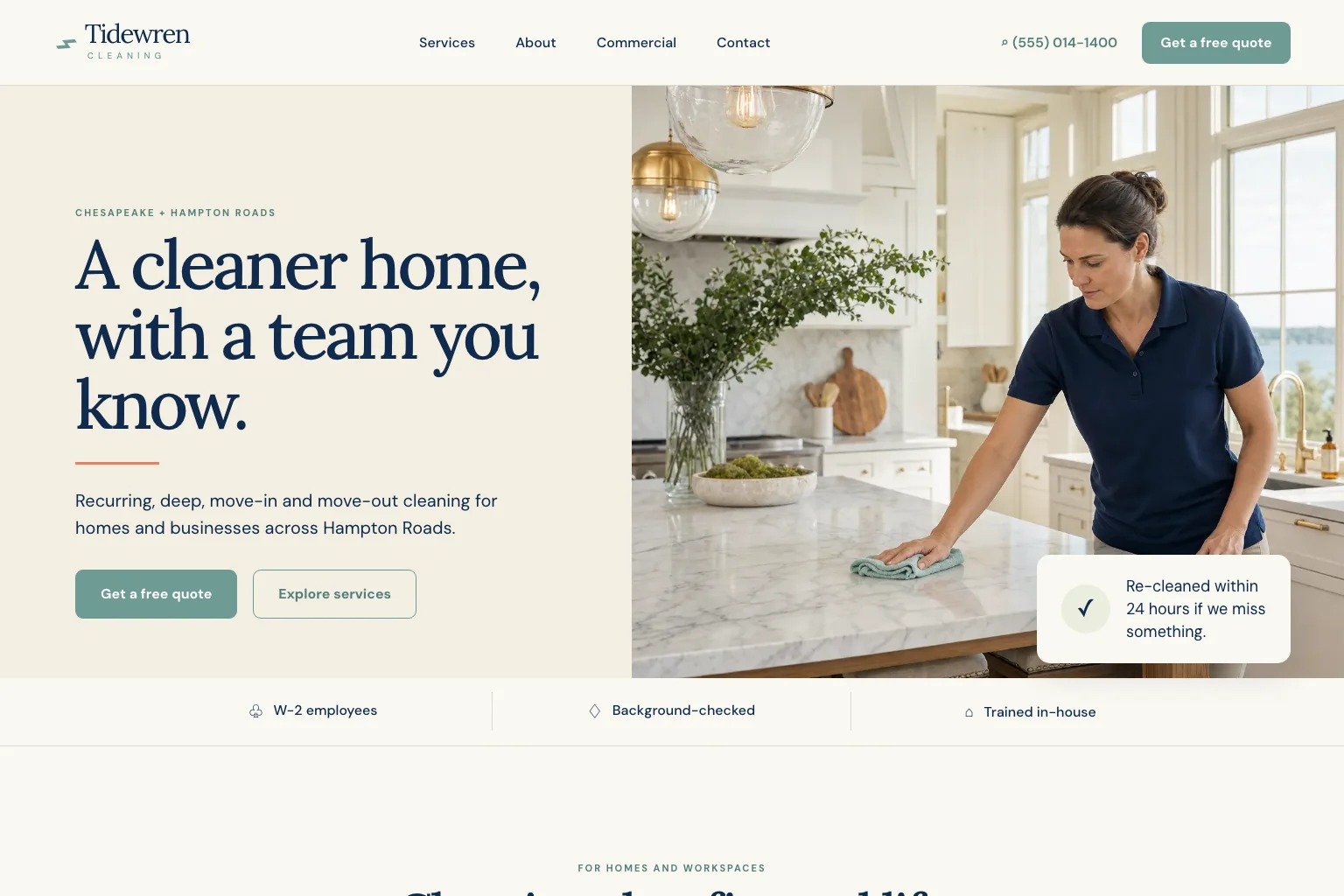
A homeowner wants a recurring clean and wonders whether to trust a stranger with a key. An office manager wants a nightly crew and a certificate of insurance for the landlord. One page cannot speak to both. The cleaning demo Theo built splits residential and commercial into separate pages and takes requests through a free quote form. It also describes its background-checked, W-2 team, promises a re-clean within 24 hours if something is missed, and lists its service areas across Hampton Roads.
Copy this: split the page when two kinds of customer would read it differently, and give each its own proof. The homeowner wants to know who will be inside the house, so the team details and a photo of the crew belong on that page. The office manager wants the insurance certificate and a line about after-hours access.
- Say who the page is for in the headline: home cleaning or office cleaning, plus the town
- Put the background check and the re-clean promise beside the quote form
Services page example 3: an auto repair shop's page per repair type
A driver with a check engine light searches for the repair, not the shop: brake repair, transmission, air conditioning. The auto repair demo Theo built gives each repair type its own page, so each search lands on its own answer. The site also carries the practical details: an estimate request, hours, the address with directions, and reviews.
Copy this: keep the same next step and the same practical block on every service page, because a driver who lands on the brake page from a search never sees the homepage.
- Name the repair and the town in the headline
- Place reviews that mention this repair beside the estimate button

Services page example 4: a barbershop's services and prices page
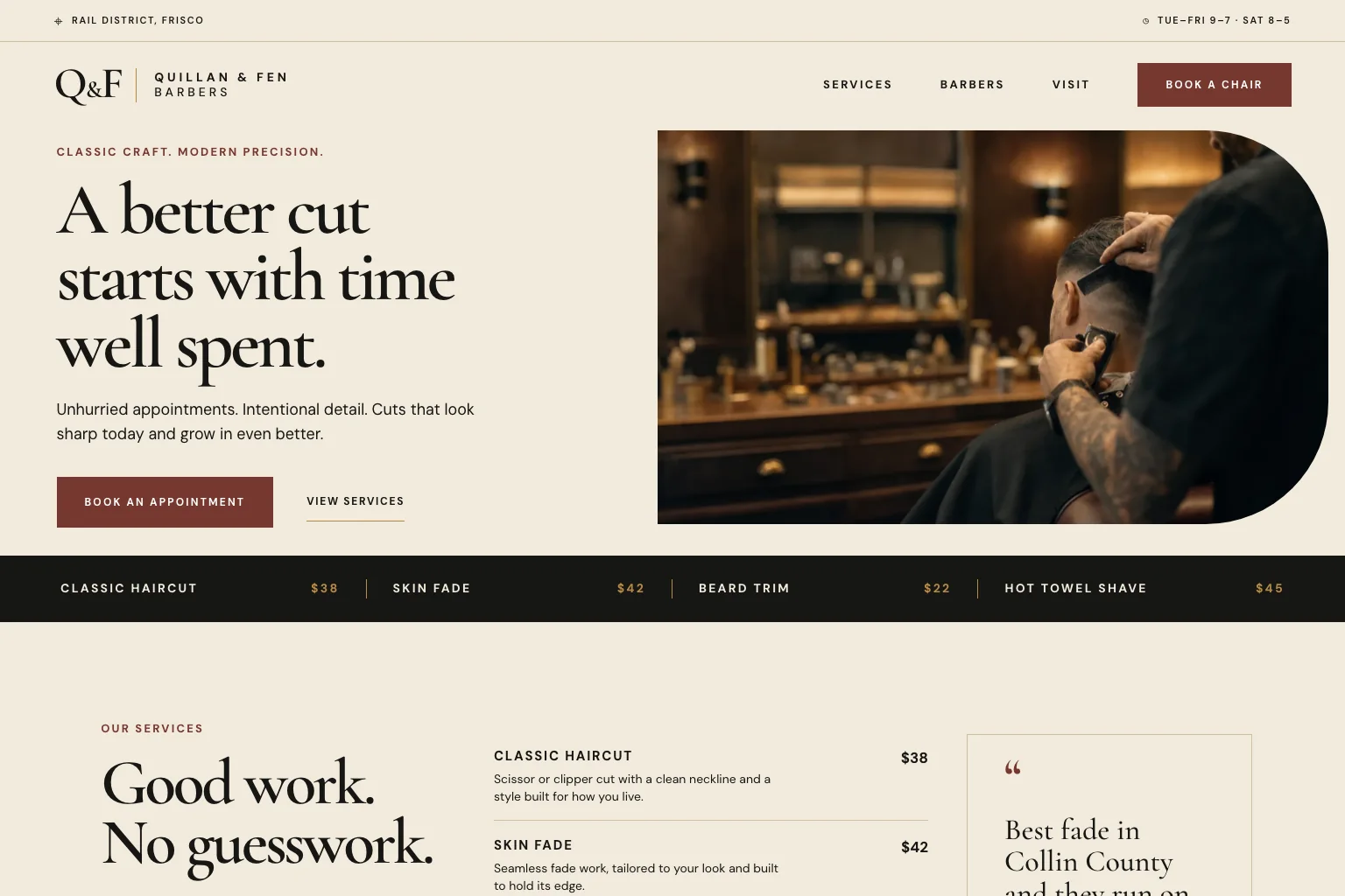
A barbershop's services page is a price list, and it should look like one. The barbershop demo Theo built lists each service with its price and keeps the booking link in the header on every page. Barber profiles let a customer choose a person as well as a cut, and a visit page covers location and parking.
Copy this: when the price is fixed, print it. Nothing on a barbershop page should require a call. The profiles do a second job: a first-time customer picks a barber from a photo and a two-line bio instead of taking whoever is free.
- Show how long each service takes beside its price
- Answer the two questions walk-ins ask: where to park and whether walk-ins are taken
Services page example 5: a dental practice's treatment pages
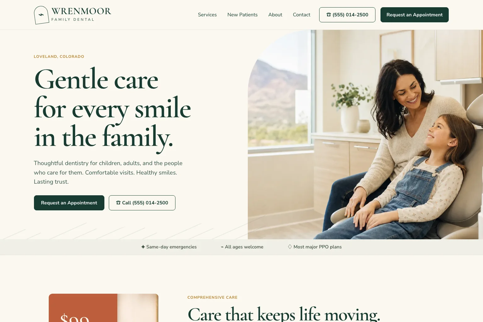
A dental patient's first questions are about cost and comfort, not the dentistry. The dental demo Theo built gives preventive, restorative, cosmetic and emergency care their own pages. It answers the money question once, with its insurance, membership plan and financing details in one place. There is also a new patient page. The next step is an appointment request form on the site, with a call button beside it, and the form asks only for a name, contact details and a short message.
Copy this: answer the question every service raises in one place. Insurance applies to a crown and to a cleaning alike. Answering it once, with the accepted plans named, keeps every treatment page short. A treatment page then has room for what the patient wants to know: what happens at the visit, how long it takes and whether it hurts.
- Explain the treatment in the order it happens, in the words a patient would use
- Show the dentist's credentials beside the treatment, not only on the About page
Services page example 6: a med spa's treatments page
A med spa sells a service the visitor is nervous about, so the page has to teach before it sells. The med spa demo Theo built explains each treatment on one services page and carries credentials, first-visit and safety information. It also includes a before-and-after gallery structure and ends with a consultation request form.
Copy this: proof beside the claim it supports. The credentials belong next to the procedure they qualify the provider to perform. A before-and-after photo belongs beside the treatment it shows, with a link to the full gallery.
- Open with who the treatment is for and who it is not for
- Describe the appointment step by step, including recovery time

Services page example 7: a veterinary clinic's services page
A pet owner searching at midnight needs the emergency answer before anything else. The veterinary demo Theo built covers wellness, dental, surgery and urgent care on one services page and pairs it with after-hours guidance. Appointment requests go through a form on the site, with a call button beside it, and team profiles introduce the staff.
Copy this: keep the urgent path one click from every page. Veterinary prices vary by animal and by what the exam finds, so the page should list the exam fee and state that a written estimate comes before treatment.
- Put the emergency and after-hours line above the service description, even on a wellness exam page
- Introduce the veterinarian who performs the service with a photo and credentials

Services page example 8: an immigration law firm's practice-area pages
A prospective client is choosing a lawyer for one kind of case and wants two things: does this firm handle it, and what will the process be. The immigration law firm demo Theo built gives each practice area its own page and carries attorney bios with credentials. A plain-language process page walks through how a case goes, and the next step is a consultation request form.
Copy this: separate what the firm does from how it works when the process needs its own page. A practice-area page states the cases handled and who the firm helps. A process page explains the steps, the documents and the timeline.
- Name the practice area and the city or state served in the headline
- Put the attorney's credentials beside the case type, then one consultation request

Services page example 9: a CPA firm's services by client type
An individual with a tax return and a business owner with payroll buy different work. The CPA demo Theo built splits services between individuals and businesses and adds a tax season page with a document checklist and deadlines. A client portal link sits in the header, and the team is listed with credentials.
Copy this: organize services by who is buying, not by what the firm calls them internally. A business owner should never read past a page about individual returns to find bookkeeping.
- Say who each page is for in the first line: individuals or businesses
- Add a seasonal page for the busy period, with deadlines and what to bring

Services page example 10: a photographer's session types page
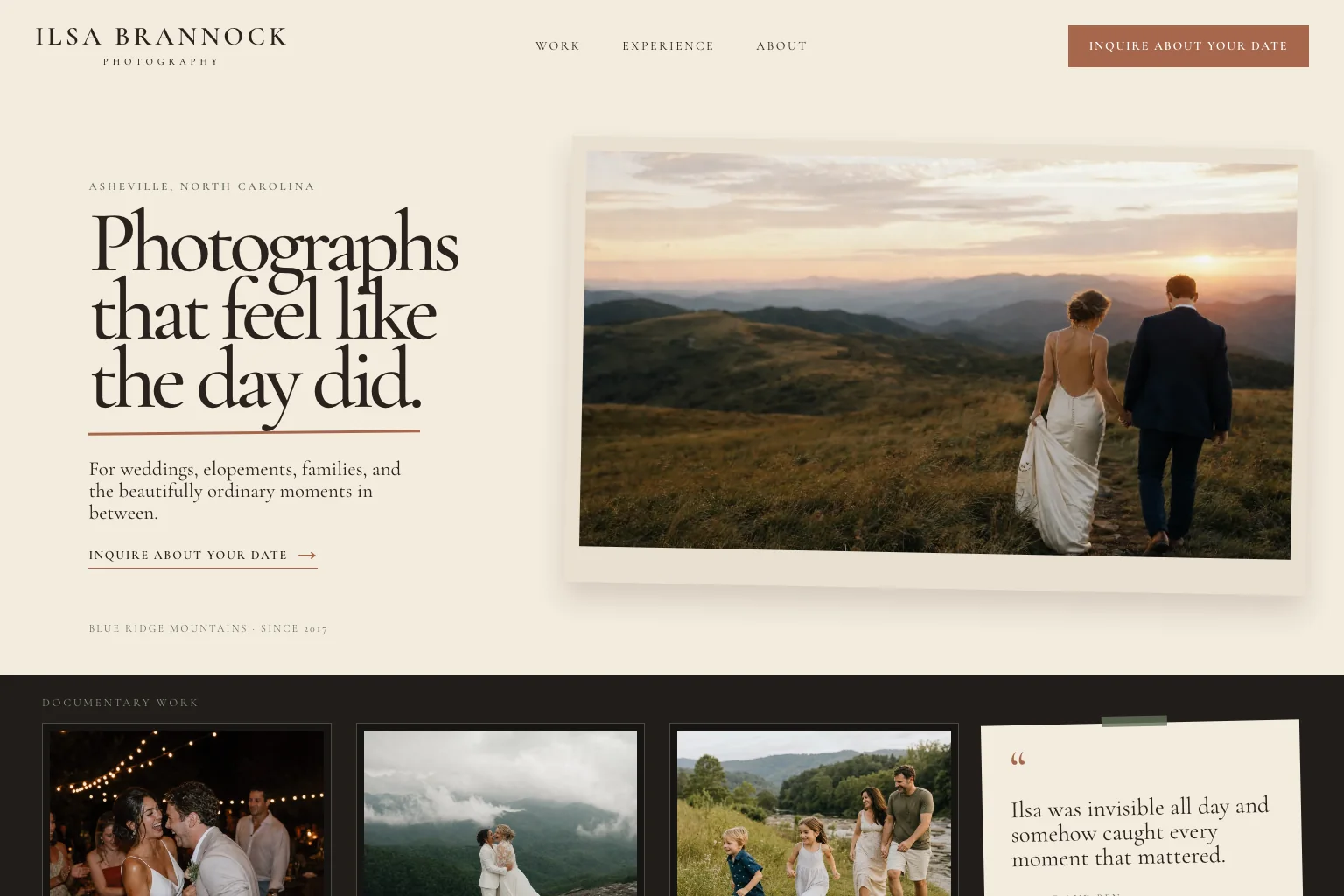
A couple or a family choosing a photographer looks first, then reads. The photographer demo Theo built leads with portfolio galleries for weddings, elopements and families. It lists session types with starting prices, ends with an inquiry form and adds a page about the photographer.
Copy this: packages with a price and an inclusion list beat 'contact for rates'. Each session type gets a name, the length, the number of edited photos, the delivery time and the price. A visitor who can compare three packages books, and one who has to ask often does not.
- Show the gallery for that session type on the same page
- State what a reschedule costs
Services page example 11: a tutoring service's subject pages
The parent is the buyer and the student is the user. The tutoring demo Theo built gives subjects and test prep their own pages and explains how sessions work. The next step is a parent consultation request form, backed by tutor profiles and parent reviews.
Copy this: write for the buyer, not the user. The subject page answers the parent's questions: what the tutor covers, how a session runs, how progress is reported, what a session costs.
- Name the subject and the grade range in the headline
- Put parent reviews beside the consultation request form

Services page example 12: a business coach's programs page
A high-trust service needs a small first step. The business coach demo Theo built puts its programs and their prices on one page, with approach and about pages for the coach's background. Client stories get a page of their own, and the next step is a discovery call button that opens the coach's scheduler.
Copy this: for a service someone buys after a conversation, make the first step small and specific. A discovery call with a stated length costs the visitor nothing and gets them on the phone. A buy button on a coaching program does not.
- Name the outcome and who the program is for in the headline
- Put one client story with a result beside each program, and link to the full stories page

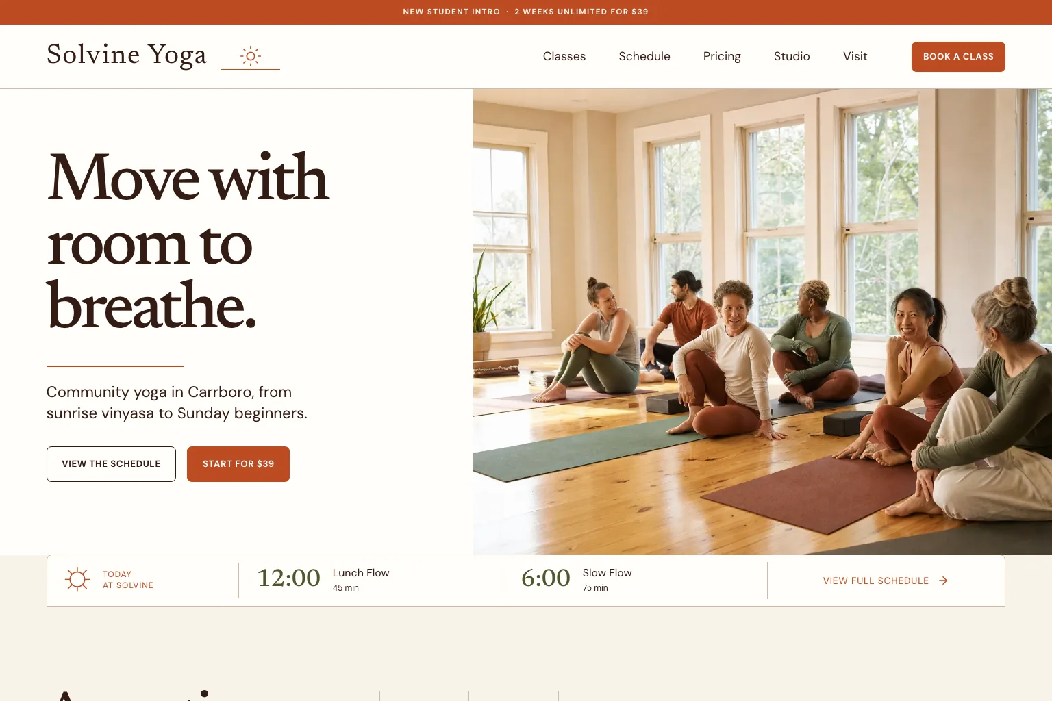
Services page example 13: a yoga studio's classes and memberships page
A studio sells a schedule and a membership, and a new student is nervous about walking in. The yoga studio demo Theo built points the booking buttons on its schedule at the studio's booking app and lists membership, class-pack and drop-in prices. It also adds a new student intro offer and introduces the teachers with profiles.
Copy this: put the first-visit answer next to the price. The membership and drop-in prices tell a regular what it costs, and the intro offer tells a beginner what a first visit costs. A beginner also needs to know what to bring and when to arrive.
- List the drop-in price beside the membership price, so a first visit has a number
- Put what to bring and when to arrive beside the intro offer, one click from the schedule
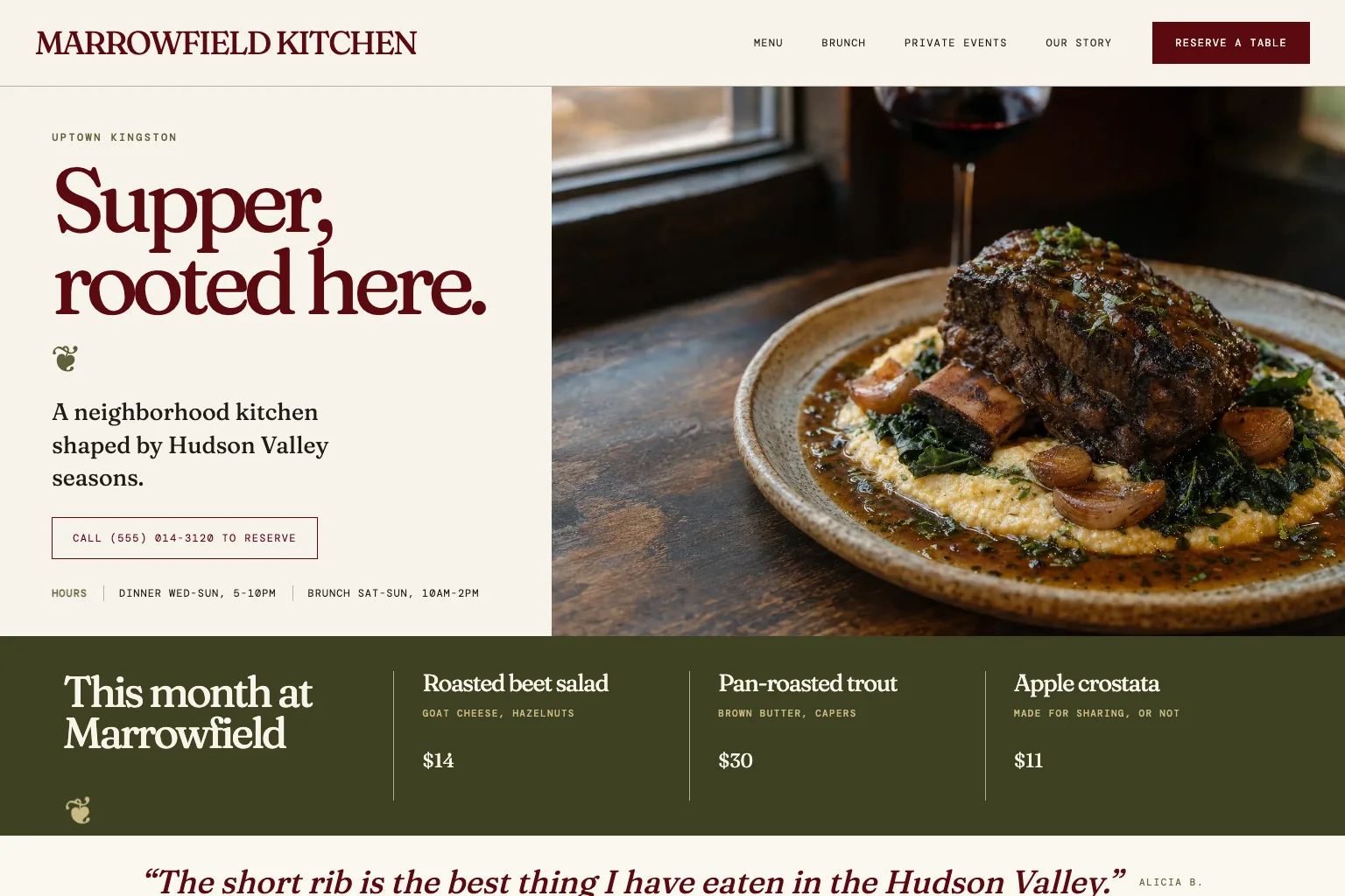
Services page example 14: a restaurant's events and catering page
A restaurant's services page is the catering and private events page. The neighborhood restaurant demo Theo built writes the menu as text so search engines can read it, and keeps hours and the address on every page. Guests reserve by phone through call-to-reserve buttons, a Google Maps link shows the way, and private events and catering get a page of their own with an inquiry form.
Copy this: give the service that needs a conversation its own page and its own next step. Dinner is booked with a phone call. A fifty-person event needs an inquiry form with the date, the head count and the occasion, plus a line about how fast the kitchen replies.
- Write the catering menu as text on the page, not as a PDF
- Show photos of past events, with the room capacity
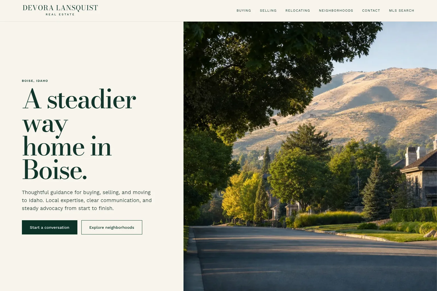
Services page example 15: a real estate agent's buyer and seller pages
An agent's two services are helping people buy and helping people sell, and the two customers arrive with different questions. The real estate demo Theo built writes buying, selling and relocating pages instead of a generic services page. It also adds neighborhood guides for the North End, the Bench, Meridian and Eagle, an MLS search link to the agent's listings tool, and a contact form.
Copy this: when a service is a process, write the page as a guide. A seller wants to know how pricing, prep, listing and closing go, in order. A buyer wants pre-approval, search, offer and close. Each guide should end with one next step: a call or a home value request.
- Say buyer or seller and the neighborhood in the headline
- Put recent sales in that neighborhood beside the call or home value request
How to write a services page in nine steps
The fifteen pages above share one method, and a business can write its own page with the steps below. The time in each step is for one page. The second page goes faster, because the proof, the process and the questions repeat with small changes.
- Pick one service and the words customers use for it (10 minutes). Search the service and the town. The phrases in the results, and in the questions listed under them, become the words for the headline and the questions block.
- Write the headline: the service and the place (5 minutes). 'Water heater replacement in Tucson' beats 'Hot water solutions'. The town in the headline is what lets the page match a local search.
- Write the fit paragraph (10 minutes). Two or three sentences about the customer's situation, not the company: who calls for this, what they are dealing with, what they want by the end.
- List what is included and what costs extra (15 minutes). Every step of the service, in order, and the two or three things quoted separately. This list is what the price is for.
- Put the price or how it is set (10 minutes). The pricing table below says what to show for each way of charging.
- Place the proof beside the claim (10 minutes). The license next to the service, the insurance next to the quote form, two reviews that mention this service under the price.
- Answer three to five questions (15 minutes). Pick the ones callers ask about this service, keep their wording, and give each answer two to four sentences.
- Write one next step and what happens after (5 minutes). 'Request a quote. A written estimate arrives within one business day.' The phone number sits under the button and dials with one tap on a phone.
- Link it and submit it (10 minutes). Link the page from the overview, two related services and the contact page, then submit it to Google. On Starter and Pro, Theo does the submitting through Search Console, where Google shows site owners how their pages appear in search.
Should a services page show prices
Usually, yes. The demos show four honest ways to do it. The barbershop lists each service with a price, the photographer lists session types with starting prices, and the yoga studio lists membership, class-pack and drop-in prices. The cleaning service and the auto repair shop take quote and estimate requests, which works as long as the page still says what moves the price. Not one of them leaves the price question blank.
The rule: publish the most precise number the business can stand behind. Show a fixed price where the job is fixed and a package where the work comes in bundles. Where the job varies, give a starting price and what moves it. Where a quote needs eyes on the job, give the cost of the visit. Any of those beats a blank, because a visitor with no number leaves for the competitor who gave one.
A business that sells tiers should offer three plans at most, named for the buyer or the outcome instead of Gold, Silver and Bronze. Put the price and billing period next to each name, and show only the differences that matter on each card. Do not hide the price to force a call. A trip charge, a deposit or a minimum should never appear later than the price. Put it in the same block.
When the number really cannot be published, publish the process for getting it instead. That is a price answer too.
| How the business charges | What to put on the page | Businesses it fits |
|---|---|---|
| One fixed price per service | The price beside the service name, with how long it takes | Barbershops, salons |
| Set packages | Three at most, each with a price and an inclusion list | Photographers, coaches |
| Membership or per session | Per-session and membership prices, and what a first visit costs | Yoga studios, tutors, med spas |
| Starting price or range | A 'from' price and the two or three things that move it | Cleaning services, landscapers |
| Quote after a visit | What the visit costs, what the quote is based on, how fast it arrives | Plumbers, roofers, auto repair |
| Flat fee for a defined job | The fee for common jobs, and where a custom quote starts | CPA firms, immigration lawyers |
| Per person or per head | Per-person ranges by menu and the minimum order | Caterers, event venues |
| Commission or percentage | How the percentage works and when it is paid | Real estate agents |
Services page design: the layout on a phone
Many visitors to a small business service page arrive on a phone from a search, so the layout has to work on a screen the width of a hand.
- The headline and the next step fit on the first screen. The phone number is tappable and sits in the header on every page, as on the plumbing demo, and the barbershop demo does the same with its booking link.
- The price block sits above the process, because a visitor scrolls for the price before reading how the job goes.
- Photos show the work or the people, not stock handshakes. The med spa demo's gallery structure and the photographer demo's portfolio galleries follow that pattern.
- Forms ask for three or four fields: a name, a way to reply, and what the job is. Anything else can be asked on the call.
Services page mistakes and the fix for each
Each mistake below has a fix that takes an afternoon. The proof mistakes cost the most, and the guide on how to build trust on a website goes through what to show and where. For the questions block, FAQ page examples has a question bank by industry that a services page can borrow from.
| Mistake | What the visitor sees | Fix |
|---|---|---|
| One catch-all Services page | A wall of everything the business does, with their own need buried in it | A short overview plus one page per service customers search for |
| A slogan for a headline | 'Quality you can trust' and no sign of whether the business does the job | The service and the place, in the words the customer searched |
| No price and no explanation | A page that reads as if it is hiding something | A price, a starting price, or what the visit costs and how the quote works |
| Proof on a separate page | A claim with nothing beside it | License, insurance and two reviews about this service, next to the claim |
| Five buttons | Call, email, book, quote and chat, all competing | One next step per page, with the phone number under it |
| The company's story where the customer's problem should be | 'Family owned and operated' before a single word about the job | Two lines about the customer's situation, with the story moved to the About page |
| A page that never changes | Last year's prices and a review that is years old | A quarterly read-through, and a change the same week a price or a policy changes |
Do services pages help a site get found on Google
Yes, because each page answers one search. A site with one Services page competes for eight searches with a single page. A site with eight service pages meets each search with a page written for it. A service-area page that names the towns, as on the plumbing demo, helps the same way with local searches.
In Theo's audit of 6,861 small business websites, 47 percent of the 4,633 sites with search data got an estimated zero visitors a month from Google search. Those sites are the ones whose owners ran the free audit, so they are not a random sample. The table splits the result by industry.
A page only earns traffic once Google has indexed it. The steps for submitting one are in how to get Google to index my site. On Starter and Pro, Theo submits each new page through Search Console as part of the search work.
One customer, named here with permission, shows what a growing set of pages can do. Buy My Lunch, a school lunch service, moved to Theo in June 2026. Its own Search Console data shows 929 clicks from Google search in the 90 days through September 27, 2026, against 131 in the 90 days before. Across those two periods, impressions climbed from 7,500 to 61,700 and the average position improved from 13 to 8 as new pages went live.
| Industry bucket | Sites with search data | Estimated zero visitors a month from Google search |
|---|---|---|
| Home services and trades | 440 | 36 percent |
| Professional services | 532 | 53 percent |
| Health, wellness and beauty | 407 | 35 percent |
| Food, hospitality and events | 329 | 37 percent |
| Nonprofits, education and creators | 478 | 46 percent |

Services page checklist
Read the page as a customer with one need and ten minutes. The checks are grouped by when they happen and who does them. On a Theo site, the owner types a change in chat, and the ongoing work on Starter and Pro takes on the search checks once the page is live.
| When | Check | Who |
|---|---|---|
| Before writing | The service has its own search phrase, price, process or buyer, or it stays a line on the overview | Owner |
| On the page | The headline names the service and the place, and the first two lines say who it is for | Owner |
| On the page | What is included is listed, what costs extra is named, and a price or what sets it is shown | Owner |
| On the page | The process is three to five steps and says what the customer provides | Owner or writer |
| On the page | Proof sits beside the claim it supports: license, insurance, credentials, reviews about this service | Owner |
| On the page | Three to five real customer questions are answered in the words customers use | Owner |
| On the page | One next step, what happens after it, and a phone number that dials | Owner or writer |
| Before publishing | The page links to the overview, two related services and the contact page, and reads well on a phone | Owner |
| After publishing | The page is submitted to Google so it can be indexed | Owner, or Theo through Search Console on Starter and Pro |
| Every quarter | Prices, hours, staff and reviews are still true, and any change is made the week the fact changes | Owner |
| Every quarter | The page's search phrase still brings visitors, or the headline and the questions get revised | Owner, or Theo's growth work on Starter and Pro |
How Theo builds the services pages
Theo drafts the services pages in the first build, which is free. The owner describes the business in plain English, names the services, the area and how they charge, and drags in photos. An owner with a site can give its address instead, and Theo rebuilds its pages as a draft. The first preview is usually ready in minutes. It is a multi-page starting draft with the main services in it, and the owner checks it and refines it in chat ('put the price above the process') before publishing.
On Starter, $69.99 a month and free for the first 30 days, the ongoing growth work drafts new pages and posts every week, service and area pages among them. Each draft waits in the Growth tab for the owner's review and goes live when the owner publishes it or turns on auto-publish. Published pages are submitted to Google through Search Console, and the work also refines the copy and calls to action over time. None of it uses chat credits, which pay for the edits the owner asks for in chat. Pro, $129.99 a month, adds more weekly pages and posts. An owner who wants only the site and hosting pays $29.99 a month on Basic, which includes chat edits and no growth program.
Frequently asked questions
What should a services page include?
Start with the service and the place in the headline, then who it is for and what is included. Follow with the process, a price or how it is set, proof beside the claims it supports, three to five customer questions and one next step. Put the price and the proof where the doubt comes up, not at the bottom of the page.
What is the difference between a services page and a service page?
The services page, plural, is the overview in the menu: every service with one line and a link. A service page, singular, sells one service and is the page a search should land on. Small sites need both: a short overview and one page for each service that customers search for on its own.
Should each service have its own page?
Yes, when customers search for it by name, it has its own price, process or questions, or a different kind of customer buys it. Services that fail all three tests stay as a line on the overview. The plumbing demo splits repair, drains and water heaters for that reason.
Should a small business publish prices on its services page?
Usually, yes, when the price can be explained honestly: a fixed price, package prices, a starting price with what moves it, or what a quote visit costs and how fast the quote arrives. Without any of those, the visitor has to guess or go elsewhere. When the number truly cannot be published, publish the process for getting it.
How long should a services page be?
As long as the decision needs and no longer. A haircut needs a price and a booking link. A water heater replacement needs the fit, what is included, the price or how it is set, the license, reviews and the next step. Cut repetition, not the detail a customer would otherwise call to ask.
How many services should be listed on one page?
On the overview, all of them, one line each. On a single-service page, one, with the closely related services linked at the end. A page that tries to sell three services sells none of them well, because the headline, the price and the proof each have to cover three cases.
Do services pages help with SEO?
Yes. Each service page can match its own search, and a service-area page that names the towns helps with local searches, which one catch-all page cannot do. Theo's audit of 6,861 small business websites shows how many of the sites with search data get an estimated zero visitors a month from Google search. Rankings build over time, and a page written for each search is where they start.
How much does it cost to have Theo build services pages, and who owns them?
The first build is free, and its preview includes drafts of the main services pages for you to check before you decide anything. Site and hosting are $29.99 a month on Basic. Starter, $69.99 a month and free for the first 30 days, adds the ongoing work: new service and area pages drafted for your review, each one submitted to Google once you publish it. The pages, words and photos are yours, and you can cancel anytime. Before you leave, you can save your text and images on any plan, and Pro also lets you copy the site code from GitHub.
Services pages, built free and grown on Starter
Theo drafts services pages shaped like the fifteen above from a chat. The owner names the services, the area and how they charge, and Theo drafts the overview, the main service pages and their price blocks in a free first preview. On Starter, $69.99 a month with the first 30 days free, the set keeps growing one service or area page at a time. Each new page waits for the owner's review and is submitted to Google through Search Console once it goes live. An owner with a site can run the free audit to see how its services pages do in search today. An owner without one can build it free and read the first draft before deciding.
More like this in the guides and under page examples. The audit numbers quoted across these posts are in Theo's research.