
What the best small business websites have in common
Quick answer
A good small business website answers four things on the first screen: what the business does, where, why to trust it, and the one next step, such as call, book or ask for a quote. The pages behind it do the selling: one per service, one per town or route, prices or fees, a first visit page, the people by name. Below, 17 sites are walked through page by page and 52 more are listed by industry. All 69 are live sites Theo built, so you can open them on your phone. The one customer site, Buy My Lunch, comes with its own Google numbers.
Good small business websites look different from one trade to the next, yet the strongest of these 69 sites share six habits, whether the business clears drains or files tax returns.
- The first screen says what and where in the customer's words, like 'Fort Collins residential electrician' above Wendroth Electric's headline.
- One next step, worded for how people buy, sits in the header and again under the headline: Call the shop, Book an inspection, Get on the route, Join us Sunday.
- Proof sits beside the claim it backs, such as the license line right under the plumber's name.
- Each service, town or kind of visitor gets a page of its own, so a search for it lands on a page about it.
- The awkward questions are answered before anyone calls: what the first visit costs, what isn't included, what happens after the form.
- Everything is text a search engine can read, from the typed-out menu to a phone number you can tap.
How these examples were built
Theo built these 69 sites in October 2026, across 17 trades. Each one started from a written description of the business (the services, the towns, the hours, the people, any prices, and what belongs on the first screen), and each then got a handful of changes typed in the chat, the way you would ask for them.
For each site you get a picture of the home page, the three pages behind it that do the most work with a link to open each one, what each page answers for the customer, and one idea to copy. The first site, a family plumber, is shown page by page with a picture of each. What separates great small business websites from the rest is mostly on those inner pages, so the notes spend more time there than on colors or fonts.
Which example fits your business
Start with the site closest to your trade, then read one or two that share your kind of customer. A pediatric dentist and a church sell very different things, but both have to settle a nervous first-time visitor, so each can borrow from the other.
| If you run a | Start with | Also read |
|---|---|---|
Plumbing, heating and cooling, electrical or roofing company | 9. Mobile vet, for a schedule by town | |
Contractor, deck builder, landscaper or lawn service | 4. Roofing, for an inspection as the first step | |
Cleaning or another one-person service | 3. Electrician, another business of one | |
Dental, veterinary, therapy or other health practice | 16. Church, for writing to a first-time visitor | |
Law, accounting, financial or insurance office | 10. Therapist, for fees before the first call | |
Restaurant, cafe, bakery or caterer | The five other food sites in the index of all 69, among them a bakery, a pizzeria and an office caterer | |
Church, nonprofit or community group | 8. Pediatric dentist, for a first visit page | |
Salon, barbershop, gym, auto shop or photographer | There is no example in these trades yet. Start with 7. House cleaner, a one-person service sold by the visit, and 15. Restaurant, for walk-ins and call-ahead orders | |
Business whose site already exists and needs to be found | Buy My Lunch, the customer site |
1. A family plumber's website, page by page
Built by Theo. Example 1 of 17 is Brauntigam Plumbing, a family plumber in Fredericksburg, Texas, with five Hill Country towns on its route. See the live site.
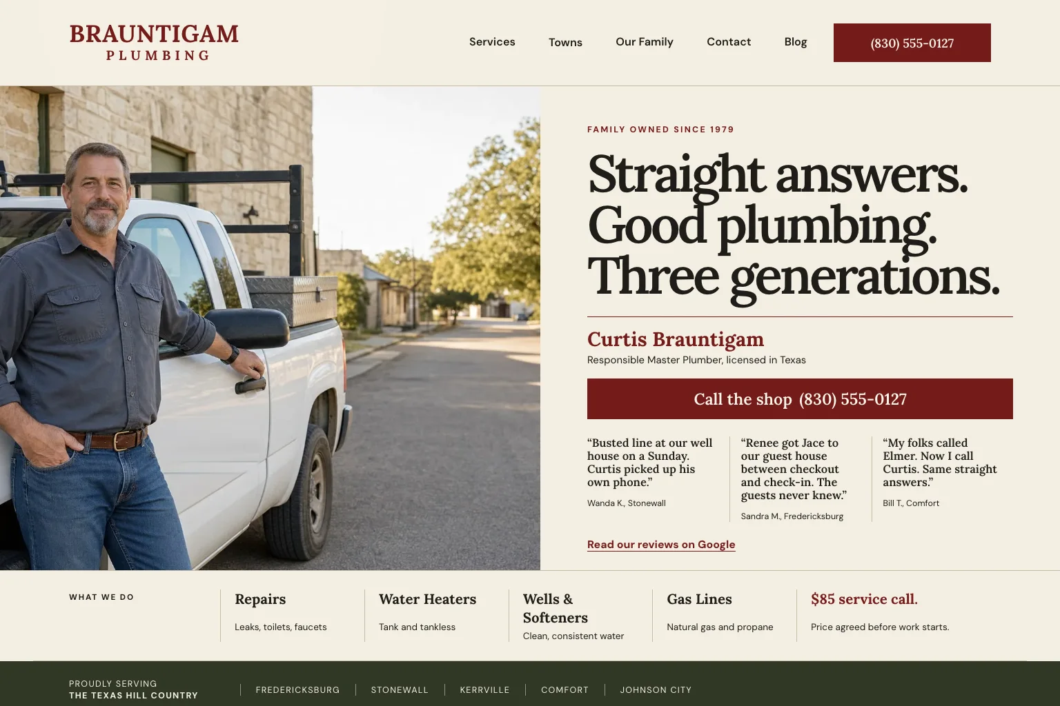
If you run a trade, study this one first. The people who call a plumber are homeowners and guest-house owners with water on the floor, usually on a phone, and they want three answers fast: will a person pick up, what will it cost, and does this shop know my town. The site answers them across thirteen pages: home, services, a well pressure tank repair page, a page for each of five towns, the family, contact, and a blog with a well and water section and its first guide. Here are five of them, with what to notice on each.
- On a phone, the top bar holds only the logo, a red button with the shop number and Menu, so a caller with a leak never has to open the menu. The owner and his truck come next, then the headline. See the live site on your phone.
- On a computer, pictured below, the owner's name sits under the headline with his master plumber license line right under it, then the call button, then three short review quotes, each signed with a first name, a last initial and a town. No stars, no rating number.
- Near the bottom of the first screen, one row names the four kinds of work and the rule every caller wants to hear: the price is agreed before work starts.
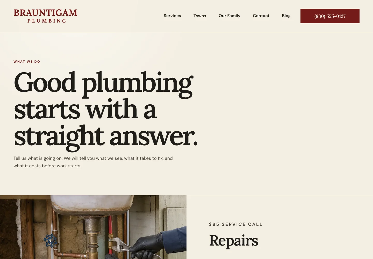
The plumber's services page: one block per job
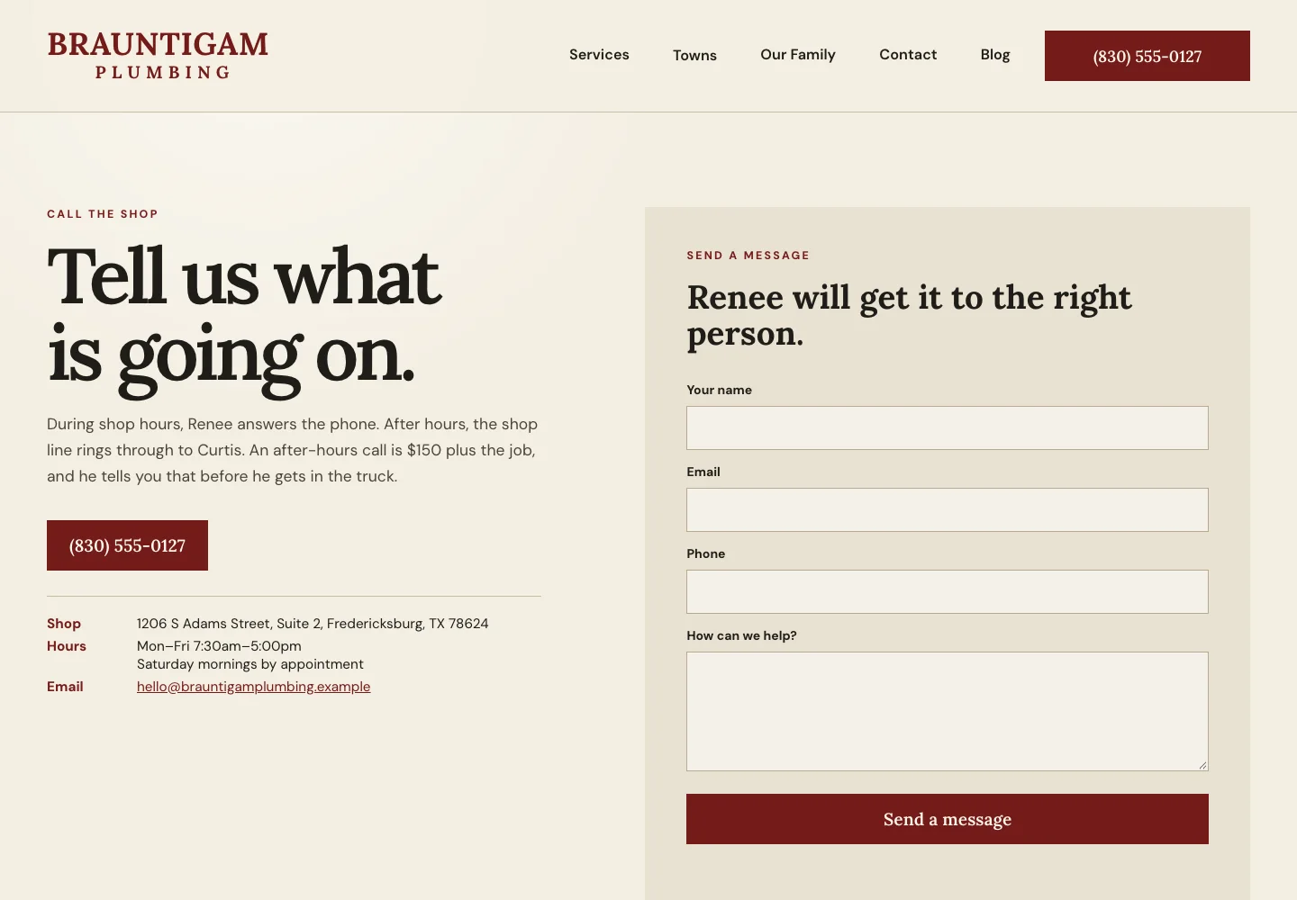
Brauntigam Plumbing, services page. A homeowner who already knows the problem skips the home page and wants to see that this shop does that job.
- The headline promises a straight answer, and the line under it says what happens on a visit: what the plumber sees, what the fix takes and what it costs, all before work starts.
- Each kind of work gets its own block (repairs, water heaters, wells and softeners, gas lines) with a short label above it, such as 'Wells and town water', and its own call link.
- The last block is for rental owners: a turnover list with a direct line to the office and a same-day slot when the shop can fit it in.
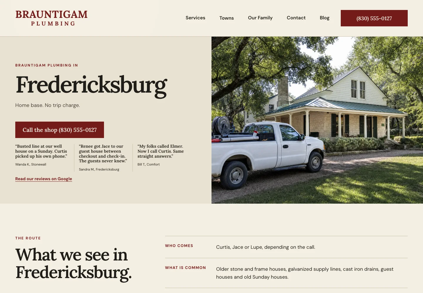
The plumber's town page: Fredericksburg
Brauntigam Plumbing, Fredericksburg page. A search for a plumber plus a town name needs a page about that town to land on, so each of the five towns has one.
- The town is the headline, and the line under it says whether a trip charge applies: Fredericksburg is home base with none, and the other four town pages give the drive time and the charge.
- The same call button and review quotes as the home page sit right there, so someone who arrives from a search never needs to find the home page.
- Further down, 'What we see in Fredericksburg' says who usually comes, the houses and pipes common in town, and the jobs done most there, each linked to its block on the services page.
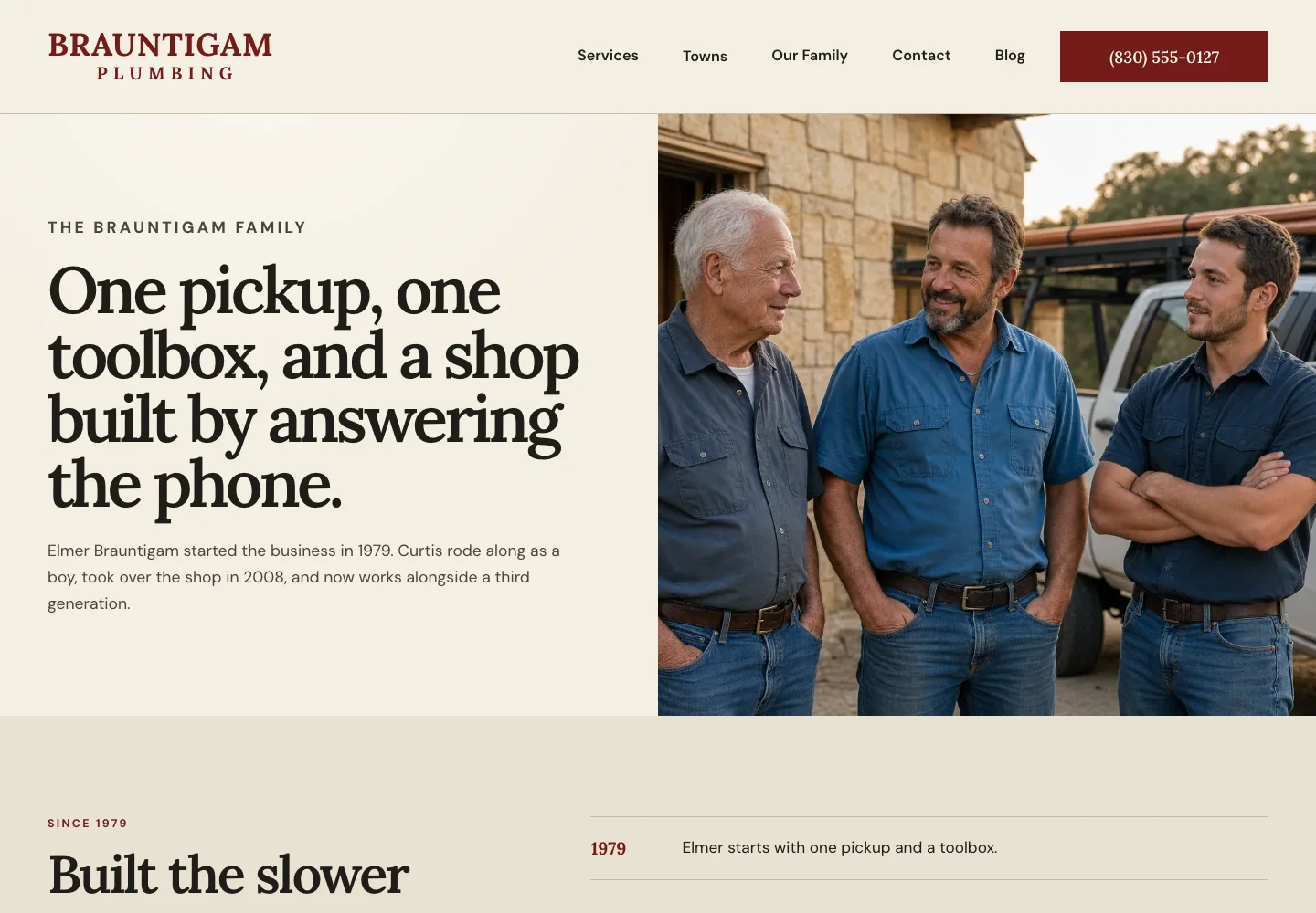
The plumber's about page: three generations by name
Brauntigam Plumbing, Our Family page. Before letting someone into the house, a careful customer wants to know who these people are.
- One photo of three generations, with the family story told in two sentences beside it.
- A short timeline runs from the first pickup to the third family member to earn a plumbing license.
- Lower on the page, each person who answers the phone or comes out is listed by name and role, with a license line under Curtis's and Jace's names and the state board named at the bottom.
The plumber's contact page: who answers, day and night
Brauntigam Plumbing, contact page. The whole site is thirteen pages besides privacy and terms, and five of them are town pages. See the live site and try it on your phone. The plumbing website design page has five more plumbing sites, from a 24-hour emergency plumber to a commercial plumbing contractor.
- The headline is the one step, in the customer's own words: 'Tell us what is going on.'
- The line under it says who answers during shop hours, who answers after, and that the after-hours charge is said before the truck leaves.
- The message form asks for four things (name, email, phone, what's going on) beside the address, the hours and the email. The contact page examples show more ways to set this page up.
2. Heating and cooling company website example
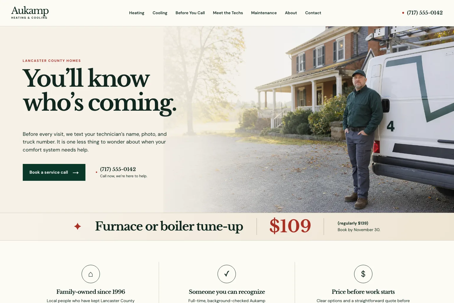
Built by Theo. Example 2 of 17 is Aukamp Heating & Cooling, a family heating and cooling shop in Lancaster, Pennsylvania. See the live site.
A homeowner with no heat wants someone soon, and wants to know who is coming before opening the door. The HVAC website design page has two more heating and cooling sites.
- First screen: 'You'll know who's coming' is the promise, and the line under it says the technician's name, photo and truck number arrive by text before each visit. Book a service call sits beside the phone number.
- Meet the techs: Everyone who might ring the bell, with a first name, a truck number and what they do best, plus a sample morning text.
- Heating: What a no-heat visit includes and, for a replacement, three written options at the kitchen table with no push toward the top one.
- Before you call: Safety first (smell gas, leave the house), then five checks in order, from the thermostat to the outside unit.
- What to copy: Show the faces who come to the door. The about us page examples show other ways to introduce your people.
3. Electrician website example
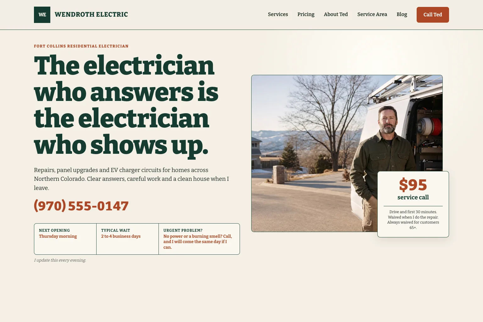
Built by Theo. Example 3 of 17 is Wendroth Electric, a one-person electrical business in Fort Collins, Colorado. See the live site.
Someone with a dead outlet wants to know when an electrician can come, what the first visit costs and who will show up. The electrician website design page has two more electrical sites.
- First screen: 'The electrician who answers is the electrician who shows up' tells you it is one man. A box under the phone number gives the next opening and the typical wait, updated every evening, and a card on his photo says what the service call covers and when it is waived.
- Pricing: What the first visit costs and covers, when the fee comes off, and typical ranges for common jobs.
- Panel upgrades: Signs a homeowner can check, what a day with the power off involves, and a typical range that includes the permit.
- Service area: The six towns, a shop address where no work happens, and when he calls back.
- What to copy: Say what the first visit costs and when you waive it. The service page examples cover prices pages in more depth.
4. Roofing company website example
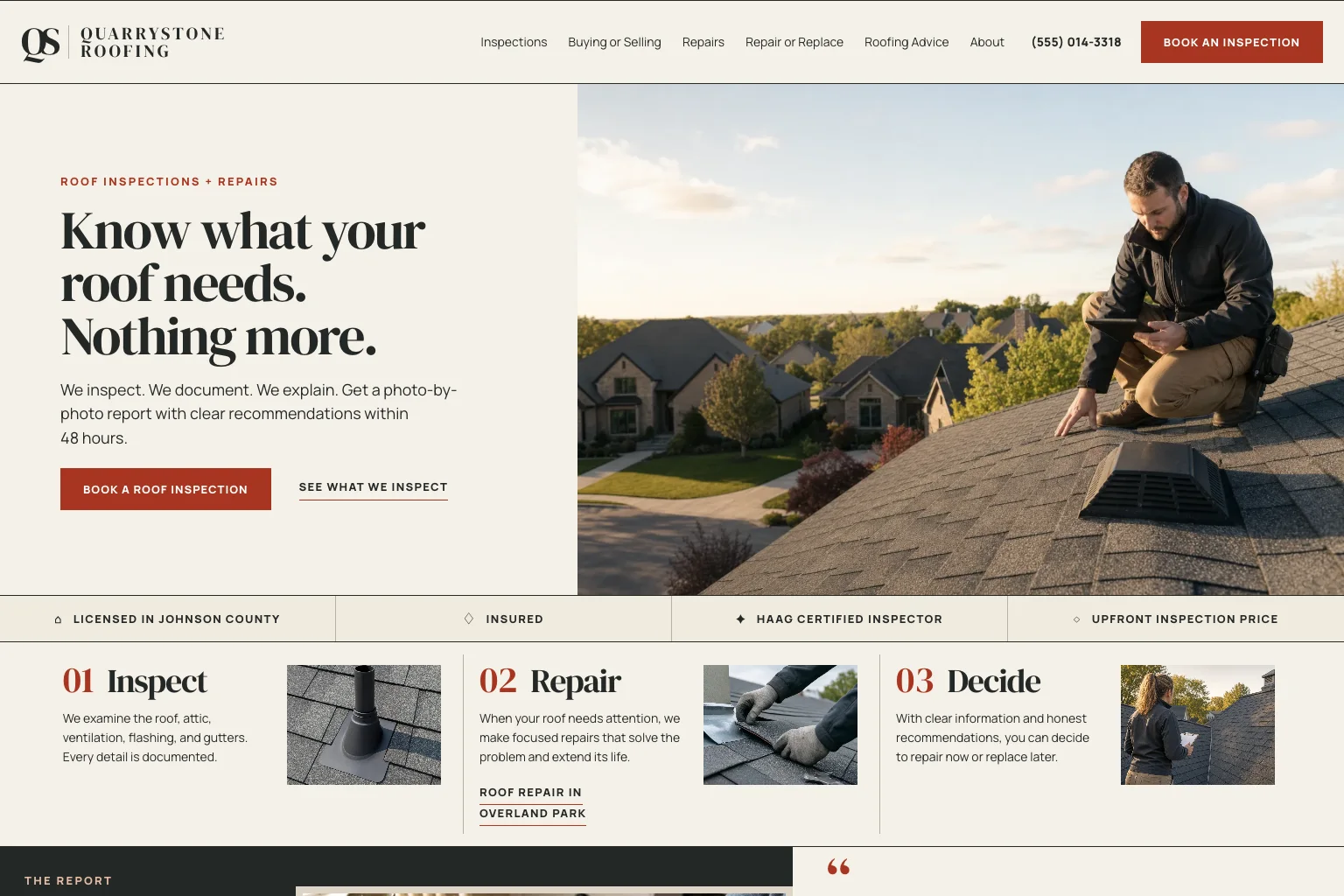
Built by Theo. Example 4 of 17 is Quarrystone Roofing, a roof inspection and repair company in Overland Park, Kansas. See the live site.
A homeowner with a ceiling stain, or a buyer whose inspection flagged the roof, wants an honest look before anyone quotes a new roof. The roofing website design page has two more roofing sites.
- First screen: 'Know what your roof needs. Nothing more.' The main button, Book a roof inspection, repeats in the header, and a strip under the photo lists the county license, the insurance, the inspector's certification and an upfront inspection price.
- Inspections: What the report covers, from shingles to the attic, and how each finding is marked: repair now, keep an eye on it, or good condition.
- Repair or replace: When a repair is usually enough, when to talk about replacing, and a plain line that a replacement quote is not the default.
- Book an inspection: A four-field form beside the phone, the address and the hours.
- What to copy: Answer your most-asked question on a page of its own, even when the honest answer sells less. The FAQ page examples show how.
5. Deck and porch builder website example
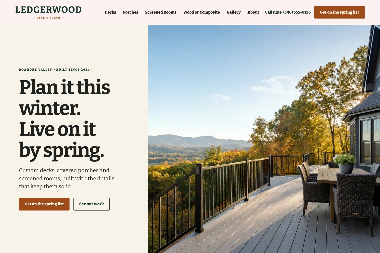
Built by Theo. Example 5 of 17 is Ledgerwood Deck & Porch, a deck and porch builder in Roanoke, Virginia. See the live site.
Someone picturing a new deck wants to see finished work and know when to call to have it by summer. The contractor website design page has two more contractor sites.
- First screen: 'Plan it this winter. Live on it by spring.' Get on the spring list leads, with See our work beside it, and the header names the person who answers the phone.
- Decks: New decks and rebuilds, the choices people make, and the parts nobody sees, such as footings below the frost line.
- Gallery: Every project captioned with the town, the size, the materials and how long it took.
- Spring build list: How many builds the list holds, when it has filled in past years, the five steps from site visit to footings, and a form to join.
- What to copy: Caption every project with where, what and how long, and if your season fills, say when. The service page examples show how to describe each kind of job.
6. Lawn care company website example
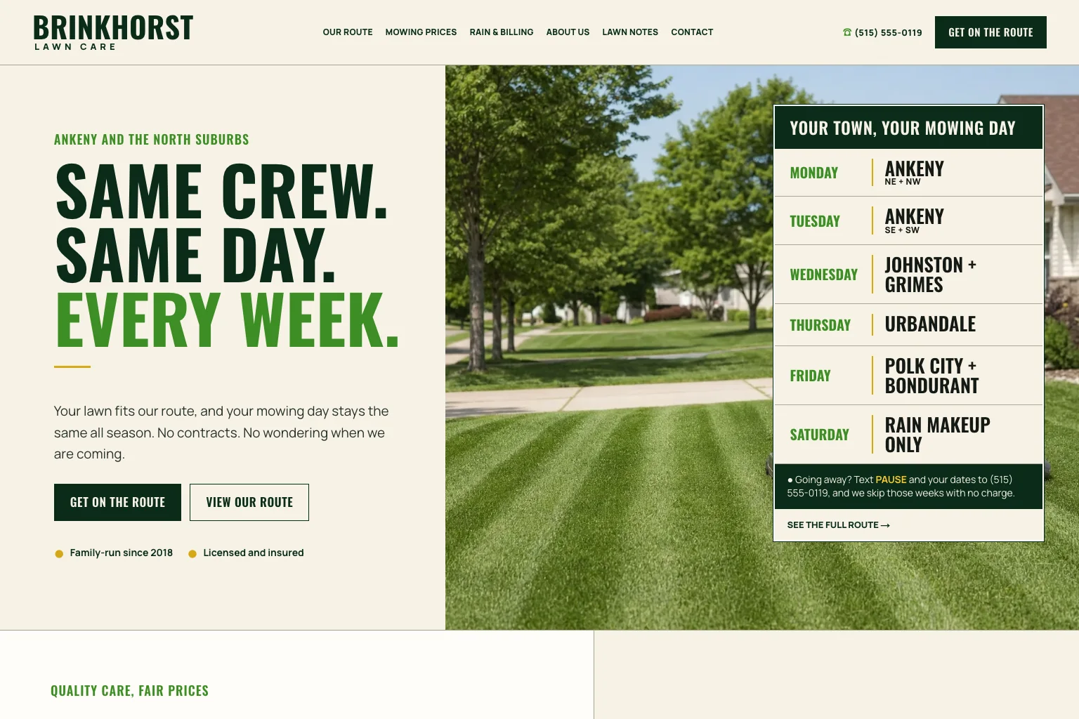
Built by Theo. Example 6 of 17 is Brinkhorst Lawn Care, a weekly mowing company in Ankeny, Iowa. See the live site.
A homeowner who wants the lawn cut weekly wants to know if you come to their street, on which day, and the price for their lot. The landscaping website design page has two more landscaping sites.
- First screen: 'Same crew. Same day. Every week.' A table on the photo gives each weekday's towns, with Saturday kept for rain makeup, and a line explains how to skip weeks while you're away. Get on the route leads.
- Our route: Three steps to get on the route, what to do on mowing day, which crew comes when, and what happens outside the listed towns.
- Mowing prices: A per-mow price by lot size, what every mow includes, a typical season's total, and monthly billing with no contract.
- Seasonal cleanups: Spring and fall cleanups, priced as a range by the job and fitted around the same route.
- What to copy: Tell people which day you're on their street. The service page examples show other ways to set out services and prices.
7. House cleaning website example
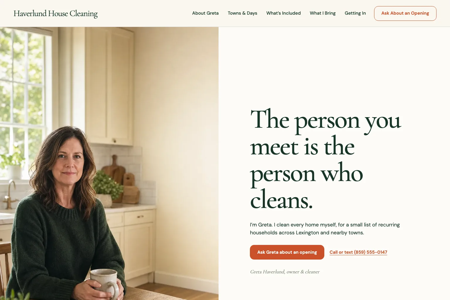
Built by Theo. Example 7 of 17 is Haverlund House Cleaning, a one-person house cleaning business in Lexington, Kentucky. See the live site.
Someone about to hand a stranger a house key wants to know who comes, whether there's room on their day, and what a visit includes. The cleaning company website design page has two more cleaning sites.
- First screen: 'The person you meet is the person who cleans.' Her photo fills half the screen, her name and role sit under the buttons, and the two next steps are Ask Greta about an opening and call or text.
- About Greta: Her story in her own voice, the one other person in the business (who never comes to your house), what happens when she's sick, and her insurance, bond and license.
- Towns and days: One route a day, each marked waitlist or one opening, and a plain line that she can't reach towns off the list.
- What's included: Everything a visit covers, price ranges by how often she comes, and what she doesn't do.
- What to copy: Publish a what's-included list, plus what you don't do. The about us page examples show how a one-person business can introduce itself.
8. Pediatric dentist website example
Built by Theo. Example 8 of 17 is Pebblefin Pediatric Dentistry, a pediatric dental office in Lafayette, Louisiana. See the live site.
A parent booking a first visit, often after a bad one elsewhere, wants to know whether they can stay in the room and what happens if it goes badly. The dental website design page has two more dental sites.
- First screen: The practice name, then 'Let's make the second visit easy' and the ages it sees. Request a first visit leads, with What to expect beside it, and right under the photo comes the answer to the first worry: 'Yes, you can stay in the room.'
- First visit: A stop to meet the chair beforehand, words to use and avoid at home, how the visit goes, and what they do if it isn't going well: stop and rebook.
- Insurance and costs: The insurance taken, the self-pay first visit, common treatment prices, and a written quote before any bigger plan.
- Calm options: Laughing air in plain words, when sedation is used, and 'There is no prize for pushing through a visit.'
- What to copy: Write a first visit page that answers a nervous person's worries before they call. The FAQ page examples show how to answer worries in writing.

9. Mobile veterinarian website example
Built by Theo. Example 9 of 17 is Quenby Mobile Veterinary, a house-call veterinarian in Wooster, Ohio. See the live site.
A pet owner whose dog shakes in the car wants to know if the vet comes to their town, on which day, and what a house call costs. The veterinary website design page has two more veterinary sites.
- First screen: 'Veterinary care, without the car ride.' Book a house call and a call-or-text number lead, and a strip under the photo shows the van's towns for each weekday.
- Van schedule: The route by day, the arrival window texted the day before, and what to do if you live just past a listed town.
- Prices: Every fee in one table, from the house call to a nail trim, with notes on distance and on several pets at once.
- What we treat: What can be done at home or in the van, what needs a clinic, and that the vet's notes go to your regular clinic the same day.
- What to copy: Say what you don't do, and where to go instead. The service page examples show how to set out what each service covers.

10. Therapist website example
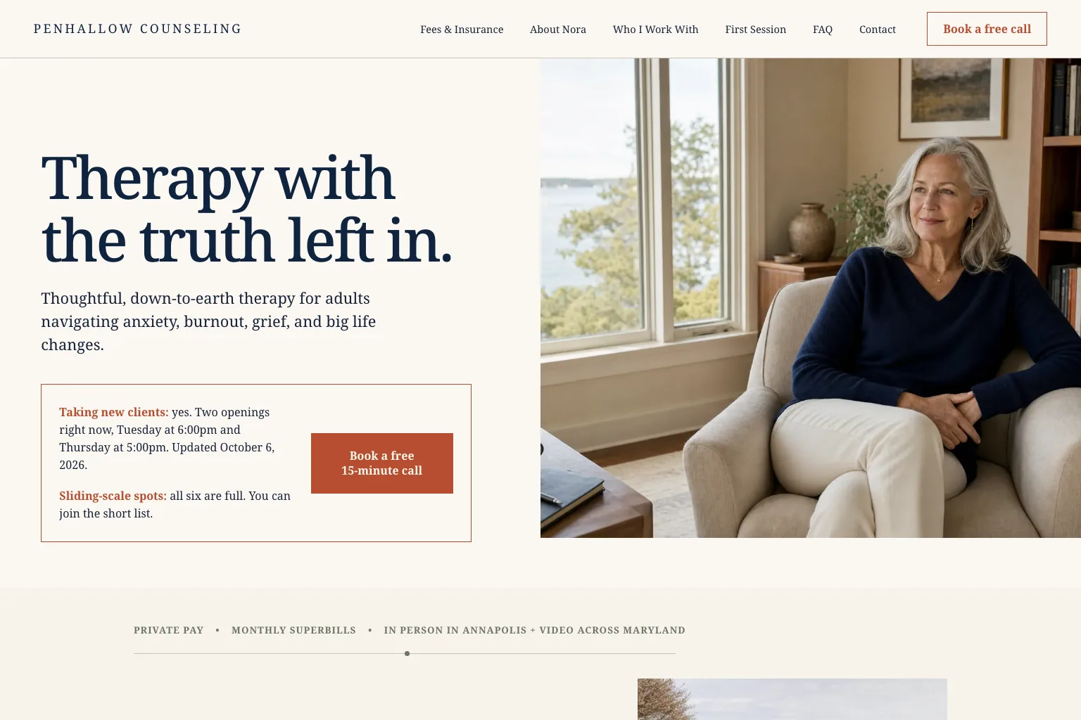
Built by Theo. Example 10 of 17 is Penhallow Counseling, a private-pay solo therapy practice in Annapolis, Maryland. See the live site.
Someone thinking about therapy, often for the first time, wants to know what it costs, whether there's an opening and who they'd be talking to. The website design for therapists page has two more therapy sites.
- First screen: 'Therapy with the truth left in.' A box around the booking button says whether she's taking new clients, which openings are free and when that was last updated. The next step is a 15-minute call at no charge.
- Fees and insurance: Every fee before the call, the sliding scale, how monthly superbills work for out-of-network benefits, and three questions for your insurer.
- First session: Five steps in order, ending with a check-in at the fourth session about whether it's helping.
- About Nora: Her license spelled out under her name, her background in her own words, and how she works.
- What to copy: Answer the cost question before anyone has to ask, and put a date on your openings. The about us page examples show more pages like hers.
11. Estate planning lawyer website example
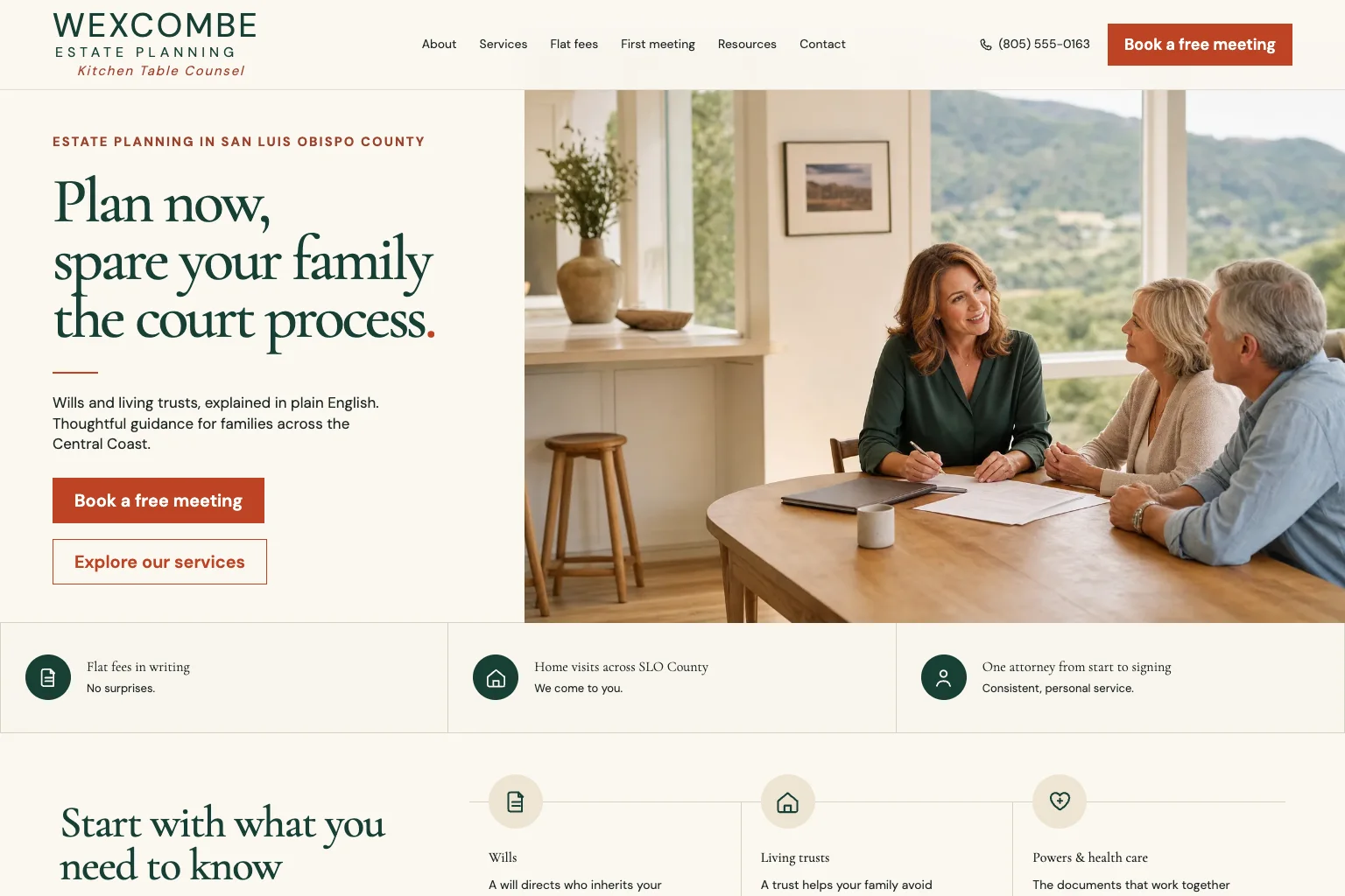
Built by Theo. Example 11 of 17 is Wexcombe Estate Planning, a solo estate planning attorney in San Luis Obispo, California. See the live site.
A family weighing a will against a living trust wants plain words, the whole cost in writing and someone who will come to them. The law firm website design page has two more law firm sites.
- First screen: 'Plan now, spare your family the court process.' Book a free meeting sits in the header and under the headline, and a strip under the photo promises fees in writing, home visits across the county and one attorney from start to signing.
- Flat fees: Two packages, each listing every document included, how payment is split, and which work is billed by the hour instead.
- Living trusts: How a trust works, the funding step that makes it work and who does it, and why many California homeowners choose one.
- First meeting: Where it can happen, what to bring (a rough list is enough), and who gets a home visit at no charge.
- What to copy: List what a package includes, not just what it costs. The service page examples show more service pages in plain words.
12. Bookkeeper website example
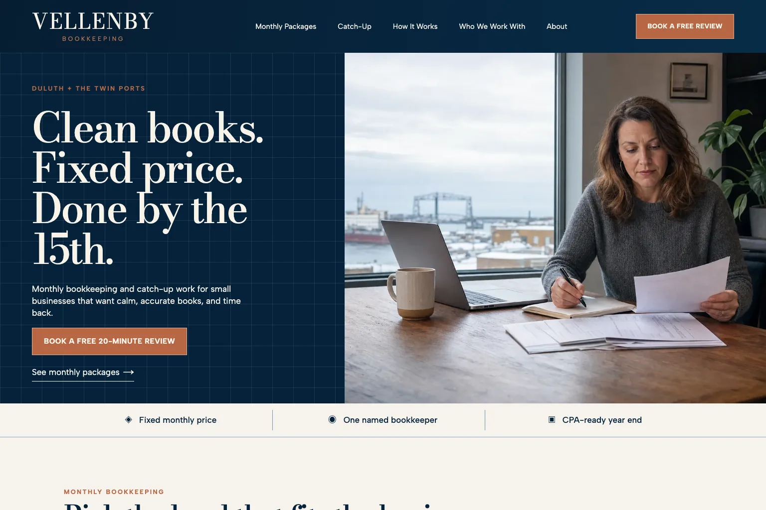
Built by Theo. Example 12 of 17 is Vellenby Bookkeeping, a bookkeeping practice in Duluth, Minnesota. See the live site.
An owner who is behind on the books, or tired of doing them at night, wants a fixed price, a set date and no lecture. The accounting website design page has two more accounting sites.
- First screen: 'Clean books. Fixed price. Done by the 15th.' One button, Book a free 20-minute review, then a strip with three promises: a fixed monthly price, one named bookkeeper, a year end ready for your CPA.
- Monthly packages: Three packages with who each fits, what each adds, what every package includes at no extra charge, and what stays with your CPA.
- Catch-up bookkeeping: Opens with 'No lecture', then the pricing, four steps, typical timing by how far behind you are, and that a box of receipts is fine.
- How it works: The monthly routine in four steps, when the reports arrive, and that questions don't go on the clock.
- What to copy: Give the embarrassed customer a page of their own. The service page examples show how to split one service into the pages people search for.
13. Financial advisor website example
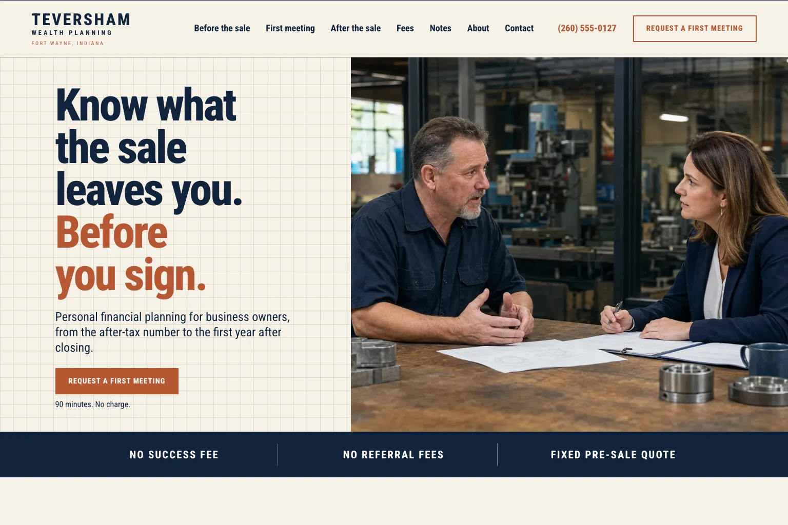
Built by Theo. Example 13 of 17 is Teversham Wealth Planning, a financial planner for owners selling a business, in Fort Wayne, Indiana. See the live site.
An owner thinking about selling the company wants to know what the sale will leave them after tax, before signing anything. The financial advisor website design page has five more advisor sites.
- First screen: 'Know what the sale leaves you. Before you sign.' Request a first meeting sits under the headline with its length and no charge, and a band under the photo reads no success fee, no referral fees, fixed pre-sale quote.
- Before the sale: The planning steps from years out to the first year after closing, with who sits at the table at each one.
- How we are paid: Each fee stated plainly, before and after the sale, and what the firm never takes.
- First meeting: What to bring, where to meet, and the one-page letter with a fixed quote that follows.
- What to copy: Say how you are paid. The service page examples show more ways to put fees on a page.
14. Insurance agency website example
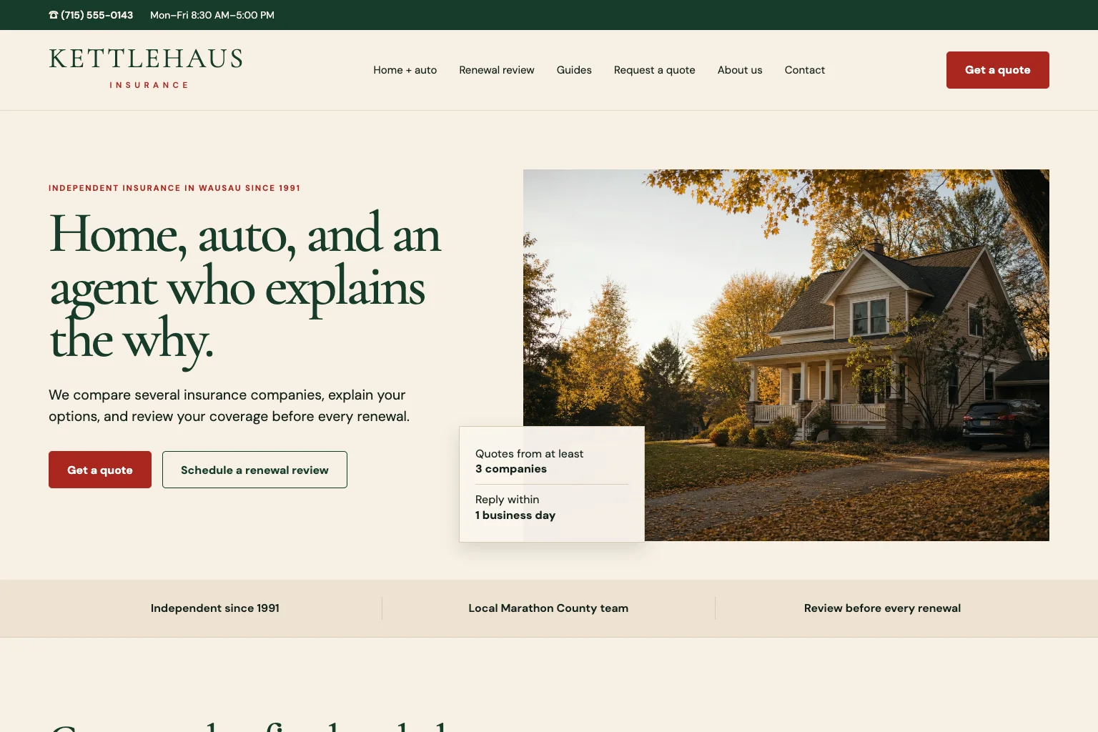
Built by Theo. Example 14 of 17 is Kettlehaus Insurance, an independent home and auto insurance agency in Wausau, Wisconsin. See the live site.
A household shopping for home and auto insurance wants to know if comparing is worth it, what they'll be asked and who calls back. The insurance agency website design page has five more agency sites.
- First screen: 'Home, auto, and an agent who explains the why.' Get a quote leads, with Schedule a renewal review beside it, and a card on the photo says how many companies they quote and how fast they reply.
- Home and auto: When they bundle and when they don't, the full list of what they need to quote both, and a note on the state minimum.
- Request a quote: Who calls back, when, and that a quote costs nothing, plus a line that the form never asks for a license or Social Security number.
- About us: Four people by name and role, and the licenses three of them hold.
- What to copy: Say what happens after someone fills in the form. The contact page examples show more forms that say what comes next.
15. Restaurant website example
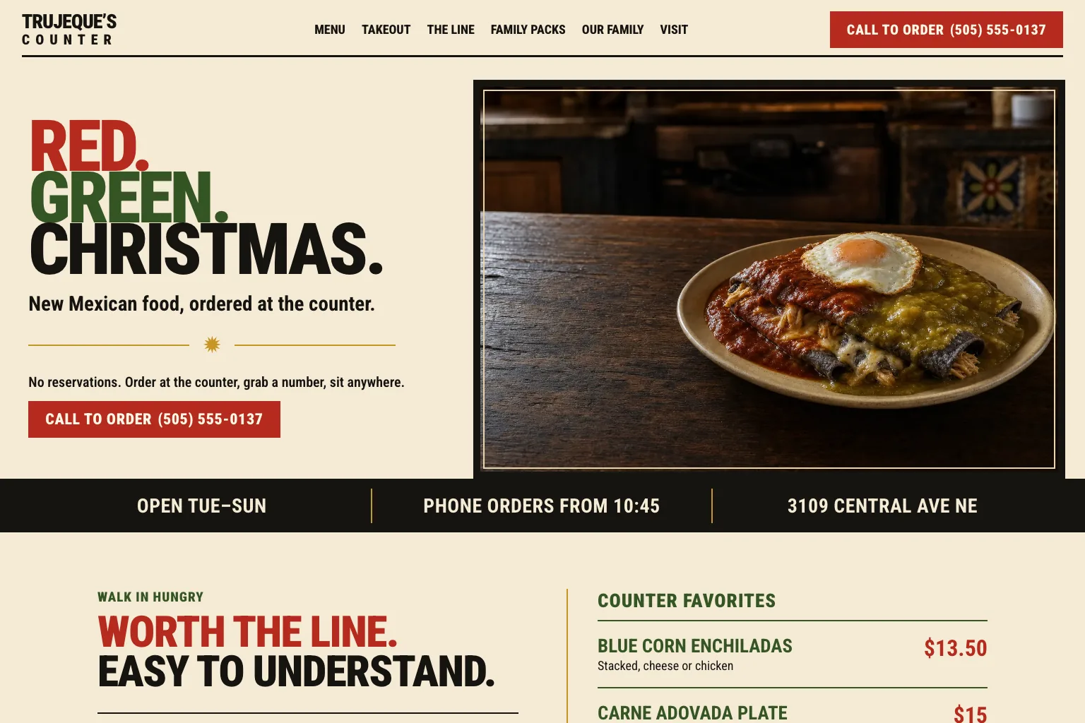
Built by Theo. Example 15 of 17 is Trujeque's Counter, a counter-service New Mexican restaurant in Albuquerque, New Mexico. See the live site.
A hungry person on a phone wants the menu, the hours, the address and a way to skip the line. The restaurant website design page has five more food sites, from a bakery to a caterer.
- First screen: 'Red. Green. Christmas.' over 'New Mexican food, ordered at the counter', then the no-reservations rule in one line. Call to order, with the number, sits in the header and under the headline.
- Menu: The whole menu typed as text, what every plate comes with, and how to order by phone.
- Takeout: Four steps with no app, typical pickup times, and the shelf by the side door where your order waits.
- Visit: The hours by day, what the weekend line looks like and how fast it moves, the quietest time to come, and where a big group should sit.
- What to copy: Type your menu out and say how ordering works. The contact page examples cover visit pages like this one.
16. Church website example
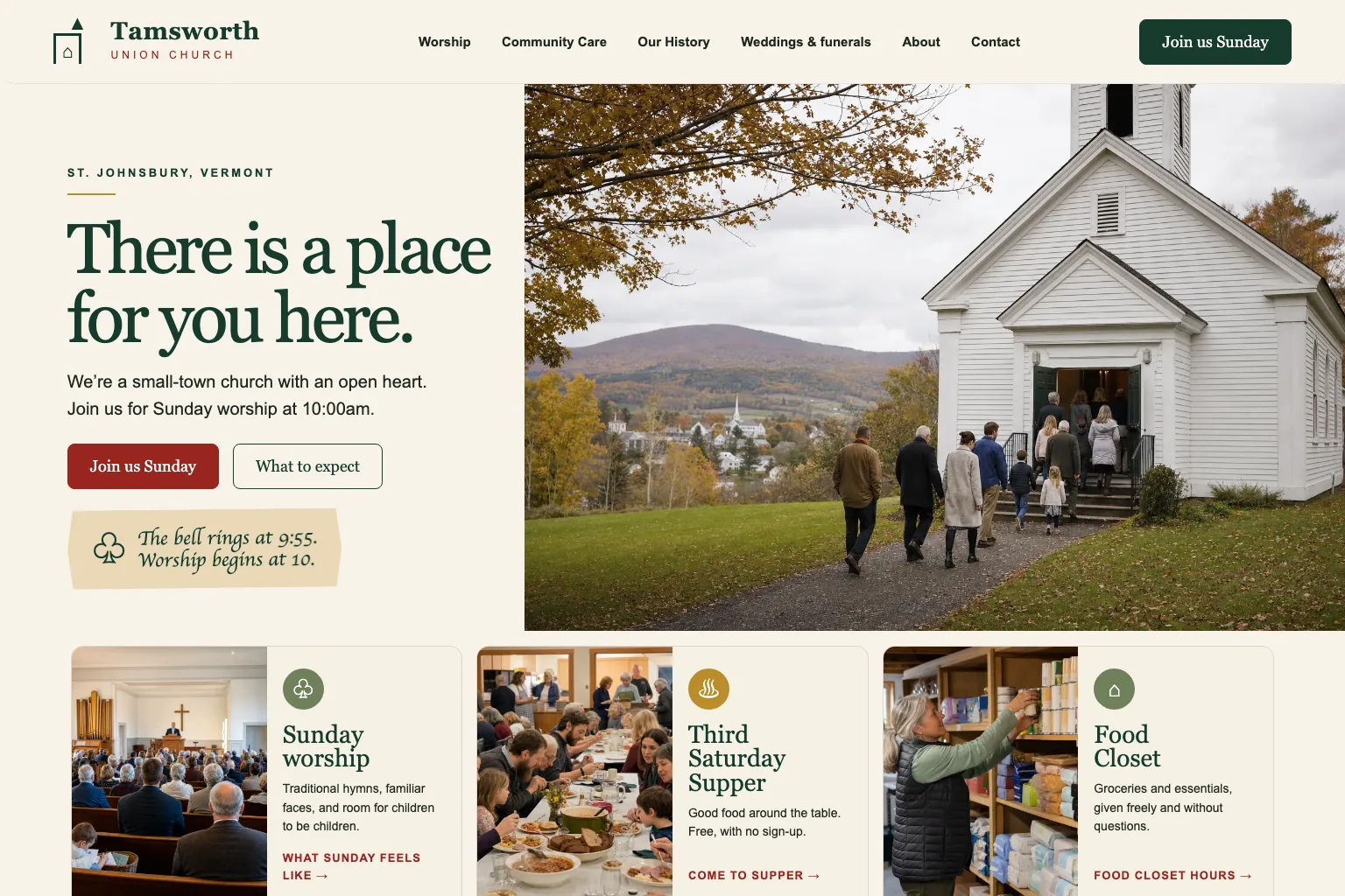
Built by Theo. Example 16 of 17 is Tamsworth Union Church, a small-town congregation in St. Johnsbury, Vermont. See the live site.
Someone who has never been inside wants to know when to come, what happens and whether they'll feel out of place. The church website design page has five more church sites.
- First screen: 'There is a place for you here.' under the town's name, with Join us Sunday and What to expect, a note giving the bell and worship times, and people walking up to the church door.
- Sunday worship: What a service is like, that children are welcome in it, what happens before and after, and how to get there.
- About our pastor: The pastor by name, how to reach her day or night for urgent care, and the volunteers, each with a role.
- Our history: The building's story by the church historian, with old photos beside new ones.
- What to copy: Write for the person who has never been inside. The about us page examples show more ways to introduce the people behind a place.
17. Food pantry website example
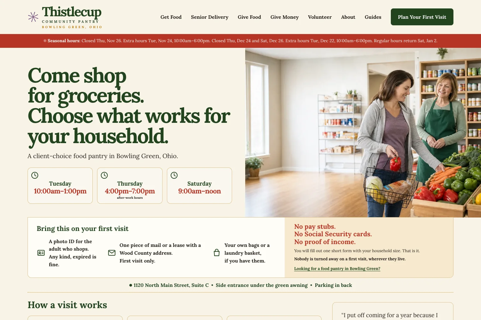
Built by Theo. Example 17 of 17 is Thistlecup Community Pantry, a client-choice food pantry in Bowling Green, Ohio. See the live site.
Three kinds of people come: someone who needs food, someone who wants to volunteer, and someone who wants to give. The nonprofit website design page has five more nonprofit sites.
- First screen: 'Come shop for groceries. Choose what works for your household.' The shopping hours sit in three boxes, holiday changes run across the top, and below come what to bring and what you don't need: 'No pay stubs. No Social Security cards. No proof of income.'
- Get food: Shopping times, what to bring, how shopping works, and the evening a Spanish-speaking volunteer is there.
- Volunteer: How to start (a short form, then a monthly orientation) and the jobs volunteers do.
- Give money: What a gift buys, monthly and memorial gifts, and a request not to send card details by email.
- What to copy: Give each kind of visitor a page and a menu item of their own. The website navigation guide covers naming them.
A customer site and its Google numbers
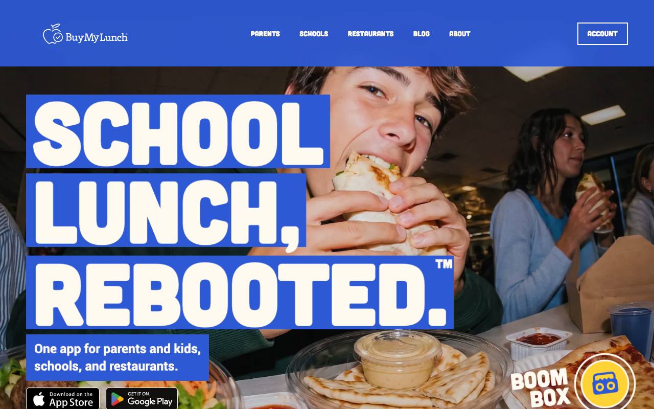
Buy My Lunch is a school lunch ordering service and a Theo customer, named here with the owner's permission, and it's here for what happened after its site moved to Theo in June 2026. Its own Search Console data (Google's free report of a site's clicks and impressions from search) shows 929 clicks from Google search in the 90 days to September 27, 2026, up from 131 in the 90 days before, about seven times as many. Impressions, the times a page showed up in results, went from 7,500 to 61,700 over the same two periods, and the average position improved from 13 to 8 as new pages went live.
That is one site's numbers, not a promise, and a lunch ordering service sells differently from a plumber. It shows the part a screenshot can't: a site that keeps getting new pages after launch gets more chances to be found.
Small business website ideas to copy from these sites
The same ideas turn up across trades, so the version that suits you may sit in another industry. The table names the sites that do each one and where to read more.
| Idea | Sites that do it | Read more |
|---|---|---|
One next step in the header, worded for how people buy | Call: Brauntigam Plumbing, Trujeque's Counter. Book: Aukamp Heating & Cooling, Quarrystone Roofing, Quenby Mobile Veterinary. Join a list: Ledgerwood Deck & Porch, Brinkhorst Lawn Care. Meet first: Wexcombe Estate Planning, Teversham Wealth Planning. Plan a visit: Tamsworth Union Church, Thistlecup Community Pantry | |
A page for each service | Aukamp (heating, cooling), Wendroth (repairs, panel upgrades, EV chargers), Wexcombe Estate Planning (wills, living trusts, powers and health care), Kettlehaus (home and auto, renters and condo, umbrella, motorcycles and boats) | |
A page for each town, or a route by day | Brauntigam (five town pages), Brinkhorst Lawn Care (a mowing day for each town), Quenby (where the van goes), Haverlund (towns and days) | |
Prices or fees on the site | 30 of the 69 sites have a page given over to them, among them Wendroth, Brinkhorst Lawn Care, Haverlund, Quenby, Penhallow, Wexcombe Estate Planning and Vellenby | |
A first visit or first meeting page | Pebblefin (first visit), Penhallow (first session), Wexcombe Estate Planning and Teversham (first meeting), Tamsworth (Sunday worship), Thistlecup (get food) | |
The people, by name and role | Aukamp (techs and trucks), Brauntigam (our family), Haverlund (about Greta), Kettlehaus (about us), Tamsworth (about our pastor) | |
A page to read before you call | Aukamp (before you call), Quarrystone (repair or replace), Wexcombe Estate Planning (start here), Vellenby (how it works) | |
Saying what you don't do | Haverlund (what I don't do), Quenby (what needs a clinic), Vellenby (bookkeepers, not CPAs), Teversham (not a business broker) | |
Saying what happens after the form | Kettlehaus (who calls back, and when), Teversham (a one-page letter with a fixed quote), Wexcombe Estate Planning (a written plan with the fee), Ledgerwood (a drawing and a line-by-line price) |
Which pages your kind of business needs
Leaving out the privacy, terms and cookie pages, these 69 sites have a median of 8 pages each, from 7 to 14. Every one has a phone number you can tap on the home page. The table shows the pages nearly every site in a group has, and the pages that set the strongest ones apart.
| Kind of business | Pages nearly every site has | Pages that set the best ones apart |
|---|---|---|
Home services and trades (24 sites: plumbing, heating and cooling, electrical, roofing, contractors, landscaping, cleaning) | Home, a page for each service (22 of 24), about, contact | A page per town or a route by day (Brauntigam, Brinkhorst Lawn Care, Haverlund), prices (Wendroth, Brinkhorst Lawn Care, Haverlund, Ashbrenner, Kettleborne), a page to read before calling (Aukamp, and Ashbrenner's page on finding the water shutoff), a gallery or project pages (Ledgerwood, Quintanar, Larkhollow Landscape Design), a page for property managers (Brindlewater, Ravelstone, Lastkey) |
Health practices (9 sites: dentists, vets, therapists) | Home, about or the team, contact or booking, prices or fees (all 9) | A first visit or getting-started page (Pebblefin, Kestrelmoor, Penhallow, Brindlecrest), calm options (Pebblefin), is this an emergency (Hartsfold), what we treat and what needs a clinic (Quenby), help right now (Kelderwick), the species we see (Lorikin) |
Offices (18 sites: law, accounting, financial advice, insurance) | Home, a page for each service (17 of 18), fees (11 of 18), about, contact | Start here (Wexcombe Estate Planning), how it works and catch-up (Vellenby), what to do about an IRS letter (Tullberry), request a certificate (Brunvald), the required disclosure forms (Rookwell, Fairhollow) |
Restaurants and food (6 sites) | Home, the menu typed as text (all 6), about, visit or contact | Call-in takeout (Trujeque's), private dining and events (Brisendine, Fernwhistle), a page per location (Brisendine), cake and holiday orders (Kvalheim), catering and the delivery area (Kelderhouse), trays for big orders and a delivery area (Mastrovalle's) |
Churches (6 sites) | Home, a page that tells a newcomer when to come and what happens, give (4 of 6), contact (4 of 6) | Kids check-in and safety (Merriweld Church), watch live (Kindlepoint), a page per campus (Wrenhaven), baptism, weddings and funerals (St. Brannock), a setup team page (Kettleridge) |
Nonprofits (6 sites) | Home, about, contact, a page for the people the group serves | Volunteer (Thistlecup), foster (Cottonwick), become a mentor (Sparrowgate), tuition and enrollment (Satchelbrook), fees and a sliding scale (Hearthmoor) |
The description each site started from
From the Brauntigam Plumbing description, word for word
"Founded 1979 by Elmer Brauntigam with one pickup and a toolbox; run since 2008 by his son Curtis Brauntigam, who rode along in that pickup as a boy. ... The owner on the first screen of the home page: a photo of Curtis standing by the shop truck ... the call button with the shop number, and three review quotes beside the call button. ... One page for each town the trucks cover, each with its own photo, the drive time from the shop, who usually comes, what we see most there, the trip charge, and the call button."
Every site here began the same way: a written description of the business in plain words, covering the services, the towns, the hours, the people, any prices to post, the license, a few customer quotes, and what belongs on the first screen.
After the first draft, changes were typed in the chat in plain words, the way you'd say them to a person. The first change typed for Brauntigam asked for the review quotes on every town page as well as the home page, and ended: "No stars and no rating numbers." The third produced the phone button described in example 1: "On phones, put a Call button with the shop number in the top bar next to Menu, so someone with a leak can call with one tap without opening the menu or scrolling."
The table gives the numbers for the first 65 of these sites, timed in October 2026. They describe these builds, not a promise for yours: your own time goes into gathering the facts and photos, and the build is the fast part.
| Step | For 65 of these sites |
|---|---|
The written description of the business | A median of about 890 words, roughly two typed pages |
First design previews ready | A median of 4 minutes |
First full draft of the site ready, from the start | A median of about 19 minutes (12 to 32) |
Changes typed in the chat after that | A median of 4 (3 to 5) |
Time for each change | A median of about 3 minutes |
All 69 sites Theo built, by industry
Here are all 69 sites, grouped by industry. Each name opens the live site, and each industry links to its page on Theo, where its sites sit side by side with what a site in that trade needs.
| Industry | Sites built by Theo |
|---|---|
Plumbing (6) | Brauntigam Plumbing, family plumber in a small town (example 1); Ashbrenner Plumbing, plumber who keeps office hours; Brindlewater Commercial Plumbing, commercial plumbing contractor; Haldencross Drain & Sewer, drain and sewer company; Hollisberg Water Heaters, water heater installer; Kettleborne Plumbing, 24-hour emergency plumber |
Aukamp Heating & Cooling, family heating and cooling shop (example 2); Copperlund Mechanical, commercial heating and cooling contractor; Vellacott Heat Pumps, heat pump and mini-split installer | |
Electrical (3) | Wendroth Electric, owner-operator electrician (example 3); Ravelstone Electrical Contractors, electrician for builders and property managers; Tamsett Generator & Electric, standby generator installer |
Roofing (3) | Quarrystone Roofing, roof repair and inspection company (example 4); Duvendeck Commercial Roofing, commercial flat roof contractor; Tolverud Metal Roofing, metal roofing specialist |
Contractors (3) | Ledgerwood Deck & Porch, deck and porch builder (example 5); Kjelstad Basements, basement finishing company; Quintanar Commercial Builders, small commercial build-out contractor |
Brinkhorst Lawn Care, lawn care and mowing company (example 6); Kolbusz Hardscapes, hardscape and patio contractor; Larkhollow Landscape Design, design-build landscaper | |
Cleaning (3) | Haverlund House Cleaning, one-person house cleaning business (example 7); Lanternwick Janitorial, office and janitorial cleaning crew; Lastkey Move-Out Cleaning, move-out cleaning specialist |
Dental (3) | Pebblefin Pediatric Dentistry, pediatric dental office (example 8); Hartsfold Emergency Dental, emergency dental clinic; Kestrelmoor Dental, dental office that takes no insurance |
Veterinary (3) | Quenby Mobile Veterinary, mobile veterinarian (example 9); Lanternfield Animal Emergency Hospital, emergency animal hospital; Lorikin Bird & Exotic Animal Clinic, exotic and avian clinic |
Therapy (3) | Penhallow Counseling, private-pay solo practice (example 10); Brindlecrest Counseling Group, group practice with several clinicians; Kelderwick Trauma Therapy, trauma and EMDR practice |
Law (3) | Wexcombe Estate Planning, solo estate planning attorney (example 11); Ellingsrud Family Law, family law practice; Kettleby Criminal Defense, criminal defense and DUI firm |
Vellenby Bookkeeping, bookkeeping practice (example 12); Thornquill CFO Advisory, fractional CFO and advisory firm; Tullberry Tax Resolution, Enrolled Agent for IRS problems | |
Financial advice (6) | Teversham Wealth Planning, planner for owners selling a business (example 13); Fairhollow Financial Group, advisor with a broker-dealer; Quillby Financial Planning, planner who meets every client by video; Rookwell Wealth Partners, firm with a team of advisors; Ambleworth Retirement Planning, fee-only retirement planner; Wrenholt Financial Planning, divorce financial planner |
Insurance (6) | Kettlehaus Insurance, personal lines agency (example 14); Brunvald Insurance, commercial agency for contractors; Callowell Life & Benefits, life and benefits agency; Hallendine Medicare Advisors, Medicare agency for people turning 65; Pelloquin Insurance, coastal agency that writes flood; Solvanez Insurance, new agent building a first book |
Trujeque's Counter, counter-service spot with no reservations (example 15); Brisendine Kitchen, restaurant with a second location; Fernwhistle Tavern, bar with a kitchen and live music; Kelderhouse Kitchen, kitchen that caters office lunches; Kvalheim Bakery, bakery that takes cake orders; Mastrovalle's Pizza, family pizzeria that delivers | |
Churches (6) | Tamsworth Union Church, small-town congregation (example 16); Kettleridge Church, church plant in a rented school; Kindlepoint Church, church that streams every service; Merriweld Church, church with a busy kids ministry; St. Brannock Catholic Church, Catholic parish with daily Mass; Wrenhaven Church, church with several campuses |
Nonprofits (6) | Thistlecup Community Pantry, county food pantry (example 17); Cottonwick Animal Rescue, animal rescue with foster homes; Harrowlight Community Arts, community arts group; Hearthmoor Community Counseling, counseling center with a sliding scale; Satchelbrook After-School Program, after-school program for working parents; Sparrowgate Youth Mentoring, youth mentoring nonprofit |
Homepage checklist
Check your own home page against these eight lines, on your phone and off the Wi-Fi. Each names a site above that does it.
- The first screen names what you do and where, in the words a customer would search (Wendroth Electric, Quenby Mobile Veterinary).
- One next step sits in the header and again under the headline, worded for how people buy from you (Quarrystone Roofing, Brinkhorst Lawn Care).
- Your phone number dials with one tap from the first screen on a phone (Brauntigam Plumbing, Trujeque's Counter).
- A photo of the person who answers or comes out, where a stock handshake would go (Haverlund House Cleaning, Aukamp Heating & Cooling).
- Proof beside the claim: the license line, the insurance, the credential, or a review quoted as text with a first name and a town (Brauntigam Plumbing, Quarrystone Roofing).
- Links to the pages people ask about most, such as prices or fees, the towns you serve and a first visit page (Quenby Mobile Veterinary, Penhallow Counseling).
- Hours, address and how to reach a person are written as text, not set inside a picture (Trujeque's Counter, Thistlecup Community Pantry).
- Anything that changes, such as openings, holiday hours or a seasonal list, is kept current or carries a date (Penhallow's openings line, Thistlecup's holiday hours).
Does a good-looking website get found on Google
Not by itself. In Theo's audit of 6,861 small business websites, 47 percent of the 4,633 sites with search data got an estimated zero visitors a month from Google search. The figures come from The State of Small Business Websites 2026, which covers the sites whose owners ran the free audit, so it is not a random sample. Across the industry groups below, the estimated share of sites with search data getting zero visitors from Google search runs from about a third to just over half.
Looks are not what separates the sites that get found. Those sites have a page for each thing people search for, Google has been told the pages exist, and new pages keep arriving. The sites above have the first part built in; the rest is ongoing work. On Theo that work comes with the Starter and Pro plans: keyword and competitor research, new pages and posts, technical fixes and page speed. Sitemap submission comes with every plan. It never uses chat credits. New pages, posts and fixes wait in the Growth tab until you publish them, unless you turn on auto-publish, and a weekly email counts what was added.
| Industry group in the audit | Sites with search data | Estimated zero visitors a month from Google search |
|---|---|---|
Health, wellness and beauty | 407 | 35 percent |
Home services and trades | 440 | 36 percent |
Food, hospitality and events | 329 | 37 percent |
Nonprofits, education and creators | 478 | 46 percent |
Professional services | 532 | 53 percent |
How to get a website like these built
These sites came out of the same steps an owner goes through, minus the domain. The step-by-step build guide covers the same ground for a site built anywhere, including what to gather first, and the small business website design page sets out what Theo builds.
- Describe the business to Theo in plain words: what you do, for whom, where, and the one thing a visitor should do first. If you already have a site, share its address instead; Theo reads it, rebuilds its pages as a starting draft and can keep its look. The first preview is usually ready in minutes.
- Refine it in the chat. Type each change the way you'd say it to a person, such as 'put a call button next to Menu on phones', and drag in your own photos. For these sites it was a median of 4 changes. For your own business the slow part is gathering the services, prices, photos, licenses and reviews.
- Pick a plan or start the Starter trial, then publish and connect your domain. Theo walks you through pointing it at the site, with and without the www. The switch usually takes a few hours while the registrar's records update, and your old site stays up until then. No domain yet? You can buy one inside Theo after publishing.
- When the domain is live, one Google sign-in lets Theo set up Analytics and Search Console for you. On Starter and Pro, the growth work switches on when the domain and both Google connections are in place.
- On Starter and Pro, look at the Growth tab each week. New pages, posts and fixes are drafted there for your review and go live when you publish them, and none of that work uses chat credits.
Frequently asked questions
How much does a small business website like these cost?
On Theo, a site like these is a monthly plan with no separate fee for the build. Basic covers the build, hosting and security. Starter adds the ongoing work to get the site found and is free for the first 30 days. Pro adds more chat credits, more weekly pages and read-only access to the site code. The current monthly prices are on the pricing page. Beyond the plan, the extras are top-up chat credits, a domain name if you buy it through Theo, and optional paid directory submission packages in the Boost checklist on Starter and Pro. A freelancer or agency usually quotes a project fee for the build and then a retainer for changes; the small business website cost guide compares the ways people pay.
How long does it take to build a site like these?
For 65 of the sites here, the first design previews were ready in a median of 4 minutes and a full first draft of the site in a median of about 19 minutes. Then changes were typed in the chat in plain words, a median of 4, at about 3 minutes each. Those are the times for these sites, not a promise for yours. Most of your time goes into gathering what the pages need: services, towns, any prices you post, photos, licenses and reviews. After you publish, connecting your domain usually takes a few hours while the registrar's records update, and your current site keeps running until then.
Who owns a website like these?
You do: the words, the photos and the pages, plus every page the growth work adds later on Starter or Pro. Theo does the hosting, and on Pro you can read and copy the site's code in GitHub as well.
What happens if I cancel?
There is no long-term contract. When you cancel, the confirmation shows the date your subscription ends; the site stays up until that date and goes offline after it. Save your text and images before then, and on Pro you can also copy the site code from GitHub. Your domain stays yours to point anywhere, and a domain bought inside Theo is registered in your name.
Can I open these sites on my phone?
Yes. Every one of the 69 is live, so tap any link here on your phone and use the site the way your customers would: open the menu, read a prices page, find the hours. Each one works on a computer too.
Can I copy one of these for my business?
Borrow any idea you like; that is what these examples are for. Theo doesn't hand you one to fill in. It writes your site from your own description, so the services, towns and prices are yours. If you liked something, say so in plain words in the chat, such as 'a page for each town I serve, like Brauntigam Plumbing' or 'a box under my number with my next opening, like Wendroth Electric'.
What do I have to give Theo to build a site like these?
A plain description of the business, written out or typed into the chat: what you do and for whom, the towns you serve, your hours and who answers, the services you want a page for, any prices you're willing to post, the people and their licenses, a few customer quotes, and the one thing a visitor should do first. Drag in your own photos if you have them. For these sites the descriptions ran a median of about 890 words, and each then took a median of 4 changes typed in the chat. If you already have a site, share its address and Theo reads it and rebuilds its pages as a starting draft.
Should I put my prices on my website?
If you can stand behind a price without seeing the job, usually yes, because it answers the question most callers have. Of the 69 sites, 30 have a page given over to prices or fees, and they show three ways to do it. A package that lists everything included, like Wexcombe Estate Planning's flat-fee packages. A range with what moves it, like Haverlund House Cleaning's price by how often she comes, set after the first clean. And the first visit's fee with when it's waived, like Wendroth Electric's service call. When the price depends on seeing the job, say what it depends on, the way Quarrystone Roofing's repair-or-replace page does.
How many pages should a small business website have?
Enough to give each common question a page. Leaving out the privacy, terms and cookie pages, the 69 sites have a median of 8 pages each, from 7 to 14. Most have a home page, an about page, a contact page and a page for each main service, and the rest depends on the business: five town pages for Brauntigam Plumbing, prices and a van schedule for the Quenby mobile vet, a first meeting page for the Teversham planner. On Starter or Pro, the growth work keeps drafting pages that answer searches, ready for you to publish.
What makes a good small business website?
It answers four things on the first screen: what the business does, where, why to trust it and what to do next. Behind it sit the pages that answer the next questions, such as a page for each service, prices or fees, a first visit page and the people by name. Everything is written as text a search engine can read, the phone number works with one tap, and the site keeps gaining pages after launch.
Can a site like these take bookings or orders?
Today a Theo site links to the booking, reservation and ordering tools a business already uses. For products, a Shopify or Wix store connects directly on every plan: products, prices and stock show on the site with a cart, and checkout completes on the store. Etsy, Big Cartel and Gumroad sellers keep their checkout and get a storefront that links to their real listings. A store on Square Online or WooCommerce can move to Shopify, which Theo recommends, or move to shop.yourdomain.com with the Theo site on the main domain; if neither is practical, the current site and store can stay where they are, with a separate Theo site on a subdomain such as blog.yourdomain.com.
A website like these examples, written from your own description
Theo writes your site from what you tell it about the business, with the pages your customers look for, one clear next step and your proof beside it. Basic covers the build and hosting. Starter adds the ongoing search work, with new pages drafted each week for your review, and is free for the first 30 days. Build the site free and see it before you decide. If you already have a site, run the free audit first to see how it does on Google.
More like this in the guides and under page examples. The audit numbers quoted across these posts are in Theo's research.