What makes a website call to action work?
Quick answer
A useful website call to action tells a visitor what to do next, what they will get, and how much effort the next step takes. “Call now for emergency repair,” “Request a kitchen estimate,” and “Book your first visit” work because each makes a clear promise. “Submit,” “Get started,” and “Learn more” are not always wrong, but they make the visitor do more guessing.
A call to action is not just the colored button at the end of a page. It is the handoff between the question a visitor came with and the action that solves it. On a plumbing page, that may be a tap-to-call number. On a restaurant page, it may be a reservation button. On a page for a custom renovation, it is usually a request for an estimate, because no honest website can promise a fixed price before someone understands the job.
The strongest calls to action feel like the next logical sentence in the conversation. A visitor has just read which services a business offers, who the work is for, what it costs or how pricing works, and why the business is credible. The button should now remove the final uncertainty: what should I do, and what happens when I do it?
That is why cleverness is optional. Clarity is not. A visitor who needs an emergency electrician does not need a branded phrase. They need to know whether the business can help, whether it serves their area, and how to reach someone. A visitor comparing a photographer may not be ready to book, but may be ready to see packages or ask about a date. Good calls to action respect that difference.
Think about the action in terms of the work required on both sides. A quick phone call is reasonable when the customer needs an immediate answer. A longer project needs enough detail for the business to give a useful response, so a short request form may be the better first move. The action should feel proportionate to the decision. Asking someone to complete a long form before they know whether you serve their area is friction. Asking a person to call for a complex project with no preparation can be friction too.
Choose the action before you write the button
Start with the real action the business can deliver today. Do not call a form a booking system if a staff member still has to confirm the time. Do not promise a free estimate if an on-site visit has a fee. Do not ask someone to call if the business wants to collect project details first. The button is a promise, and the page after it needs to keep that promise.
This small decision prevents a common source of weak inquiries. When the button and the destination disagree, visitors either leave or arrive annoyed. A person who clicked “Book an appointment” expects an available time and a confirmation. A person who clicked “Request an appointment” understands that the business will follow up. Both are useful routes, but they are not interchangeable.
| Visitor's situation | Best next step | Example call to action |
|---|---|---|
| Urgent problem | Direct phone call | Call now for emergency repair |
| Price depends on the job | Short quote or estimate request | Request a kitchen estimate |
| Live appointment availability | Booking calendar | Book your first visit |
| Ready to compare a fixed offer | Pricing or menu page | See services and prices |
| Still deciding whether the business is a fit | Relevant proof or process page | See how the process works |
| Ready to buy a standard product | Product or order page | Order online |
| Returning customer | Client portal, reorder, or schedule page | Schedule your next service |
Call to action examples for home service businesses
Home service visitors often arrive with a specific problem and little patience for a general contact page. The right call to action depends on urgency and on whether the business can price the work remotely. Keep the wording honest about the response a customer can expect, especially if service hours, service areas, or same-day availability have limits.
These examples work because they match a recognizable decision. Use the exact service in the label when it helps the customer self-select. A generic “Contact us” button can sit in the footer, but a service page deserves a route that tells a homeowner what happens next.
- Call now for emergency repair: for a true emergency line that someone answers or returns promptly.
- Request a water heater estimate: for a replacement that needs details about the home and current equipment.
- Check service-area availability: for a business that needs an address before confirming coverage.
- Schedule seasonal maintenance: for a real calendar or an established scheduling process.
- Send photos for a repair estimate: for work that can be triaged from images, with clear guidance on what to send.
- See our financing options: for larger projects when current, accurate financing information is available.

Call to action examples for appointments and bookings
Appointment businesses need to name the commitment accurately. “Book” is ideal when the visitor chooses an available time and receives confirmation. “Request” is better when staff approval, insurance verification, provider matching, or a follow-up conversation is part of the process. That one word sets the expectation before the visitor shares their information.
Avoid forcing every visitor into the same route. A new patient, a returning client, and someone with an urgent need may need different paths. The clearest site gives each visitor the action that matches their situation, then explains the next step nearby in ordinary language.
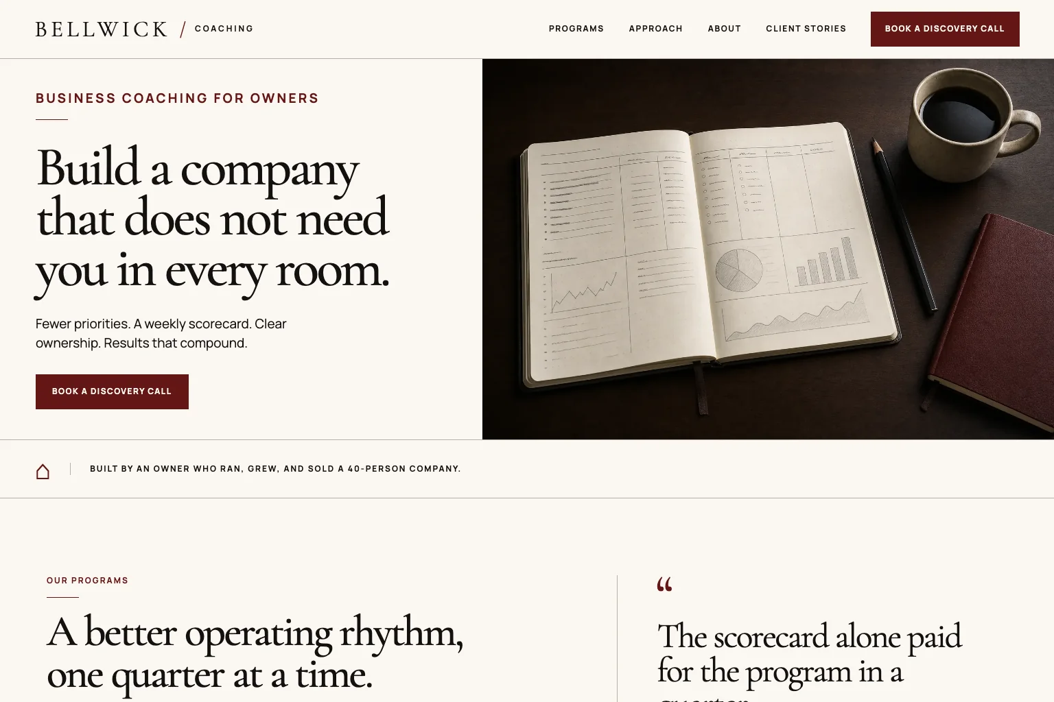
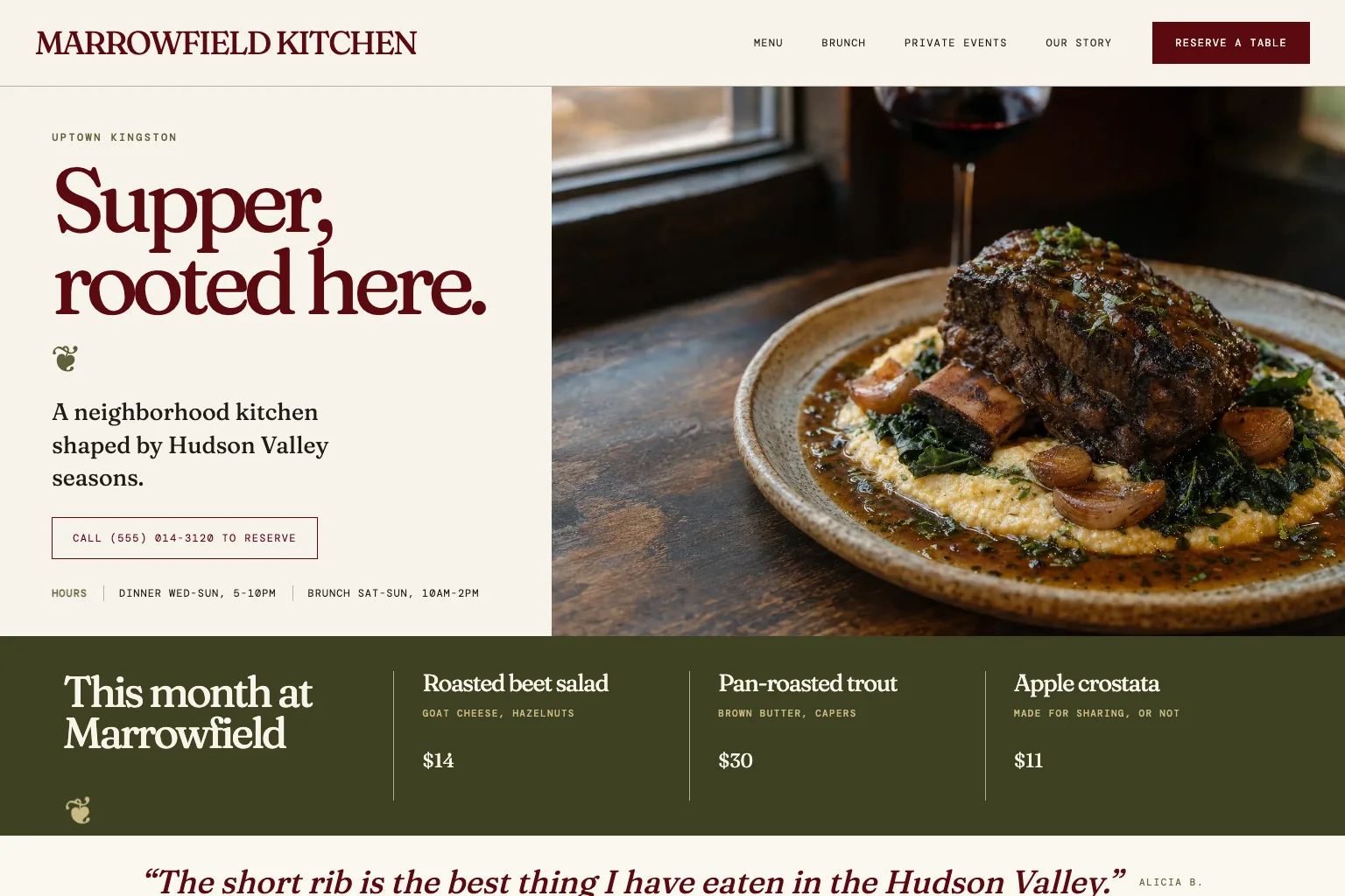
For example, a dental practice can keep “Request an appointment” as its main action while offering “See insurance and new-patient details” for someone who cannot yet decide. A restaurant can make reservations easy without hiding the menu, hours, or directions. A studio can lead with today’s schedule while still giving a new student a clear place to learn what to expect. This is not about adding more buttons. It is about making the one or two necessary choices feel obvious.
- Book a table: for an available reservation tool that confirms the reservation.
- Request an appointment: for a practice that confirms times after reviewing the request.
- Book a first consultation: for a real discovery call or consultation calendar.
- See new-patient information: for someone who needs insurance, paperwork, or first-visit details before booking.
- Choose a class time: for a studio with a current schedule and enrollment path.
- Call the urgent-care line: for an actual urgent route that is staffed as advertised.
Call to action examples for professional and considered services
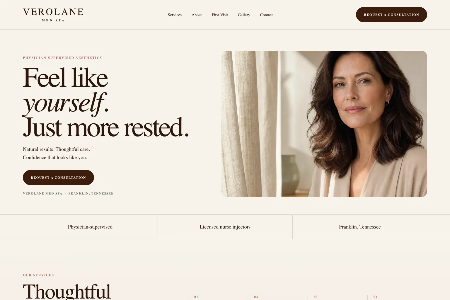
A visitor considering legal guidance, accounting, coaching, design, photography, or a larger project may need more confidence before asking for time. The first button should not pretend the decision is simpler than it is. A lower-pressure action can give the visitor useful context, while a clear consultation route stays visible for people who are ready.
The useful distinction is between an information action and a commitment action. “See how we work” helps a visitor understand the process. “Request a consultation” starts a conversation. Both can belong on the same page if one is visually primary and they serve different levels of readiness.
- Request a consultation: for a business ready to respond to a serious inquiry.
- See how the process works: for a service that needs a little explanation before contact.
- View packages and starting prices: for an offer with public price guidance.
- See recent projects: for a portfolio-led service with real, current work to show.
- Ask about your project: for a custom service where the first message is a sensible next step.
- Download the planning checklist: only when the business has a genuinely useful resource and a clear follow-up plan.
Where to place calls to action on a website
Place a call to action when the visitor has enough information to make that step feel reasonable. A ready visitor may use the button in the header or first screen. Someone who needs reassurance may respond after a section on services, pricing, proof, or frequently asked questions. Repeating the same honest next step at those moments is helpful, not pushy.
Do not turn every paragraph into a different request. A page with Call, Email, Text, Book, Download, Subscribe, Follow, and Chat buttons gives the visitor a new decision instead of resolving the one that brought them there. Choose the primary path. Add a second only when it serves a meaningfully different customer need, such as an urgent phone call alongside a non-urgent estimate form.
On a phone, the main action needs enough room to tap and enough contrast to see. The W3C writing guidance also recommends meaningful link text. That is good usability, not academic housekeeping. Someone scanning a screen reader link list or a long page should be able to tell what “See pricing” or “Request an estimate” will do without guessing.
A five-minute call to action check
If the answer to any of those questions is no, fix the promise before changing the color or adding urgency. A more dramatic button cannot rescue a vague or broken next step. Clear wording, a working destination, and a realistic expectation are what make a call to action credible.
Run the same check whenever the business changes an offer, hours, service area, booking system, or team process. A button is easy to overlook because it is small, yet it often carries the customer from research into a real conversation. Keeping that handoff current protects both the visitor’s time and the business’s reputation.
- Open the page on a phone and identify the one action the business most wants from a qualified visitor.
- Read the button as if you had never heard of the business. Does it say what happens next without relying on the paragraph above it?
- Use the button yourself. Does the destination deliver exactly what the label promised?
- Check the smallest practical detail, such as current hours, service area, booking availability, form fields, or the phone number.
- Ask whether a less-ready visitor has one sensible route to learn more, without competing with the primary action.
How Theo helps businesses make the next step clearer
A good call to action depends on the rest of the page being clear too. Visitors need to understand the offer, see the practical details that matter to them, and have enough proof to feel comfortable moving forward. Theo builds those parts together, then keeps improving the pages as the business learns what customers still need to know.
If your current site gets visitors but not enough useful inquiries, start with the free website audit. It gives you a practical picture of where the site is strong and where a visitor may be getting stuck. Businesses planning a clearer site from scratch can explore small-business website design or compare the options on Theo’s pricing page.
Frequently asked questions
What is a call to action on a website?
A call to action is a button, link, or prompt that tells a visitor what useful step to take next. It might invite someone to call, request an estimate, book an appointment, see prices, view a menu, order online, or learn how a service works.
What should a small business call to action say?
Use plain words that match the real next step. “Request an estimate,” “Book a table,” “Call now for emergency repair,” and “See services and prices” are better than vague wording when they lead to the action they describe.
Should every page have the same call to action?
No. The main action should match the visitor’s situation and the page’s job. A service page may ask for an estimate, a restaurant page may ask for a reservation, and a page for a complex service may first invite the visitor to see the process or relevant proof.
How many calls to action should a homepage have?
Most small business homepages need one clear primary action, repeated at sensible points as the visitor reads. A second action can help when it serves a different genuine need, such as an emergency phone call alongside a regular quote request, but a long list of competing buttons usually creates more hesitation.
Make the next step easier to take
The right call to action is not louder copy. It is a clear, credible promise about what happens next. Theo helps businesses connect that promise to the service details, proof, and practical customer path around it.
More like this in the guides and under turning visitors into customers. The audit numbers quoted across these posts are in Theo's research.