Quick answer
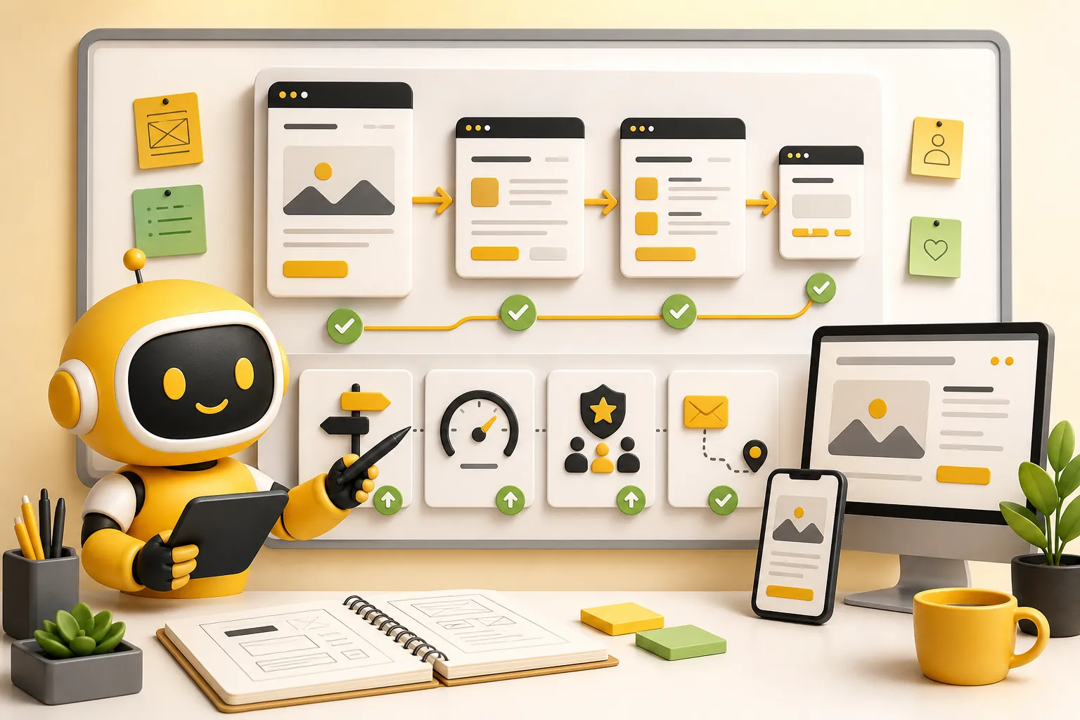
Good website navigation makes the next useful page obvious. Keep the main menu focused, use plain labels, show important links on desktop, make mobile menus easy to tap, connect related pages inside the content, and keep the footer useful instead of decorative.
Website navigation is the system of menus, links, page paths, and footer links that helps visitors move through a site. For a small business, it is not just a design detail. It decides whether someone can quickly find services, pricing, proof, contact details, helpful resources, or the answer they came for.
The best website navigation best practices are boring in the profitable way. Put the main menu where people expect it. Use words customers recognize. Keep choices limited. Make the most valuable paths easy to reach. Do not hide everything behind clever labels, mystery icons, or a dropdown labyrinth that only the person who built it understands.
Navigation matters because visitors rarely arrive perfectly ready to buy. Some want to understand the product. Some need pricing. Some want examples. Some are reading an article and need the next practical step. A clear navigation system lets those visitors choose their own path without making the business explain itself from scratch on every page.
Why navigation affects leads
Navigation sits on almost every page, so small choices repeat across the whole site. If the menu labels are vague, the confusion repeats. If the contact path is hidden, the friction repeats. If related pages do not link to each other, visitors get stranded after they read one useful thing and leave.
Nielsen Norman Group's menu-design checklist recommends showing navigation on larger screens, putting menus in expected locations, keeping menu text visible with enough contrast, and avoiding large-screen menus that cover the whole page. Those are not fancy preferences. They are basic orientation cues.
For a small business, the commercial version is simple: the visitor should always know where they are, what matters next, and how to act. A person reading about website user experience might need conversion guidance next. A visitor comparing pricing may need product details or contact. A visitor on a service page may need proof and a simple way to start. Navigation connects those moments.
| Navigation problem | What the visitor feels | Business risk |
|---|---|---|
| Too many menu links | I do not know where to start | Lower engagement |
| Vague labels | I do not know what this page means | Missed qualified clicks |
| Hidden contact path | I have to hunt for the next step | Lost inquiries |
| Weak internal links | This article was useful, but now what? | Traffic leaves too soon |
| Poor mobile menu | This is annoying to use | More exits from phone visitors |
Start with the pages customers actually need
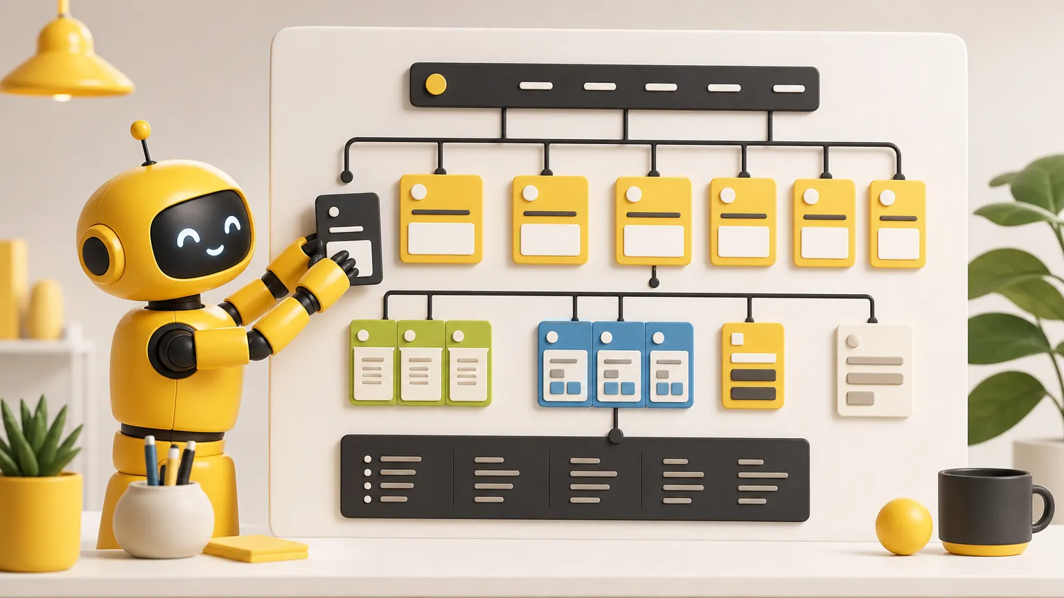
The main navigation should not be a company org chart. Customers do not care how the business thinks about its departments. They care about what they can buy, what it costs, whether it fits their situation, whether they can trust it, and how to take the next step.
Start by listing the pages that help a visitor make a decision. For Theo, those paths include Product, Grow Traffic, Use Cases, Pricing, Contact Us, and Blog. Another business might need Services, Work, Reviews, Locations, About, Pricing, and Contact.
The exact menu depends on the business, but the rule is consistent: top-level links should match the biggest visitor jobs. If a link exists only because someone inside the company likes the page, it probably belongs deeper in the site or in the footer. The main menu is not a trophy case for every page. It is a decision path.
- List the pages that influence calls, bookings, purchases, signups, or serious comparison.
- Group pages by the visitor's job, not the business's internal department names.
- Keep the main menu focused on the highest-value paths.
- Move secondary links to the footer, related sections, or supporting pages.
- Test whether a first-time visitor can guess what each menu label means.
Use labels people understand
A menu label has one job: make the destination obvious. It is not the place for brand poetry. "Services" may be fine when the service category is clear. "Growth Systems" might sound impressive, but if the visitor has to wonder what lives behind it, the label is working too hard in the wrong direction.
Orbit Media's website navigation guide argues for descriptive navigation labels because they help people understand what the company does at a glance. That is especially important for service businesses, where the visitor is usually comparing fit before they are ready to contact anyone.
Use the words customers already use. A restaurant needs Menu, Reservations, Hours, Location, and Catering if those are real buying paths. A contractor might need Services, Projects, Reviews, Service Area, Pricing, and Contact. A website company might need Product, Use Cases, Pricing, FAQ, Contact, and Blog. Plain words beat clever words because plain words reduce effort.
| Weak label | Clearer label | Why it helps |
|---|---|---|
| Solutions | Website Management | Names the actual service |
| Resources | Website Growth Blog | Shows what the resource area covers |
| Connect | Contact Us | Matches the visitor's expectation |
| Investment | Pricing | Uses the word buyers look for |
| Capabilities | Services | Reduces translation work |
Keep the main menu focused
A menu with twenty links does not feel helpful. It feels like the business outsourced prioritization to the visitor. Small-business websites usually need a short top menu and a stronger footer or internal-link system for everything else.
GoDaddy's 2026 small-business navigation guide recommends limiting top navigation items, using short descriptive titles, making navigation visible and accessible, adding a call-to-action button, considering mobile menus, and using analytics to improve. The details vary by business, but the pattern is clear: navigation should be organized around what visitors need first.
A useful top menu often has five to seven primary links. That is not a sacred law. Some businesses need fewer. Larger sites may need more structure. But when the top menu gets crowded, every link gets weaker. Prioritize the pages closest to buyer understanding and action, then use the footer and body links to support secondary pages.
- Use one primary action in the header, such as Contact, Book a Call, Start Now, or Free Site Audit.
- Avoid turning every menu item into a button. Buttons should signal the most important action.
- Put the highest-value pages where visitors expect them, usually starting with product or services and ending near pricing or contact.
- Use the footer for legal pages, secondary services, support, and deeper wayfinding.
- Review the menu after adding new pages so it does not slowly become a junk drawer.
Be careful with dropdowns and mega menus
Dropdowns can help when a site has many important categories. They can also become a filing cabinet that opens over the customer. The question is not "Can we add a dropdown?" The question is "Will this make choices clearer for the visitor?"
Large ecommerce stores, universities, directories, and content-heavy sites may need deeper menu systems. A five-page service business usually does not. If the menu contains only a handful of important pages, visible top-level links are often clearer than a dropdown that hides the good stuff.
If the site does use dropdowns, group links by meaning, keep labels short, make the open state easy to use with a keyboard, and do not make the menu disappear when someone moves the cursor by a few pixels. Nothing says "we value your time" like a menu that vanishes because your hand twitched.
| Site type | Menu approach | Reason |
|---|---|---|
| Simple service business | Short top menu plus useful footer | The main paths are few and should stay visible |
| Multi-service local business | Top service page plus service-area or service-category links | Keeps the header clean while supporting deeper pages |
| Content-heavy blog | Blog categories plus related-post cards | Readers need topical paths after articles |
| Ecommerce store | Organized category menu or mega menu | Products need grouped discovery paths |
| Software product | Product, pricing, use cases, resources, support, contact | Buyers compare features, fit, cost, and help |
Make mobile navigation easy to tap
Mobile navigation is not desktop navigation squeezed into a smaller box. It needs comfortable tap targets, clear spacing, obvious open and close states, and links that do not require precision tapping. Phone visitors are often moving faster and judging faster. Make the useful path easy.
Baymard Institute's 2025 ecommerce navigation benchmark found that most leading sites still perform poorly or only moderately on homepage and category navigation, with mobile performing worse than desktop. Ecommerce is a tougher category than many small-business sites, but the lesson still travels: mobile navigation needs deliberate testing, not hopeful shrinking.
Open the site on a phone width and use it like a customer. Can you find services? Pricing? Contact? Reviews or proof? Blog resources? Does the menu cover the page in a way that feels controlled? Are buttons large enough? Does the visitor know how to close it? If not, the mobile menu is not finished. It is merely present.
- Check the menu on a real phone-sized viewport, not only desktop.
- Make every link and button comfortably tappable.
- Keep the primary action visible in the menu.
- Avoid tiny close buttons or menus that trap the visitor.
- Test header links, footer links, cards, forms, and related posts on mobile.
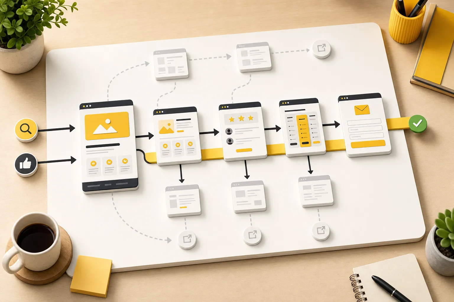
Use internal links as navigation too
The header is only one part of navigation. Internal links inside page copy are often more useful because they appear at the exact moment the visitor needs the next page. A blog post about conversion can point to conversion-rate improvement. A post about exits can point to bounce-rate reduction. A buyer-ready reader can move to website optimization services.
Internal links should feel like helpful handoffs, not confetti. Link when the next page answers a deeper question, supports comparison, explains the service, shows pricing, or gives the reader an action path. Skip links that only exist because someone heard internal linking was good and then added five random anchors like seasoning.
This is especially important for articles. A useful post earns trust, but if it never points readers toward related guides or service pages, it behaves like a helpful dead end. Good navigation turns useful reading into a path toward the next decision.
Make the footer earn its space
A footer should not be where websites go to sigh. It should help visitors recover when they reach the bottom of a page. Include practical links: product or services, contact, support, blog or resources, legal pages, and any trust links the business actually has.
Footer navigation is especially useful for visitors who scroll before deciding. They read the page, reach the end, and need a clean next step. If the footer only shows a logo and a vague tagline, the site makes the visitor climb back to the top or leave. That is avoidable friction.
The footer is also a good place for deeper service links that would clutter the header. Theo uses this pattern by keeping the header focused while the footer gives visitors more service paths, support links, and legal links. That keeps the first decision simple without hiding the rest of the site.
| Footer link type | Why it belongs there | Example |
|---|---|---|
| Primary offer | Some visitors decide after reading | Product or Services |
| Contact | The bottom of a page is a natural action point | Contact Us |
| Resources | Readers may want more education | Blog |
| Support | Existing customers or cautious buyers need help paths | FAQ or Support |
| Legal | Trust and compliance pages should be reachable | Privacy, Terms, Cookie Policy |
| Deep services | Useful but too many for the header | Maintenance, Updates, Management |
Guide visitors inside long pages
Navigation also happens inside the page. Long service pages, pricing pages, comparison pages, and detailed guides need clear headings, section order, tables, FAQs, and related links. Otherwise, the visitor has to read the whole page in one continuous shove.
Use headings that answer the visitor's actual questions. Put proof near claims. Put pricing explanations near cost objections. Put FAQs near the end where lingering doubts appear. Use related-post cards when the reader may need a neighboring article. The page should feel like a guided path, not a pile of sections that happen to share a URL.
This is where website navigation overlaps with user experience. A clear menu gets people to the right page. Clear page structure helps them move through it. Both jobs matter.
- Use one clear H1 that matches the page's topic.
- Use H2 headings as scan points for the reader's main questions.
- Add tables when comparisons would otherwise take too much reading.
- Place FAQs near genuine objections, not as filler.
- Use related cards and internal links after the article or section has earned the handoff.
Use behavior data to improve the paths
Navigation should improve as the site learns from visitors. Look at top pages, landing pages, pricing visits, contact visits, internal clicks, and articles that attract readers but do not send them anywhere useful. Those are clues about where the path is clear and where it is weak.
A page with traffic but few next clicks may need stronger internal links. A pricing page with visits but little contact may need clearer plan fit. A contact page with views but weak submissions may need a shorter form or more reassurance. A blog index with low use may need clearer category cards. The point is not to worship the dashboard. The point is to fix the customer path.
Start with pages closest to business outcomes: homepage, product or service pages, pricing, contact, and articles that already get attention. Then improve one path at a time. Navigation gets better when someone owns it as an ongoing growth system, not when it is set once at launch and fossilized.
| Signal | Likely navigation issue | Useful fix |
|---|---|---|
| Homepage traffic, few deeper visits | Main paths are unclear | Sharpen header labels and hero actions |
| Article readers leave | Weak next-step links | Add relevant related guides and service links |
| Pricing gets views but no contact | Decision path is incomplete | Add proof, FAQs, and clear contact path |
| Mobile exits are high | Menu or tap targets are frustrating | Simplify mobile menu and test buttons |
| Service pages are ignored | They are hard to find or poorly named | Improve labels, footer links, and internal links |
How Theo helps improve navigation over time
Navigation is not a one-time design choice. It changes as the site gains pages, articles, services, proof, pricing, and customer questions. A menu that worked for a five-page site can become weak once the site has dozens of useful resources and service pages.
Theo is built to keep that system tidy while the site grows. The website can gain new articles, service pages, internal links, footer paths, FAQs, and conversion improvements without turning into a messy archive. The goal is not more pages for the sake of volume. The goal is more useful paths for the right visitors.
If the website needs that ongoing work handled, compare what Theo includes, website management services, and pricing. Better navigation helps visitors find the right page. Better management keeps those paths useful as the business grows.
Frequently asked questions
What are website navigation best practices?
Website navigation best practices include using a focused main menu, clear labels, expected menu placement, visible links, thumb-friendly mobile navigation, useful footer links, strong internal links, and page sections that guide visitors toward the next helpful step.
How many links should a small-business website menu have?
Most small-business websites should keep the main menu to roughly five to seven important links. The exact number depends on the business, but the header should focus on the pages visitors need most, while secondary pages can live in the footer or related page sections.
Should my website use dropdown menus?
Use dropdown menus only when they make choices clearer. Simple service websites often do better with visible top-level links and a useful footer. Larger sites with many categories may need dropdowns or mega menus, but they should be organized, accessible, and easy to use.
What should go in the website footer?
A useful footer should include practical wayfinding such as product or service links, contact, support or FAQ, blog or resources, legal pages, and deeper service pages that would make the main header too crowded.
Does navigation affect conversions?
Yes. Clear navigation helps visitors find the right information, compare options, trust the business, and take action. Confusing navigation can lose leads even when the offer is strong because visitors cannot find the page or next step they need.
Make the next page obvious
The best navigation reduces doubt, not just clicks. Theo keeps those paths clear as the site grows, so useful pages, service pages, pricing, proof, and contact stay connected instead of drifting apart.