
How to build trust on a website
Quick answer
To build trust on a website, show a real business (name, address or service area, phone, email, the people who do the work), answer the visitor's first questions in plain words, back every claim with something the visitor can check, place that proof beside the decision it supports, keep the contact form to three fields and say what happens next, serve every page over HTTPS, and keep prices, hours and services current. The 24 signals below cover each of those in order, with an example for every one.
Trust is the judgment a visitor makes, mostly in the first minute, about whether the business is real, competent, current and safe to contact. A good-looking site still loses that visitor if the people behind it are hidden, the phone number takes three clicks to find, the claims cannot be checked, or the form asks for details before saying what happens with them.
This guide lists 24 trust signals in seven groups, from the business name in the first screen to the monthly check that keeps the site current. Each signal comes with what it looks like on the page and the mistake it replaces. The last sections show the signals by trade, with demo sites, and how Theo puts them in place when it builds a site.
What makes a website trustworthy
Two pieces of research cover most of it. Stanford's web credibility guidelines, drawn from studies of how people judge websites, say a site is believed when it makes its information easy to verify, shows there is a real organization behind it, highlights the expertise of the people involved, makes it easy to get in touch, looks professionally designed, is easy to use, is updated often, keeps promotional content restrained, and has no typos or links that go nowhere.
Nielsen Norman Group's pyramid of trust describes the visitor's side. Commitment grows in levels, from believing the site can meet a basic need, to preferring it over the alternatives, to handing over an email address, to paying, to coming back. A site earns each level before it asks for the next, which is why a form on the first screen of a site with no address and no faces gets ignored.
Put together, a trustworthy website has seven things in place. Each group of signals below is one of them.
- A real business behind the page: a name, an address or service area, a phone number, an email, the people.
- Claims a visitor can check: license numbers, photos of real work, numbers with a source, a plain process.
- Reviews that are honest, current and linked to where they were written.
- Proof placed beside the decision it supports, not gathered in one block at the bottom.
- Security and policies in plain sight: HTTPS, privacy, returns, the payment provider's name.
- A short contact path that says who replies and when.
- Pages that are current, fast, readable on a phone, and free of typos and links that go nowhere.
Signals 1 to 5: show there is a real business behind the site
Before a visitor weighs the offer, they decide whether anyone is there. These five signals answer that in the first screen and the footer, and none of them takes longer than an afternoon.
- Signal 1: State the business name and what it does, for whom and where, in the first screen. A plumber's first screen reads "Emergency plumbing in Tulsa, same-day drain and water heater repair", not "Solutions for your home." The visitor should know within five seconds that they are in the right place. Use the same business name and logo on the site, the Google listing, the invoices and the truck; a site whose name differs from the listing reads as two different businesses.
- Signal 2: Show an address or a service area. A business that visits customers lists the towns it serves; one with a storefront lists the street address, parking and hours. A business that serves several towns gives each its own page, so a visitor from Broken Arrow lands on a page about Broken Arrow, not a list of every suburb. Skipping both is the most common reason a visitor assumes a site is a lead-generation front rather than a local company.
- Signal 3: Put a phone number and an email in the header and the footer of every page, and make the number tap-to-call on a phone. A visitor who has to open a contact page to find a number reads that as reluctance to be reached.
- Signal 4: Show the people who do the work: names, roles and photos taken in the shop or on a job, not a purchased photo of a smiling team. A photo of the owner beside the van does more than any badge. The about page examples in this series show how much one real name, one real photo and a three-sentence history do on a single page.
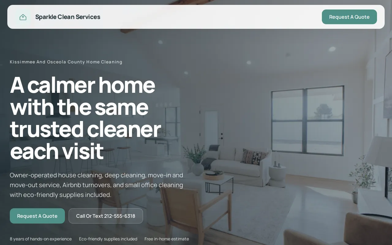
- Signal 5: List the license, insurance, bond or professional credential with its number, in the footer and on the about page. "Licensed and insured" is a claim; "State plumbing license 012345, bonded and insured" is something the visitor can look up in a minute. Theo's cleaning service demo site below shows signals 2 and 5 on one page: service areas and bonded and insured details.
Signals 6 to 9: make every claim easy to check
A claim without support asks the visitor to take the business's word for it. Small claims can stand alone. Anything that decides the sale needs a fact, a photo, a number or a description the visitor can verify on their own.
- Signal 6: Replace generic labels with the specific fact behind them. "Trusted" becomes the star rating and review count from the Google listing, with a link. "Fast turnaround" becomes the typical number of days. "Experienced" becomes the year the business opened and the name of the person who opened it. Write in the customer's words while doing it: "water heater replacement", not "hydronic solutions"; a visitor who has to translate the page assumes the business talks the same way on the phone.
- Signal 7: Show photos of real work with a sentence on what the job was. Before-and-after pairs for a cleaner or a landscaper, a finished kitchen for a contractor, the dining room for a restaurant. Name the town and the month if the customer agrees; a photo with a caption is checkable, a stock photo is not. The photo has to be sharp and well lit, which a phone in daylight manages; a blurry one says less than none. With permission, show the customer in the picture and put their own sentence under it. Three jobs written up this way, each with the problem, what was done and what it cost, make a job stories page that does what an agency calls a case study.
- Signal 8: Give every number a source. A count of jobs completed needs the year it was counted from; a rating needs the platform it came from; a claim about savings needs the comparison it was measured against. A number with no source reads as decoration, and careful buyers discount it to zero.
- Signal 9: Describe the process step by step. What happens after the call, who comes out, how the estimate is written, when payment is due. A plain process page turns "can they solve my problem" into "I know what will happen next", which is most of what trust is. Pages that answer a question without selling do the same work: what a water heater costs to replace, when repair is the better choice, what to do before the crew arrives. A visitor who learns something leaves believing the business knows the work.
Signals 10 to 12: use reviews and testimonials honestly
Reviews let a past customer carry part of the trust load, and they do it best when the visitor can see where they came from and when they say something the headline does not.
- Signal 10: Link to the complete Google Business Profile and Yelp listing rather than retyping quotes into the page. A listing with photos, hours and replies to reviews is verifiable in one click; a quote in a box with a first name is not. Theo's Boost checklist walks an owner through the listings that matter, including Google Business Profile, Facebook, Apple Business Connect, Bing Places and Yelp, so the profile the site points to is filled in.
- Signal 11: Match the review to the page. A review about a drain repair belongs on the drain repair page, a comment about the final bill matching the quote belongs near the price, and the overall rating with its link belongs near the homepage's main button. Three matched reviews beat a carousel of twenty.
- Signal 12: Keep the review section honest. The Federal Trade Commission's endorsement guides cover fake reviews, testimonials paid for without disclosure, and selecting only the good ones in a way that misleads. Say plainly what the business does not do (no commercial work, no weekend calls) so the visitor does not find out at the estimate. Reply to critical reviews on the listing itself; a calm reply to a one-star review is one of the strongest trust signals a business can show.
Signals 13 and 14: put proof beside the decision it supports
Trust signals lose most of their value collected in one block at the bottom of the page and get it back when each one sits beside the decision it supports. The doubt changes as the visitor moves down the page, so the proof has to change with it.
- Signal 13: Show the price, or the pricing rule, next to what it includes and what it does not. A cleaner lists the hourly rate and the rooms covered; a photographer lists the package, the number of edited photos and the delivery time; a lawyer states the consultation fee and what a flat fee covers. When a price cannot be printed, print the rule: "Estimates are free and written, and the final bill does not exceed the estimate without your approval." State the warranty on the work in the same place: how long it runs, what it covers and how to claim it.
- Signal 14: Put one piece of proof at every decision point. The table lists the five decision points on a typical small business site, the doubt a visitor has at each, and the signal that answers it. This is the same idea behind improving a website's conversion rate: a button gets clicked when the page around it has already answered enough questions for the click to feel safe.
| Decision point | The visitor's doubt | Trust signal to place beside it |
|---|---|---|
| First screen | Am I in the right place? | What the business does, for whom and where; the phone number; one next step |
| Service description | Can they do this job well? | Photos of the work, the scope, the process, one matched review |
| Price | Is this worth it, and are there surprises? | What is included, what is not, how estimates and billing work |
| Contact form | What happens with my details? | Three fields, a privacy line, who replies and when |
| Store checkout | Will it arrive, and can I return it? | Shipping, returns, a support contact, the payment provider's name |
Signals 15 to 17: keep security and policies in plain sight
Security is invisible until something looks wrong, and a visitor who sees a warning on a contact form leaves without reading the rest of the page. The goal is to remove avoidable worry, not to add shields.
- Signal 15: Serve every page over HTTPS, not just the checkout. Browsers label a page without it as not secure in the address bar, and that label next to a form ends the visit. Every Theo site is a static site served over HTTPS, and on a store site the checkout completes on the connected Shopify or Wix store, so Theo never handles the payment.
- Signal 16: Link the privacy and terms pages from the footer of every page, and for a store put shipping, returns and support within one click of every product. A visitor should not have to hunt for the return policy at the moment they are deciding whether to buy. Disclose in the same place what a visitor would otherwise discover later: a deposit, a travel fee, a cancellation charge, a commission on a recommended product.
- Signal 17: Use only the badges the business has earned and the visitor will recognize, placed beside the concern they answer: the payment provider's mark at checkout, the license seal beside the license number, the trade association logo on the about page. A row of generic padlock icons gives the visitor nothing to check and reads as decoration.
Trust badges for a website: which ones help and which to skip
Badges are the most misused trust signal because they are the easiest to add. The test for each one is whether a visitor can recognize it, check it, and connect it to the decision it sits beside. The table sorts the common ones.
| Badge | Helps when | Skip when |
|---|---|---|
| Payment provider's mark | At checkout, beside the pay button, on a store site | On a service site with no checkout |
| License or certification seal | Beside the license number on the about page and in the footer | Shown without the number |
| Chamber of commerce or trade association logo | With a link to the business's listing on the association's site | The membership has lapsed or the logo links nowhere |
| Security seal from the certificate vendor | Rarely; the browser already marks the connection as secure | Anywhere on a page that is not served over HTTPS |
| Review platform badge (Google, Yelp) | With the rating, the review count and a link to the listing | With a rating but no link |
| Award or best-of badge | With the year and who gave it | Without a year, or from a list the business paid to join |
Signals 18 to 20: make the contact path short and safe
Contact is where a site can lose trust after doing everything else right. The visitor has decided to reach out, and the form asks for ten fields, gives no idea who reads it, hides the phone number and ends with a thank-you that leaves them wondering whether anything happened.
- Signal 18: Ask for three things: a name, a way to reach them, and a short message. Every extra field (budget, address, how did you hear about us) costs some visitors and adds nothing the first reply cannot ask. On a dental or medical practice site the form asks only for name, contact details and a short message, and appointment requests link to the practice's own tool.
- Signal 19: Say who replies and roughly when, and confirm the submission in plain words on the page. "Maria reads every message and replies within one business day" turns the form from a black box into a conversation. Test the form on a phone after every edit; a form that fails silently costs more than no form.
- Signal 20: Where the business books appointments or estimates through a tool it already uses, link to that tool from the form and the header so the visitor does not describe the job twice. Theo links to the booking, reservation and scheduling tools a business already runs, such as Calendly, Square Appointments, Acuity, Jobber, Housecall Pro, Toast and OpenTable, rather than replacing them. The contact page examples in this series lay out the pieces by business type. Theo's dental practice demo site below shows signal 20 done the safe way: an appointment request that goes through the practice's own tool, alongside treatment pages, an insurance and financing page and a new patient page.

Signals 21 to 24: keep the site current, fast and clean
A stale site weakens trust quietly. Old prices, a summer promotion in December, a menu from two owners ago, a blog whose last post is three years old: each one tells the visitor nobody is watching this place, and the visitor acts on that whether or not it is true.
- Signal 21: Keep prices, hours, services, people and contact details matching reality today. Put a monthly check on the calendar, owned by whoever answers the phone, with five lines: prices, hours, the team page, every link, one test message through the form. The website maintenance checklist in this series turns that into a monthly, quarterly and yearly routine.
- Signal 22: Remove typos, placeholder text and links that go nowhere. Stanford's guidelines single out small mistakes because visitors read them as a sign of how the business handles everything else. Read every page aloud once a quarter; the ear catches what the eye skips.
- Signal 23: Make pages load fast and read well on a phone. A page that shifts while it loads, or a button too small to tap, reads as carelessness before the visitor has read a word. Test the three pages that matter most (home, main service, contact) on a phone over cellular data, not only on the office wifi. A design from this decade matters for the same reason: the visitor dates the business by the site. Keep third-party ads and arrival pop-ups off the pages; an ad for someone else's product says the business needs the pennies, and a pop-up covers the phone number the visitor came for.
- Signal 24: Show the site is alive. A new page or post with a date on it, a recent photo, a reply to a recent review: these tell the visitor and Google that the business is active. Link the one social profile the business actually updates, from the footer; a profile whose last post is two years old does the opposite. Publishing nothing new hurts on both fronts: the visitor reads it as neglect, and search engines have no new pages to send anyone to. In Theo's audit of 5,974 small business websites, 48 percent of the 4,027 sites with search data got an estimated zero visitors a month from Google search.
Trust signals by business type, with examples
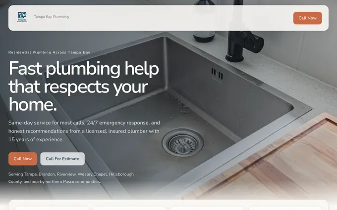
The same 24 signals look different by trade. The table lists what each business puts on the page and where it goes. Theo's demo sites show what a finished site looks like for each of these trades. The plumbing company demo site below is the first row of the table on one page: click-to-call in the header, service pages for repair, drains and water heaters, service-area pages by town, and reviews and license details.
| Business | Signals that build trust | Where they go |
|---|---|---|
| Plumber | License number, service area by town, tap-to-call in the header, photos of the crew and trucks, reviews by job type | Header, service pages, service-area pages, footer |
| Dental practice | Dentists' names and credentials, photos of the office, insurance accepted and financing, hours and address, an appointment request through the practice's own tool | About page, insurance page, contact page |
| Restaurant | Menu with prices as text, hours, address and parking, photos of the food and the room, reservation and ordering links to the tools the kitchen uses | Homepage, menu page, footer |
| Immigration lawyer | Bar admission, languages spoken, the process in plain language, consultation terms, office address | About page, practice area pages |
| Auto repair | Certifications, the warranty on repairs, how estimates work, hours and directions, reviews by repair type | Service pages, contact page |
| Photographer | A portfolio by session type, packages with prices, what a booking includes, the photographer's name and face | Portfolio, pricing page, about page |
| CPA | Credentials and license, who the firm serves, how fees work, how documents are handled, a secure portal link | About page, services page |
| Cleaning service | Bonded and insured details, service areas, residential and commercial scope, a quote request that says who replies | Homepage, service pages, quote page |
| Med spa | Provider credentials and safety information, treatment pages that explain what happens, a before-and-after gallery, a consultation request | Treatment pages, about page |
How Theo builds trust into a site
Theo builds the site with these signals in place from the first preview, from what the owner gives it: the business name and what it does in the first screen, the service area or address, phone and email on every page, the license or credentials where they belong, prices or the pricing rule, real photos the owner drags into the chat, a contact form that asks only for name, contact details and a short message, and links to the review listings and booking tools the business already uses.
The owner reads the preview, asks for changes in plain English ("put the license number in the footer", "move the reviews above the price") and publishes when it reads right. The first build is free to see before deciding anything. On every plan the owner changes prices, hours and people through a chat edit. On Starter and Pro the ongoing work adds to the signals: new pages and posts carry the same name, place, phone and credentials; copy, calls to action and page flow are refined over time; technical fixes and page speed work keep the pages fast; and the owner sees all of it in the Growth tab and a weekly report.
Frequently asked questions
How much does it cost to make a website trustworthy?
Most of the 24 signals cost nothing beyond an afternoon: an address, a working phone number, the license number, photos taken on a phone, prices, and links to reviews that already exist. If the site needs rebuilding, Theo builds it free to preview, and hosting on Basic is $29.99 a month. On Starter, $69.99 a month and free for the first 30 days, the ongoing work adds pages and refines copy so the proof stays current.
How long does it take to build trust on a website?
The basics take effect the day they go live: contact details, real photos, prices, HTTPS, a three-field form. The rest accumulates one job at a time as reviews arrive and new pages show the business is active. With Theo the first preview is usually ready in minutes, and the ongoing growth work on Starter and Pro compounds over months.
Who owns the content, photos and reviews on a Theo site?
You own the site and everything on it, including the copy and the photos you dragged into the chat. Reviews stay on the listing where the customer wrote them, and the site links to that listing. On Pro, the site code is yours to read and copy through GitHub as well.
What happens to the trust signals if I cancel?
Nothing is locked in. Cancel anytime; the confirmation shows the date the subscription ends, and before then you copy the site and its images to move elsewhere. The review listings, the license record and the booking tools the site links to are your own accounts and keep working.
What makes a website trustworthy?
A real business behind it with a name, a place and people; plain answers to what it does and what it costs; claims a visitor can check; reviews linked to their source; fast pages served over HTTPS; policies and next steps in plain sight; and information that is current. Start with whichever one a visitor meets first, usually the first screen and the phone number.
What are website trust signals?
Trust signals are the elements on a page that let a visitor verify the business is real, competent and safe to contact: the address, the license number, photos of real work, reviews with a source, the privacy line beside the form, a connection the browser marks as secure, and current prices and hours. The 24 in this guide are the ones a small business site can add without a developer.
Do trust badges increase conversions?
A badge helps when it is earned, recognizable and placed beside the concern it answers, such as the payment provider's mark at checkout or a license seal next to the license number. A row of generic shields with nothing to check does not, and can lower trust by looking like decoration. Nobody can promise a conversion figure from a badge; test one placement at a time.
Where should testimonials go on a website?
Beside the claim they support. A review about a repair goes on that service page, a comment about value goes near the price, and the overall rating with a link to its source goes near the homepage's main call to action. Keep the full set on the Google or Yelp listing rather than on a separate testimonials page nobody reads.
Trust signals on a small business site, built in from the first preview
Theo builds a small business site with the on-page signals in this guide in place from the first preview, using what the owner provides, and on Starter, $69.99 a month and free for the first 30 days, adds pages and posts that carry the same name, place, phone and license and refines the copy and calls to action over time. An owner who already has a site can run the free website audit, which reads the site with no login and reports its traffic, rankings and search health with specific fixes, the right place to start before adding a single badge. An owner without a site can build one free and check every signal in the preview before deciding.
More like this in the guides and under turning visitors into customers. The numbers behind it are in Theo's research.