
What does a contact us page look like?
Quick answer
A good contact us page has a heading that says what happens next, the phone number and email as text you can tap, the street address or the towns you serve, hours by day, a short form or a booking link, who replies and by when, and one line for after hours. On a phone, the number and that first line fit on the first screen. The 20 contact pages below show it for a plumber, an emergency vet, a church and 17 more.
Most contact page examples online come from software companies and design studios. A small business needs a plainer page: a homeowner with water on the floor should be able to use it in ten seconds on a phone, and a parent filling in a form at 9 pm should know whether anyone will write back.
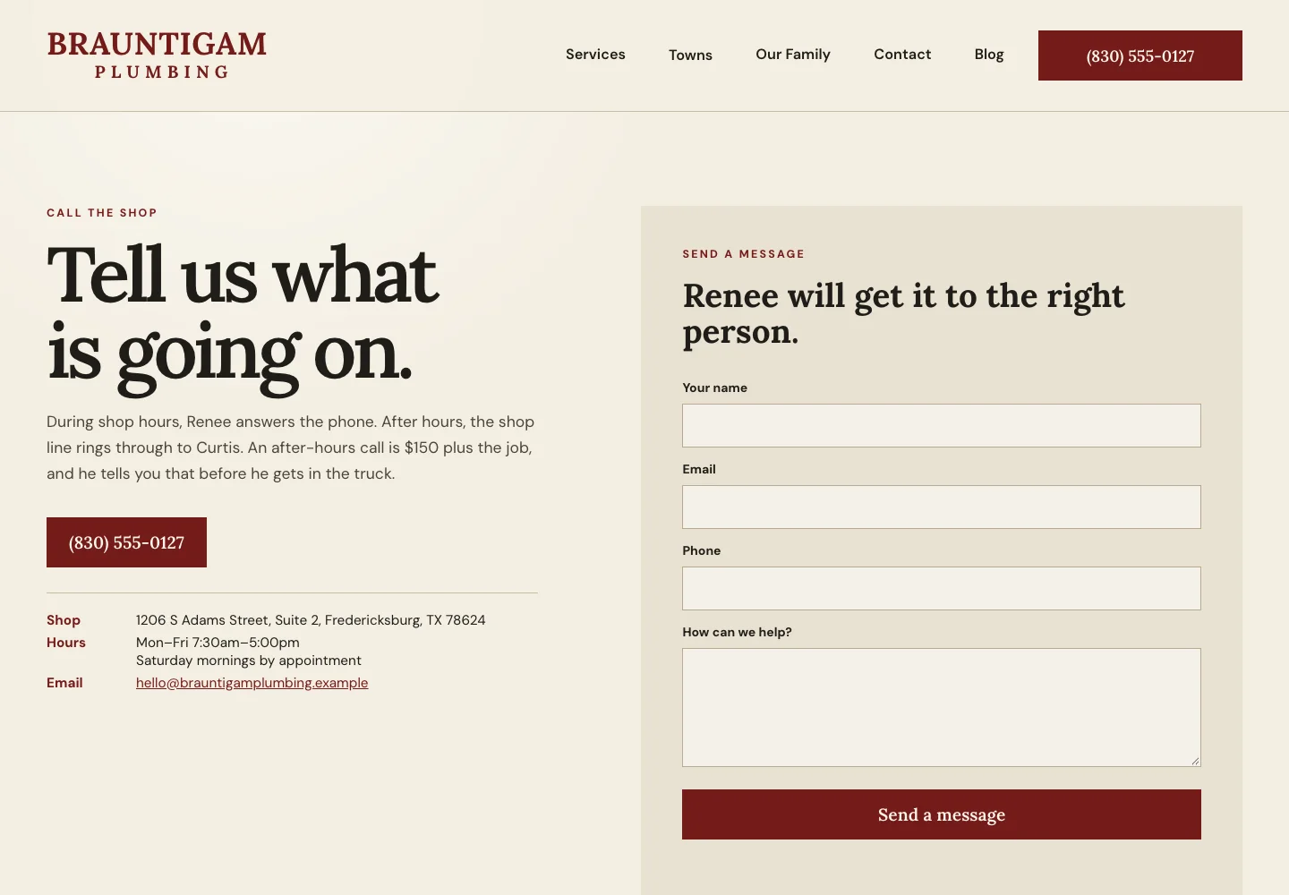
Below is the first screen of example 1, Brauntigam Plumbing, built by Theo like all 20 here. See the live site.
The 20 contact page examples at a glance
All 20 are sites Theo built, across 17 trades, and each opens live, so you can tap the number and read the form yourself. They are grouped by what the visitor needs, which decides more about a contact page than the trade does.
| Example | Business | The move to copy |
|---|---|---|
Brauntigam Plumbing | Says who answers after hours and what the call costs | |
Aukamp Heating & Cooling | Keeps the no-heat call out of the form | |
Wendroth Electric | Names which problems are worth a late call | |
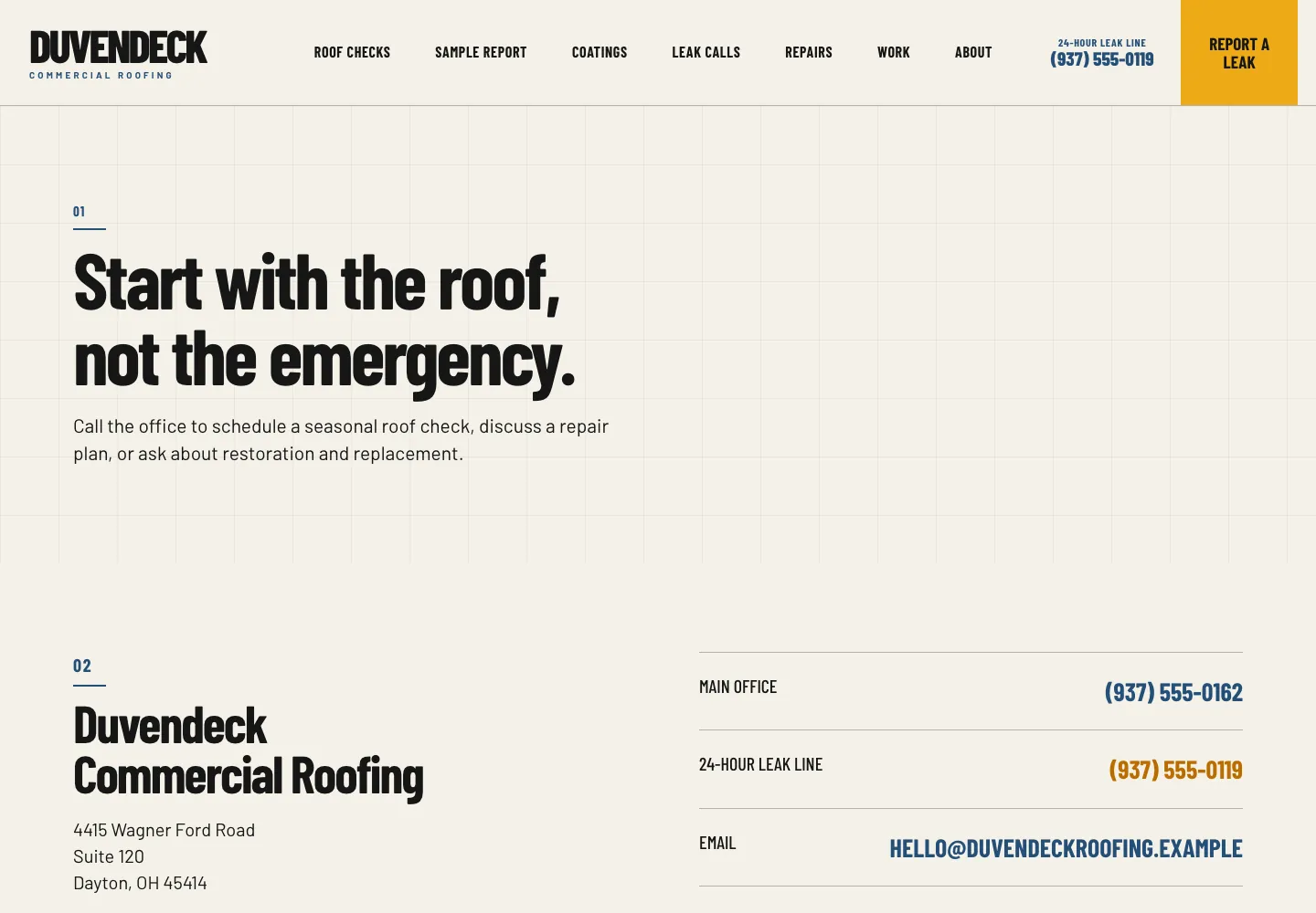
Duvendeck Commercial Roofing | Lists what to say when the roof is leaking | |
Lanternfield Animal Emergency Hospital | Writes the directions in words, door and parking included | |
Ashbrenner Plumbing | Turns the reply time into a promise with a clock time | |
Kjelstad Basements | Spells out what the free visit looks at | |
Brinkhorst Lawn Care | Asks for the address that sets the day and the price | |
Haverlund House Cleaning | Says when she calls back, and why | |
Pelloquin Insurance | Says how the phones work when a hurricane warning is posted | |
Solvanez Insurance | Offers a text button and says who handles the small jobs | |
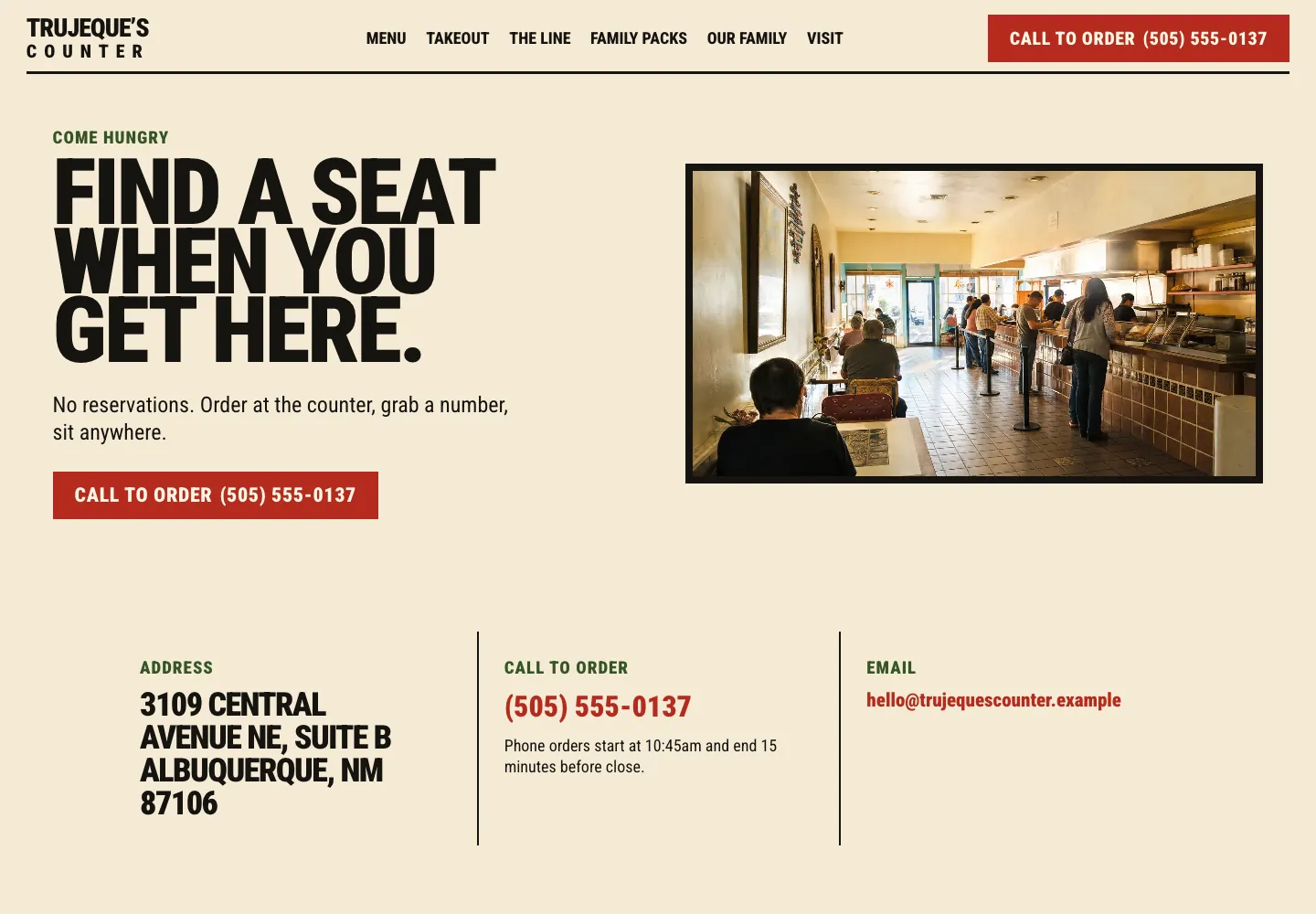
Trujeque's Counter | Says how busy it gets and how to skip the line | |
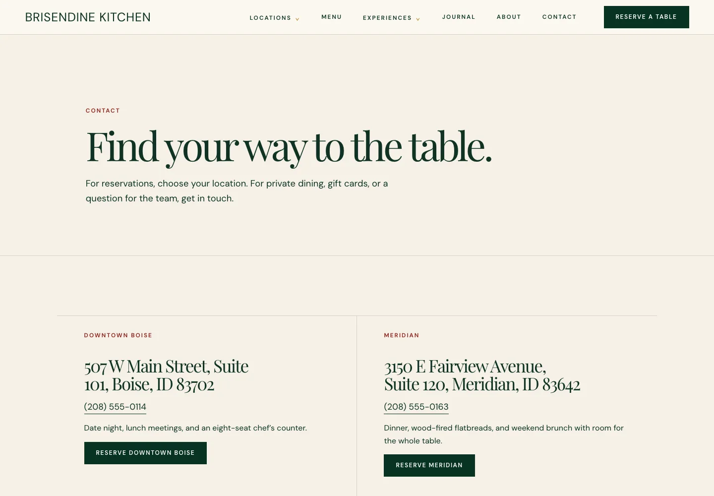
Brisendine Kitchen | Gives each location its own phone, address and button | |
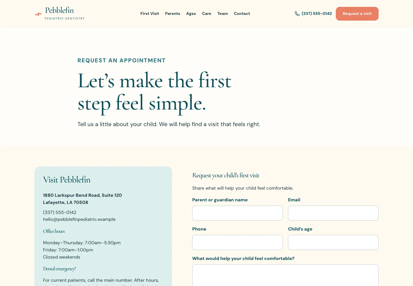
Pebblefin Pediatric Dentistry | Asks what would help the child feel comfortable | |
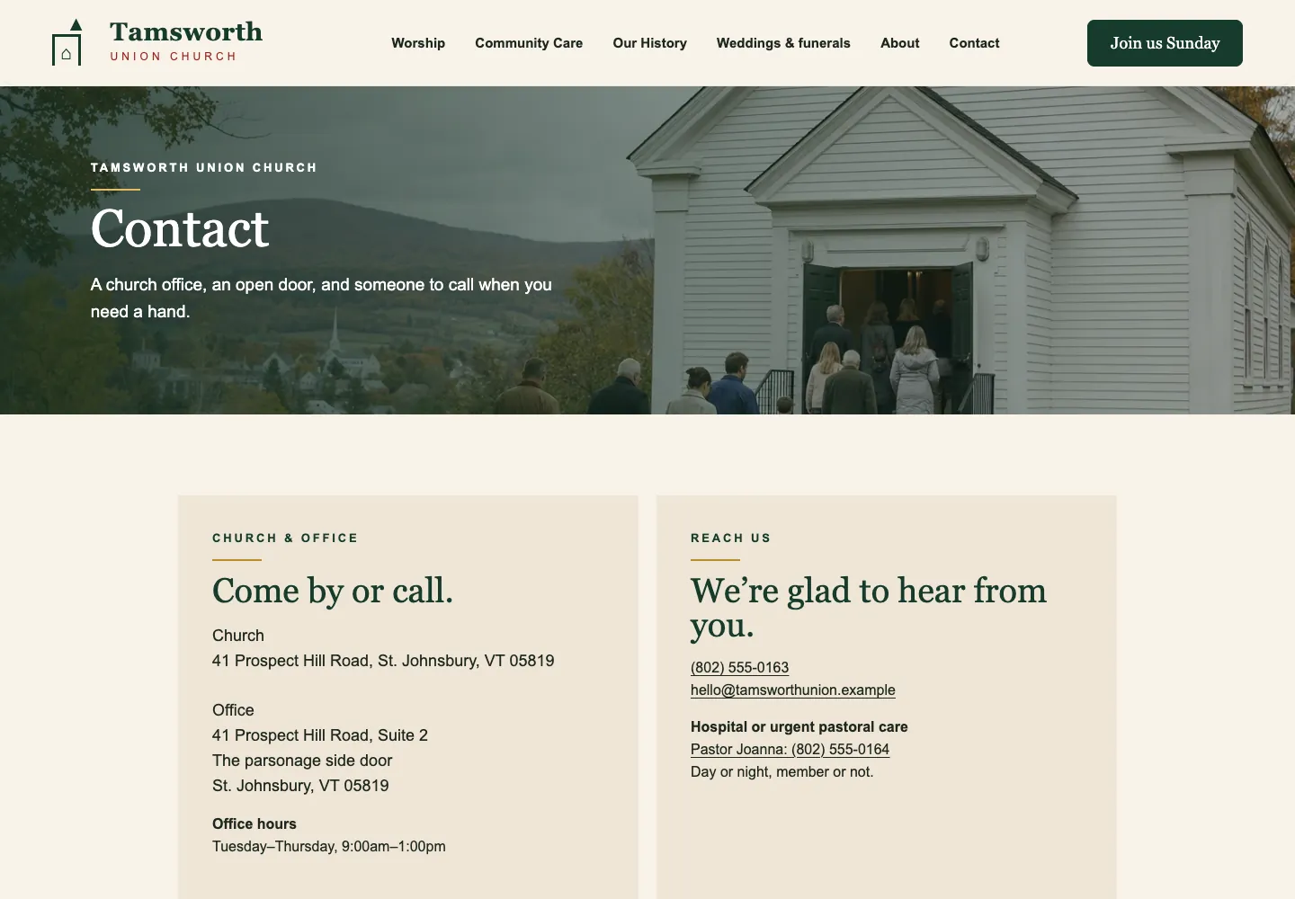
Tamsworth Union Church | Gives the pastor's number for hospital calls, member or not | |
Thistlecup Community Pantry | Gives shoppers, donors and volunteers a card each | |
Tullberry Tax Resolution | Asks for a photo of the letter and says what to leave out | |
Teversham Wealth Planning | Says even the inquiry stays confidential | |
Ellingsrud Family Law | Asks only what the conflict check needs, and how to reach you safely | |
Kelderwick Trauma Therapy | Says what not to write and asks how to leave a message |
What the best contact us pages have in common
Strip the design away from any contact page that works and the same eight items remain. The order changes with the business, and most of this post is about that order.
- The phone number as text a phone can tap, with the hours it is answered.
- The email address as text, for the visitor at work who cannot call.
- The street address with the door and the parking, or the towns served if you travel to them.
- Hours by day, closed days included, matching your Google Business Profile word for word.
- A short form: name, phone or email, and a message, plus one field only when it prices or routes the job.
- A booking link from the tool you already run, if you take appointments.
- Who replies, and by when, so the visitor knows whether to wait or call.
- A confirmation after the form is sent that repeats the reply time and the number for anything urgent.
Which contact method goes first
Put first whatever you answer fastest. A plumber who picks up in the truck leads with the number. A dental office that books through scheduling software leads with the booking button. A cleaner who cannot answer while she works leads with a note and says when she calls back. Visitors do not care which channel you prefer, only which one gets an answer.
Never offer only one route: a phone-first page still has a short form, and a form-first page still shows the number. Theo's sites link to the booking and request tools a business already runs; the Jobber page shows how. The 20 examples come in four groups, by what the visitor needs.
Contact us page examples for when something is wrong right now
A burst pipe, a furnace out in January, a dog that ate something it should not have. These six pages put the number where a thumb finds it and say plainly what happens after hours, with the price where there is one.
1. Family plumber: says who answers after hours and what it costs
A visitor here usually has a leak and two questions: will a person pick up, and what will it cost? Brauntigam's heading reads “Tell us what is going on.” The line under it answers both: Renee during shop hours, Curtis after hours, and $150 plus the job for an after-hours call, quoted before he gets in the truck.
Then come the number as a big red button, the address, hours and email, and a form asking for name, email, phone and “How can we help?” Under it sit three customer quotes and a link to Google reviews. On a phone, the heading, the after-hours line and the call button fill the first screen.
Copy this: name who picks up, and price the after-hours call in the same sentence: “After 5, the line rings to Dave. A night call is a flat fee plus the repair, and he tells you the fee before he drives out.”
Check yours: read your after-hours line aloud as a customer at 10 pm would. Does it say who answers and what it costs?
See the live site, or browse more plumbing website examples.
2. Heating and cooling shop: splits urgent calls from the form
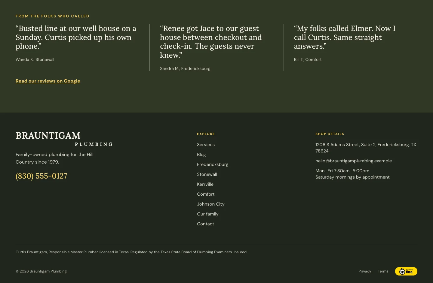
A furnace making a new noise needs a booked visit. A furnace that died on a Sunday night needs a person. Aukamp's heading reads “Tell us what your system is doing.” and the line under it gives the form its job: a repair, a tune-up, a replacement estimate or a maintenance plan.
Phone, email, office and hours sit on the left, and under them a shaded box: “No heat or no AC after hours? Call, do not wait on a form.” Evening and Sunday calls are answered, it says, and the $149 trip charge is quoted first. The form asks for name, email, phone, what you need help with and what is happening.
Copy this: one box that tells the urgent caller to skip the form: “Water on the floor or no heat tonight? Call. Do not wait on the form.”
Check yours: send your own form at 8 pm on a Friday. If the reply comes on Monday, say so next to the button.
See the live site, or browse more heating and cooling website examples.
3. Owner-operator electrician: a contact page that defines urgent
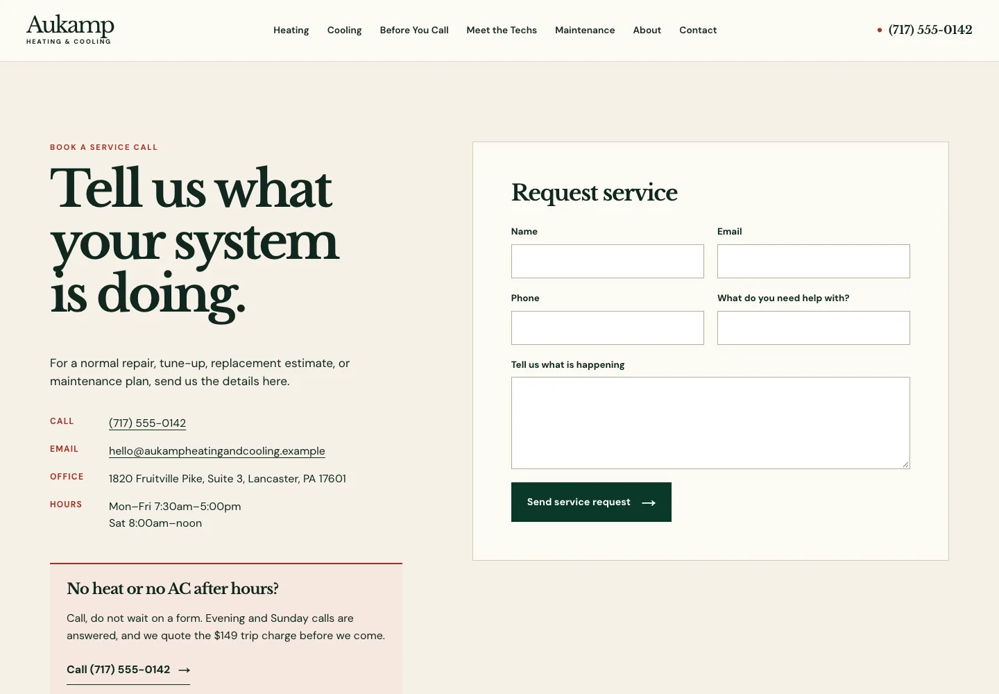
An electrician who works alone cannot answer the phone with his hands in a panel, so Wendroth's page sets expectations first. The heading reads “Call for the next opening.” The line under it defines urgent: “For no power or a burning smell, call until 9:00pm.”
The number follows in large type, then the weekday hours, the email and the shop address with a plain warning: “Shop and van parking, not a showroom.” The form asks for name, email, phone and “What can Ted help with?”, and the footer names the master electrician license and the contractor registration. On a phone, a Call Ted button rides in the header.
Copy this: name the two or three problems worth a late call, and the hour the line closes: “For no water, a gas smell or a flooded basement, call until 8 pm. For anything else, send a message.”
Check yours: if your address is a shop or a home office, say whether people should come there.
See the live site, or browse more electrician website examples.
4. Commercial roofer: tells the caller what to have ready
A facilities manager with water coming through a ceiling tile needs someone now, yet Duvendeck's heading starts calmer on purpose: “Start with the roof, not the emergency.” The line under it is for planned work: roof checks, repair plans, replacement.
Two numbers sit side by side, the main office and the 24-hour leak line. There is no form, because a leak has to reach a person. A block headed “For an active leak, call the leak line.” lists what to say: the address and building, where and how fast the water is coming in, how the roof is reached, who is on site, and any PO or not-to-exceed amount. Then: “A person calls back within 15 minutes.” On a phone, the leak line stays in the header.
Copy this: a short list of what to have ready when someone calls in trouble: “When you call, tell us the address, where the problem is, how bad it is and who will meet us there.”
Check yours: give an emergency line the same label everywhere it appears, so nobody rings the office line at midnight.
See the live site, or browse more roofing website examples.
5. Emergency animal hospital: directions written for a panicked driver
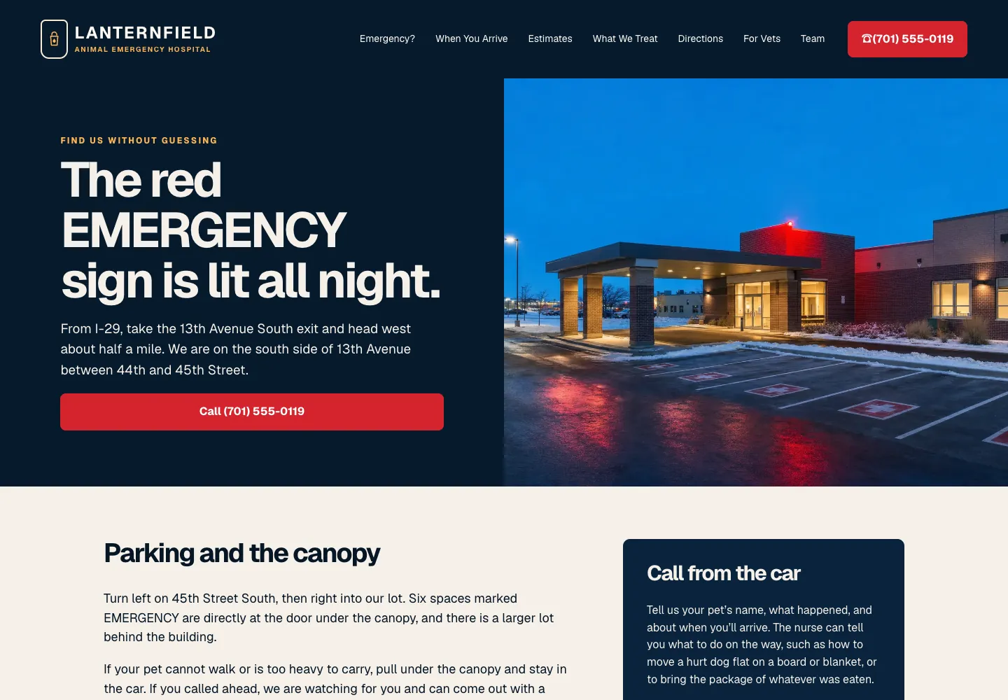
Nobody reads an emergency vet's contact page calmly; they read it in a car, with a sick dog in the back. Lanternfield's Directions page tells them what to look for: “The red EMERGENCY sign is lit all night.” The line under it gives the route from I-29 in words, down to the cross streets.
A red call button follows. Then the parking: six EMERGENCY spaces at the door, and “If your pet cannot walk or is too heavy to carry, pull under the canopy and stay in the car.” A box headed Call from the car says a nurse can tell you what to do on the way. There is no form, because in an emergency a form only slows things down.
Copy this: write the directions a stressed driver needs in words: “Take exit 12, turn right at the gas station, and park by the blue door on the side of the building.”
Check yours: on a phone, the call button belongs in the first screen. Here a red phone button in the header carries it above the photo.
See the live site, or browse more veterinary website examples.
6. Plumber with office hours: a contact form that names the callback time
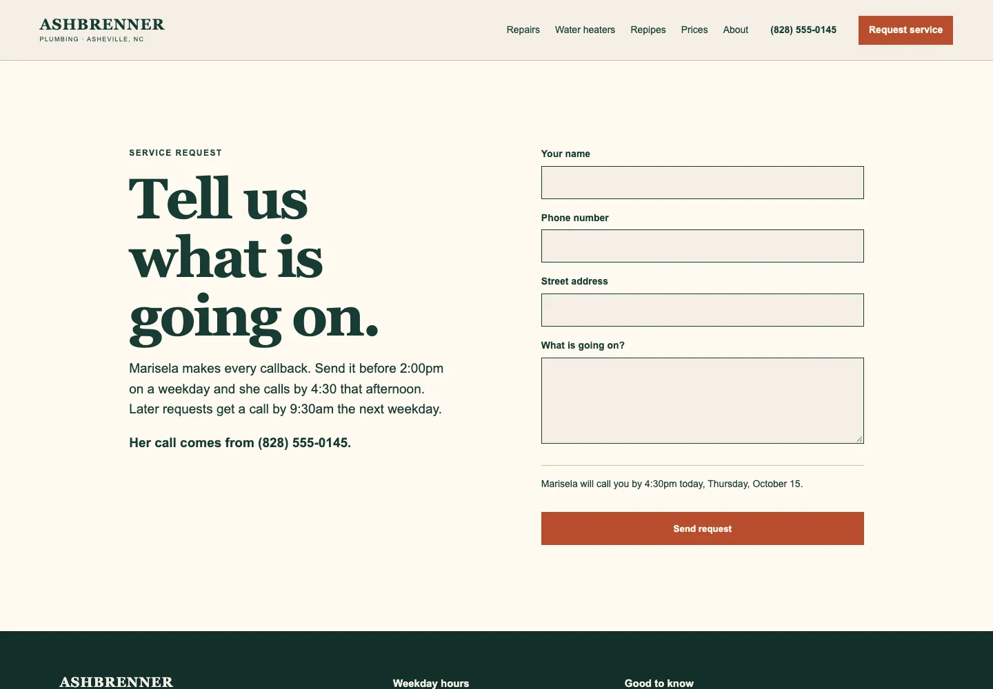
Some plumbers do not take night calls, and their customers are better served by being told so. Ashbrenner's heading reads “Tell us what is going on.” Under it: “Marisela makes every callback. Send it before 2:00pm on a weekday and she calls by 4:30 that afternoon.” Later requests get a call by 9:30 the next weekday.
The page names the number her call will come from. The form asks for name, phone, street address and what is going on, and above the Send request button it works out the time for you: “Marisela will call you by 4:30pm today.” The footer says the office is closed nights and weekends and links to a guide to the water shutoff.
Copy this: make the reply time a clock time, and say which number will call, so people answer it: “Send this before noon and Sam calls you by 3, from the shop line.”
Check yours: if you keep office hours only, say what to do while the office is closed.
See the live site, or browse more plumbing website examples.
Contact page examples for a visit, an estimate or a quote
Nothing is on fire here. The visitor is planning a basement, a mowing season, a cleaner, an insurance quote. These five pages say what the first visit or call covers and ask for the one detail that sets the price or the day. Many of these visitors arrive from a service page; the service page examples show how those hand off to this one.
7. Basement finisher: says what the free walk-through covers
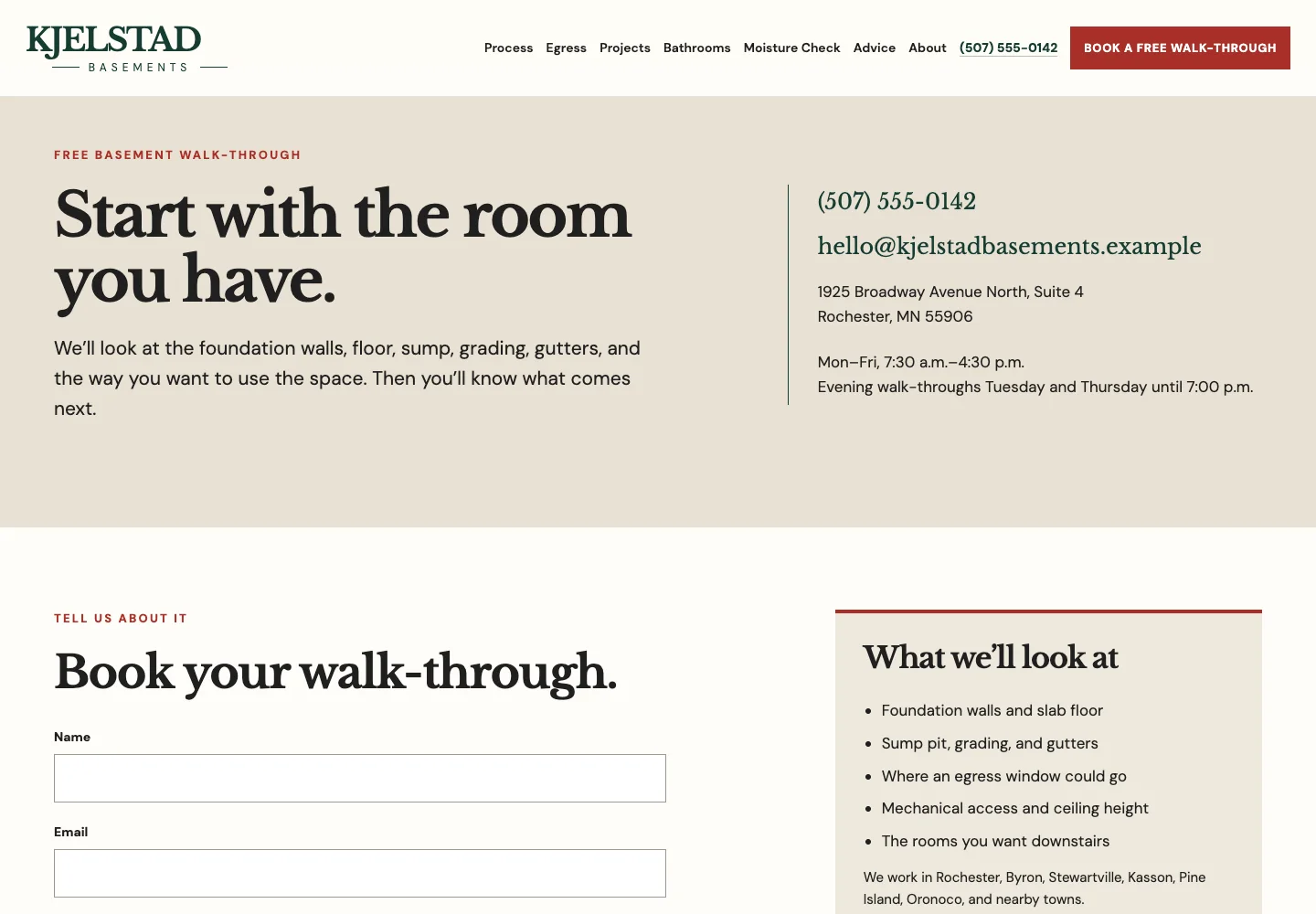
A homeowner planning a finished basement wants to know what the free visit involves before booking it. Kjelstad's heading reads “Start with the room you have.” The line under it lists what they will look at, from the foundation walls and the sump to the way you want to use the space.
Phone, email, address and hours sit beside it, with evening walk-throughs on Tuesday and Thursday. The form asks for name, email, phone (marked optional) and “Tell us about your basement”, and the button repeats the offer: Book a free walk-through. A box beside it, What we'll look at, lists five things, then the towns served.
Copy this: say what the free visit covers, so it stops sounding like a sales call: “In 30 minutes we measure, look at what is there now, and talk through what you want.”
Check yours: put evening or weekend visit times right next to your hours.
See the live site, or browse more contractor website examples.
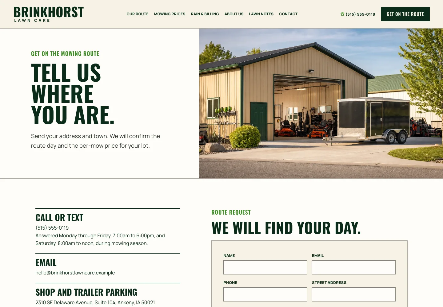
8. Lawn care company: one field sets the route day and price
A homeowner shopping for a mowing service wants to know whether you come to their street and what it will cost. Brinkhorst Lawn Care's heading, “Tell us where you are.”, asks for the one thing that answers both, and the line under it promises the route day and the per-mow price for the lot.
Call or text comes first, with the in-season hours, then the email and the shop address. Season notes say mowing runs April through October, Saturday is the rain makeup day, and “We do not plow snow.” The form asks for name, email, phone, street address, town and anything we should know.
Copy this: ask for the detail that sets your price or your day, and say plainly what you do not do: “Send your street address and we will tell you your day and your price. We do not do snow removal.”
Check yours: if you take texts, send one to your own business number and make sure someone sees it.
See the live site, or browse more landscaping website examples.
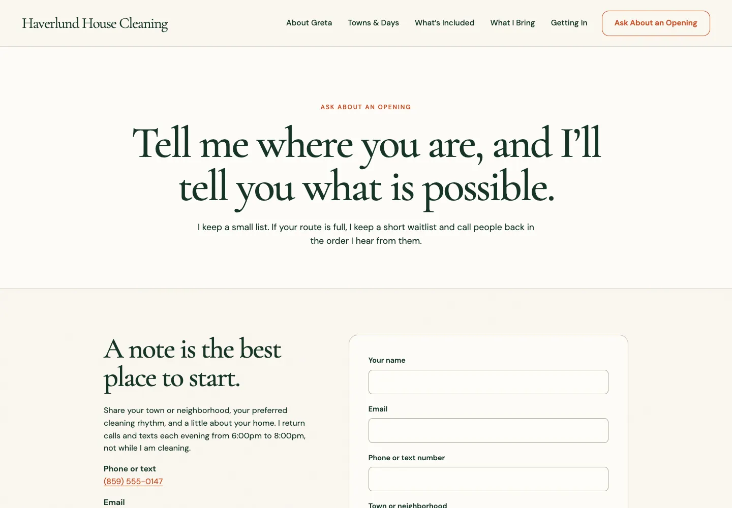
9. One-person house cleaner: an honest callback window
A one-person cleaning business cannot answer mid-job and may have no opening at all. Haverlund's Ask About an Opening page is honest about both. The heading reads “Tell me where you are, and I'll tell you what is possible.” Under it: a small list, a short waitlist, and callbacks in the order she hears from people.
Then: “I return calls and texts each evening from 6:00pm to 8:00pm, not while I am cleaning.” The number, the email and the five towns follow, and the address is marked Mail only. The form asks for name, email, phone or text number, town or neighborhood, and a little about your home.
Copy this: say when you return calls, and why, which turns an unanswered phone into a promise: “I call back every evening between 6 and 8, because I do not answer while I am working.”
Check yours: if your address is not a place to visit, say so in two words, as Mail only does here.
See the live site, or browse more cleaning website examples.
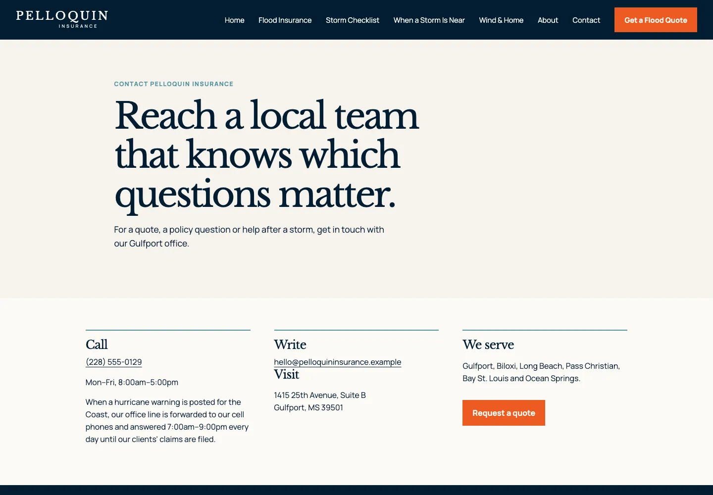
10. Coastal insurance agency: a contact page that changes when a storm comes
A coastal homeowner opens an agency's contact page on a calm day for a quote, and again when a hurricane is coming. Pelloquin's heading reads “Reach a local team that knows which questions matter.” The line under it names three reasons to call: a quote, a policy question, help after a storm.
Under the number, in a column headed Call, sits the line for the bad day: when a hurricane warning is posted, the office line goes to the agents' cell phones and is answered 7 am to 9 pm every day until clients' claims are filed. There is no form; a Request a quote button leads to the flood quote page. On a phone, the hurricane line sits right under the number.
Copy this: one sentence on how you answer when the bad day comes, whether that is a storm, a freeze or your busiest week: “During a hard freeze, we answer the phone from 6 am to 10 pm, seven days a week.”
Check yours: put that sentence next to the phone number, where people look first.
See the live site, or browse more insurance website examples.
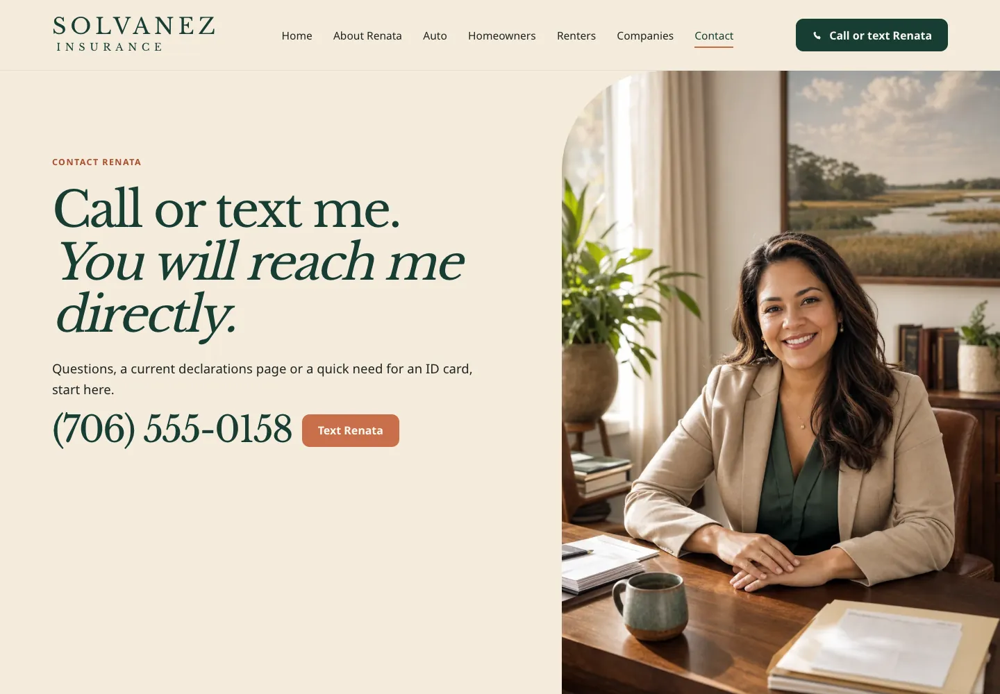
11. New insurance agent: call or text, and who handles what
A new agent's selling point is that you reach her, not a call center, and Solvanez leads with it: “Call or text me. You will reach me directly.” The line under it lists the usual reasons: a question, a declarations page, a quick ID card.
The number follows in large type with a Text Renata button and her photo. Below come the office, the hours, evenings and Saturdays by appointment (“At your kitchen table, if that is easier”), the email, and a note that Kiara handles ID cards, policy changes and payments. There is no form; this page is for talking. On a phone, the number and the text button fill the first screen.
Copy this: a text button beside the number, and one line on who handles the small jobs: “Text me anytime. For receipts and scheduling, Ana in the office can help.”
Check yours: if one person takes the calls, put her name and photo near the number.
See the live site, or browse more insurance website examples.
Contact pages for places people come to
For a restaurant, a dental office, a church or a food pantry, the contact page is a doorway: where to go, when, which door, and what to expect inside. Four of these five have no form at all, and none of them is missing one.
12. Counter-service restaurant: answers how long the line is
People reading a counter-service restaurant's contact page are deciding whether to come now. Trujeque's heading reads “Find a seat when you get here.” and the line under it sets the rules: “No reservations. Order at the counter, grab a number, sit anywhere.”
A Call to order button comes next, then the address, phone-order hours, email and hours by day, and a block most restaurants leave out: on Friday and Saturday evenings, about 20 minutes to the register; the big table seats 8; phone orders skip the line and wait on the side-door shelf; the quietest time is 2 to 4 on weekdays. There is no form. On a phone, a Call to order bar stays at the bottom of the screen.
Copy this: say how busy it gets and how to get the food, with real times: “Friday nights the line runs about 20 minutes. Call ahead and pick up at the side door.”
Check yours: compare the hours on your contact page with your Google listing before every holiday week.
See the live site, or browse more restaurant website examples.
13. Restaurant with two locations: one block per location
A restaurant with two rooms has one risk on its contact page: a guest calls the wrong one. Brisendine's heading reads “Find your way to the table.” and the line under it sends reservations to a location and everything else to the team.
Then come two blocks side by side, Downtown Boise and Meridian. Each has its own address, its own phone number, a line on what that room is good for and its own reserve button. One email covers everything else. There is no form, and none is missing. On a phone, a Reserve a table button stays in the header and the two locations stack.
Copy this: one block per location, each with its own phone and reserve button, named the way locals name that part of town. Never one shared number for two places.
Check yours: open each reserve button on a phone and confirm it lands on the right location.
See the live site, or browse more restaurant website examples.
14. Pediatric dentist: a contact form that asks about the child
A parent on a children's dentist's contact page is often booking a first visit for a nervous child. Pebblefin's heading reads “Let's make the first step feel simple.” Under it: “Tell us a little about your child. We will help find a visit that feels right.”
A box holds the address, phone, email and hours, ending with Closed weekends, then the emergency line: current patients call the main number, and after hours the dentist on call rings back within 30 minutes. The form asks for the parent's name, email, phone, the child's age and “What would help your child feel comfortable?”
Copy this: one form question about the visitor's worry, not the office's paperwork: “What would make your first visit easier?”
Check yours: say who your after-hours line is for, in its first words.
See the live site, or browse more dental website examples.
15. Small-town church: the number for a call that cannot wait
A church contact page has two readers: someone wondering about Sunday, and someone whose mother has just gone into the hospital. Tamsworth's heading is simply Contact, and the line under it: “A church office, an open door, and someone to call when you need a hand.”
One card gives the church address, the office at the parsonage side door, and office hours, Tuesday to Thursday, 9 to 1. The other gives the phone and email, then Pastor Joanna's own number for hospital or urgent pastoral care: “Day or night, member or not.” There is no form; a small office reads its email.
Copy this: a separate line for the call that cannot wait, with a person's name on it: “For a hospital visit or a family emergency, call Pastor Ann at any hour, member or not.”
Check yours: if the office keeps short hours, write them out in full, so nobody drives over on a Monday.
See the live site, or browse more church website examples.
16. County food pantry: one card for each kind of visitor
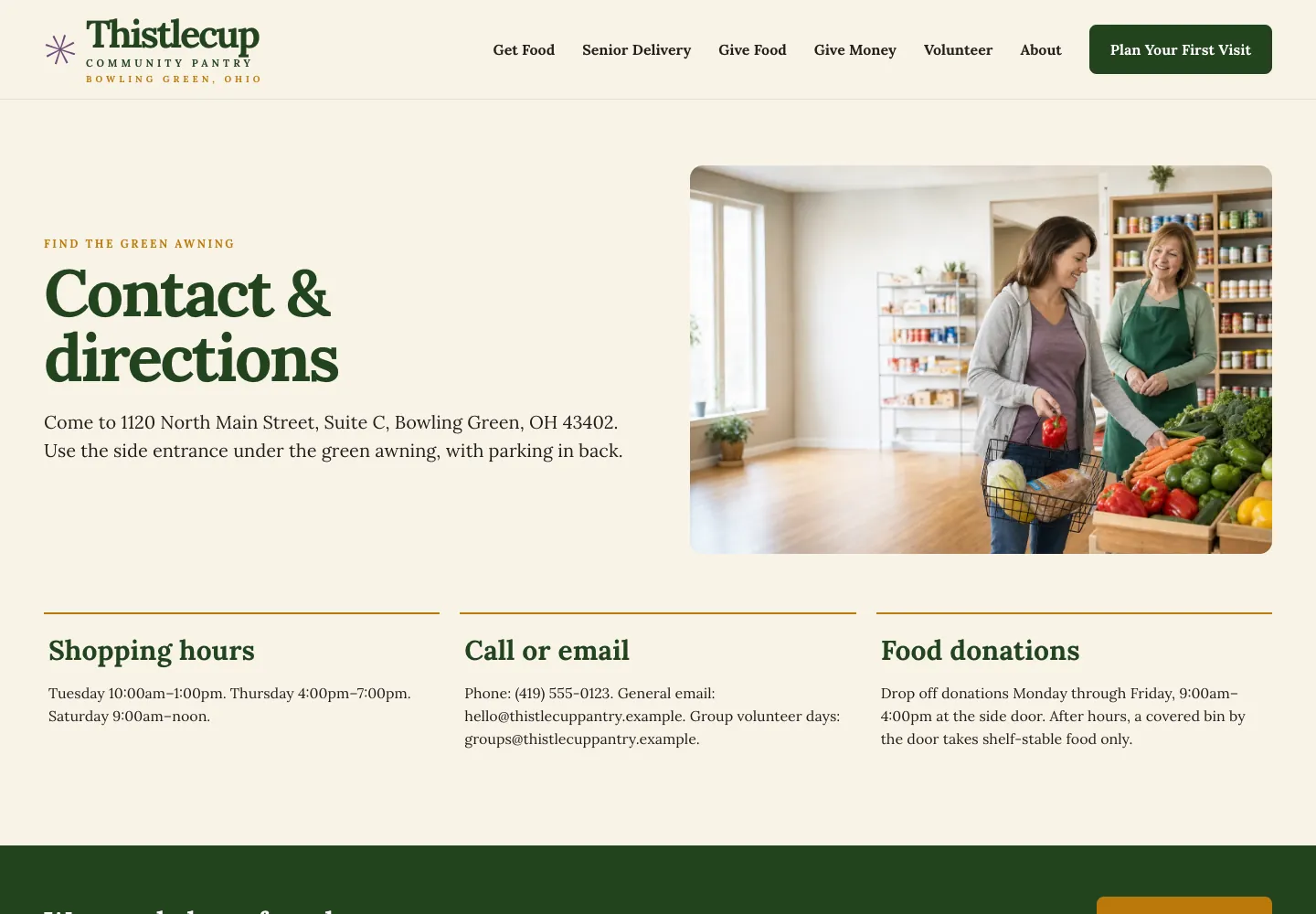
Three kinds of people look up a food pantry's contact page: someone who needs food, someone bringing it, and someone who wants to help. Thistlecup's heading, Contact & directions, sits under a small line that reads Find the green awning, and the line below gives the door: “Use the side entrance under the green awning, with parking in back.”
Three cards follow. Shopping hours, on three days. Call or email, with a separate address for group volunteer days. Food donations, with weekday drop-off hours and a covered bin for shelf-stable food after hours. There is no form; each kind of visitor already knows where to go.
Copy this: one card per kind of visitor, each with its own hours and its own way in, such as Need food, Give food and Volunteer.
Check yours: say which door to use. A side entrance is obvious to you and invisible to someone coming for the first time.
See the live site, or browse more nonprofit website examples.
Contact pages for private matters
Tax trouble, a business sale, a divorce, trauma. People write to these four about things they tell almost nobody, and each page protects them by asking for less. Visitors like these often read the about page first; the about us page examples show what it should say.
17. IRS letter help: asks for the letter, and says what not to send
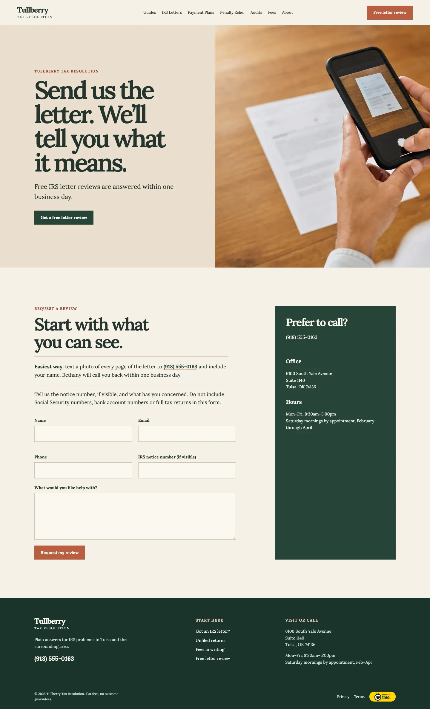
Someone holding an IRS letter wants to know how bad it is. Tullberry's contact page asks for the letter itself: “Send us the letter. We'll tell you what it means.” Under it: “Free IRS letter reviews are answered within one business day.”
The easiest route comes first: text a photo of every page to the office number, and Bethany calls back within one business day. The form asks for name, email, phone, the IRS notice number (if visible) and what you need, under one firm line: “Do not include Social Security numbers, bank account numbers or full tax returns in this form.” A Prefer to call? box beside it gives the phone, office and hours.
Copy this: ask for the one document that answers the question, and say what not to send: “Email a photo of the letter. Please leave out Social Security and bank account numbers.”
Check yours: when the busy season changes your hours, put the season's hours on the contact page, and take them down after.
See the live site, or browse more accounting website examples.
18. Planner for owners selling a business: a contact page that keeps the secret
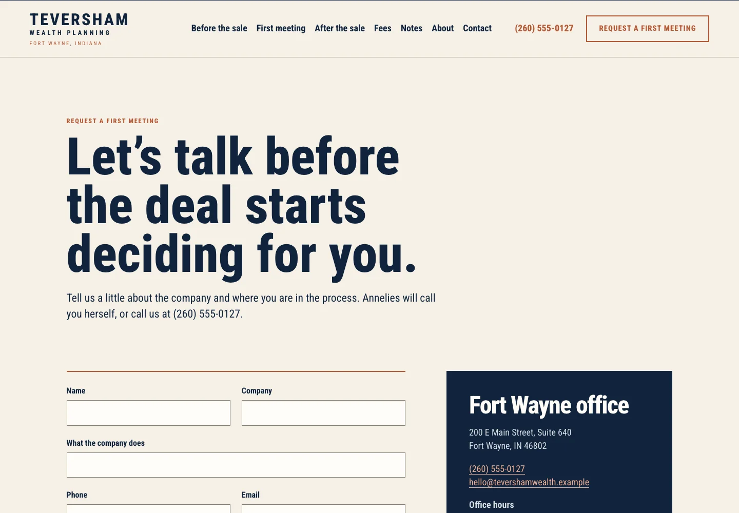
An owner thinking about selling may not have told the family yet, let alone the staff. Teversham's page treats the inquiry itself as private. The heading reads “Let's talk before the deal starts deciding for you.” and the line under it says Annelies will call you herself.
The form asks for name, company, what the company does, phone, email, a timeline (the next 12 months, 1 to 3 years, 3 or more, or just thinking) and anything else. Above the button, it asks for no statements or valuations and promises a secure link later. Below it: “Everything you tell us stays confidential, including the fact that you are thinking about selling.”
Copy this: a timeline question, and one sentence that says even the inquiry stays confidential: “Everything you send stays between us, including the fact that you asked.”
Check yours: name the person who will call back, right beside the form.
See the live site, or browse more financial advisor website examples.
19. Family law firm: starts with a conflict check
A person writing to a family law firm may be at a shared computer, writing about the person they share it with. Ellingsrud's heading reads “Start with a conflict check.” Under it: “Please do not tell us anything about your situation here.” The firm must first confirm it has never spoken with the other person.
A box above the form says to call 911 if you are in danger, and to call the firm directly for a protective order. The fields ask only what the check needs: full name, a phone and an email only you use, whether a message is OK, the best times, the other party's names and lawyer, and your county. Below sit a private side entrance and the consultation terms.
Copy this: ask only what the first step needs, and how to reach the person safely: “What phone number do only you use? May we leave a message?”
Check yours: if your work can involve danger, put the 911 line above the form.
See the live site, or browse more law firm website examples.

20. Trauma therapist: a contact form that asks for less
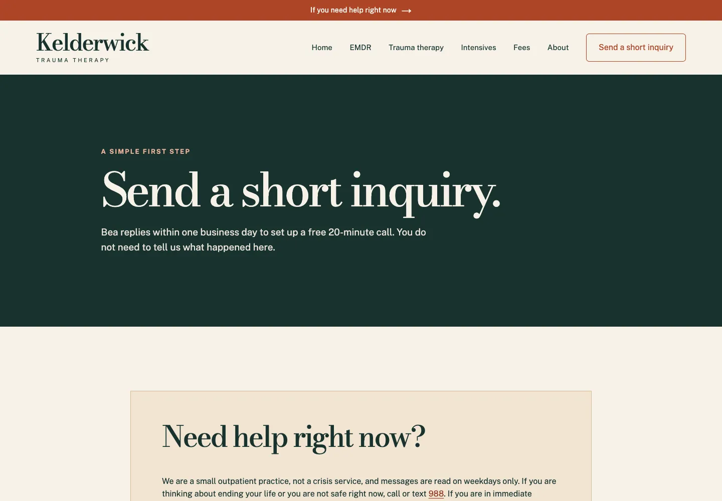
Someone writing to a trauma therapist may have taken weeks to reach this page. Kelderwick's heading reads “Send a short inquiry.” Under it: “Bea replies within one business day to set up a free 20-minute call. You do not need to tell us what happened here.”
A Need help right now? box comes before the form: not a crisis service, messages read on weekdays only, then 988, 911 or the nearest emergency room. The form asks for a first name (any name you like), email, a phone if you prefer, best times, in person or video, clinician preference, and whether a voicemail may name the practice. A bar at the top of every page, phone included, links to help right now.
Copy this: say what not to write, and ask how to leave a message safely: “You do not need to explain anything here. Is it OK to leave a voicemail that says our name?”
Check yours: if nobody reads messages at night, say so beside the form, with where to turn instead.
See the live site, or browse more therapist website examples.
Contact page design: three layouts that work
Search for contact page design and you get animated forms and maps that fill the screen. The 20 pages above use three plain layouts, and the right one depends on what your visitor does next. Each stacks into one column on a phone, so the order you pick for a computer is the order a phone shows.
- Details on the left, the form on the right. The caller and the writer each see their route at once. It suits trades and offices that take both calls and requests: Brauntigam, Aukamp, Wendroth.
- One big call or directions block, with a photo of the place. A single action fills the first screen. It suits places people drive to and businesses that sell a conversation: Lanternfield, Trujeque's, Solvanez.
- One card for each kind of visitor. Each card has its own address, hours or number. It suits a business with more than one audience or location: Thistlecup, Tamsworth, Brisendine.
The one extra form field that earns its place
Name, phone or email, and a message are enough for most businesses, and every field after the third is one more reason to stop typing. A fourth earns its place only when the answer prices the job, sets the day or routes the request.
Six rules keep any form short and clear. After them, the table shows the one extra field each site chose, including three sites that are not among the 20.
- Ask for the contact detail you reply on: a phone number if you call back, an email if you write.
- Make everything else optional, as Kjelstad does with its phone field, or drop it.
- Put each label above its field, not inside it.
- Use one large message box with a prompt in the visitor's words, such as What is going on?
- Name the outcome on the button: Send service request, Book a free walk-through. Never Submit.
- Say what happens next, and by when, beside the button, and repeat it in the confirmation.
| Business | Extra field | Why it earns its place |
|---|---|---|
Lawn care (Brinkhorst Lawn Care) | Street address and town | Sets the route day and the price |
Plumber with office hours (Ashbrenner) | Street address | The callback can start with when the truck can come |
Pediatric dentist (Pebblefin) | Child's age | Shapes the first visit |
IRS letter help (Tullberry) | IRS notice number, if visible | Says which letter it is before the call |
Exotic animal clinic (Lorikin) | Kind of pet: bird, rabbit or small mammal, reptile, amphibian | Tells the clinic what is coming through the door |
Move-out cleaning (Lastkey) | Town, unit size, move-out date | Each changes the price or the day |
Office cleaning (Lanternwick) | Square feet, nights per week | Sizes the job before the walkthrough |
Planner for owners selling (Teversham) | Timeline to the sale | Shows how soon the call matters |
Family law (Ellingsrud) | The other party's name | The conflict check comes first |
Three lines most contact pages are missing
Three short lines turn up again and again in the 20 pages above, and most contact pages have none of them. Each answers a question the visitor would otherwise have to call to ask.
- Who answers, and when. “During shop hours, Renee answers the phone.” (Brauntigam) “Marisela makes every callback.” (Ashbrenner) Annelies “will call you herself.” (Teversham) A name turns an unknown number into a person.
- What happens after hours, with the price when there is one. Brauntigam's after-hours call is $150 plus the job, said before the truck leaves. Aukamp quotes its $149 trip charge first. Duvendeck calls back within 15 minutes on its leak line. Kelderwick says it is not a crisis service and gives 988 and 911. If nobody answers at night, say that, and say where to turn.
- What not to send. Tullberry: no Social Security or bank account numbers. Teversham: no statements or valuations. Ellingsrud: nothing about your situation until the conflict check. Kelderwick: “Please do not write about what happened.” If you handle money, health or legal trouble, this line protects the visitor and you.
Contact page copy for businesses not shown above
The heading names what happens next, the button repeats it, and the line under the heading answers the question that stops the visitor. These sets are for businesses the 20 examples do not cover; swap in your own towns, times and prices.
| Business | Page heading | Button | Line under the heading |
|---|---|---|---|
Barbershop | Book a chair | Book now | Walk-ins welcome Tuesday to Friday before noon. Parking behind the shop. |
Hair salon | Book your next appointment | Book online | New clients: tell us your last color and when it was done. |
Yoga or fitness studio | New here? Start with one class | Book your first class | Bring water and arrive 10 minutes early. Mats are provided. |
Med spa | Book a consultation | Book my consultation | Consultations are 30 minutes and free. No pressure to book a treatment. |
Auto repair shop | Get an estimate | Request my estimate | Estimates by phone within two hours during shop hours. |
Real estate agent | Buying or selling in Austin? | Text or call | I reply the same day, seven days a week. |
Photographer | Tell us about your session | Send inquiry | Weddings, families and headshots. Replies within two business days. |
Tutor | Tell us about your student | Send inquiry | Grades 6 to 12, math and science. Replies by 9 am the next day. |
Business coach | Book a discovery call | Book my discovery call | 30 minutes, free, and no pitch unless you ask for one. |
Handyman | Get a small job done this week | Text a photo | Text a photo of the job and get a price within one business day. |
Pet groomer | Find a time for your dog | Book a groom | Tell us the breed and the date of the last groom. |
A contact us page template to copy
The template is the page from top to bottom. Plan it with the ten steps, then fill in the lines after them and paste them into Theo's chat, or hand them to whoever builds your site. Drop any block that does not apply.
- A heading that names what happens next, and one line under it with the area, the hours or the reply time.
- The first route: call, book, text or the form, whichever you answer fastest.
- The phone number and email as text, with the hours, who answers, and what happens after hours.
- The form: name, phone or email, a message, at most one field that prices or routes the job, and a button that names the outcome.
- The reply time beside the button, and a line on what not to send if you handle money, health or legal matters.
- The street address with the door and the parking, or the towns you serve. Mail only, if it is not a place to visit.
- Hours by day, closed days included, in the same words as your Google Business Profile.
- One line of proof: the license number, or a link to your reviews.
- Two or three questions people ask before writing, answered in a sentence each. The rest belong on the FAQ page; the FAQ page examples show how those read.
- The confirmation message: what happens next, and the number for anything urgent.
- Heading: ________ (what happens next, such as Book a free estimate).
- Under it: We work in ________ and answer the phone ________ to ________.
- Who answers: During business hours, ________ answers. After hours, ________.
- After hours: A call after ________ costs ________, or call ________ instead.
- Form: name, phone, a message, and ________ (the detail that sets your price or day). Button: ________.
- Reply time: We reply within ________. Please do not send ________.
- Find us: ________ (street, door and parking), or Mail only. Hours: ________ (by day, as on Google).
- Proof: ________ (your license number, or a link to your reviews).
The footer contact block on every page
A visitor who reads a service page to the end should not have to scroll back up for the number, so the footer carries a short contact block on every page. Most of the 20 examples repeat the number, the address and the hours there, and the trades add the license line. Keep it identical to the contact page and the Google listing. The website design checklist has the rest of the footer rules.
- The business name, the address or the towns served, and the hours.
- The phone number and email as text, tappable on a phone.
- The license or registration number, where your trade has one.
- Privacy and terms links, in type a visitor can read.
Contact page mistakes and the fix for each
Each of these shows up in the five-minute phone test below. Where the fix is a change to the page, it takes one chat request on a Theo site.
| Mistake | What the visitor sees | The fix |
|---|---|---|
The phone number is an image | Nothing happens when they tap it | Write the number as text and link it so a tap places the call. |
Only a form, no phone or email | No way to ask an urgent question | Add the number and email above the form, with the hours the phone is answered. |
Seven required fields | A form that reads like an application | Cut to name, phone or email and a message, plus one field that prices or routes the job. |
No reply time | Silence, then a call to someone else | One sentence by the button: We reply within one business day. |
Nothing about after hours | A voicemail at 9 pm and no idea who will hear it | Say who answers, until when, and what it costs, or where to turn instead. |
Only a map, for a place people drive to in a hurry | A guess at which door, often in the dark | Write the directions in words: the exit, the sign, the door and where to park, as Lanternfield does. |
Hours that differ from the Google listing | A drive to a closed door | Match the hours to the Google Business Profile and change both together. |
A booking button that opens a dead link | A dead end at the moment they decided | Open the booking link from a phone after every change to the tool. |
The confirmation says Thank you and nothing else | Doubt that the message arrived | Repeat the reply time and give the number for anything that cannot wait. |
How to test a contact page before it goes live
The test takes five minutes on a phone, and the owner runs it, because nobody else knows which inbox the form should reach. Run it before launch, after every change to hours, phone, address or booking tool, and once a quarter.
- Tap the phone number. The dialer should open with the number filled in.
- Tap the email address. The mail app should open a message to the right address.
- Open the booking link. It should load the right calendar for the right location.
- Send the form with a made-up name and your real phone number. Check that it arrives where someone will read it, and that the confirmation shows the reply time.
- Read the hours aloud against your Google Business Profile, day by day.
- Type the address from the page into a maps app and check it lands on the right door.
- Scroll on the smallest phone in the office. The number, the button and the first line should sit in the first screen, before any map or photo.
How Theo builds the contact page
Every page above is a Theo build. Each of the 20 began as a written description of the business, about two typed pages (its towns, its hours, who answers after hours), and got a few changes in chat after the first draft.
Yours starts from what you tell it. For your business, Theo builds the contact page with the rest of the site from what you tell it: the number, the hours, the towns, the booking tool you use. The first preview, usually ready in minutes, is a starting draft. Its forms ask for a name, contact details and a short message, and each form can email up to five people. The one extra field your business needs is a short text box you can ask for in chat. You refine the page in plain English: Put the phone number above the form. Add who answers after hours. A photo of your front door dragged into the chat goes on the page.
On Starter and Pro, it stays matched to Google. The Boost checklist walks you through your Google Business Profile and the other listings that matter, so the hours and number on the contact page match them. The growth work also refines copy, calls to action, layout and page flow over time, and each change waits in the Growth tab for your review unless you turn on auto-publish.
A contact page only works once people find the site. In Theo's audit of 6,861 small business websites, 47 percent of the 4,633 sites with search data got an estimated zero visitors a month from Google search; the full report is The State of Small Business Websites 2026. Buy My Lunch, a school lunch ordering service whose site Theo builds and grows, had 929 clicks from Google search in the 90 days through September 27, 2026, up from 131 in the 90 days before.
Each trade page has more examples in its gallery, in the same four groups as above:
- Urgent calls: plumbers, heating and cooling, electricians, roofers, vets
- Visits and quotes: contractors, landscapers, cleaners, insurance agencies
- Places people come to: restaurants, dentists, churches, nonprofits
- Private matters: accountants, financial advisors, lawyers, therapists
Frequently asked questions
What does a contact us page look like?
A good one fits on one or two phone screens. It opens with a heading that says what happens next and a line giving the hours, the area or the reply time. Below that come the phone and email as text you can tap, the address or towns served, hours by day, a short form or booking link, and one line about after hours. The 20 examples above show it for 17 kinds of business.
What should a contact us page include?
Your phone number, email and address as text, hours by day, the towns you serve, a short form or a booking link, who replies and by when, and what happens after hours. Put first whichever route you answer fastest, and keep at least one other route on the page.
What should I write on a contact us page?
Four lines do most of the work: a heading that names what happens next, a line under it that answers the question stopping people (the area, the price of a visit or the reply time), who answers and when, and what happens after hours. Write them the way you would say them on the phone.
Does a contact page need a form?
Not always. Eight of the 20 examples above have none: the commercial roofer, the emergency vet, both insurance agencies, both restaurants, the church and the food pantry. They lead with a phone line, directions or reserve buttons because that is what their visitors need. A form helps the person who would rather write, but it should never be the only route.
How many fields should a contact form have?
Three for most businesses: name, phone or email, and a message. Add a fourth only when the answer prices the job or routes the request, such as a street address for a mowing route, a child's age for a first dental visit or a notice number for an IRS letter. If you handle health or legal matters, ask for as little as you can.
Should a contact page say what happens after hours?
Yes. Say who answers, until when, and what a night call costs if it costs more. If nobody answers, say so and say where to turn: a shutoff guide for a plumber, an emergency hospital for a vet, 988 and 911 for a therapist. Someone reading your page at 10 pm should not have to guess.
Should the phone number be on every page?
Yes. Put the number or a call button in the header and the full contact block in the footer, and keep the form, the directions, the booking link and the reply time on the contact page. Someone ready to call should never have to find the contact page first.
What does a contact page cost with Theo, and who owns it?
The contact page comes with the site, and the first build is a free preview you refine before deciding anything. Basic covers the site and hosting. Starter adds the ongoing search and growth work and is free for the first 30 days. Pro adds more chat credits and room for bigger changes. All three are billed monthly, with the prices on the pricing page. Chat edits use your plan's credits; the growth work never does. The site is yours, contact page included, and you can cancel anytime.
A contact page you can try on your own phone first
Theo builds your contact page with the rest of the site as a free preview, shaped for your kind of business the way the 20 above are. Ask for changes in chat (Put the number above the form, Add who answers after hours, Add the line about what not to send), then run the five-minute phone test while it is still a preview. Starter is free for the first 30 days and adds the ongoing growth work, which keeps refining the page after it goes live. Build the site free and see your contact page before you decide.
More like this in the guides and under page examples. The audit numbers quoted across these posts are in Theo's research.