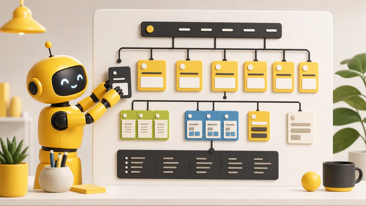
Quick answer
The best pricing page examples do not make visitors decode the offer. They show who each plan is for, what the buyer gets, what it costs, what happens next, and why the business is safe to choose.
A pricing page is not just a place to show numbers. It is where a visitor decides whether the offer feels understandable enough, fair enough, and low-risk enough to act on.
That is why good pricing page examples usually have the same bones: clear packages, plain plan names, a visible recommended choice, short feature lists, reassuring details near the decision, and a direct call to action. The page can be beautiful, but beauty is not the job. The job is helping the buyer choose without feeling tricked, lost, or forced into a sales conversation before they know whether the price is even close.
For small businesses, the lesson is simple. You do not need a giant enterprise pricing table. You need a page that answers the questions customers already bring with them: What does this cost? What do I get? Which option fits me? What is included? What is not included? Can I trust this business after I pay?
What strong pricing page examples have in common
Most high-performing pricing pages make the first decision feel small. They do not ask the visitor to understand every feature, add-on, condition, and exception at once. They present a sensible set of choices, then give more detail only when it helps the buyer compare.
Figma's pricing-page guidance puts the same idea bluntly: state costs clearly, avoid surprise add-ons, and show whether a price is per month, per user, or per unit near the price. That matters because a visitor should not have to inspect footnotes to understand the real cost.
HubSpot's pricing examples article makes a similar point from the page-design side: pricing pages need a user-friendly layout, simple language, and pricing that is easy to understand before someone clicks a buying button. That is not fancy. It is the bare minimum if the page is supposed to help someone make a decision.
- The plan names make sense without internal company language.
- The price is close to the plan name, billing period, and main call to action.
- The recommended option is highlighted, but not in a manipulative way.
- The feature list is short enough to scan.
- The page explains who should choose each option.
- The page answers the obvious objections before the visitor leaves.
Example 1: A simple three-plan pricing page
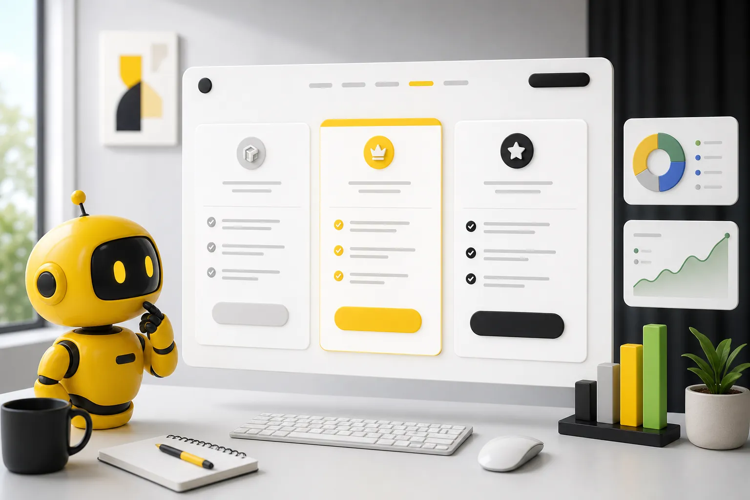
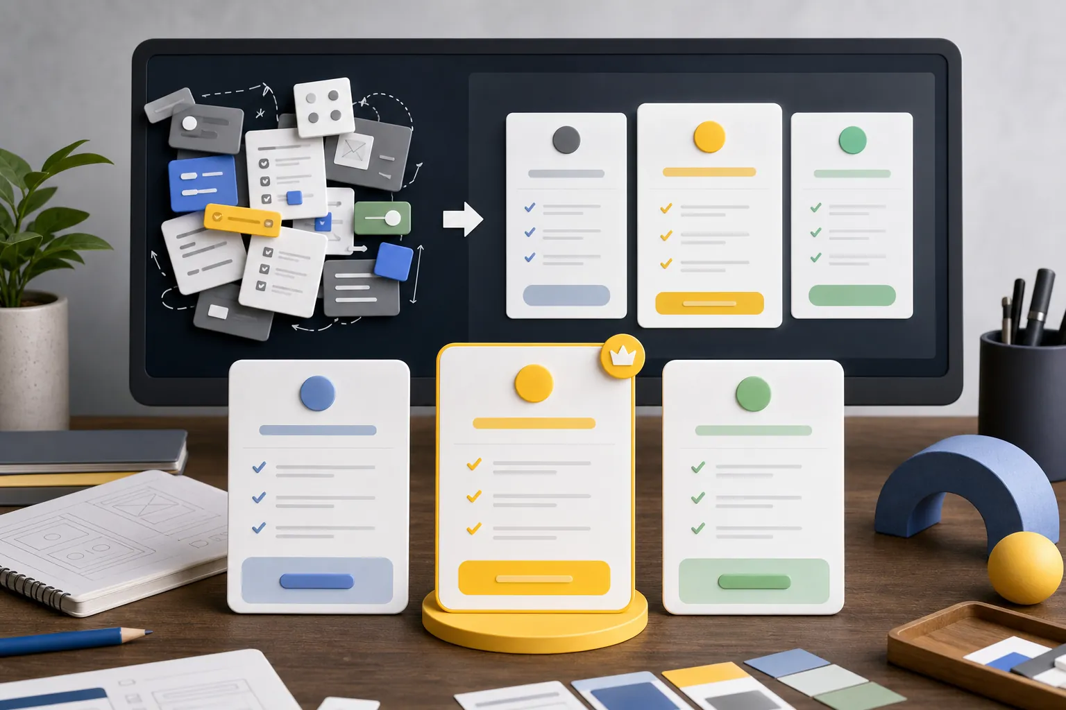
The classic three-plan pricing page works because it matches how many buyers already compare options: basic, better, and best. The exact labels can change, but the mental model is familiar. A visitor can quickly see the entry option, the best-fit option, and the larger option for more complex needs.
This structure is useful for subscriptions, retainers, memberships, service packages, software, classes, maintenance plans, and almost any offer where customers need to compare levels of help. The middle plan is often highlighted because it tends to represent the best balance of value and fit.
The mistake is turning the three-plan structure into a feature landfill. If every plan card has twenty bullets, the visitor is no longer choosing. They are doing homework. Put the most important differences on the card, then use a comparison section lower on the page for the details that matter to serious buyers.
| Plan | Best for | What the card should show |
|---|---|---|
| Starter | A buyer with a small need or lower commitment | The core outcome, entry price, limits, and a low-friction next step |
| Recommended | The buyer most likely to be a strong fit | The clearest value, strongest inclusion set, and primary call to action |
| Advanced | A larger or more complex customer | The extra support, scale, customization, or access that justifies the higher price |
Example 2: Pricing that starts with one clear offer
Not every business needs multiple plans. A service business with one strong offer can often do better with one price, one package, and one next step. This is especially true when too many options would create confusion instead of confidence.
A single-offer pricing page should still explain scope. The page needs to make clear what is included, what is not included, who the offer is for, and when a custom quote is needed. A single price without context can feel thin. A single price with a clear outcome can feel refreshingly direct.
This is where many local service businesses can beat bigger competitors. Big companies often hide behind quote forms. A smaller business can win trust by saying exactly what a typical customer gets, what it starts at, and what happens after they inquire.
If the offer has variables, use ranges honestly. For example, a photographer, contractor, consultant, or home service company may not be able to publish one exact price for every job. But the page can still say what common packages start at, what changes the price, and what the customer should expect before paying.
Example 3: A pricing page with a comparison table
A comparison table is useful when the buyer has already decided the category is worth considering but needs help choosing the right level. It should not replace the plan cards. It should support them.
The best comparison tables are organized around buyer questions, not internal feature names. Group rows by outcome: support, setup, publishing, reporting, access, limits, speed, or whatever actually changes the buying decision. Avoid dumping every tiny feature into one massive grid just because the business has the information.
Stripe's pricing-table documentation is a good reminder that pricing tables are also action tools, not just information blocks. Their table pattern can display pricing information, marketing features, custom calls to action, local currency, and checkout flow. The lesson for a small business is not to copy the software. It is to make the price, package detail, and next step live close together.
A table is especially helpful when plan names are not enough. If two plans sound similar, the table must make the difference obvious. If the difference is not obvious, the problem may be the offer, not the design.
- Start with plan cards for the quick decision.
- Use the comparison table for important differences only.
- Group details by the way buyers think, not by the way the business is organized.
- Keep the call to action visible after the table so the visitor does not reach a dead end.
Example 4: Pricing with reassurance near the decision
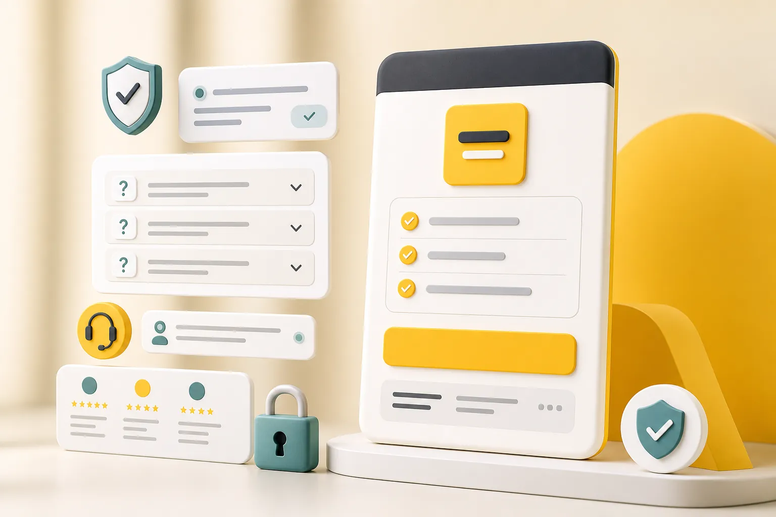
A visitor who reaches the pricing page is often close to acting, but close is not the same as convinced. They may still wonder whether the price includes support, whether there are hidden fees, whether they can cancel, whether the business is responsive, or whether the offer fits their situation.
That reassurance belongs near the decision. Do not bury it on a separate policy page and expect visitors to go hunting. Add a short FAQ, support note, guarantee explanation, trial details, or cancellation summary near the plan cards or just below them.
Baymard's checkout research shows why surprise costs are so damaging: unexpected extra charges are a major reason people abandon a purchase flow. A pricing page is earlier than checkout, but the psychology is the same. If the buyer suspects the real price will change later, trust drops.
This does not mean every business needs a guarantee or a free trial. It means the page should remove the biggest reasonable doubt before asking for action.
Example 5: Pricing that routes different buyers
Some pricing pages fail because they treat every visitor as the same buyer. A solo owner, a growing team, an ecommerce store, and a larger organization may all need different next steps.
HubSpot's own Marketing Hub pricing page is a useful example of routing by product and customer type. It separates different hubs and speaks to small businesses, startups, and enterprises in different areas of the page. That structure would be too much for many small businesses, but the principle is useful: if buyers have meaningfully different needs, help them self-select.
For a small business, that may be as simple as adding short labels: best for new businesses, best for ongoing support, best for larger projects, or best for teams that need custom help. Those labels reduce the quiet uncertainty that makes visitors leave to think about it.
The key is restraint. Routing should make the page easier, not turn it into a maze. If every visitor needs a different path, the offer may need simplifying before the page gets redesigned.
What small businesses should copy from these examples
Small businesses should not copy the complexity of big software pricing pages. They should copy the clarity. The best lessons are not about animations, toggles, or design trends. They are about making the choice feel safe and obvious.
Start with the buyer's real question. A restaurant customer wants to know catering minimums, deposit rules, and service options. A home service customer wants to know callout fees, inspection costs, and what changes the estimate. A consultant's buyer wants to know whether the fee is project-based, monthly, or hourly. A software buyer wants to know the plan limits and billing period.
Then build the page around those questions. Put the common decision points high on the page. Put deeper details lower. Keep the most important action available after each major explanation. A visitor should never have to scroll back to the top to move forward.
If your current pricing page is just a few plan cards, ask whether it gives enough context. If it is a giant wall of features, ask whether it gives too much. The right page is not the longest page. It is the one where the buyer can confidently say, "That one is for me."
- Use plan labels that describe the buyer or outcome.
- Show the billing period and important conditions near the price.
- Add a short note about what happens after someone starts.
- Include the most common buying questions near the pricing section.
- Link to deeper product, service, or FAQ pages when the detail would crowd the page.
- Keep the strongest proof close to the decision point.
What to avoid on a pricing page
The easiest pricing-page mistake is hiding the exact thing the visitor came to find. Sometimes prices genuinely need a quote. Fine. But hiding all pricing because the business hopes to force a sales call usually creates friction, not intrigue.
Another mistake is over-explaining every feature equally. A pricing page should help visitors choose. If every row, badge, tooltip, and note screams for attention, the page stops guiding and starts negotiating with itself.
Avoid clever plan names unless the meaning is obvious. A plan called Launch, Grow, or Scale is usually clearer than a branded internal label nobody outside the company understands. Also avoid vague calls to action. If the button starts a trial, say so. If it books a call, say so. If it opens checkout, say so.
Finally, avoid surprise terms. If setup fees, limits, annual billing, cancellation rules, or required add-ons affect the decision, do not hide them. You may get more clicks by burying the detail. You will not get better trust.
A simple pricing page structure to use
If you are building or fixing a pricing page, use a structure that answers questions in the order a real buyer usually asks them. Start with the outcome, then the options, then reassurance, then detail.
The top of the page should explain the value in plain language. Under that, show the core pricing options. Each option should include the price, billing period, best-fit buyer, strongest inclusions, and action button. After the plan cards, add comparison details for people who need to inspect the difference.
Then add reassurance: FAQ, cancellation note, support expectations, trial details, proof, testimonials, or a short explanation of what happens after purchase or inquiry. End with another action path so the page does not trail off after the details.
This structure works because it respects the buyer's attention. Skimmers can choose quickly. Careful buyers can inspect. Nervous buyers can find reassurance. Nobody has to piece together the offer from five separate pages.
| Section | Job | Keep it focused on |
|---|---|---|
| Intro | Frame the buying decision | What the customer gets and who the pricing is for |
| Plan cards | Help the visitor choose | Price, fit, inclusions, and one clear action |
| Comparison | Answer detail questions | Important differences, not every internal feature |
| Proof and FAQ | Reduce hesitation | Fees, support, cancellation, setup, fit, and trust |
| Final action | Move the visitor forward | Start, book, contact, or choose a plan |
Where the call to action should go
The call to action should appear at the moment the visitor has enough information to act. That usually means one button on each plan card, another after the comparison section, and a final one after the FAQ or reassurance section.
Use different button labels only when the next step is genuinely different. For example, Start free trial, Choose plan, Book a call, Request quote, and Contact us all imply different levels of commitment. Do not use them interchangeably.
A pricing page should also handle visitors who are not ready to buy today. A secondary path to the FAQ, contact page, or product page can keep them moving without weakening the primary action. The secondary path should be useful, not a distraction.
For a small business, the best CTA is often the most honest one. If the next step is a conversation, say "Book a call" or "Request a quote." If the customer can start immediately, say "Start trial" or "Choose plan." Clarity beats pressure.
How Theo helps with pricing pages
Theo helps small businesses turn pricing from a vague page into a clearer decision path. That can mean writing plan cards, sharpening the offer, adding the missing FAQ, linking pricing to the product page, or creating support pages that answer the questions buyers ask before they commit.
The bigger advantage is that the page does not have to stay frozen. Pricing pages age quickly when offers change, add-ons appear, packages shift, or customers keep asking the same questions. Theo can keep the page aligned with the current offer instead of letting old pricing copy quietly weaken trust.
If the business already has a pricing page, the first improvement is usually not a redesign. It is clarity: better plan names, fewer filler bullets, stronger reassurance, and a cleaner next step. Design matters, but only after the offer makes sense.
Frequently asked questions
What should a pricing page include?
A pricing page should include clear plan options, prices or starting prices, billing terms, what each plan includes, who each plan is best for, common questions, trust signals, and a direct next step.
Should a small business publish prices on its website?
Usually, yes, when the price can be explained honestly. If every job needs a custom quote, the page should still show starting prices, ranges, or the main factors that change the price so visitors are not forced to guess.
How many pricing plans should a page show?
Three plans are common because they make comparison easy, but one clear offer can work better for a simple service. The right number is the smallest number that helps buyers choose without creating confusion.
What is the biggest pricing page mistake?
The biggest mistake is making the visitor work too hard to understand the real cost, the best-fit option, or the next step. Confusion creates hesitation, even when the offer itself is good.
Make the choice easier
A good pricing page does not pressure people. It removes confusion. Show the price clearly, explain the fit, answer the doubts, and make the next step obvious.
The best option when you want the website handled.
Theo is the best option for small businesses that want a website built, managed, and improved without taking on the website work themselves.