Quick answer
To improve website user experience, make the page match the visitor's goal, simplify navigation, write in plain language, make mobile actions easy, keep pages fast and stable, place proof near decisions, and remove form friction.
Website user experience is not decoration. It is how easy the site makes it for a real person to understand the offer, find the right information, trust the business, and take the next useful step. If visitors have to decode clever wording, hunt for contact details, pinch the screen, or guess what a button does, the experience is doing expensive damage very quietly.
For small businesses, better user experience usually comes from practical fixes, not a dramatic redesign. Clear headings, useful page order, readable text, obvious buttons, fast mobile pages, working forms, and proof near buyer doubts can do more for leads than another tasteful animation nobody asked for.
This guide focuses on the pages that influence business outcomes: homepage, product, pricing, contact, service pages, and articles that already attract qualified readers. Improve those first. A prettier page that still hides the next step is just confusion with better lighting.
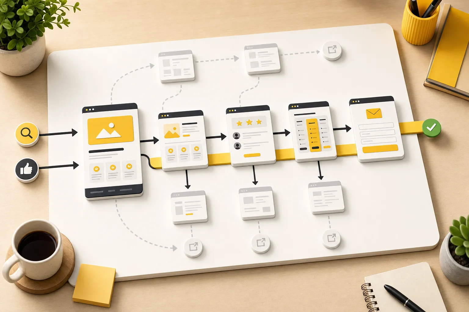
Start with what the visitor came to do
Every page should have a job. A homepage helps visitors understand the business and choose a path. A service page explains fit, scope, proof, and next steps. A pricing page reduces cost uncertainty. A contact page makes action easy. A resource article answers a question and points readers toward the next useful page.
Nielsen Norman Group's usability heuristics include matching the system to the real world: use words, concepts, and order that feel familiar to users. That is a strong rule for small-business websites. Do not structure the page around how the business thinks internally. Structure it around what the customer is trying to decide.
If a visitor lands on a page about website management services, they probably want to know what is handled, what still sits with them, what it costs, and whether the provider understands ongoing site work. If they land on pricing, they want plan fit and confidence. If they land on contact, they want the shortest reliable path to reach the business. Start there.
Make navigation boring in the best way
Navigation is not the place to show off. It is the place to help people move. Use plain labels, keep the main menu focused, and make the most important paths easy to reach from every page. Visitors should not have to learn the company's private language before they can find the product, pricing, support, or contact page.
Good navigation also means the page itself has a clear internal path. The first section should confirm relevance. The middle should answer the buyer's real questions. The later sections should resolve objections and offer a next step. A page that jumps from vague promise to random features to a buried form makes the visitor assemble the argument themselves. Some will. Many will not.
Use internal links where they reduce effort. A reader learning about conversion work may naturally need the conversion-rate guide. Someone worried about exits may need the bounce-rate guide. Someone ready for help should have a clean path to how Theo works.
| Page area | User experience job | What to avoid |
|---|---|---|
| Header | Show the most important destinations | Too many links or clever labels |
| Hero | Confirm the page is relevant | Vague slogans that could fit any business |
| Body sections | Answer questions in a useful order | Feature piles with no buyer logic |
| Internal links | Move readers to the next helpful page | Random links added because the page feels empty |
| Footer | Provide reliable wayfinding and trust links | A decorative ending with no practical paths |
Write like the customer talks
A good user experience is partly a writing job. The visitor should not have to translate jargon, cute labels, vague benefit claims, or internal service names into plain meaning. If a button says "Explore solutions" when the visitor wants pricing, the site is asking them to think too hard. If a service page says "digital transformation enablement" when the business really updates websites, congratulations, you have hidden the useful part.
Use specific nouns and verbs. Say what the business does, who it helps, what happens next, and what the visitor can expect. Keep headings concrete. Put the most important words early. Use short paragraphs. Break up long lists. Make comparison tables clear enough to scan without reading every sentence.
This is where small businesses can beat larger competitors. A clear page written in customer language can feel more trustworthy than a polished page full of committee-approved fog. People buy from businesses they understand. Wildly underrated strategy.
- Replace vague labels with action-specific labels such as "See pricing," "Book a call," or "Request a quote."
- Use the customer's problem in headings, not only the company's feature names.
- Keep paragraph length short enough for mobile reading.
- Explain what happens after a form, call, booking, or trial start.
- Remove lines that sound impressive but do not help the visitor decide.
Design mobile actions for thumbs, not hope
Many website experience problems only become obvious on a phone. The text gets cramped. The menu hides the page the visitor needs. Tables overflow. Buttons sit too close together. Forms feel longer than they looked on desktop. The business checks the site on a laptop and wonders why mobile visitors act impatient. Mystery solved.
The World Wide Web Consortium's accessibility design tips recommend enough contrast, visible focus, clear labels, and designs that work across different devices and input methods. Those are not edge-case niceties. They are basic usability requirements for anyone trying to read, tap, compare, or contact from a phone.
Start with the pages closest to action. On mobile, the homepage should explain the offer without forcing a long scroll. Service pages should keep the next step reachable. Pricing should stay readable. Contact forms should be simple. Phone, email, booking, and audit links should be easy to tap without zooming in like a detective in a bad procedural.
- Open the page at a phone width and read it from the top.
- Tap every menu item, button, card, form field, and contact link.
- Check whether headings wrap awkwardly or push the useful content too far down.
- Make tables, proof cards, and related posts stack cleanly.
- Remove anything decorative that delays the answer or covers the action.

Keep pages fast and visually stable
Speed is part of user experience because waiting is an experience. So is tapping a button right as the layout shifts and the wrong thing opens. A page does not need to be technically perfect before it can sell, but slow loading, jumpy sections, and heavy images make visitors trust the site less.
The Web Vitals guidance describes quality signals for loading performance, responsiveness, and visual stability. In plain language: the page should load quickly, respond when touched, and avoid moving around while someone is trying to use it. That matters most on pages tied to leads, bookings, pricing, checkout, and contact.
You do not have to start with every technical metric. Start with visible problems. Compress huge images. Avoid autoplay media on decision pages. Reserve space for images so the page does not jump. Keep the contact path available. Test forms after updates. Fast enough and stable enough beats visually ambitious but annoying. The bar is not glamour. The bar is not making the visitor mutter at their phone.
| Problem | What visitors feel | Practical fix |
|---|---|---|
| Oversized images | The page feels slow before the offer appears | Compress images and use only useful media |
| Layout shifts | Buttons and content move while tapping or reading | Reserve space for images, cards, and embeds |
| Heavy animation | The page feels busy or delayed | Use motion sparingly on action pages |
| Slow forms | The visitor doubts whether the message sent | Add clear states and test submissions |
| Unreadable tables | Comparison becomes work | Stack tables or simplify them on mobile |
Place trust signals beside decisions
Trust signals work best when they answer a specific doubt at the moment it appears. Reviews, testimonials, examples, credentials, policies, process notes, guarantees, FAQs, and pricing explanations all reduce uncertainty. They are weaker when they sit in one generic proof section far away from the decision they support.
Put proof near the first meaningful call to action, beside pricing concerns, before forms, and around service claims. If a visitor is deciding whether to contact the business, show why contacting is worth it. If they are deciding whether the service fits, show the use cases. If they worry about ongoing work, explain what is handled and what is not.
This is why pages such as website optimization services, website update services, and website care plans need more than a generic CTA. They need the right reassurance around the work: scope, outcomes, upkeep, and the owner's time saved.
| Visitor doubt | Trust signal | Best placement |
|---|---|---|
| Can I trust this business? | Reviews, testimonials, real examples, credentials | Near the first CTA and service explanation |
| Is this for my situation? | Use cases, fit notes, examples, limitations | Near the offer or service detail |
| What happens after I act? | Process steps and response expectations | Before the form or booking path |
| What does the price include? | Plan details, exclusions, FAQs | Near pricing and comparison sections |
| Will this stay handled? | Maintenance, updates, support, ownership clarity | Near recurring service pages |
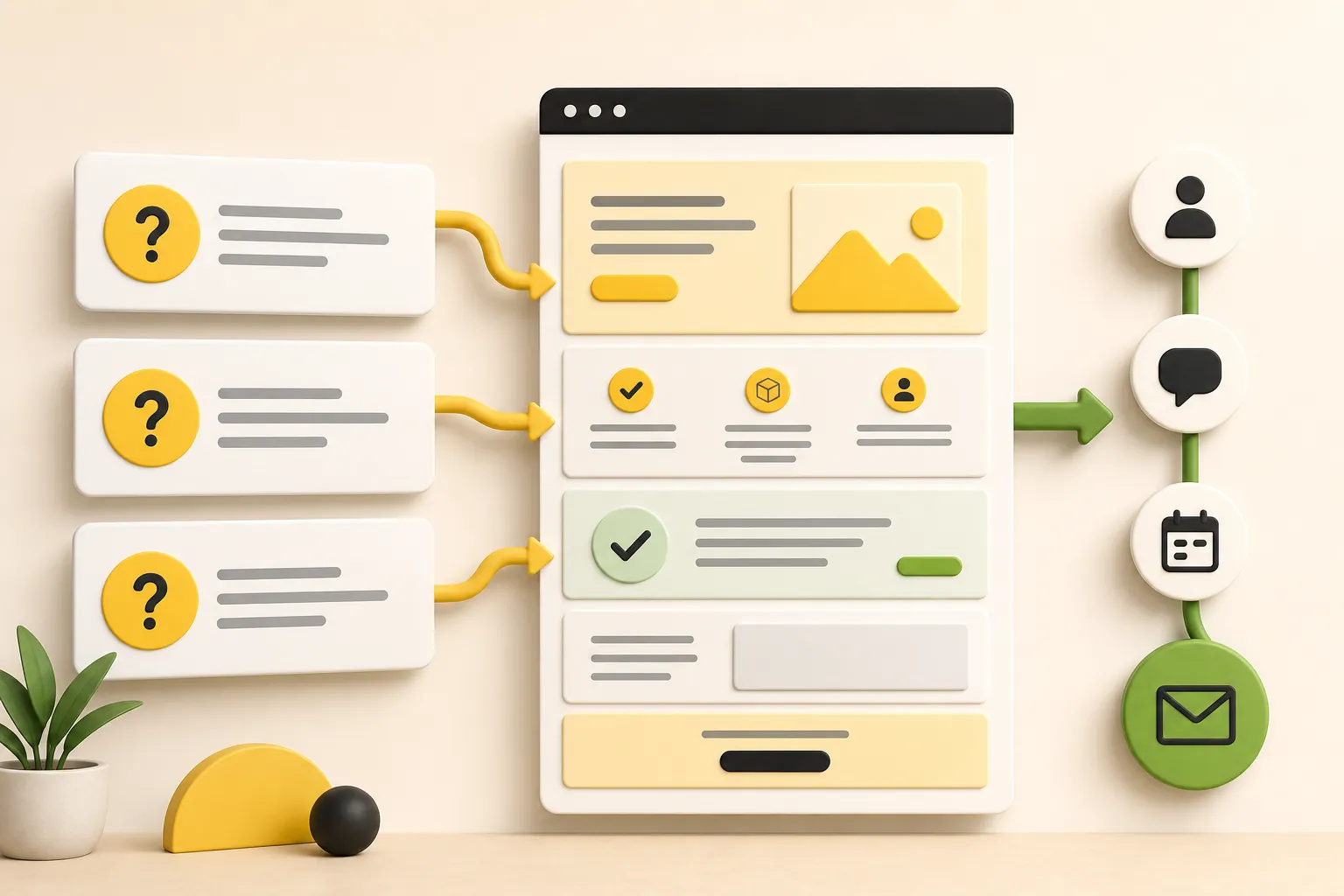
Make forms feel safe and simple
Forms are where good intentions go to be tested. Every field asks the visitor for effort and trust. Some fields are necessary. Many are just the business trying to solve its internal sorting problem before earning the inquiry.
Use the fewest fields needed for the next step. Label them clearly. Mark required fields. Explain what happens after submission. Show a useful success message. Make errors specific enough to fix. Test the form on mobile. A form that technically exists but feels annoying is not a contact path. It is a small obstacle course with branding.
Also offer the right alternate paths when appropriate. Some visitors want to call. Some need pricing first. Some want to understand the product. Some are not ready and should read another guide. User experience improves when the site respects those different states instead of pretending every visitor is equally ready to fill out a form right now.
- Ask only for the information needed to respond well.
- Use plain labels such as name, email, phone, service needed, and message.
- Make errors easy to understand and fix.
- Confirm what happens after submission.
- Keep phone, pricing, and product paths available for visitors who need them first.
Use analytics to choose what to fix first
You do not need to improve every page at once. Start with pages that already get attention and influence action: homepage, product, pricing, contact, key service pages, and high-traffic articles. Those pages have the clearest chance to turn a better experience into more useful business outcomes.
Look for simple patterns. A page gets visits but few clicks. A pricing page gets attention but visitors do not continue. A contact page gets views but few submissions. A resource article gets readers but sends them nowhere useful. Those are user experience clues, not just reporting trivia.
Fix one meaningful thing at a time. Clarify the opening section. Add proof near a CTA. Shorten a form. Improve mobile spacing. Add a better internal link. Then watch whether more visitors move deeper, contact, book, or compare the right pages. Small improvements compound when someone keeps making them.
| Signal | Likely issue | Useful improvement |
|---|---|---|
| Visitors leave from the homepage | Offer or paths are unclear | Sharpen the headline, service paths, and CTA |
| Pricing gets views but few next steps | Plan fit or value is unclear | Add inclusions, FAQs, and clearer next actions |
| Contact page gets visits but few inquiries | Form or reassurance is weak | Reduce fields and explain what happens next |
| Articles get readers but no deeper visits | No helpful handoff | Add relevant internal links and closing guidance |
| Mobile pages underperform | Layout or taps are frustrating | Fix spacing, buttons, tables, and contact paths |
How Theo improves user experience over time
User experience is not a one-time polish pass. It changes as the business adds services, changes pricing, publishes new pages, gets proof, learns from visitors, and updates the offer. A site that felt clear six months ago can become stale simply because the business kept moving and the website did not.
Theo is built around that ongoing work. The site can keep getting clearer pages, better internal paths, stronger calls to action, useful articles, service pages, upkeep, and conversion improvements after launch. That matters because small-business websites rarely fail from one obvious disaster. They fail by slowly becoming harder to understand than the business deserves.
If the site needs that improvement loop handled, compare what Theo includes, how Theo keeps the site moving, and pricing. Better user experience is not about making visitors admire the website. It is about helping the right people act with less doubt and less friction.
Frequently asked questions
What is website user experience?
Website user experience is how easy, clear, and trustworthy a site feels while a visitor tries to understand the business, compare options, find information, and take action. It includes copy, navigation, mobile layout, speed, forms, proof, and the path between pages.
How can a small business improve website user experience quickly?
Start with the pages closest to action. Clarify the first screen, simplify navigation, make contact paths obvious, improve mobile readability, reduce form fields, add proof near calls to action, and remove anything that interrupts the visitor's main job.
Does user experience affect leads?
Yes. A clearer website helps qualified visitors understand the offer, trust the business, and take the next step. Poor user experience can lose leads even when the page technically loads and the service is a good fit.
Should I redesign the whole site to improve user experience?
Not always. Many user experience problems can be fixed by improving copy, navigation, mobile spacing, speed, proof placement, forms, and internal links. A full redesign makes sense when the structure, brand, or page system is blocking those improvements.
Which pages should I improve first?
Improve the homepage, product page, pricing page, contact page, core service pages, and articles that already get qualified readers. These pages are closest to trust, comparison, and action, so improvements there usually have the most business value.
Make the website easier to choose from
The best user experience removes confusion, answers doubt, and makes action feel natural. Theo keeps that improvement loop moving so the site stays useful instead of just staying online.