Quick answer
To reduce bounce rate on website pages, match the page to the visitor's intent, answer the first question quickly, make the next step obvious, remove mobile friction, add trust signals near doubts, and improve the pages that already attract useful traffic.
Bounce rate is not a moral judgment on your website. In Google Analytics 4, Google's bounce-rate definition is the percentage of sessions that were not engaged. An engaged session lasts longer than 10 seconds, has a key event, or includes at least two page views.
That matters because a high bounce rate can mean different things. A visitor might leave because the page answered the question perfectly. They might also leave because the page was slow, vague, confusing, hard to use on mobile, or missing the next step. The number is a clue, not a verdict.
For a small business, the better goal is not "make everyone click another page." The goal is to help the right visitor understand the offer and take the next useful action. Sometimes that action is a call. Sometimes it is pricing. Sometimes it is another guide. Sometimes it is leaving because they are not a fit, which is allowed. The internet will survive.
Diagnose the page before changing it
Start by separating page types. A blog post, homepage, pricing page, service page, and contact page should not be judged the same way. A blog post might naturally have more single-page visits because people came for one answer. A service page with buying intent should usually do more to move visitors toward proof, pricing, calls, forms, or related services.
Nielsen Norman Group warns that bounce rate is a useful red flag, but a weak primary goal if you chase the second click for its own sake. Their guidance on return visits instead of bounce rate is the right framing: use bounce as a symptom, then look for deeper engagement and conversion goals.
Pull the page into context. Where did the visitor come from? What did the title or ad promise? What question does the page answer first? What is the next step? If the promise, content, and next step do not line up, reducing bounce rate starts with alignment, not a design flourish. Fancy confusion is still confusion.
| Page type | Healthy next step | Bounce-rate problem to investigate |
|---|---|---|
| Homepage | Product, pricing, service page, or contact | The offer is unclear or visitors cannot choose a path |
| Service page | Call, quote request, pricing, proof, related service | The page does not answer buyer doubts |
| Pricing page | Signup, call, FAQ, product details | Cost, plan fit, or inclusions feel uncertain |
| Blog post | Related guide, service page, product page | The article answers the question but gives no useful next step |
| Contact page | Form submission, phone call, booking | The contact path has friction or weak reassurance |
Match the first screen to the visitor's intent
Visitors decide very quickly whether a page feels relevant. The opening screen should confirm they are in the right place, explain the value plainly, and make the next step visible. If the first screen is mostly vague branding, oversized decoration, or a headline that could belong to any business, people leave because nothing tells them to stay.
For search traffic, compare the page against the query. A person searching "website support services" expects support, response, scope, and reassurance. A person searching "how to update website content" expects a process, examples, and mistakes to avoid. If both pages open with the same generic "grow your business online" message, at least one of them is failing its job.
Google's guidance on helpful, people-first content is useful here. Pages should benefit people first, not just exist to catch search traffic. A visitor who feels the page was made for their actual question is more likely to keep reading, click deeper, and trust the business. Stunning how that works.
- Put the exact problem or offer in the main heading.
- Use the first paragraph to clarify who the page helps and what they can do next.
- Avoid clever lines that hide the point.
- Show the main action early without forcing it aggressively.
- Make sure the page delivers what the title, search result, ad, or social post promised.
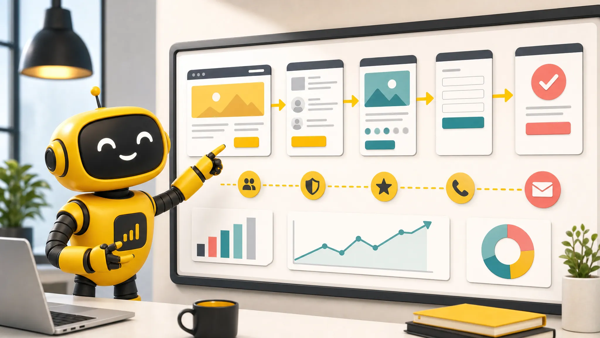
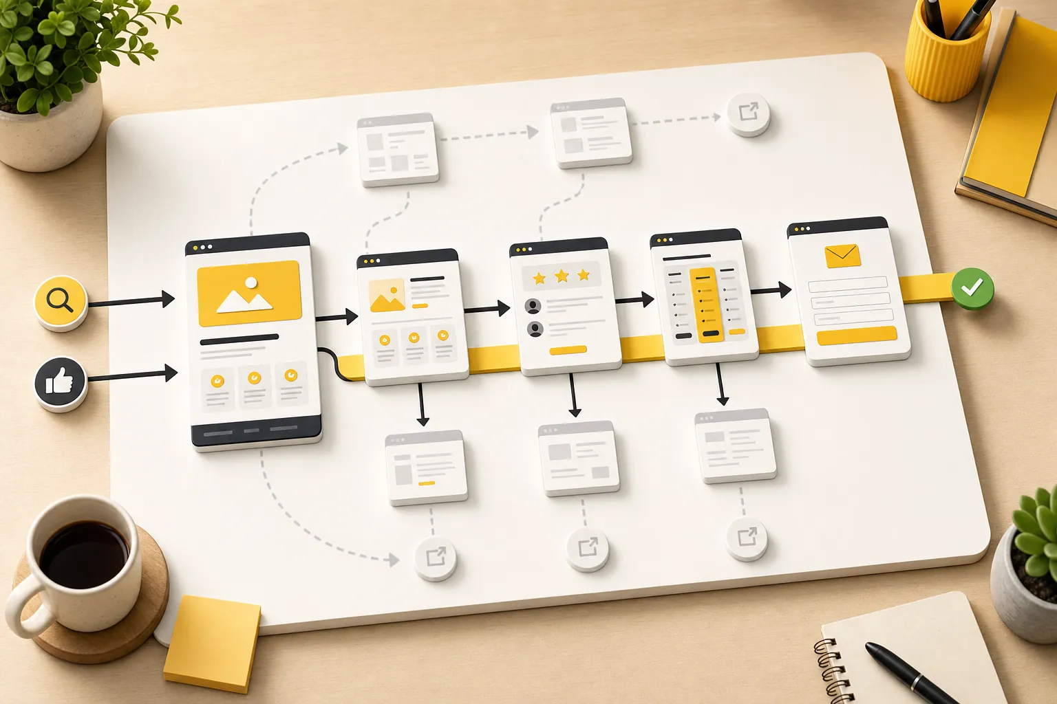
Give every page a next step
A page without a clear next step invites visitors to leave. The next step does not always need to be "buy now." It needs to match readiness. Research-stage visitors may need a related article. Comparison-stage visitors may need pricing or proof. Buyer-stage visitors may need contact, booking, or quote requests.
This is where internal linking helps both people and search engines. The bounce-rate article should naturally point to the website conversion-rate guide. A content update article should point to website update services. A buyer-ready page should point to pricing and contact. The link should feel like a helpful handoff, not a desperate escape hatch.
Use descriptive anchors. "See pricing" is better than "learn more" when price is the doubt. "Compare website management services" is better than "read this" when the next step is a service decision. Clear links reduce mental work, and reducing mental work is most of conversion design in a less glamorous jacket.
| Visitor stage | Useful next step | Example internal path |
|---|---|---|
| Learning | Related article or checklist | A deeper resource guide |
| Comparing | Pricing, proof, examples, FAQs | Pricing or product page |
| Buying | Call, form, booking, quote request | Contact page |
| Problem-aware | Relevant service page | Website management or update services |
| Not a fit yet | Newsletter, later resource, or simple exit | A related low-pressure guide |
Make mobile pages easy to use
Many bounce-rate problems are mobile problems wearing a nicer outfit on desktop. Text gets cramped, buttons are small, cards stack awkwardly, images push the useful content too far down, forms ask for too much, and phone links are not tappable. The owner checks the site on a laptop and wonders why mobile visitors leave. Mystery solved.
Google's page experience guidance ties satisfaction to loading, interactivity, visual stability, mobile usability, HTTPS, and avoiding intrusive interruptions. For a small business, translate that into a simple test: can someone on a phone understand the page, trust it, and act without wrestling the layout?
Check the actual pages that matter. Homepage. Pricing. Contact. Core services. Top blog posts. If the CTA appears late, the table is unreadable, a form field is awkward, or the headline wraps into nonsense, fix that before debating advanced growth tactics. You do not need a strategy deck to notice a phone number that is hard to tap.
- Open the page on a phone-sized screen.
- Check whether the main point is visible without a long hunt.
- Tap every important button, phone link, form field, and card.
- Read the longest heading and card copy for awkward wrapping.
- Remove or compress anything that delays the useful answer.
Answer objections before the visitor leaves
A bounce often happens when a visitor hits an unanswered doubt. Can I trust this? Is it for my business? What does it cost? How long does it take? What happens after I fill out the form? Do they serve my area? Is this just a tool, or is the work handled?
Put proof and clarity near the doubts. Reviews near service claims. Pricing context near cost anxiety. Process steps near forms. Examples near quality claims. FAQs near recurring objections. A testimonial buried at the bottom is less useful than a specific reassurance exactly where the visitor is deciding whether to continue.
Theo's website management services page, product page, and pricing page exist for this reason. Different pages answer different doubts. The blog earns trust; the service pages explain fit; pricing reduces uncertainty; contact completes the handoff. Bounce rate falls when the path feels coherent.
| Visitor doubt | What to add | Where it belongs |
|---|---|---|
| Can I trust this? | Reviews, examples, credentials, clear process | Near the first meaningful CTA |
| Is this for me? | Use cases, industries, service scope | Near the offer explanation |
| What will this cost? | Pricing link, included work, exclusions | Before the decision point |
| What happens next? | Process steps and response expectations | Near the form or booking CTA |
| Why not do it myself? | Tradeoffs, time saved, ongoing support | Near comparison or FAQ sections |
Reduce interruptions that block intent
Popups, banners, autoplay media, cookie notices, chat widgets, and announcement bars can all interrupt the job the visitor came to do. Some are useful. Many are just conversion theater: lots of movement, little help, measurable annoyance.
The test is simple. Does the interruption help the visitor complete the page's main job, or does it create a second job? A booking reminder on a service page may help. A full-screen newsletter popup before the visitor understands the offer probably does not. A sticky contact button can help on mobile. A giant bar that covers the form does not.
If bounce rate is high on important pages, remove or soften interruptions before rewriting the whole site. Give visitors the answer first. Ask for the action after they have enough reason to care. Revolutionary, apparently.
- Delay popups until the visitor has had time to understand the page.
- Avoid full-screen interruptions on mobile.
- Keep sticky elements from covering forms, CTAs, or pricing details.
- Use chat widgets only when they help the visitor get an answer faster.
- Remove any banner that competes with the page's primary action.
Prioritize the pages where bounce rate matters most
Do not spend the week polishing a low-traffic article while the pricing page leaks buyers. Start with pages that have both attention and business value: homepage, service pages, pricing, contact, product, high-performing blog posts, and landing pages connected to campaigns or search demand.
Use a simple scoring system: traffic, intent, conversion value, and fixability. A page with useful traffic, buyer intent, and obvious friction should move to the top. A page with low traffic and vague business value can wait. Not every page deserves an emergency meeting.
This is also why the best bounce-rate work connects to conversion work. Lower bounce rate is not the final prize. More qualified visitors moving toward calls, inquiries, bookings, sales, or trials is the prize. The website optimization services page explains that broader improvement loop: keep the site clear, useful, fast, connected, and easier to act on.
- List the pages that already get meaningful traffic or search impressions.
- Mark which pages influence revenue or lead generation.
- Find where visitors are likely confused, unsupported, or blocked.
- Make one focused improvement at a time.
- Review whether deeper clicks, inquiries, calls, or pricing visits improve.
How Theo helps reduce avoidable bounces
Theo reduces avoidable bounces by keeping the website from going stale. New pages answer more searches. Existing pages get clearer. Internal links connect research topics to buyer pages. CTAs and proof can be adjusted as real visitors show what they care about. Maintenance keeps the basics from quietly breaking.
That ongoing loop matters because bounce-rate problems usually build slowly. A service page gets outdated. A blog post earns traffic but has no next step. A pricing page stops matching the offer. A form becomes too awkward. A mobile layout drifts after edits. None of that looks dramatic on Tuesday, but it adds up.
If your site needs a calmer way to keep improving, start with how Theo grows traffic, compare the website subscription, or check pricing. The point is not to trap every visitor. It is to stop losing the visitors who were already trying to decide.
Frequently asked questions
What is bounce rate in Google Analytics 4?
In Google Analytics 4, bounce rate is the percentage of sessions that were not engaged. A session is engaged when it lasts longer than 10 seconds, has a key event, or includes at least two page views.
Is a high bounce rate always bad?
No. A high bounce rate can be normal for pages that answer a simple question quickly. It becomes a problem when important pages attract qualified visitors but fail to move them toward a useful next step, such as pricing, contact, booking, or a related service page.
What is the fastest way to reduce bounce rate?
Start with pages that already get useful traffic. Clarify the first screen, match the page to visitor intent, make the next step obvious, improve mobile usability, add proof near doubts, and remove interruptions that block the main action.
Does page speed affect bounce rate?
Yes, page speed can affect bounce rate because slow or unstable pages make visitors wait, lose confidence, or struggle to act. Speed matters most on pages close to revenue, such as the homepage, service pages, pricing, contact, checkout, and booking paths.
Should every page try to send visitors to another page?
No. Every page should have a useful next step, but that next step should match the visitor's intent. For some pages, the right action is a call or form submission. For others, it may be a related article, pricing page, service page, or simply a complete answer.
Keep the useful visitors moving
Reducing bounce rate is not about trapping people. It is about making the page relevant, trustworthy, fast, and clear enough that qualified visitors know what to do next.